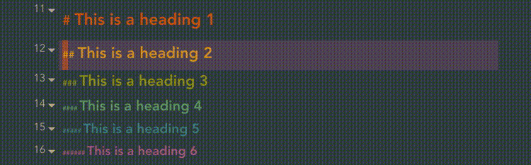
Hi, I want to start collecting common CSS hacks for people to reference. If the hack you’ve come across isn’t particularly large then go ahead and use the format
Title
Version it last worked with
Code
Otherwise just post a link and I will maintain a list
The border color is from me as I posted a half-baked solution for the same issue on the Discord. Sadly it couldn’t show more than level one line and worked in edit mode only.
This one is much more elaborate and it actually works all the way, but only in Preview! Seems like we can’t have it everywhere. Still, thanks for this @death.au
Hi there! I’m a total newbie at css. Could anyone tell me if it’s possible to change how the tags look? I’d like to highlight certain important tags (for example #complete as green, #inprogress as yellow, etc)
/* Cursor color in normal vim mode and opacity */
.cm-fat-cursor .CodeMirror-cursor, .cm-animate-fat-cursor {
  width: 0.5em;
  background: #d65d0e;
  opacity: 60% !important;
}

/*an active line highlight in vim normal mode */
.cm-fat-cursor .CodeMirror-activeline .CodeMirror-linebackground{
  background-color: rgba(89, 75, 95, 0.99) !important;
}

/*if you want the highlight to present in both normal and insert mode of vim*/
.CodeMirror-activeline .CodeMirror-linebackground{
  background-color: rgba(89, 75, 95, 0.99) !important;
}
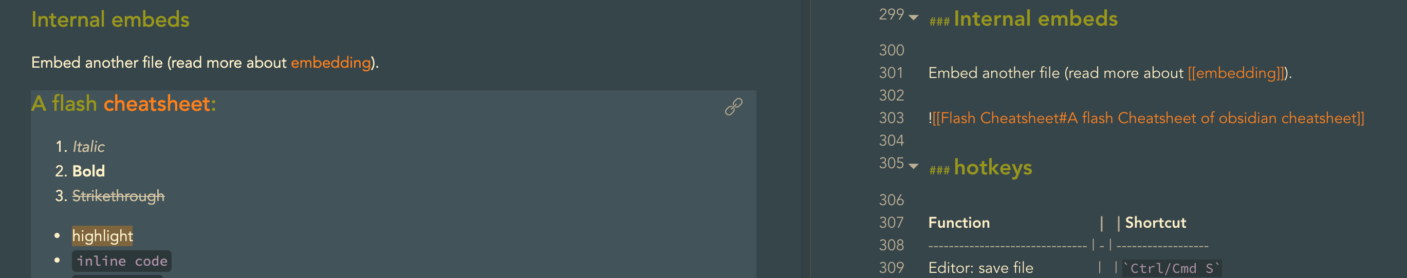
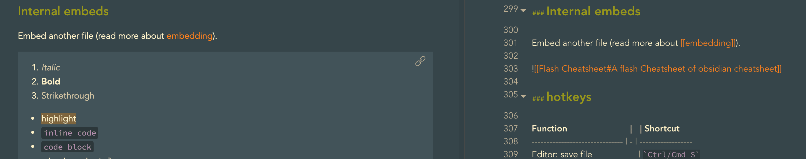
/* Naked Embeds */
.markdown-embed-title { display: none; }
.markdown-preview-view .markdown-embed-content>:first-child { margin-top: 0;}
.markdown-preview-view .markdown-embed-content>:last-child { margin-bottom: 0;}

/*remove the following two line, you will get border and scroll*/
.markdown-preview-view .markdown-embed { border:none; padding:0; margin:0; }
.markdown-preview-view .markdown-embed-content {
  max-height: unset;
  background-color: var(--background-secondary); /*define different bg color*/
}

/* the link on the top right corner*/
.markdown-embed-link {
color: var(--text-faint) !important;
}

.markdown-embed-link:hover {
color: var(--text-accent) !important;
}


