Auto fade note controls
Minimal Series
Before:

After:

Note, the note controls are still there, but will increase contrast, i.e. get to the before state, on hover.
0.7.3 compatible
.view-header:not(:hover) .view-actions {
  opacity: 0.1;
  transition: opacity .25s ease-in-out;
}
Auto fade status bar
Minimal Series
0.7.3 compatible
Reduced status bar contrast.
With this code snippet you get this:

and on hover you get this:

/* auto fades status bar items */
.status-bar:not(:hover) .status-bar-item {
  opacity: 0.25;
  transition: opacity .25s ease-in-out;
}
Smaller horizontal and vertical scrollbars
Minimal Series
0.7.3 compatible
.CodeMirror-vscrollbar, .CodeMirror-hscrollbar, ::-webkit-scrollbar {
  width: 3px;
  height: 3px;
}
Subtler code folding arrows
Minimal Series
0.7.3 compatible
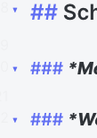
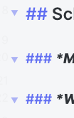
Increases the size of the folding gutter arrows and decreases their opacity until hovered.
Without this code:

After this code:

/* Make subtler folding gutter arrows */
.CodeMirror-foldgutter-folded:after, .CodeMirror-foldgutter-open:after {
    opacity: 0.5;
    font-size: 60%;
}

.CodeMirror-foldgutter-folded:hover:after, .CodeMirror-foldgutter-open:hover:after {
    opacity: 1;
}

.CodeMirror-foldgutter-folded:after {
    content: "\25BA";
}

.CodeMirror-foldgutter-open:after {
    content: "\25BC";
}