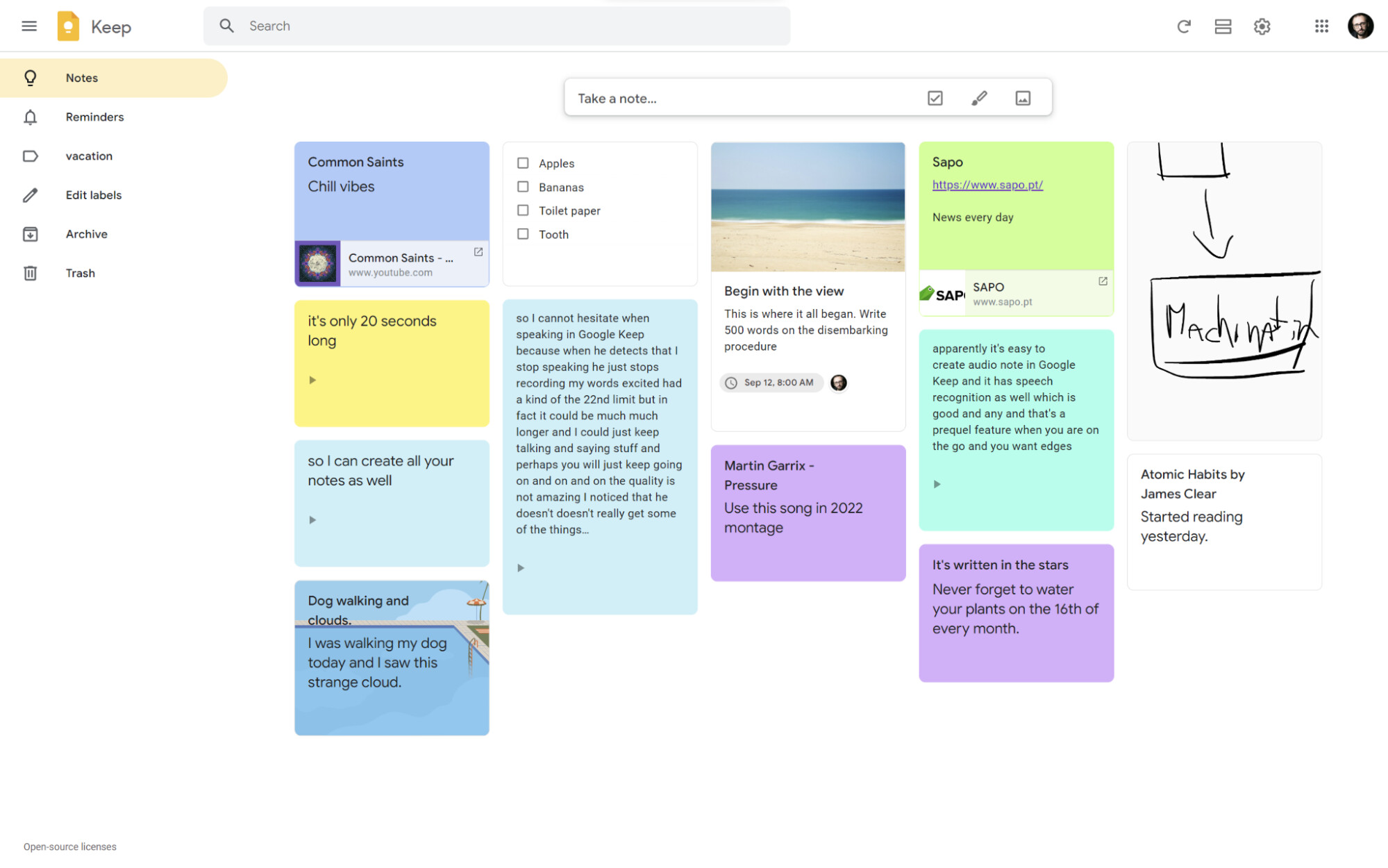
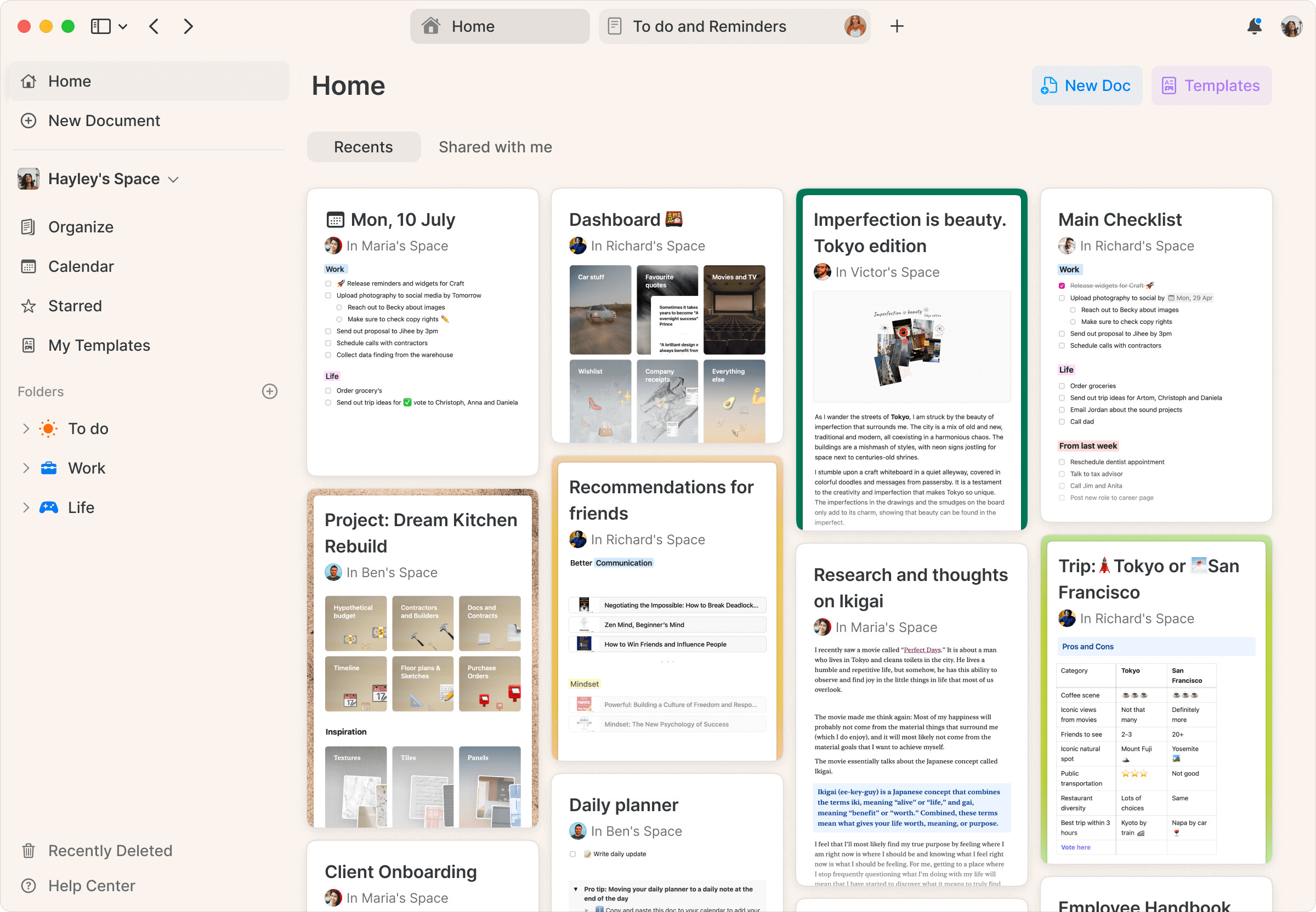
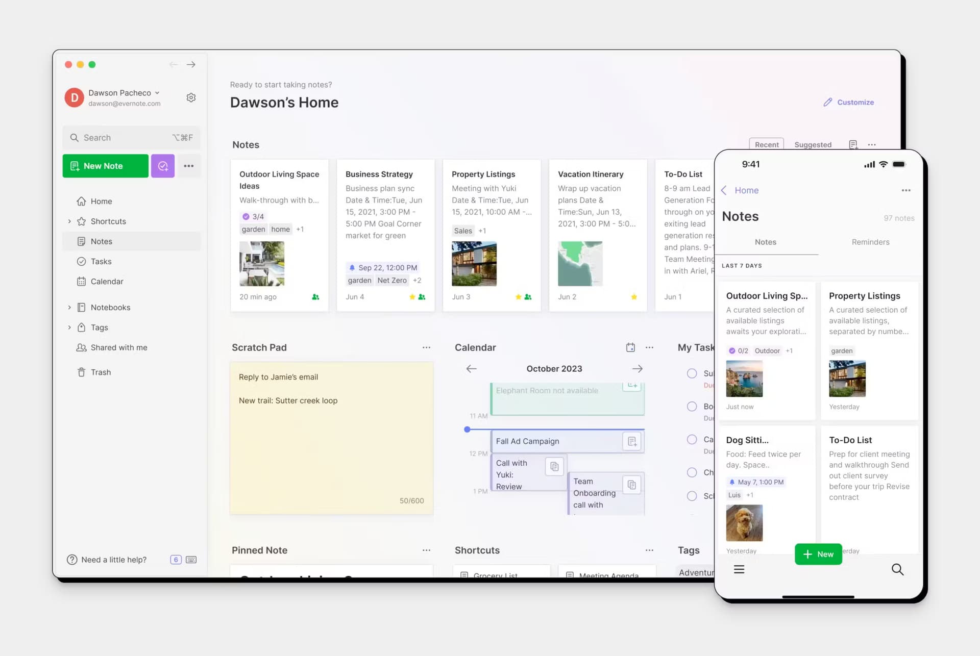
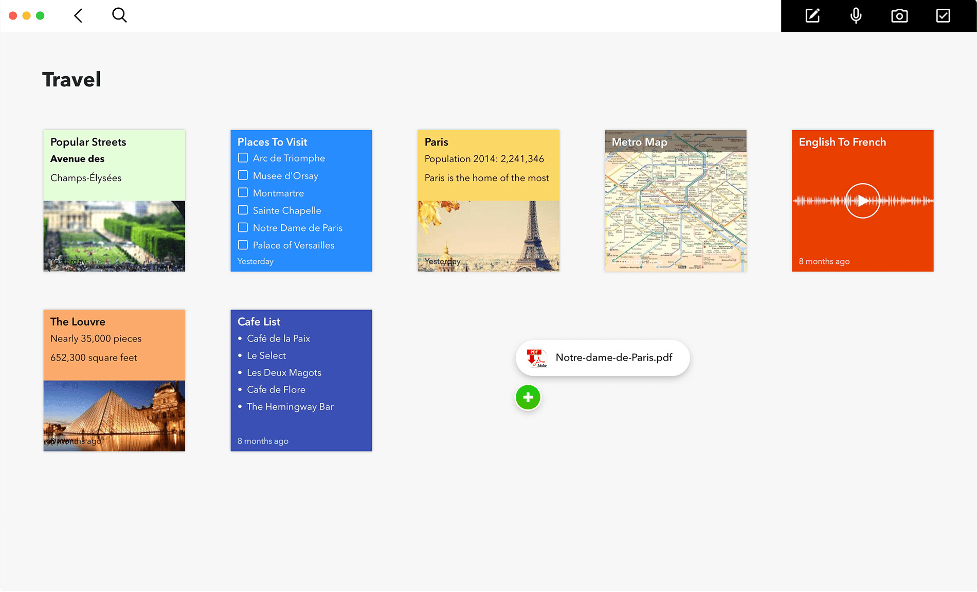
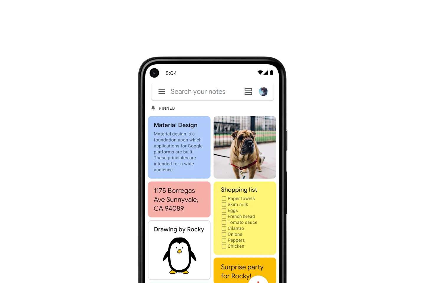
We organize our lives in Obsidian, yet the current file explorer presents our notes as a mere list of titles–missing the rich visual context that makes note-taking apps like Craft, Google Keep and Evernote so delightful to use.
When working with dozens or hundreds of notes, being able to view snippets, images, and metadata at a glance becomes essential. While the hover preview is helpful, it’s inefficient for scanning through many notes quickly.
There’s a clear demand for more visual ways to browse notes. A grid layout would transform folders from simple file indexes into rich visual spaces that offer a bird’s eye view of one’s vault.
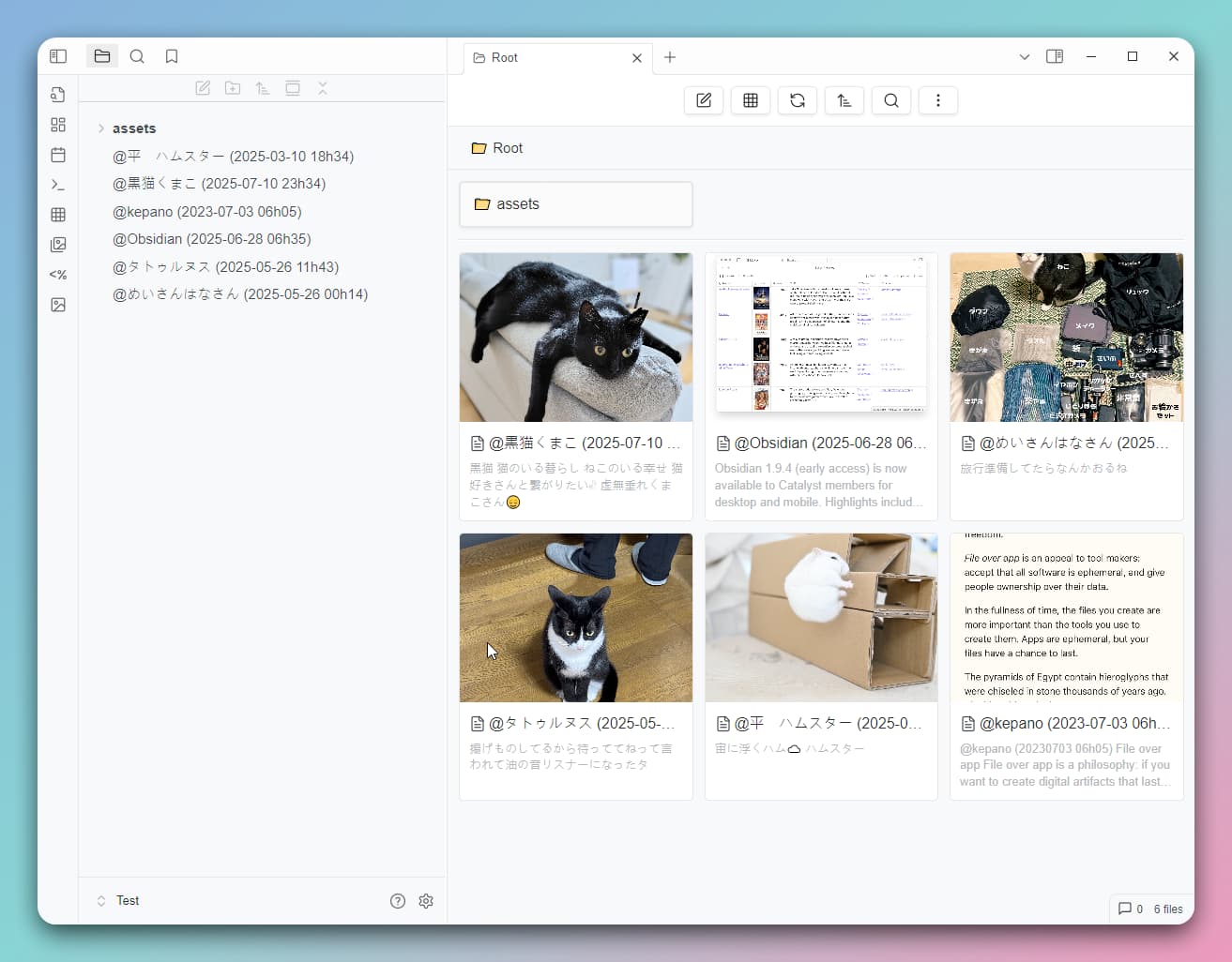
This would also allow one to browse their attachment folder just like in a photo gallery app.
Add a second, grid/masonry view mode for folders that, for each tile, displays:
Note title
First few lines/paragraphs
Thumbnail preview of first image or attachment
Key metadata (tags, date modified)
The layout should maintain snappy performance even with many notes and provide all currently available sorting options.
The grid view could be accessed by clicking on folder name, replacing the current expand/collapse action, which would be relegated to the chevron button. (That’s how it’s implemented in Folder Note and MAKE.MD community plugins.)
Implementation could follow the successful patterns seen in apps like Craft and Google Keep, while staying true to Obsidian’s clean aesthetic.
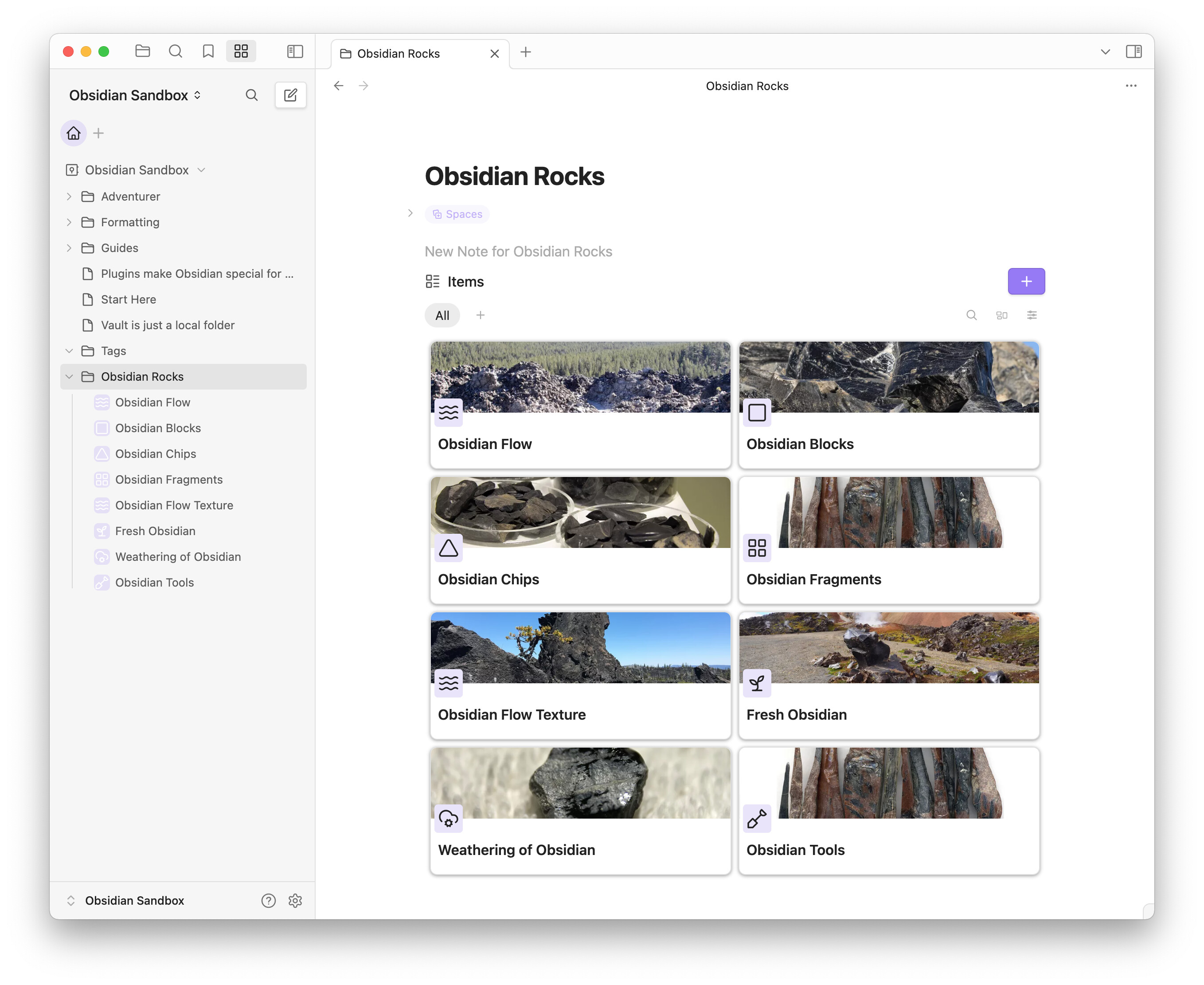
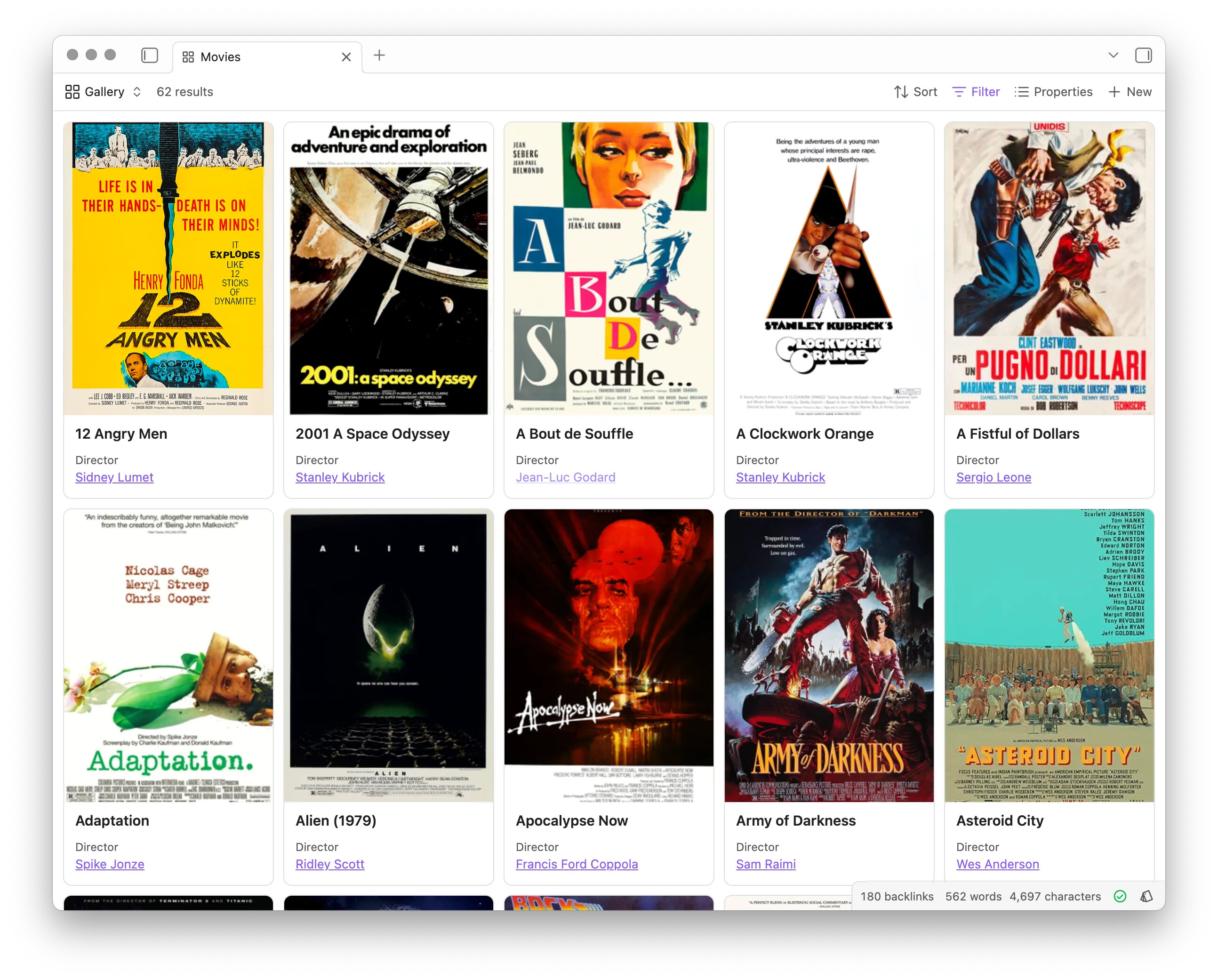
Bases add a built-it card view in Obsidian. This is great and I love it for things like media databases but this doesn’t fulfill what’s requested here. For one, one needs to manually populate a property with a link to the cover image. And there’s no way to display a text snippet from the first few lines of a note. Also, each individual base must be created and configured manually—meaning there’s no quick way to view any folder as a base.
Canvas
It’s possible to drag & drop a folder onto Canvas to bulk create cards for each of its notes. This is only an acceptable solution for working with a very limited number of notes due to the static nature of Canvas, and due to performance dips if lots of cards are added.
Community plugins
While some community plugins offer grid layouts, they tend to:
Live within dedicated notes rather than enhancing the core UI
Lack polish and optimization
Are hobbyist projects with little to no support
Are purely visual and miss key features like note management
Require extra maintenance overhead
A native implementation would provide the seamless, performant experience that such a view calls for.
Also, the following plugins also utilize a card layout in a different context from the examples above (i.e. not as an alternative way to browse notes) but may serve as a source of inspiration:
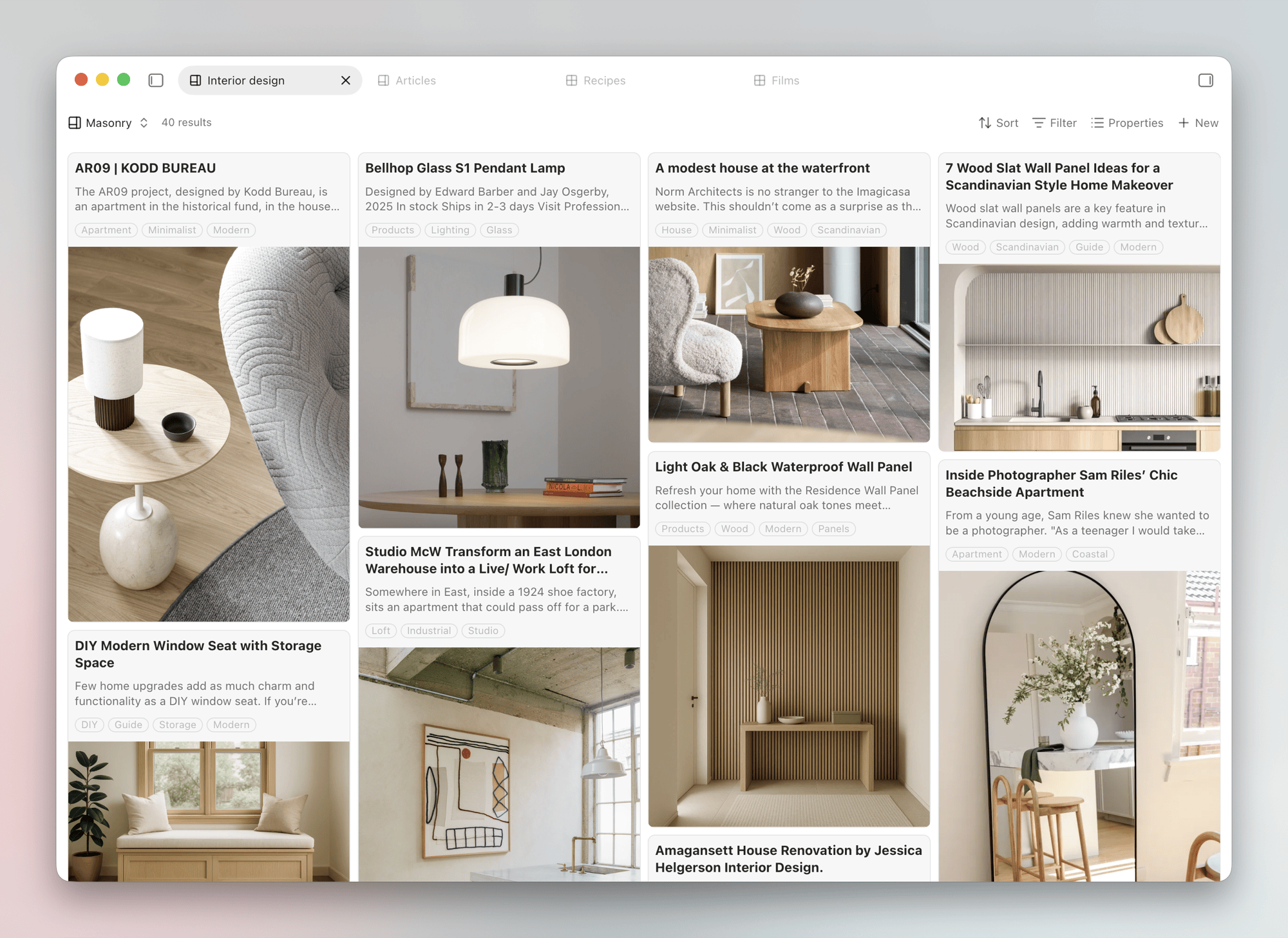
Pinterest is a good example, how to organize images in an appealing and effective way.
Well, I think the concept of “note walls” works as long as there’s some image present in a note, preferably on the top of a note. Otherwise, how should “note walls” work? OK, there are callouts and other stylistical elements to diversify text, still images are the most immediate way to recognize quickly content.
In one of the latest versions of obsidian mobile, v.1.7.4, Obsidian changed suddenly (textual) tabs to a visual overview of tabs, visual organization.
I’m not sure if “note walls” are so effective without images.
To be honest, I really liked the simple, compact view of textual menus of tabs before the introduction of Obsidian mobile v1.7.4, the access to textual lists is much quicker, than looking and eventually, scrolling through a looong list of image cards. I mean, “note walls” are very very nice to have, but not essential at the end, at least without images.
BTW, with the keyword “card” you get a lot of matches in community plugins to “try out” this concept to see how “useful” this idea really is, in everyday use.
Talking from my experience , I used some of these “note walls” plugins too and wasn’t able to integrate them as a new habit to search notes in a regular fashion, so I also dropped them after a short while.
For text navigation, this feature looks more like toys than a tool - I prefer dynamic tables created by dataview.
That’s me at least.
This feature varies from user to user. However, since most of the popular services have this feature built-in, it has become a habit for many users to view their notes in a card view on the homepage to see recent notes. As a result, this feature can be essential for users transitioning from those apps to Obsidian. Personally, I think it would be great to have this as an additional built-in feature in Obsidian.
It’s not necessary to completely replace the current vault navigation method (tree view on the left-side section) with this new navigation style. Instead, it could be offered as an optional feature.
The closest way to implement this is by using the Dataview plugin to create a homepage that can open at Obsidian startup. In terms of UI and displaying recent notes, I’ve found the Card View plugin to be the closest match for this functionality. However, it still requires some improvements, such as better image display support and handling the content of the cards to make it look better at that scale.
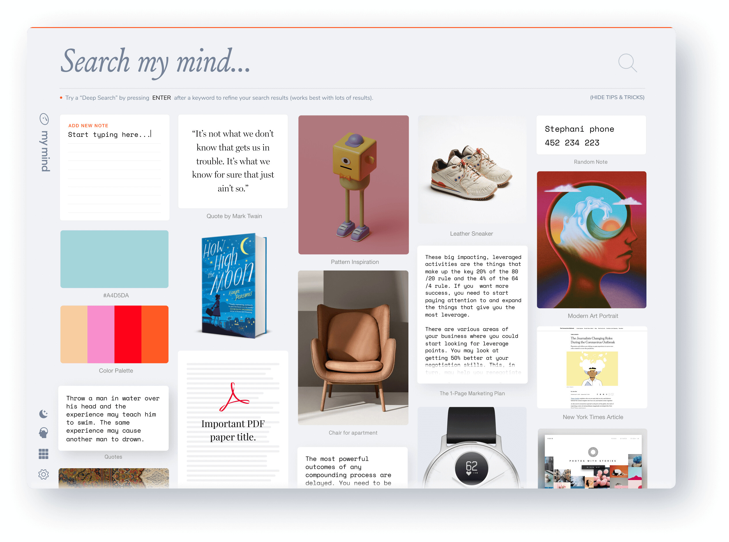
While images certainly enhance the visual appeal of the card view, I disagree that visual media is its defining value or functionality. The card view excels even for text-only content.
Here’s a personal example: I’ve compiled a large note containing hundreds of inspirational quotes. Although breaking them into separate notes would offer greater versatility, I prefer keeping them together to preserve their collective essence. When viewed as a whole, the collection becomes more impactful than its individual components.
The “wall” analogy you used is fitting. It’s like pinning an entire folder of notes onto a wall to survey them at a glance, capturing the big picture. In contrast, the current setup feels like flipping through pages in a notebook, limiting the ability to view the broader context.
Canvas, while useful, doesn’t quite solve this. It requires manual updates and arrangement, which adds friction. The card view, by contrast, is seamless—it’s dynamic, requires no setup, and organizes itself automatically.
Although the Cards view plugin comes close to achieving this vision, it’s still got a long way to go.
You may take a look at “Additional examples” under “Proposed solution” to get a better idea of what I mean.
Question, can you decipher miniature text on a grid layout with cards, yes or no (to identify the notes you need)?
I think, it’s easy to see my point. Just saying, something “nicely looking” isn’t necessarily “more useful” - in a everyday routine. Agreed, a fresh and nice design is pleasing.
Still I assume, the only means to diversify notes is to add colors to cards - I’m not sure how efficient this diversification is, when you’ve a wall (many cards) of notes.
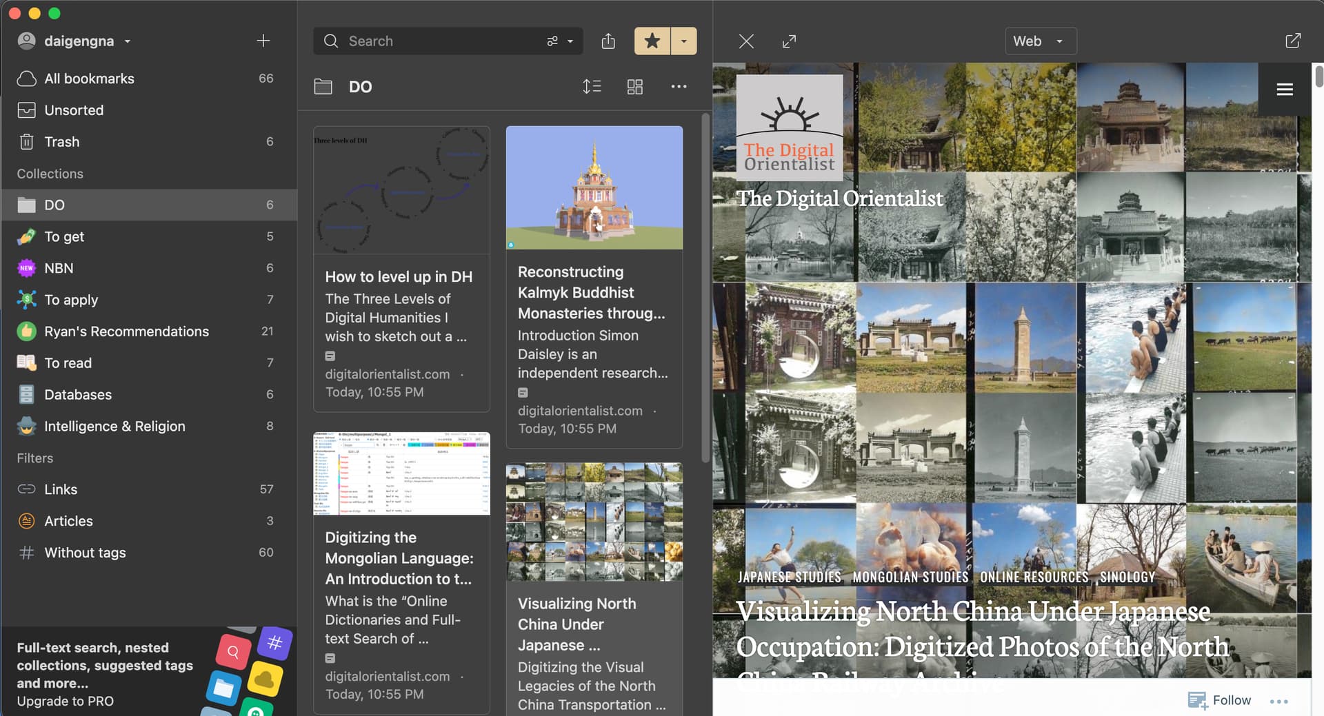
Vertical Tabs has added ‘Mission Control’—an option to view a tab group in a grid layout in ver 0.15.0. An option to open a folder in a tab group has also been added (50 notes max).
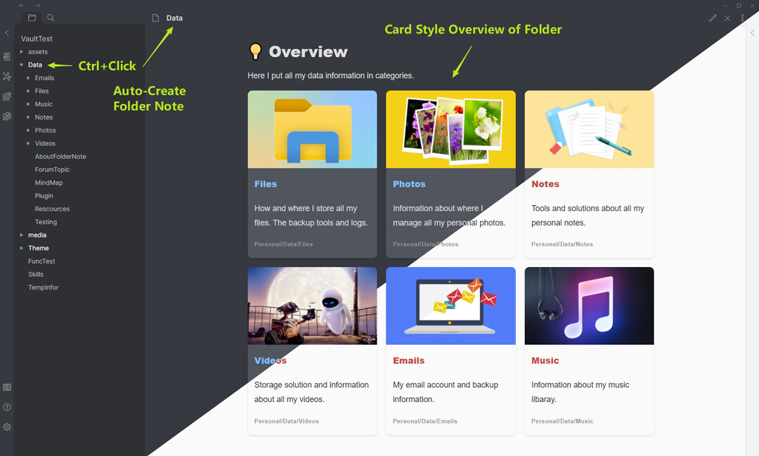
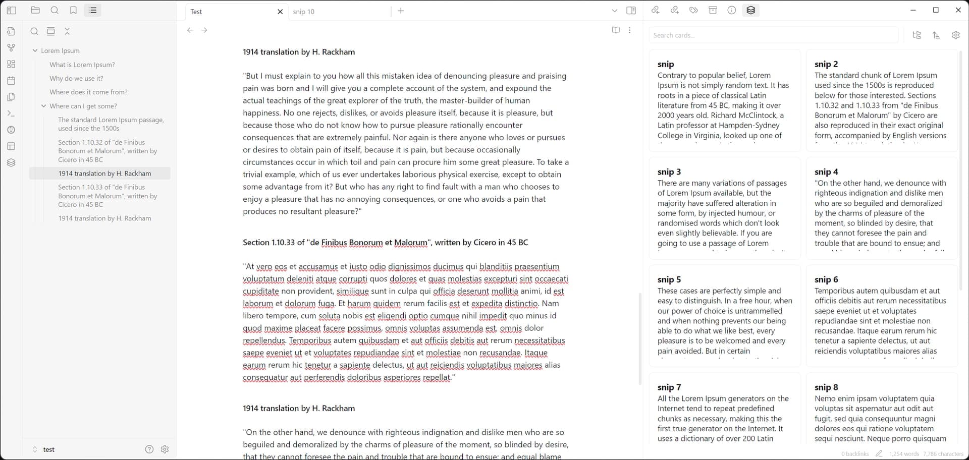
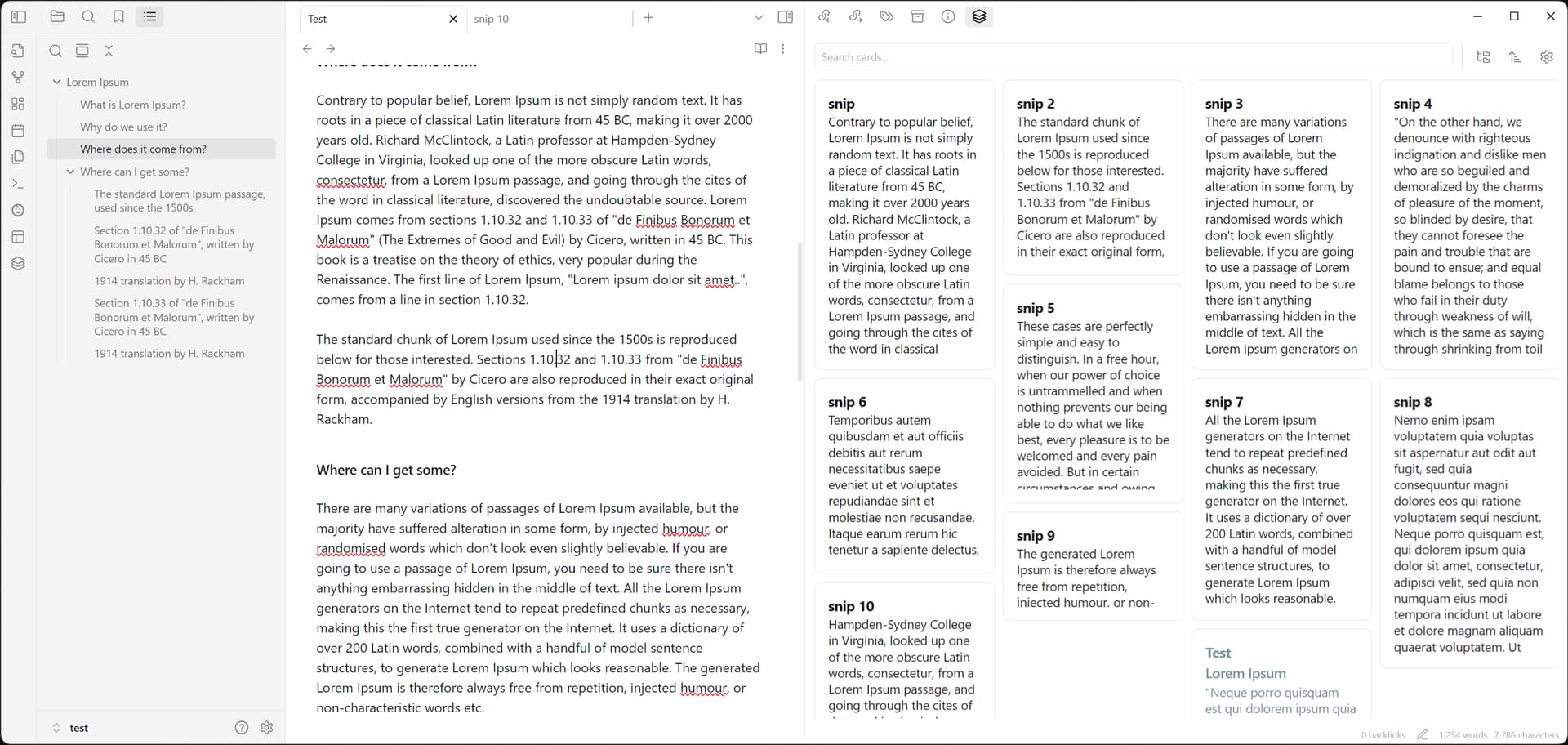
Adding this here because it’s the plugin I started using. It opens a card view side panel. I’m using it to view a specific folder of snippets I’m cutting or writing out of order while working on a larger document. It could also work well along side a canvas. Kind of like the card library in Lattics or Heptabase.
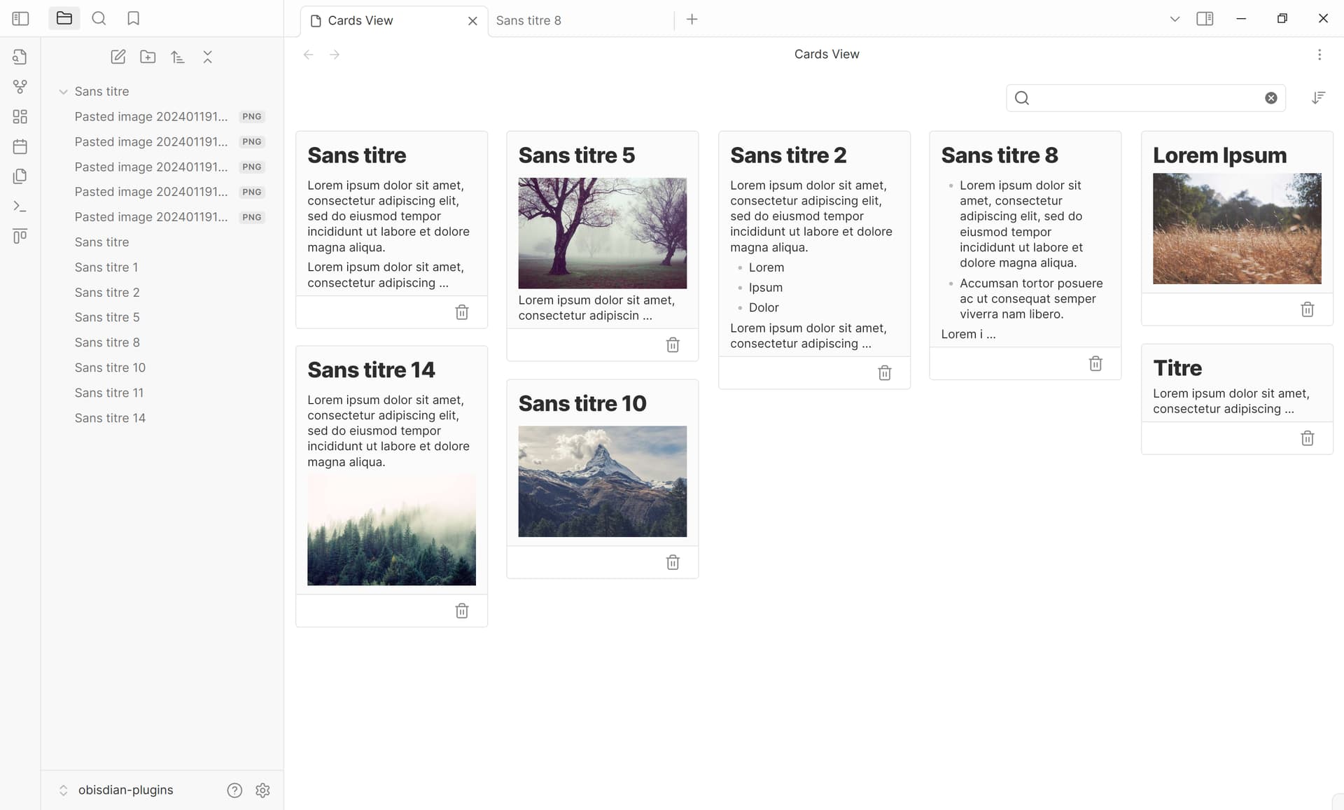
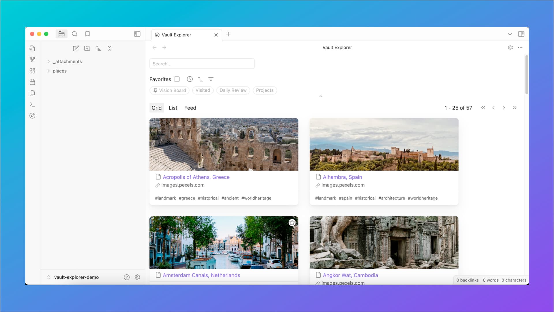
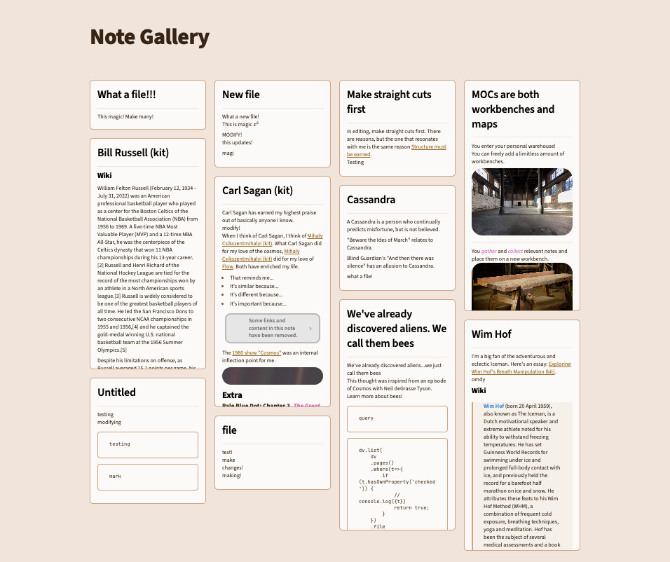
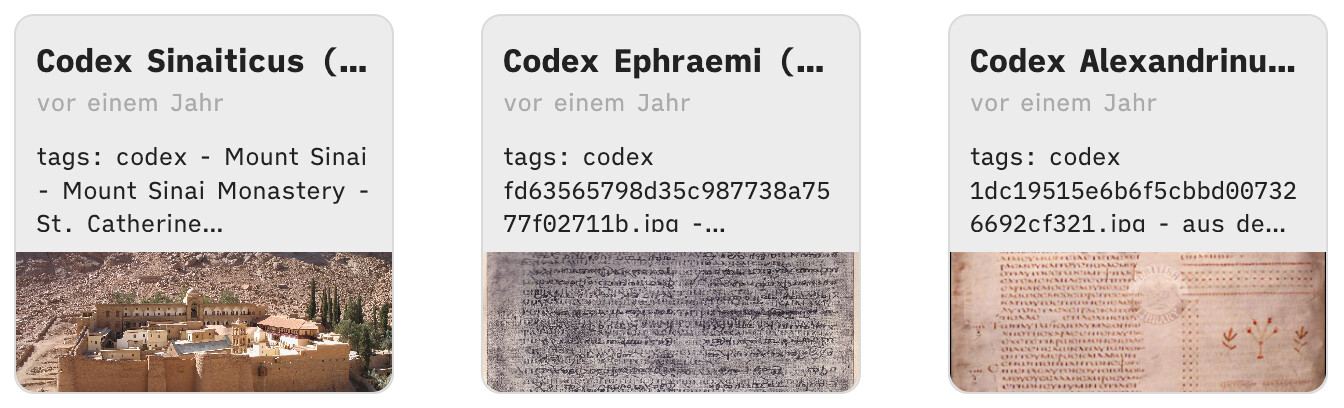
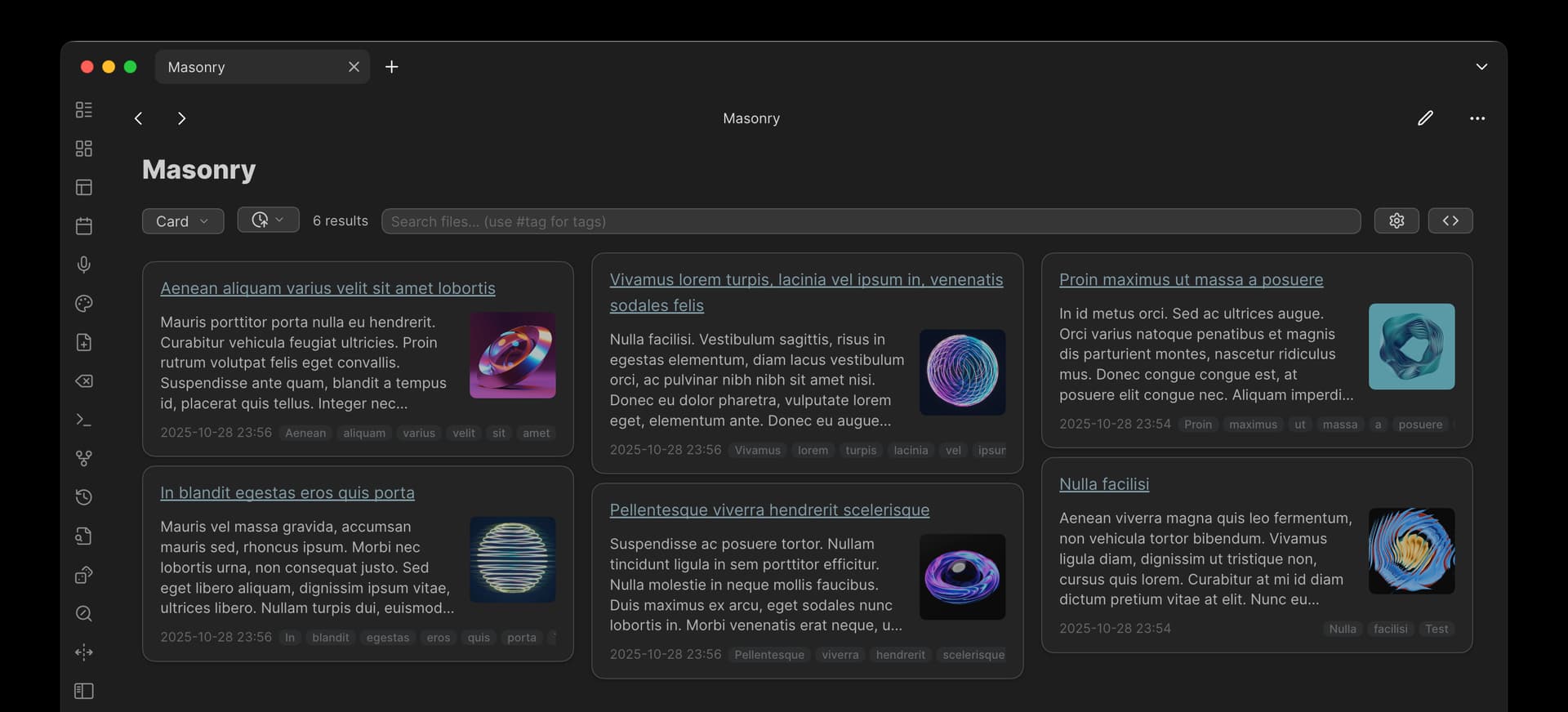
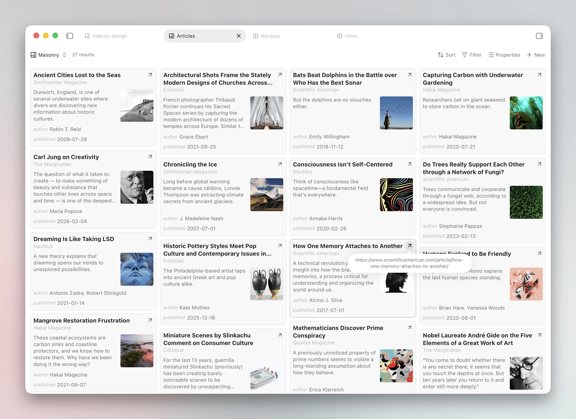
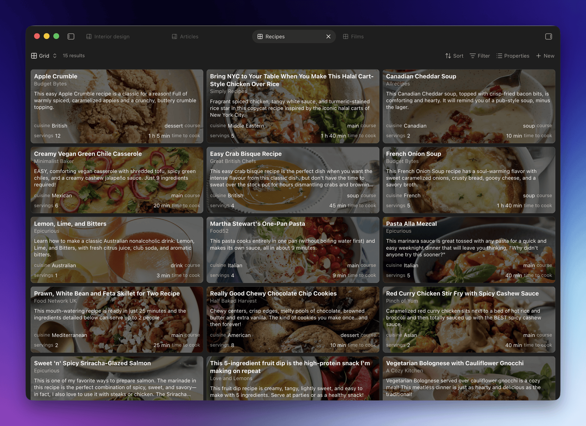
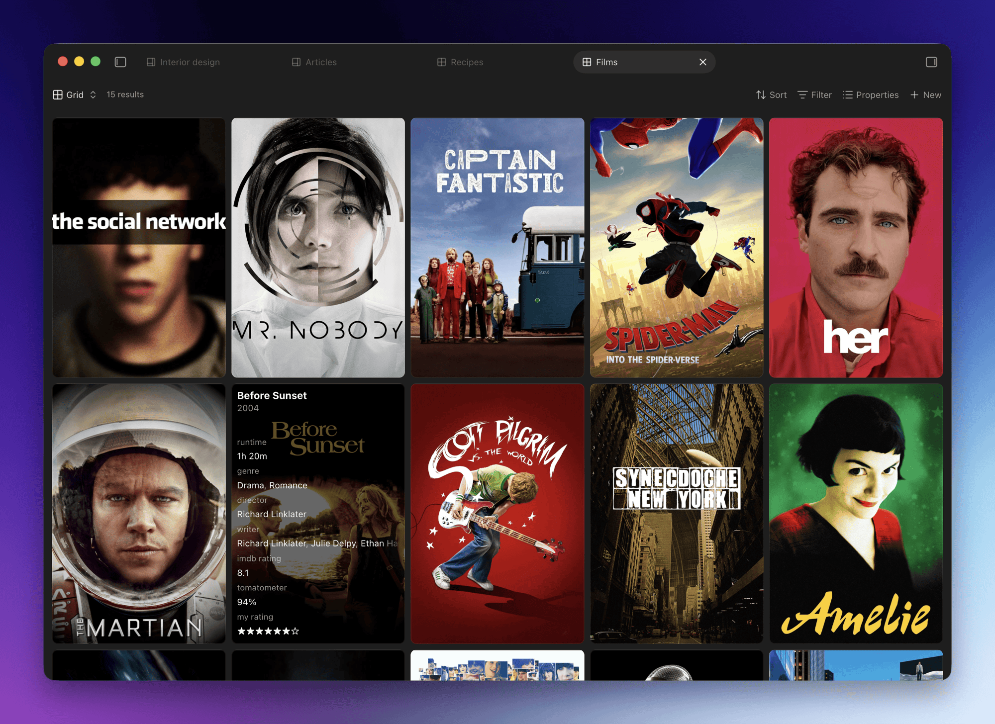
Here are two screenshots from my test vault. Could be a single column or wide and multiple columns and a masonry version.
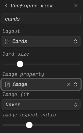
This is great and I love it for things like media databases but this doesn’t fulfill what’s requested here.
For one, one needs to manually populate a property with a link to the cover image. And there’s no way to display a text snippet from the first few lines of a note. Also, each individual base must be created and configured manually—meaning there’s no quick way to view any folder as a base.
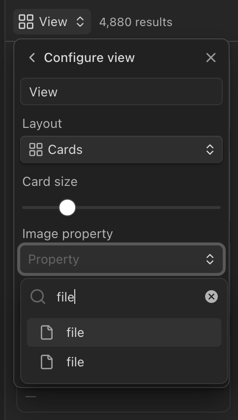
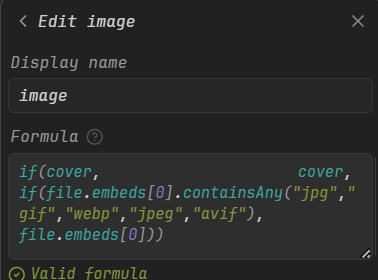
I don’t use Obsidian Bases yet but in the documentation said that you can access to file embeds, so you could use something like file.embeds[0] to get the first image in your note.
Yes, but you can create a formula with file.embeds[0], and then use that formula in the image property for cards. You can even create a formula like this for exemple
In my previous posts I didn’t explain the main reason why a grid layout view is not really useful: because a view is always fixed, you can’t move/organize cards. So here’s the solution I suggest:
Have you tried to drag a folder over a new canvas?
Additionally, consider to use the community plugin Advanced canvas, which is a great plugin.