Plugin for 3-Pane File Explorer with Note Previews

Many note-taking apps (and, for that matter, mail apps, see below) provide a few lines of preview of the note.

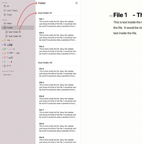
The basic idea for this plugin is to create a similar experience for the file explorer, where the explorer gives more space for each note, providing not just the filename but also the first few lines of the note.

A more advanced version of this plugin would also allow for displaying tags and other data (e.g., creation date) in the “preview” section of each file.

The BEST version (my dream plugin) would allow for a “three pane” view (now pretty much standard in MacOS), where there is a pane with a list of folders, then a pane with the files in the current folder showing the title and previews of the note, and then the editor pane.

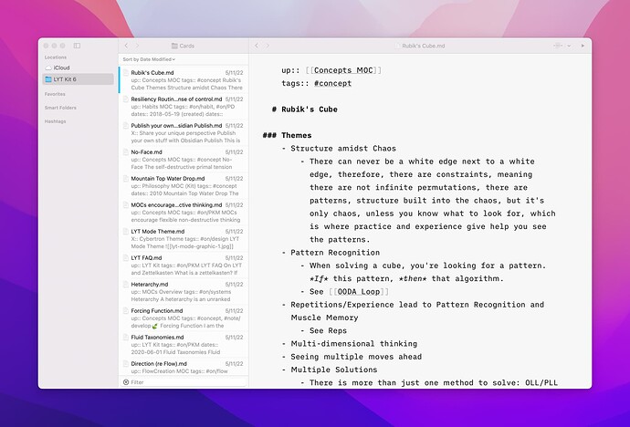
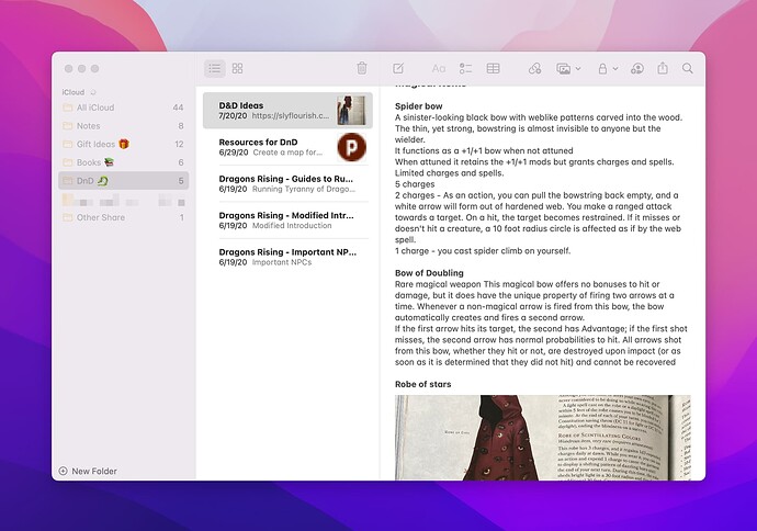
Here are some screenshots of what I have in mind:

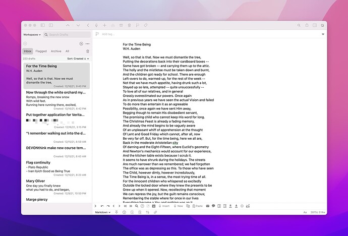
An example of the advanced implementation can be seen in the Drafts App, where the file list shows the note title (or, in Drafts’ case, the first line) in bold, and then gives a few lines of preview of the note body. Notice also how additional data is included, in my case the modified date:

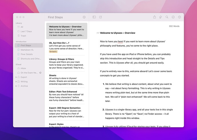
Examples of the three pane view include Ulysses (which has the prettiest and most useful three pane file explorer):

iA Writer:

And most of the stock MacOS and iOS apps, such as Notes:

and even Mail:

Nothing like this seems possible with current plugins and/or themes, and I am not a developer, alas. But combining such a plugin with the awesome Minimal Theme and the MacOS configuration Guide by @kepano would make Obisidan look fully at home in the Apple ecosystem.

And I think such an approach to the file explorer would also be really valuable for non-apple users as well, for those who prefer a long list of scannable previews over the density of the current file explorer.
24 Likes

I’d suggest a different approach:
keep windows as they are and add instead, a slider or search field on top to “zoom into” a note of our choice after evaluating what note we need

Basically a sort of “overview” would display a quick previews of notes, then you just had to write a name in the search field, and pick manually from the filtered results to open your note
Beautiful plugin

If we pay attention, the folder tree is the most synthetic view and let’s say at the first level of magnification, the overview of notes in a folder is at the second level of magnification and the note itself is the 3rd and last level of magnification
So, zooming in to a desired note would be an update to current features.

Imitating existing designs because of pleasure in uniformity and a “habit to have” isn’t logical and very distant from a conscious use of functional features, imo. Nothing personal.
Also, adding 3 columns is an Apple thing - Obsidian is multi-platform and these columns are not essential in its current Form and therefore, would only clutter up the Gui.
After a decade of app development and ui design, i know a bit how things could work or work even better.

1 Like

Thanks for your thoughts. The card View Switcher certainly looks pretty neat!

To clarify: I’m not suggesting a 3-pane, detailed file layout for reasons of uniformity (alone), or because of habitual use (at least, not in a non-reflective way, as you were suggesting).

I provided examples from other popular note taking apps because I think that they demonstrate both the viability and also the well-thought-out ui for a certain kind of user in a certain context, i.e., someone who wants to scan their notes in the file explorer and have a visual reminder of the contents.

To be sure, 3 panes is “an Apple thing”—but Apple designers also have a decade or more of app development and ui design, and also know how things work well. (Which is not to say that Apple gets everything right!)

The 3-pane explorer/editor is just one paradigm; but it is a popular one, and one that I find both familiar, useful, and intuitive. That’s why I’m thinking it would make for a great plugin.

Of course, it’s not for everyone. Which is also why I’m thinking it would make for a great plugin.

A three pane outliner isn’t an Apple thing. It’s an outliner thing. There was a good freeware I used for years that worked well. keepnote.org I switched to it from another software http://theguide.sourceforge.net/ because of the three pane ui.

This appeal to authority doesn’t have the affect you think it does, imo. Nothing personal.

I added that last one sentence because it’s true and not because i wanna reinforce that I’m right, but… that I’ve a wider overview in regards.

The 3 pane layout is “recurrent” in many Mac apps so in the end it’s easy to attribute it to a “apple thing” - conceptually it’s not Apple but an outline as you pointed out. An outline is just a method of organizing.
Debating which brand used this layout most is most rhetorical nature and less helpful, imo.

A lot of customization is appealing but not essential, so what I do is, I try to understand what features are essential to improve a gui.

I still remember Notational velocity and you hadn’t any folders at all - very minimal and : functional. It’s still alive if someone wants to explore functionality over cosmetic designs .

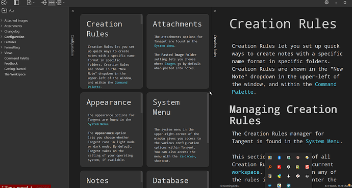
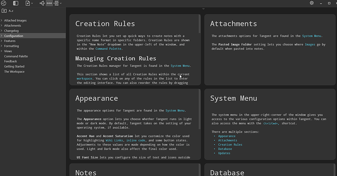
This is one of the views available in Tangent Notes.


Tangent Notes is a separate program (Windows, Mac, Linux only) but can be used as if it were a plugin. It uses workspaces (= Obsidian vaults) and Obsidian syntax. As well as the Notes view, it also has a Feed view, showing the content of all the files in seuence.

Early stage in its development - and it’s one developer’s side project - but this part works well and easily integrates with Obsidian use. Based on Typewriter rather than Codemirror.

with workspaces in Obsidian, you should be able to set this up. I have seen a split 4 column
window ( 4X4) , that can be saved as. workspace.

Barry

This isn’t the same, but I was thinking about improvement to the sidebar when I added this thread. The idea might appeal to those interested in a three pane system.

I don’t see this thread as a matter of cosmetic design choice. It’s more like a workflow choice. I’d accept an argument that Obsidian is different because of the graph, and backlinks, and whatever, but because we already have a file tree, it makes sense that some users would want it exploded into separate columns: divided by folders, and files, with a preview. All able to be hidden away with a hotkey for a distraction free experience when preferred. The examples provided by the op demonstrate the utility clearly, so I don’t accept an argument that it’s just a common pattern, and not rooted in function.

I’m sorry to say this is probably why most developers shouldn’t design user interfaces. It always pains me how they fail to understand user intent.

BTW-that is exactly what you did. You made a judgement claim about the idea being not essential, and then stated your authority on the matter. It seemed arrogant and dismissive.

This is a forum on the internet, so I could be getting a totally wrong impression. If so I apologize. My point is to support options that would be used and useful.

1 Like

@ontheexam , I want this too. I’d personally finance the development of this plugin.

If you’re a dev who can this— and you want to make it—speak up!

If I could have a ulysses folder/file browser in obsidian… I’d never use ulysses again!

1 Like

Just going to play out what I think would be cool:

I’d like:

  • A “Folder Sidebar” — on far left.
    • that shows all top-level folders in vault.
  • A “Folder Contents Sidebar” — next to the Folder Sidebar.
    • that shows all folders & files inside the top-level folder…
    • when you
    • select a folder in the far-left Folder Sidebar.

In the “Folder Contents Sidebar”, I’d like:

  • “File Thumbnails” to display:
    • A File’s Title.
    • A File’s Body Content (maybe 100-200 characters).

What do you think?

Can this be done?

4 Likes

Should have custom sort order option also. Goes along with this kind of view/workflow

I would love this! It would make a very large improvement in it’s functionality, maybe even essential for Obsidian. It’s not necessarily an ‘Apple’ design I’d say. In other note apps, like Evernote, Synology notes or even every e-mail program like Outlook it helps and improves day to day work for me having this kind of preview.

1 Like

This looks exactly like how I would want it as well! Thanks for taking the time to mock this up.

Like you, I am really interested in such a layout. I like, also, the idea that as a plugin you could toggle this on or off. So you could go back to the more compact, “standard” file explorer if you wanted, or could use this layout.

Obsidian would also replace Ulysses for me if we had this! I think a three pane view like this is particularly well-suited to a certain kind of longer-form writing. Ulysses employs the metaphor of “sheets” that you can glue together. That is easily translatable to internal liniks and embeds in Obsidian. What we need is just this alternative way of looking at the files.

And I agree, a built-in ability to drag-around to custom sort would be really great too.

Who do we know in the developer community that could pull this off???

I agree!

I also think @Jopp 's reply ended up being a digression which put an over-emphasis on the “Apple” design, which wasn’t my primary point. I actually had Evernote in mind as well, I just don’t have that installed anymore. I’m kind of surprised that with the three-pane view being such a popular layout, there’s no plugin yet to support it as one possible view that might be helpful for users.

I like this as it is a time-tested format that works for a lot of people. I insist on his visual format when reading email: Mailbox :arrow_right: List of emails with a line or two of context) :arrow_right: Full view of one email. The format is helpful for quick overviews of a number of items. Many apps, including apple notes, use this view because of its utility. Also, people are used to working with this format, so presenting notes this way is immediately useful.

It could be fun, even. How is the content summary generated? There’s so many ways of doing this that it would be fun to discuss.

(BTW I would LOVE to see Omnisearch results presented in a 3 pane format like this.)

-Sean

1 Like

Agreed! One thing that would be cool would be settings to choose the number of preview lines, the metadata, etc. that would be displayed under the title of the note.

Another thought: maybe an option to choose between showing the note title and the first heading (h1)

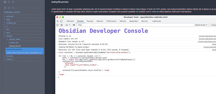
To start off, one might just modify the existing file list to show a preview line, would not be too difficult I guess (needs to reset/trigger on file save or folder expand/close, etc), for example:

js

const container = document.getElementsByClassName('nav-file-title-content');

for (let i = 0; i < container.length; i++) {
    path_ = container[i].parentElement.dataset.path;
    if (path_.endsWith(".md")) {
        txt_ = await this.app.vault.read(this.app.vault.getAbstractFileByPath(path_));
    } else { 
        txt_ = "";
    }
    container[i].insertAdjacentHTML(
      'afterend',
      `<div class="fl_prv">${txt_}</div>`,
      );

    container[i].parentElement.style.flexFlow = 'wrap';
}

css

.fl_prv {
    color: #d3c8c8;
    width: 100%;
    white-space: nowrap;
    overflow: hidden;
    text-overflow: ellipsis;
    padding: 2px 7px;
    border: 0;
    vertical-align: middle;
}

.nav-file-title:not(.is-active) {
    border-bottom: 1px dashed #49c098;
    border-bottom-right-radius: 0px;
    border-bottom-left-radius: 0px;
}

.nav-file-title.is-active {
    border-bottom: 1px dashed #ca1daf;
}

.nav-folder-title {
    border-bottom: 1px dashed #8b8b8b;
    border-bottom-right-radius: 0px;
    border-bottom-left-radius: 0px;
}
2 Likes

That looks awesome allready!
Is this a solution I (and other people) could implement by editing configuration files?

I am happy to edit the JS and CSS files myself. But I fail to find them.
In a search I checked the Program directory, the User folder and in the Vault directories.
Which would be the correct file/directory to edit?
Many thanks!

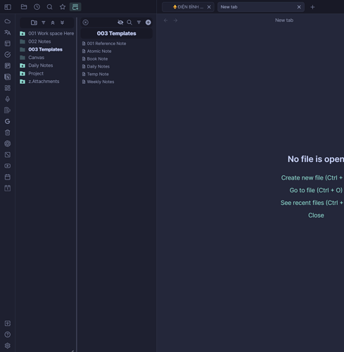
I found the solution! File-Tree Alternative Plugin:

6 Likes