Design talk about the Graph View

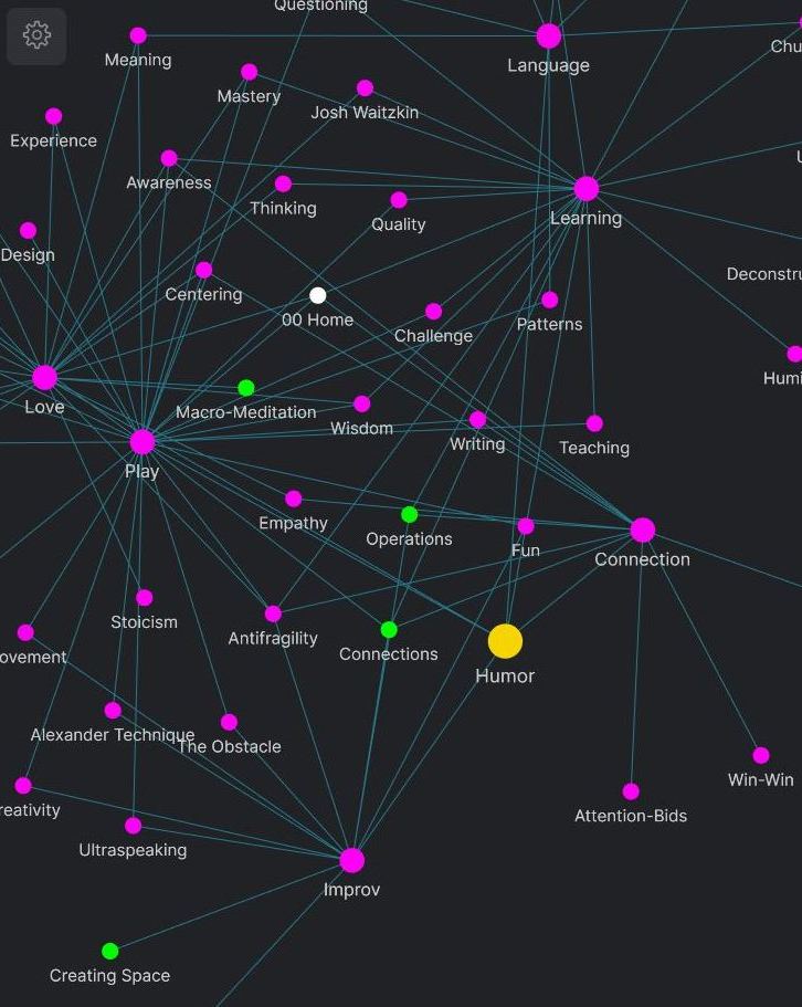
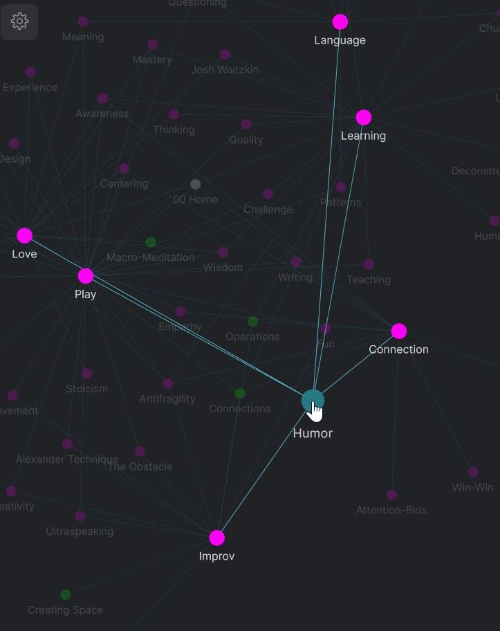
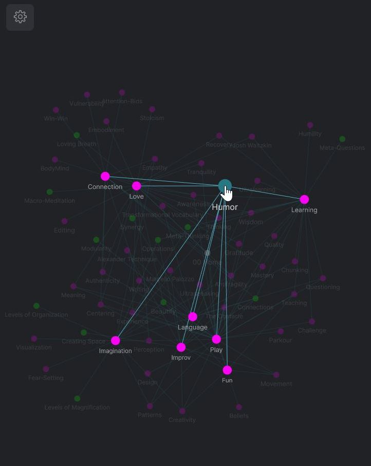
When I look at the graph view in Obsidian I see possibility. I see huge untapped potential. I want this thread to be a discussion about what the graph view could be.

The purpose is to eventually distill this thread in a design document that could serve as inspiration for the developers and plug-in creators.

Right now, the graph view feels secondary to the main experience. I’m particularly interested in ways to make the graph view integral to the experience. To be able to navigate it, and sculpt it, and visualize meaningful pathways and patterns.


20


80

11 Likes

Graph Sculpting Operations

Seeing too many nodes at once is overwhelming. One of the most important things for making the graph functional is filtering, having the possibility to reduce the visible nodes to a manageable amount. Obsidian does a great job at filtering the graph through search. But even so, the result can be overwhelming. Here’s an example of a local graph view at depth 2:

All the visible information on the graph above is meaningful, thanks to the search, but there’s just too much of it. What’s needed, is the ability to interact with the graph on a node by node basis (and by selecting multiple nodes), to isolate the nodes that are most relevant in the moment, and to hide or fade those less relevant. I like to think of this process as graph sculpting.

Graph sculpting could be performed by a few basic operations:

  • Hiding Nodes
  • Folding Nodes
  • Fading Nodes

Hiding Nodes

Not much to say here. Every node you hide makes the remaining nodes more legible. Ideally, you should be able to see the hidden nodes at any time and selectively make nodes visible again.

Folding Nodes

On the local graph at depth 1. you see the nodes directly connected with the central node (level 1 nodes). At depth 2, you also see the nodes directly connected with the level 1 nodes (level 2 nodes).

Imagine you start from one local node on the graph. By clicking on it you unfold it, thus seeing its level 1 nodes.
By clicking on any of the level 1 nodes, you unfold it, thus seeing its level 1 nodes (which are level 2 relative to the initial node).
By clicking on any of the level 2 nodes, you unfold it, thus seeing its level 1 nodes (which are level 3 relative to the initial node).
And so on.

It’s the same principle as folding/unfolding blocks within notes, but at graph level.

Fading Nodes

When you hover the cursor over a node, the visual effect is beautiful:

I like to metaphorically think of it as foreground/background. Items in the foreground are normally visible; items in the background are faded. This could be a feature in itself. What’s beautiful about it is that you can see the context, but it does not clutter the view.

How this feature could work is by having the option, at any time, to persistently move nodes from the background to the foreground and vice versa.

Imagine if when I selected a note, only the central node and its level 1 nodes were in the foreground on the local graph, and the level 2 nodes and higher were in the background (faded). For me, this would be the ideal view when selecting a note:


Think of all these operations as tools, and the tools could be combined. I could choose to fold some nodes, hide others, and fade others, thus shape the graph into the most meaningful pattern possible.

4 Likes

Graph visualizing operations.

As a 67 yr old non-techie writer, I have been taking a crash course in Obsidian since I discovered it about a week ago. My first project is to develop a large number of concept definitions (words, basically, with each captured in a unique note). I’m following a specific genus/differentia philosophical model, which anchors concrete “things” (tree, house, red, etc.) to more general categories (plants, buildings, colors, etc.), more detailed things (oak tree, bungalow, crimson, etc.).

The reason I’m doing this is in order to get clearer on how our minds derive intangible concepts (property, value, morality, etc.). Wiki-links capture the relationships well. I’m using tags to specify general subject matter as well as whether a concept is surface-level, a generalization, an extension, or intangible.

Clearly, I’m dealing with a LOT of notes. In order to use this as a learning and teaching tool, I need to somehow influence where the notes show up on the graph. For example, the highest level category is “thing” or “existent.” Ideally, I could cause notes tagged with #Generalization to be pulled toward the top of the graph. This would cause notes such as oak tree → tree → plant → living organism → existent/thing to drift to the top. Likewise, I could have notes tagged with #Extension to be pulled toward the bottom of the graph. So, person → doctor → pediatrician → pediatric oncologist would be pulled toward the bottom. That would cause the whole conceptual structure to become shaped like a sort of jellyfish, with the most detailed extensions hanging at the bottom, and the “surface-level” concrete sorts of concepts floating around in the middle. Further, concepts tagged with #Intangible, etc. might “pull” notes containing them to the right. You get the idea.

This would make the whole structure quite useful for research, teaching, persuasion, and so forth. And that is not to mention helping individuals ensure the content of their minds is tied to reality somehow.

If anyone knows of a way to do this, I would really, really appreciate some pointers. Otherwise, I hope this suggestion makes it into the hopper for future development.

3 Likes

Graph Navigation History

Imagine being able to trace on the big graph your navigation history over the course of a day.

Imagine seeing the big graph faded in the background at the end of the day, and imagine having the option to proceed chronologically through every node you accessed during the day. As you start tracing back your steps, a node comes to the foreground – the first note of the day. Then another node comes to the foreground, then another, and another, and another, until you reach the last node of the day. You’ve thus revealed the daily graph – consisting of all the nodes you navigated during the day –, with the rest of the graph faded in the background.

I can see it with mind’s eye, and it’s beautiful.

5 Likes

You could take a look at the breadcrumbs plugin.

1 Like

I personally would love to be able to graph my notes over time like a timeline of when they were made. That way I could start to organize things by how they’ve changed over the years.

If I may, I’d like to re-ping an idea I proposed for rendering the local note as different geometry. I think that would also help with being able to intuitively grasp where you are in the network.

Also, have you seen Eleanor’s write-up about the graph view?

Hi Chris.

This ties in nicely with something I’d suggested a while ago:


Thank you for the link to the article. I agree that the graph is not just a pretty gimmick, but I think it’s very far from what it could potentially be.

1 Like

From what I understand, you’d like to be able to create a hierarchical relationship between concept-notes (hierarchization) and to be able to display the hierarchy in a certain way (visualization).

The way this could work is by using tags for the levels of the hierarchy.

eg
#lvl1 – person
#lvl2 – doctor
#lvl3 – pediatrician
#lvl4 – pediatric oncologist

Someone else might use the structure differently.

eg
#lvl1 – the 20%, the most important, highest-leverage notes
#lvl2+ – the 80%

With the hierarchy established, there could be different ways of visualizing the structure (eg radial, stratified, etc). You might choose to visualize your system in the way you described it (I didn’t understand it very well). Someone else might use a different visualization method.

For instance, in terms of visualization, I’d like to be able to control what notes are displayed in the foreground (#lvl1) and which in the background (#lvl2+).

What would be your ideal default graph view?

For me, it would be a selection of the most important (highest-leverage) notes. Most of them would be faded in the background and some would be visible in the foreground (those I want to keep on top of my mind).

Filter as You Type Graph Search

I often find myself looking for a particular node on the graph. I wish there was an option to filter the graph as you type. Filtering could use the foreground/background graph display mode: the filtered nodes are displayed in the foreground, and the rest of the nodes are displayed faded in the background.

There could be an additional search field specifically for finding nodes on the graph.

3 Likes

From what I read here, it sounds like many of us would like the graph view to become a configurable map rather than just a graph. With a map, all these aspects can be assigned a meaning and so would be presented consistently each time the map is viewed.

  • Location in X and Y direction based on distance from some concept or tag.
  • Color of the nodes.
  • Size and shape of the nodes.

Those all sound like what we expect to find when looking at a map.

7 Likes

Graph View Modes

There are multiple possible perspectives here:

  • Map View – Fixed view, like a constellation in the sky. This creates a sense of familiarity because the “skymarks” have a fixed possition.

  • Random View – This is useful because every time you open the graph you see different juxtapositions, hence possible connections you can make between nodes.

  • Node-Centered View – You could designate a node as the center of the graph, so all other nodes would be displayed in relation to it. There would be two structures, one within the other: nodes connected with the central node (directly or indirectly) form the inner structure; nodes not connected with the inner node form the outer structure.

All of them could be useful / fun to use. And there could be others I haven’t thought of.

5 Likes

Random Node Selection

I love randomness, so I’d love to be able to randomly select nodes on the graph – so without opening them.

Imagine you see the graph faded in the background. There could be an option called select x random nodes, where x is customizable.

  • If x=1, the option makes a random node come to the foreground.
  • If x=2, the option makes two random nodes come to the foreground.
  • If x=5, the option makes five random nodes come to the foreground.

Node Selection Operations

By that, I mean operations that select nodes on the graph, where the selected nodes are displayed in the foreground, and the rest of the graph is faded in the background.

Random node selection is an example of one such operation. But there are others as well.

For instance, let’s say you want to select on the graph all nodes with a particular tag. Imagine if you could do this from the tag pane. With an option activated, clicking on a tag in the tag pane would select on the graph all nodes with that tag.

1 Like

Graph Minimap

Let’s say you have a page with its local graph open in the right sidebar. And let’s say you open the big graph. When you do, the local graph remains empty in the sidebar:

I’d suggested a while ago a minimap option for the graph:

What if the minimap view appeared in the local graph area when viewing the big graph?

So you’d see the big graph, and in the right sidebar, you’d see the minimap: a representation of the big graph faded in the background, and only the nodes visible on-screen on the big graph displayed in the foreground within a rectangle proportional to the screen. If you zoomed in/out the big graph, the size of the rectangle would decrease/increase on the minimap.

3 Likes

Two graph filtering modes:

  • Subtraction Filtering – When you search for something on the graph, the graph is filtered to show only the nodes that meet the search criteria. This is the default.
  • Selection Filtering – The nodes that meet the search criteria are displayed in the foreground while the rest of the graph is faded in the background. It’s beautiful to be able to see the graph in the background, as context.

There could be an option to use both at the same time: you could make the visible graph smaller with subtraction filtering, and bring a set of nodes to the foreground with selection filtering.

3 Likes

When you hover over a link, you are shown a preview window. What if it also highlighted the node on the local graph, as if you hovered the cursor over it?

3 Likes

Foreground/Background Mode: Some notes are visible in the foreground, and the rest of the graph is faded in the background – visually similar to the current action of hovering the cursor over a graph node.

I’d love such a mode of visualizing the graph. I’ve been thinking of possible ways to implement it. Here’s one:

There are two search fields:

  • filtering search – filters the graph (the current search field)
  • fading search – fades the graph; when you search for something, those nodes are visible in the foreground, and the rest of the nodes are faded.

The two searches would work in tandem. You could filter the big graph, and then fade all but a selection of nodes from the filtered graph.

1 Like

Hi! Excellent topic.

I think what you’re proposing might be the solution that I was looking for: how to visualize a complex and customizable historical chronology.

I’m researching a topic in global history and the nature of my job requires that I maintain awareness over a variety of events that occur simultaneously in different parts of the world. With Obsidian I was able to find two solutions to this challenge:

  • Nested Tags, for example: #Year/XIX/1871; #Year/XIX/1872; #Year/XIX/1873; or #Year/XVIII/1788; #Year/XVIII/1789; #Year/XVIII/1790 and so on
  • Event-notes, for example: 1701_War of the Spanish Succession_1714; 1713_Peace of Utrecht_1715; 1756_Seven Years War_1763; and so on

I like this system because it allows me to have two types of chronology, one in the tag list and another in the “Event-notes” folder that is ordered by year.

Now, if I could customize the graph view as you are proposing, I would have a very interesting upgrade to my chronology. I could finally create a timeline with the year- tags placed side by side and the Event-notes connecting to them in the surroundings. Event-notes could still have a force of approximation according to links and back-links, but the most relevant force of approximation would be the chronology line connected with the tags. Your “foreground- background” proposal would also solve the problem of event notes overlapping in years that are crammed with events.