I really liked AnuPpuccin implementation of custom checkboxes. This SCCS File contains the custom formatting. In order to replicate this in CSS
/* Save this as a CSS Snippet alternativeCheckboxes.css */


/* Checkbox important ! */

input[data-task="!"]:checked::after,

li[data-task="!"]>input:checked::after,

li[data-task="!"]>p>input:checked::after {

    -webkit-mask-image: url("data:image/svg+xml,%3Csvg xmlns='http://www.w3.org/2000/svg' viewBox='0 0 128 512'%3E%3C!--! Font Awesome Pro 6.2.0 by @fontawesome - https://fontawesome.com License - https://fontawesome.com/license (Commercial License) Copyright 2022 Fonticons, Inc. --%3E%3Cpath d='M96 64c0-17.7-14.3-32-32-32S32 46.3 32 64V320c0 17.7 14.3 32 32 32s32-14.3 32-32V64zM64 480c22.1 0 40-17.9 40-40s-17.9-40-40-40s-40 17.9-40 40s17.9 40 40 40z'/%3E%3C/svg%3E");

    -webkit-mask-size: 20%;

}


input[data-task="!"]:checked::before,

li[data-task="!"]>input:checked::before,

li[data-task="!"]>p>input:checked::before {

    color: var(--checkbox-color);

    margin: 0 3px;

    position: absolute;

    left: calc(var(--checkbox-size) * 1);

    font-weight: bold;

}


input[data-task="!"]:checked,

li[data-task="!"]>input:checked,

li[data-task="!"]>p>input:checked {

    --checkbox-color-hover: var(--color-yellow);

    background-color: var(--color-yellow);

    border-color: transparent;

    /* border-radius: 50%; */

}


/* Checkbox Question ? */


input[data-task="?"]:checked,

li[data-task="?"]>input:checked,

li[data-task="?"]>p>input:checked {

    --checkbox-color: transparent;

    --checkbox-color-hover: transparent;

    border-width: 0;

}


input[data-task="?"]:checked::after,

li[data-task="?"]>input:checked::after,

li[data-task="?"]>p>input:checked::after {

    -webkit-mask-image: url("data:image/svg+xml,%3Csvg xmlns='http://www.w3.org/2000/svg' viewBox='0 0 512 512'%3E%3C!--! Font Awesome Pro 6.2.0 by @fontawesome - https://fontawesome.com License - https://fontawesome.com/license (Commercial License) Copyright 2022 Fonticons, Inc. --%3E%3Cpath d='M256 512c141.4 0 256-114.6 256-256S397.4 0 256 0S0 114.6 0 256S114.6 512 256 512zM169.8 165.3c7.9-22.3 29.1-37.3 52.8-37.3h58.3c34.9 0 63.1 28.3 63.1 63.1c0 22.6-12.1 43.5-31.7 54.8L280 264.4c-.2 13-10.9 23.6-24 23.6c-13.3 0-24-10.7-24-24V250.5c0-8.6 4.6-16.5 12.1-20.8l44.3-25.4c4.7-2.7 7.6-7.7 7.6-13.1c0-8.4-6.8-15.1-15.1-15.1H222.6c-3.4 0-6.4 2.1-7.5 5.3l-.4 1.2c-4.4 12.5-18.2 19-30.6 14.6s-19-18.2-14.6-30.6l.4-1.2zM288 352c0 17.7-14.3 32-32 32s-32-14.3-32-32s14.3-32 32-32s32 14.3 32 32z'/%3E%3C/svg%3E");

    -webkit-mask-size: contain;

    background-color: var(--color-orange);

    left: 0;

}


/* Checkbox cancelled - */

input[data-task="-"]:checked::after,

li[data-task="-"]>input:checked::after,

li[data-task="-"]>p>input:checked::after {

    -webkit-mask-image: url("data:image/svg+xml,%3Csvg xmlns='http://www.w3.org/2000/svg' viewBox='0 0 320 512'%3E%3C!--! Font Awesome Pro 6.2.0 by @fontawesome - https://fontawesome.com License - https://fontawesome.com/license (Commercial License) Copyright 2022 Fonticons, Inc. --%3E%3Cpath d='M310.6 150.6c12.5-12.5 12.5-32.8 0-45.3s-32.8-12.5-45.3 0L160 210.7 54.6 105.4c-12.5-12.5-32.8-12.5-45.3 0s-12.5 32.8 0 45.3L114.7 256 9.4 361.4c-12.5 12.5-12.5 32.8 0 45.3s32.8 12.5 45.3 0L160 301.3 265.4 406.6c12.5 12.5 32.8 12.5 45.3 0s12.5-32.8 0-45.3L205.3 256 310.6 150.6z'/%3E%3C/svg%3E");

    -webkit-mask-size: 50%;

}


input[data-task="-"]:checked::before,

li[data-task="-"]>input:checked::before,

li[data-task="-"]>p>input:checked::before {

    color: var(--checkbox-color);

    margin: 0 3px;

    position: absolute;

    left: calc(var(--checkbox-size) * 1);

    font-weight: bold;

}


input[data-task="-"]:checked,

li[data-task="-"]>input:checked,

li[data-task="-"]>p>input:checked {

    --checkbox-color-hover: var(--color-red);

    background-color: var(--color-red);

    border-color: transparent;

    /* border-radius: 50%; */

}


/* Checkbox bookmark b */


input[data-task="b"]:checked,

li[data-task="b"]>input:checked,

li[data-task="b"]>p>input:checked {

    --checkbox-color: transparent;

    --checkbox-color-hover: transparent;

    border-width: 0;

}


input[data-task="b"]:checked::after,

li[data-task="b"]>input:checked::after,

li[data-task="b"]>p>input:checked::after {

    -webkit-mask-image: url("data:image/svg+xml,%3Csvg xmlns='http://www.w3.org/2000/svg' viewBox='0 0 384 512'%3E%3C!--! Font Awesome Pro 6.2.0 by @fontawesome - https://fontawesome.com License - https://fontawesome.com/license (Commercial License) Copyright 2022 Fonticons, Inc. --%3E%3Cpath d='M0 48V487.7C0 501.1 10.9 512 24.3 512c5 0 9.9-1.5 14-4.4L192 400 345.7 507.6c4.1 2.9 9 4.4 14 4.4c13.4 0 24.3-10.9 24.3-24.3V48c0-26.5-21.5-48-48-48H48C21.5 0 0 21.5 0 48z'/%3E%3C/svg%3E");

    -webkit-mask-size: contain;

    background-color: var(--color-red);

    left: 0;

}


/* Checkbox Idea I */


input[data-task="I"]:checked,

li[data-task="I"]>input:checked,

li[data-task="I"]>p>input:checked {

    --checkbox-color: transparent;

    --checkbox-color-hover: transparent;

    border-width: 0;

}


input[data-task="I"]:checked::after,

li[data-task="I"]>input:checked::after,

li[data-task="I"]>p>input:checked::after {

    -webkit-mask-image: url("data:image/svg+xml,%3Csvg xmlns='http://www.w3.org/2000/svg' viewBox='0 0 384 512'%3E%3C!--! Font Awesome Pro 6.2.0 by @fontawesome - https://fontawesome.com License - https://fontawesome.com/license (Commercial License) Copyright 2022 Fonticons, Inc. --%3E%3Cpath d='M272 384c9.6-31.9 29.5-59.1 49.2-86.2l0 0c5.2-7.1 10.4-14.2 15.4-21.4c19.8-28.5 31.4-63 31.4-100.3C368 78.8 289.2 0 192 0S16 78.8 16 176c0 37.3 11.6 71.9 31.4 100.3c5 7.2 10.2 14.3 15.4 21.4l0 0c19.8 27.1 39.7 54.4 49.2 86.2H272zM192 512c44.2 0 80-35.8 80-80V416H112v16c0 44.2 35.8 80 80 80zM112 176c0 8.8-7.2 16-16 16s-16-7.2-16-16c0-61.9 50.1-112 112-112c8.8 0 16 7.2 16 16s-7.2 16-16 16c-44.2 0-80 35.8-80 80z'/%3E%3C/svg%3E");

    -webkit-mask-size: contain;

    background-color: var(--color-yellow);

    left: 0;

}


/* Checkbox Pro p */


input[data-task="p"]:checked,

li[data-task="p"]>input:checked,

li[data-task="p"]>p>input:checked {

    --checkbox-color: transparent;

    --checkbox-color-hover: transparent;

    border-width: 0;

}


input[data-task="p"]:checked::after,

li[data-task="p"]>input:checked::after,

li[data-task="p"]>p>input:checked::after {

    -webkit-mask-image: url("data:image/svg+xml,%3Csvg xmlns='http://www.w3.org/2000/svg' viewBox='0 0 512 512'%3E%3C!--! Font Awesome Pro 6.2.0 by @fontawesome - https://fontawesome.com License - https://fontawesome.com/license (Commercial License) Copyright 2022 Fonticons, Inc. --%3E%3Cpath d='M313.4 32.9c26 5.2 42.9 30.5 37.7 56.5l-2.3 11.4c-5.3 26.7-15.1 52.1-28.8 75.2H464c26.5 0 48 21.5 48 48c0 25.3-19.5 46-44.3 47.9c7.7 8.5 12.3 19.8 12.3 32.1c0 23.4-16.8 42.9-38.9 47.1c4.4 7.2 6.9 15.8 6.9 24.9c0 21.3-13.9 39.4-33.1 45.6c.7 3.3 1.1 6.8 1.1 10.4c0 26.5-21.5 48-48 48H294.5c-19 0-37.5-5.6-53.3-16.1l-38.5-25.7C176 420.4 160 390.4 160 358.3V320 272 247.1c0-29.2 13.3-56.7 36-75l7.4-5.9c26.5-21.2 44.6-51 51.2-84.2l2.3-11.4c5.2-26 30.5-42.9 56.5-37.7zM32 192H96c17.7 0 32 14.3 32 32V448c0 17.7-14.3 32-32 32H32c-17.7 0-32-14.3-32-32V224c0-17.7 14.3-32 32-32z'/%3E%3C/svg%3E");

    -webkit-mask-size: contain;

    background-color: var(--color-green);

    left: 0;

}


/* Checkbox Con c */


input[data-task="c"]:checked,

li[data-task="c"]>input:checked,

li[data-task="c"]>p>input:checked {

    --checkbox-color: transparent;

    --checkbox-color-hover: transparent;

    border-width: 0;

}


input[data-task="c"]:checked::after,

li[data-task="c"]>input:checked::after,

li[data-task="c"]>p>input:checked::after {

    -webkit-mask-image: url("data:image/svg+xml,%3Csvg xmlns='http://www.w3.org/2000/svg' viewBox='0 0 512 512'%3E%3C!--! Font Awesome Pro 6.2.0 by @fontawesome - https://fontawesome.com License - https://fontawesome.com/license (Commercial License) Copyright 2022 Fonticons, Inc. --%3E%3Cpath d='M313.4 479.1c26-5.2 42.9-30.5 37.7-56.5l-2.3-11.4c-5.3-26.7-15.1-52.1-28.8-75.2H464c26.5 0 48-21.5 48-48c0-25.3-19.5-46-44.3-47.9c7.7-8.5 12.3-19.8 12.3-32.1c0-23.4-16.8-42.9-38.9-47.1c4.4-7.3 6.9-15.8 6.9-24.9c0-21.3-13.9-39.4-33.1-45.6c.7-3.3 1.1-6.8 1.1-10.4c0-26.5-21.5-48-48-48H294.5c-19 0-37.5 5.6-53.3 16.1L202.7 73.8C176 91.6 160 121.6 160 153.7V192v48 24.9c0 29.2 13.3 56.7 36 75l7.4 5.9c26.5 21.2 44.6 51 51.2 84.2l2.3 11.4c5.2 26 30.5 42.9 56.5 37.7zM32 320H96c17.7 0 32-14.3 32-32V64c0-17.7-14.3-32-32-32H32C14.3 32 0 46.3 0 64V288c0 17.7 14.3 32 32 32z'/%3E%3C/svg%3E");

    -webkit-mask-size: contain;

    background-color: var(--color-red);

    left: 0;

}


/* Checkbox Information i */


input[data-task="i"]:checked,

li[data-task="i"]>input:checked,

li[data-task="i"]>p>input:checked {

    --checkbox-color: transparent;

    --checkbox-color-hover: transparent;

    border-width: 0;

}


input[data-task="i"]:checked::after,

li[data-task="i"]>input:checked::after,

li[data-task="i"]>p>input:checked::after {

    -webkit-mask-image: url("data:image/svg+xml,%3Csvg xmlns='http://www.w3.org/2000/svg' viewBox='0 0 512 512'%3E%3C!--! Font Awesome Pro 6.2.0 by @fontawesome - https://fontawesome.com License - https://fontawesome.com/license (Commercial License) Copyright 2022 Fonticons, Inc. --%3E%3Cpath d='M256 512c141.4 0 256-114.6 256-256S397.4 0 256 0S0 114.6 0 256S114.6 512 256 512zM216 336h24V272H216c-13.3 0-24-10.7-24-24s10.7-24 24-24h48c13.3 0 24 10.7 24 24v88h8c13.3 0 24 10.7 24 24s-10.7 24-24 24H216c-13.3 0-24-10.7-24-24s10.7-24 24-24zm40-144c-17.7 0-32-14.3-32-32s14.3-32 32-32s32 14.3 32 32s-14.3 32-32 32z'/%3E%3C/svg%3E");

    -webkit-mask-size: contain;

    background-color: var(--color-blue);

    left: 0;

}


/* Checkbox Location l */


input[data-task="l"]:checked,

li[data-task="l"]>input:checked,

li[data-task="l"]>p>input:checked {

    --checkbox-color: transparent;

    --checkbox-color-hover: transparent;

    border-width: 0;

}


input[data-task="l"]:checked::after,

li[data-task="l"]>input:checked::after,

li[data-task="l"]>p>input:checked::after {

    -webkit-mask-image: url("data:image/svg+xml,%3Csvg xmlns='http://www.w3.org/2000/svg' viewBox='0 0 384 512'%3E%3C!--! Font Awesome Pro 6.2.0 by @fontawesome - https://fontawesome.com License - https://fontawesome.com/license (Commercial License) Copyright 2022 Fonticons, Inc. --%3E%3Cpath d='M215.7 499.2C267 435 384 279.4 384 192C384 86 298 0 192 0S0 86 0 192c0 87.4 117 243 168.3 307.2c12.3 15.3 35.1 15.3 47.4 0zM192 256c-35.3 0-64-28.7-64-64s28.7-64 64-64s64 28.7 64 64s-28.7 64-64 64z'/%3E%3C/svg%3E");

    -webkit-mask-size: contain;

    background-color: var(--color-purple);

    left: 0;

}


/* Checkbox Star * */


input[data-task="*"]:checked,

li[data-task="*"]>input:checked,

li[data-task="*"]>p>input:checked {

    --checkbox-color: transparent;

    --checkbox-color-hover: transparent;

    border-width: 0;

}


input[data-task="*"]:checked::after,

li[data-task="*"]>input:checked::after,

li[data-task="*"]>p>input:checked::after {

    -webkit-mask-image: url("data:image/svg+xml,%3Csvg xmlns='http://www.w3.org/2000/svg' viewBox='0 0 576 512'%3E%3C!--! Font Awesome Pro 6.2.0 by @fontawesome - https://fontawesome.com License - https://fontawesome.com/license (Commercial License) Copyright 2022 Fonticons, Inc. --%3E%3Cpath d='M316.9 18C311.6 7 300.4 0 288.1 0s-23.4 7-28.8 18L195 150.3 51.4 171.5c-12 1.8-22 10.2-25.7 21.7s-.7 24.2 7.9 32.7L137.8 329 113.2 474.7c-2 12 3 24.2 12.9 31.3s23 8 33.8 2.3l128.3-68.5 128.3 68.5c10.8 5.7 23.9 4.9 33.8-2.3s14.9-19.3 12.9-31.3L438.5 329 542.7 225.9c8.6-8.5 11.7-21.2 7.9-32.7s-13.7-19.9-25.7-21.7L381.2 150.3 316.9 18z'/%3E%3C/svg%3E");

    -webkit-mask-size: contain;

    background-color: var(--color-yellow);

    left: 0;

}


/* Checkbox Note n */


input[data-task="n"]:checked,

li[data-task="n"]>input:checked,

li[data-task="n"]>p>input:checked {

    --checkbox-color: transparent;

    --checkbox-color-hover: transparent;

    border-width: 0;

}


input[data-task="n"]:checked::after,

li[data-task="n"]>input:checked::after,

li[data-task="n"]>p>input:checked::after {

    -webkit-mask-image: url("data:image/svg+xml,%3Csvg xmlns='http://www.w3.org/2000/svg' viewBox='0 0 384 512'%3E%3C!--! Font Awesome Pro 6.2.0 by @fontawesome - https://fontawesome.com License - https://fontawesome.com/license (Commercial License) Copyright 2022 Fonticons, Inc. --%3E%3Cpath d='M32 32C32 14.3 46.3 0 64 0H320c17.7 0 32 14.3 32 32s-14.3 32-32 32H290.5l11.4 148.2c36.7 19.9 65.7 53.2 79.5 94.7l1 3c3.3 9.8 1.6 20.5-4.4 28.8s-15.7 13.3-26 13.3H32c-10.3 0-19.9-4.9-26-13.3s-7.7-19.1-4.4-28.8l1-3c13.8-41.5 42.8-74.8 79.5-94.7L93.5 64H64C46.3 64 32 49.7 32 32zM160 384h64v96c0 17.7-14.3 32-32 32s-32-14.3-32-32V384z'/%3E%3C/svg%3E");

    -webkit-mask-size:contain;

    background-color: var(--color-red);

    left: 0;

}


/* Checkbox Amount S */


input[data-task="S"]:checked,

li[data-task="S"]>input:checked,

li[data-task="S"]>p>input:checked {

    --checkbox-color: transparent;

    --checkbox-color-hover: transparent;

    border-width: 0;

}


input[data-task="S"]:checked::after,

li[data-task="S"]>input:checked::after,

li[data-task="S"]>p>input:checked::after {

    -webkit-mask-image: url("data:image/svg+xml,%3Csvg xmlns='http://www.w3.org/2000/svg' viewBox='0 0 512 512'%3E%3C!--! Font Awesome Pro 6.2.0 by @fontawesome - https://fontawesome.com License - https://fontawesome.com/license (Commercial License) Copyright 2022 Fonticons, Inc. --%3E%3Cpath d='M320 96H192L144.6 24.9C137.5 14.2 145.1 0 157.9 0H354.1c12.8 0 20.4 14.2 13.3 24.9L320 96zM192 128H320c3.8 2.5 8.1 5.3 13 8.4C389.7 172.7 512 250.9 512 416c0 53-43 96-96 96H96c-53 0-96-43-96-96C0 250.9 122.3 172.7 179 136.4l0 0 0 0c4.8-3.1 9.2-5.9 13-8.4zm84.1 96c0-11.1-9-20.1-20.1-20.1s-20.1 9-20.1 20.1v6c-5.6 1.2-10.9 2.9-15.9 5.1c-15 6.8-27.9 19.4-31.1 37.7c-1.8 10.2-.8 20 3.4 29c4.2 8.8 10.7 15 17.3 19.5c11.6 7.9 26.9 12.5 38.6 16l2.2 .7c13.9 4.2 23.4 7.4 29.3 11.7c2.5 1.8 3.4 3.2 3.8 4.1c.3 .8 .9 2.6 .2 6.7c-.6 3.5-2.5 6.4-8 8.8c-6.1 2.6-16 3.9-28.8 1.9c-6-1-16.7-4.6-26.2-7.9l0 0 0 0 0 0 0 0c-2.2-.8-4.3-1.5-6.3-2.1c-10.5-3.5-21.8 2.2-25.3 12.7s2.2 21.8 12.7 25.3c1.2 .4 2.7 .9 4.4 1.5c7.9 2.7 20.3 6.9 29.8 9.1V416c0 11.1 9 20.1 20.1 20.1s20.1-9 20.1-20.1v-5.5c5.4-1 10.5-2.5 15.4-4.6c15.7-6.7 28.4-19.7 31.6-38.7c1.8-10.4 1-20.3-3-29.4c-3.9-9-10.2-15.6-16.9-20.5c-12.2-8.8-28.3-13.7-40.4-17.4l-.8-.2c-14.2-4.3-23.8-7.3-29.9-11.4c-2.6-1.8-3.4-3-3.6-3.5c-.2-.3-.7-1.6-.1-5c.3-1.9 1.9-5.2 8.2-8.1c6.4-2.9 16.4-4.5 28.6-2.6c4.3 .7 17.9 3.3 21.7 4.3c10.7 2.8 21.6-3.5 24.5-14.2s-3.5-21.6-14.2-24.5c-4.4-1.2-14.4-3.2-21-4.4V224z'/%3E%3C/svg%3E");

    -webkit-mask-size:contain;

    background-color: var(--color-green);

    left: 0;

}


/* Checkbox In Progress / */


input[data-task="/"]:checked,

li[data-task="/"]>input:checked,

li[data-task="/"]>p>input:checked {

    --checkbox-color: var(--color-base-50);

    --checkbox-color-hover: var(--color-base-50);

    border-width: 1px;


}


input[data-task="/"]:checked::after,

li[data-task="/"]>input:checked::after,

li[data-task="/"]>p>input:checked::after {

    background-color: transparent;

}


/* Checkbox Scheduled < */


input[data-task="<"]:checked,

li[data-task="<"]>input:checked,

li[data-task="<"]>p>input:checked {

    --checkbox-color: transparent;

    --checkbox-color-hover: transparent;

    border-width: 0;

}


input[data-task="<"]:checked::after,

li[data-task="<"]>input:checked::after,

li[data-task="<"]>p>input:checked::after {

    -webkit-mask-image: url("data:image/svg+xml,%3Csvg xmlns='http://www.w3.org/2000/svg' viewBox='0 0 448 512'%3E%3C!--! Font Awesome Pro 6.2.0 by @fontawesome - https://fontawesome.com License - https://fontawesome.com/license (Commercial License) Copyright 2022 Fonticons, Inc. --%3E%3Cpath d='M96 32V64H48C21.5 64 0 85.5 0 112v48H448V112c0-26.5-21.5-48-48-48H352V32c0-17.7-14.3-32-32-32s-32 14.3-32 32V64H160V32c0-17.7-14.3-32-32-32S96 14.3 96 32zM448 192H0V464c0 26.5 21.5 48 48 48H400c26.5 0 48-21.5 48-48V192z'/%3E%3C/svg%3E");

    -webkit-mask-size:contain;

    background-color: var(--color-cyan);

    left: 0;

}


/* Checkbox Rescheduled > */


input[data-task=">"]:checked,

li[data-task=">"]>input:checked,

li[data-task=">"]>p>input:checked {

    --checkbox-color: transparent;

    --checkbox-color-hover: transparent;

    border-width: 0;

}


input[data-task=">"]:checked::after,

li[data-task=">"]>input:checked::after,

li[data-task=">"]>p>input:checked::after {

    -webkit-mask-image: url("data:image/svg+xml,%3Csvg xmlns='http://www.w3.org/2000/svg' viewBox='0 0 512 512'%3E%3C!--! Font Awesome Pro 6.2.0 by @fontawesome - https://fontawesome.com License - https://fontawesome.com/license (Commercial License) Copyright 2022 Fonticons, Inc. --%3E%3Cpath d='M307 34.8c-11.5 5.1-19 16.6-19 29.2v64H176C78.8 128 0 206.8 0 304C0 417.3 81.5 467.9 100.2 478.1c2.5 1.4 5.3 1.9 8.1 1.9c10.9 0 19.7-8.9 19.7-19.7c0-7.5-4.3-14.4-9.8-19.5C108.8 431.9 96 414.4 96 384c0-53 43-96 96-96h96v64c0 12.6 7.4 24.1 19 29.2s25 3 34.4-5.4l160-144c6.7-6.1 10.6-14.7 10.6-23.8s-3.8-17.7-10.6-23.8l-160-144c-9.4-8.5-22.9-10.6-34.4-5.4z'/%3E%3C/svg%3E");

    -webkit-mask-size:contain;

    background-color: var(--color-blue);

    left: 0;

}


/* Checkbox Quote " */


input[data-task='"']:checked,

li[data-task='"']>input:checked,

li[data-task='"']>p>input:checked {

    --checkbox-color: transparent;

    --checkbox-color-hover: transparent;

    border-width: 0;

}


input[data-task='"']:checked::after,

li[data-task='"']>input:checked::after,

li[data-task='"']>p>input:checked::after {

    -webkit-mask-image: url("data:image/svg+xml,%3Csvg xmlns='http://www.w3.org/2000/svg' viewBox='0 0 448 512'%3E%3C!--! Font Awesome Pro 6.2.1 by @fontawesome - https://fontawesome.com License - https://fontawesome.com/license (Commercial License) Copyright 2022 Fonticons, Inc. --%3E%3Cpath d='M0 216C0 149.7 53.7 96 120 96h8c17.7 0 32 14.3 32 32s-14.3 32-32 32h-8c-30.9 0-56 25.1-56 56v8h64c35.3 0 64 28.7 64 64v64c0 35.3-28.7 64-64 64H64c-35.3 0-64-28.7-64-64V320 288 216zm256 0c0-66.3 53.7-120 120-120h8c17.7 0 32 14.3 32 32s-14.3 32-32 32h-8c-30.9 0-56 25.1-56 56v8h64c35.3 0 64 28.7 64 64v64c0 35.3-28.7 64-64 64H320c-35.3 0-64-28.7-64-64V320 288 216z'/%3E%3C/svg%3E");

    -webkit-mask-size:contain;

    background-color: var(--color-base-50);

    left: 0;

}
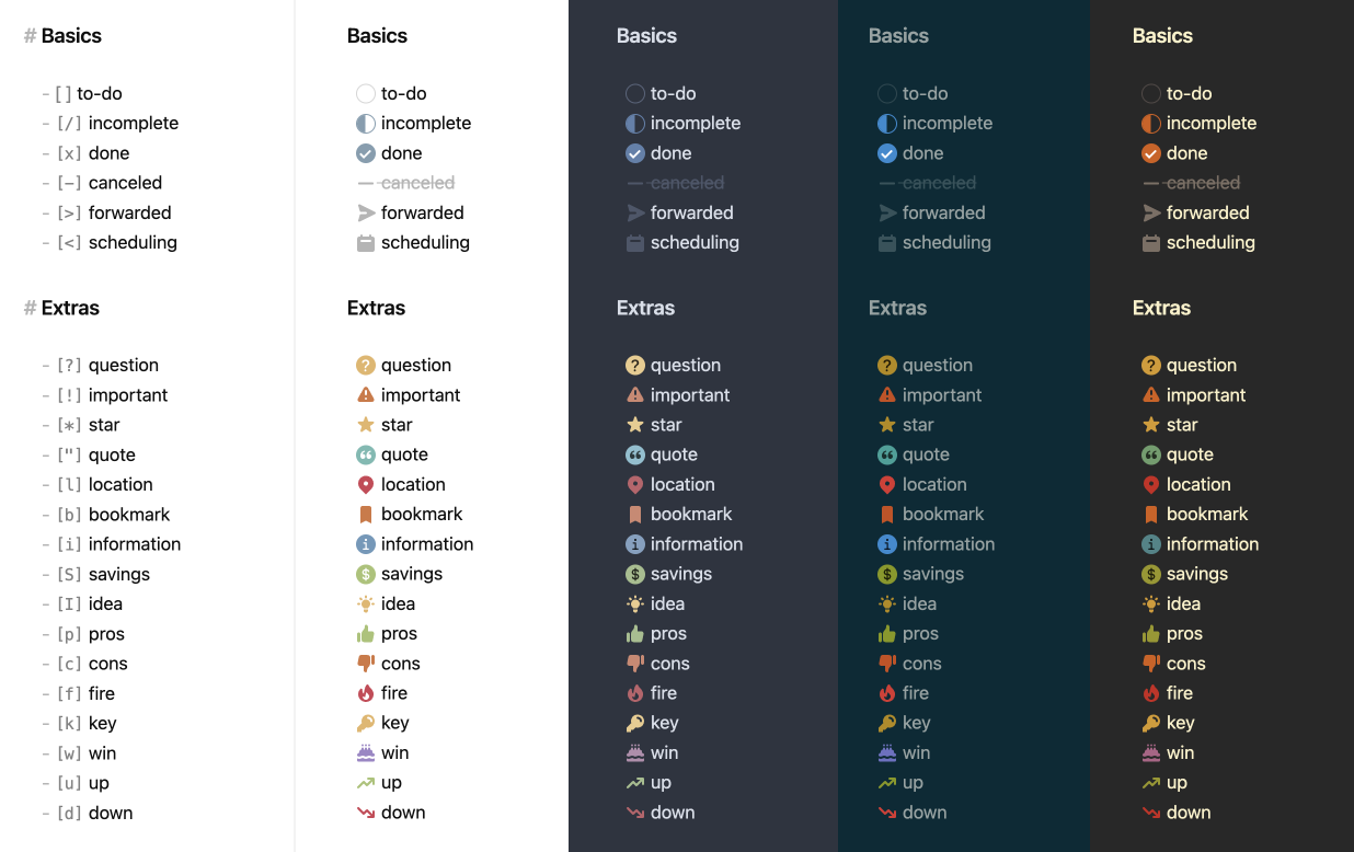
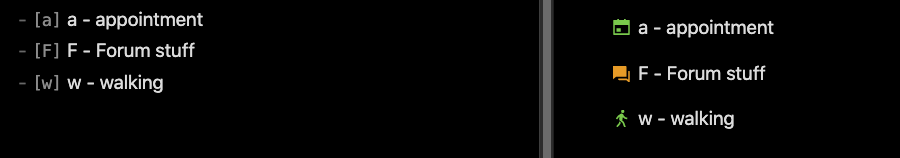
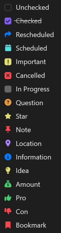
Below is how they look like in the default theme
| Syntax |
Description |
- [ ] |
Unchecked |
- [x] |
Checked |
- [>] |
Rescheduled |
- [<] |
Scheduled |
- [!] |
Important |
- [-] |
Cancelled |
- [/] |
In Progress |
- [?] |
Question |
- [*] |
Star |
- [n] |
Note |
- [l] |
Location |
- [i] |
Information |
- [I] |
Idea |
- [S] |
Amount |
- [p] |
Pro |
- [c] |
Con |
- [b] |
Bookmark |
- ["] |
Quote |