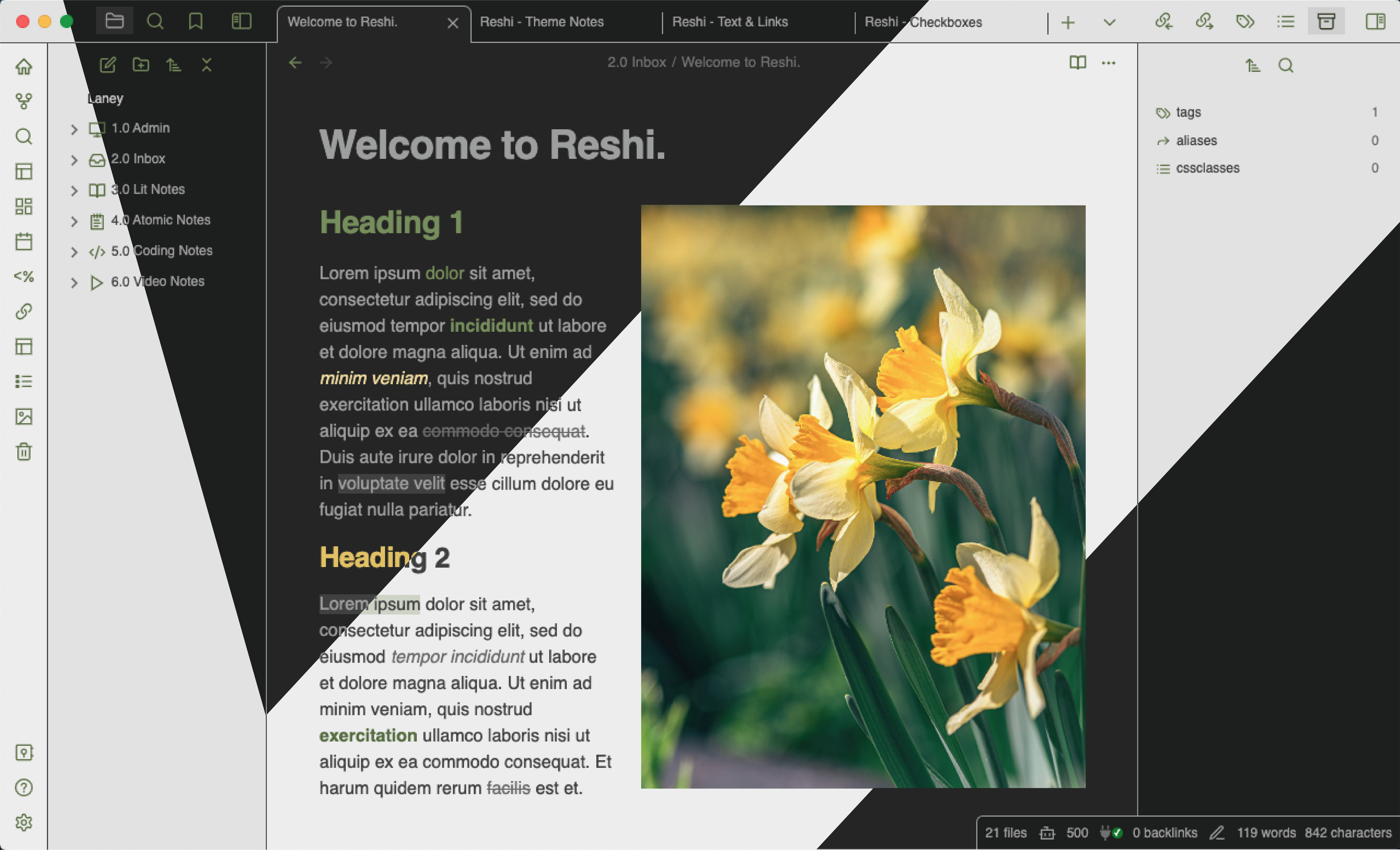
About
Inspired by the protagonist of The Name of the Wind, by Patrick Rothfuss, Reshi is a theme for storytellers, teachers, students, and lifetime learners. Designed with a color palette of warm greens and yellow-golds, as well as a full spectrum of grays, it is meant to be both easy on the eyes and readable, both comforting and stimulating. I hope it makes Obsidian even more enjoyable for your use cases.
Installation
Option 1: Search “Reshi” in the Obsidian Community Themes library. Select “Install and use”. Enjoy!
Option 2: Download the git repository to your .obsidian/themes folder. Select “Reshi” from the themes dropdown in Obsidian (Settings > Appearance). Enjoy!
Features
- Light and Dark modes:
- Custom checkboxes with Lucide icons:
To create, type these (don’t use a code block):
- [/] in progress
- [-] canceled
- [<] scheduled
- [>] rescheduled

- [!] important
- [?] question
- [i] information
- [S] amount

- [p] pro
- [c] con

- [n] note
- [I] idea
- [b] bookmark
- [*] star
- [k] key
- [t] time
- [l] location
- ["] quote
- Two custom textboxes per mode:
To create, type these (don’t use code blocks):
<i id="bubble">
Bubble
</i>
<i id="quote">
<em>"Quote."</em> - Author
</i>
- “Sparkle” callout block:
To create, type (don’t use code block):
> [!sparkle]
> Data
-
CSS modifications for the following plugins:
- Dataview
- Obsidian Columns
- Multi-Column Markdown
-
Colorized bold and italics:
- Underlines removed from links:
- Fonts:
- Noto Sans, sans-serif (general)
- JetBrains Mono (programming)
Color Palette
Background
- Light
- light-grey: ececec (background primary)
- medium-light-grey-1: e1e1e1 (background secondary)
- medium-light-grey-2: d7d7d7 (background primary alt)
- medium-light-grey-3: c4c4c4 (background secondary alt)
- Dark
- medium-dark-grey: 252525 (background primary)
- dark-grey-1: 1d1d1d (background secondary)
- dark-grey-2: 1f1f1f (background primary alt)
- dark-grey-3: #151515 (background secondary alt)
Text
- Light
- black: 202020
- light-black: 404040 (text, inline title, dividers, borders)
- Dark
- white: a3a3a3
- dark-white: 9d9d9d (text, inline title, dividers, borders)
Accents
- Greys
- medium-grey-1: 707070
- medium-grey-2: 6a6a6a
- medium-grey-3: 555555
- medium-grey-4: 404040
- medium-grey-5: 333333
- medium-grey-6: 202020
- Light
- Greens
- green-01: 829f55
- green-02: 748e4c
- green-03: 677e43
- green-04: 596d3a (accent color)
- green-05: 4b5c31
- green-06: 3e4c28
- green-07: 303b1f
- Greens
- Dark
- Greens
- green-08: 9db27e
- green-09: 91a86e
- green-10: 849e5f
- green-11: 778e55 (accent color)
- green-12: 6a7e4b
- green-13: 5c6e42
- green-14: 4f5e38
- Golds
- gold-01: f4e8be
- gold-02: f0e0a8
- gold-03: ecd993
- gold-04: e8d17d
- gold-05: e4c967
- gold-06: e0c252
- gold-07: ddba3c
- Greens
- Extras
- light-green: cdd3c3
- light-gold: f8f1d8
License
Core CSS License
Reshi is licensed under the GPL-3.0 license which allows you to modify the code freely, however the Copyright and license notices must be preserved in your CSS. If you redistribute a part of my code, please credit my theme in your CSS file, and specify which code you are using. Please keep my Buy Me a Coffee link in your README if you do so.

Lucide Icons License
ISC License
Copyright (c) for portions of Lucide are held by Cole Bemis 2013-2022 as part of Feather (MIT). All other copyright (c) for Lucide are held by Lucide Contributors 2022.
Permission to use, copy, modify, and/or distribute this software for any purpose with or without fee is hereby granted, provided that the above copyright notice and this permission notice appear in all copies.
THE SOFTWARE IS PROVIDED “AS IS” AND THE AUTHOR DISCLAIMS ALL WARRANTIES WITH REGARD TO THIS SOFTWARE INCLUDING ALL IMPLIED WARRANTIES OF MERCHANTABILITY AND FITNESS. IN NO EVENT SHALL THE AUTHOR BE LIABLE FOR ANY SPECIAL, DIRECT, INDIRECT, OR CONSEQUENTIAL DAMAGES OR ANY DAMAGES WHATSOEVER RESULTING FROM LOSS OF USE, DATA OR PROFITS, WHETHER IN AN ACTION OF CONTRACT, NEGLIGENCE OR OTHER TORTIOUS ACTION, ARISING OUT OF OR IN CONNECTION WITH THE USE OR PERFORMANCE OF THIS SOFTWARE.
Credits
AnubisNekhet (AnuPpuccin) & malhashemi: custom checkboxes
- Buy Anubis a coffee: https://www.buymeacoffee.com/anubisnekhet
sailKite: colorful ribbon snippet
Lucide: icons
Special Thanks
Nugtastick_Surprise and Marble_Wraith on Reddit: helpful CSS tips
 this theme!!