I’d like more screen space on mobile when typing on the screen keyboard, and less interface clutter when I’m drafting text. I especially want this on my tablet, where the double top bar plus mobile toolbar really cut into the half of the screen left by the keyboard.
It would be nice to have in desktop too but less important.
Proposed solution
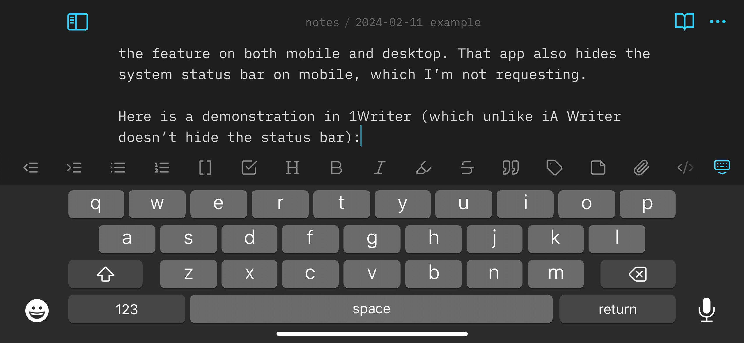
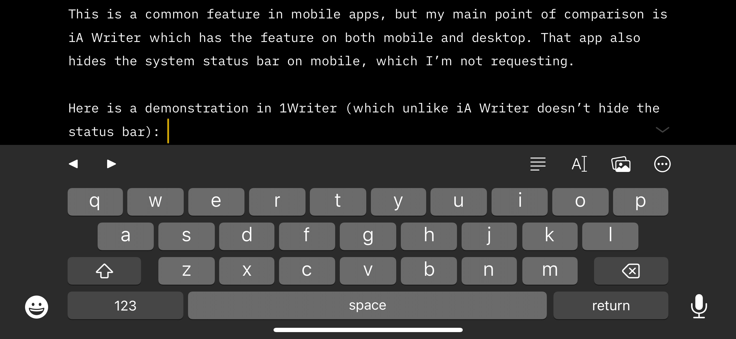
Scroll the top bar(s) out of view when scrolling the page up (moving the text upward and the view downward) and reveal it again when scrolling down. This is a common feature in mobile apps, but my main point of comparison is iA Writer which has the feature on both mobile and desktop. That app also hides the system status bar on mobile, which I’m not requesting.
Here is a demonstration in 1Writer (which unlike iA Writer doesn’t hide the status bar):
A less ideal alternative would be to hide the bar when the keyboard is open, as in the workaround snippet. This works, but is non-standard — I’m not sure if I’ve seen another app do it; the ones I know use scrolling as the trigger. But since Obsidian also doesn’t hide the keyboard in scroll in the standard way either, this would be consistent with that.
Current workaround (optional)
A CSS snippet that hides the bar when the keyboard is open. To do it in response to scrolling would apparently require JavaScript, but this is a good substitute. I might even prefer it to the scroll version, but the scroll version is the standard convention.
Write in another app when I really want more space.
No plugin exists for this that I could find. Hider doesn’t do it. It seems that the required JavaScript wouldn’t be large (there are numerous tutorials online explaining how to implement the technique for websites), so I imagine it wouldn’t be hard for a knowledgeable person to make one.
Toggle off Settings > Appearance > Show tab title bar. This is only a very partial workaround — it only hides part of what I want hidden and is inconvenient to switch on and off.
2025-02-26: Reduced positivity of description of alternative option.
2024-05-21: Added good workaround snippet in comments, linked to it from main post, suggested the technique as an alternate proposal, and changed the title to include it.
Not sure if I fully understand your request. Maybe add some screenshots to show what bars / spacing are in the way.
To gain more space on screen, try following:
install a new keyboard app that allows keyboard resizing and bar configuration (to remove those helper bars for eg numbers, quick emojis, copy-paste options etc). I use Android so i wouldn’t know what keyboard app to suggest for iOs. But some Android keyboard apps are available for multiple systems, eg ms swiftkey, example
Try Dune or other themes which also modify Obsidians mobile gui
Thanks for the suggestions! I added a video to the post. I don’t want to change my keyboard and am reluctant to change my theme, but maybe I’ll check out some themes — I haven’t browsed them in a while.
I’d like to second this request. Typing on mobile in landscape mode can be pretty difficult because there’s so little vertices room, so I usually end up using another app for that but my preference would be use Obsidian.
I’m including a screenshot from Obsidian and IA Writer, each in landscape. In IA (and most editors, for what I can tell) the top bar slides out of the way when the keyboard is active, and the thing we’re noticing here is the extra vertical space for text when the top bar is out of the way.
It occurred to me that perhaps CSS could hide the bar when the keyboard is open, and @sailKite kindly confirmed that and provided a working snippet! I’ve only just started using it but I think it’s a very nice workaround.
/* Hide top bar when keyboard is open on mobile (includes tab bar on tablet).
Workaround for https://forum.obsidian.md/t/option-to-show-hide-top-bar-s-when-note-is-scrolled/69610?u=cawlinteffid
Courtesy of sailKite https://discord.com/channels/686053708261228577/702656734631821413/1242571258881642547
Remaining border removed by me. */

.workspace-leaf.mod-active > * > .view-header,
body.is-tablet .workspace-tabs.mod-active > .workspace-tab-header-container {
    transition: height 250ms;

    .app-container:has(.mobile-toolbar) & {
        border-bottom: 0;
        height: 0;
        overflow: hidden;
    }
}
Added my heart to this request.
Good point, mobile devices (phone, tablets) in general have little space on screen and keyboard interfaces take too much of this space. On my phone, the landscape format is basically pointless, because I see just the keyboard interface, not a line of my note.
A possible solution is, to use a custom keyboard interface specifically developed for thumbs, with two smaller interfaces on the key and right side on-screen. I’ve seen this type of keyboards and didn’t try them yet. Default, pre-installed keyboards are unsuitable.
I wonder if CSS is able to solve this feature request in some other way than with scrolling, probably not. Because to work with scrolling it’d need additional JavaScript, CSS can’t do it alone. CSS is “just” about styling of available components.
For my next update of Dune, (probably these days, latest changes are still in a check phase) I’ve added semi transparent buttons so there’s a hint on screen so you can read through the buttons.
Since I don’t get bug reports for tablets, implementations for tablets aren’t possible for me
I also want a version of what is being requested here except I think it would be ideal to shift the items in the top bar to the bottom bar alongside the tab-switcher, etc. The (kind of pointless?) left sidebar button, reading view button, and “more options” button all hide the keyboard when pressed so its not like there is any benefit to having them up on the screen at the same time as the keyboard. I feel like there is enough room in the bottom bar to fit these buttons. Also my thumbs aren’t 6 inches tall that I can reach those buttons comfortably anyways.
There is the issue of plugins adding extra buttons to the top bar. I think it would be fine to just make it so that they exist within the “more options” menu. I know it will mean that the plugins will need to be updated but I think it will end up being a better experience in the end.
As for the file path text at the center of the top bar, I think with the new addition of that “auto-reveal current file” button, the text can be done away with, or perhaps just moved to the right sidebar.
Making these changes helps with creating more space as well as making them accessible and finger-friendly. ALSO, immersive fullscreen would be REALLY nice please.
I agree to the majority of your points.
Would you like to try out my theme ? I support both desktop and phone devices. Check out my wiki to get an idea what Dune adds; I’d be happy to hear your feedback.
I use a Chromebook and don’t need the toolbar at all, so for anyone who’s the same and knows even less CSS than me here’s code that hides the toolbar completely. Edited from the code above.
/* Hides toolbar completely, for me at least, idk how Obsidian uses CSS. Fiddled with into creation from the code snippet here: https://forum.obsidian.md/t/option-to-show-hide-top-bar-s-when-note-is-scrolled/69610?u=cawlinteffid */

.mobile-toolbar {
    border-bottom: 0;
    height: 0;
    overflow: hidden;
}
This feature request is about the bar at the top of the screen, not the toolbar. But if you post your snippet in Share & showcase someone may find it useful!
I’m glad to have the snippet, but having this built in would be smoother, and more consistent with other apps. I still have a lot of little moments where I need to access the top bar and scrolling down a bit doesn’t bring it back like it does on other apps, so I spin my wheels briefly before remembering to press the “dismiss keyboard” button.
When I’m reading a file, I don’t actively need the navigation elements that take up a lot of screen real estate.
Proposed solution
Add toggle for native iOS behavior for bottom tab bar to slide out when you start scrolling down and reappear when you start scrolling back up. Bonus would be to also minimize the top title bar as well (example: Safari browser when tab layout is set to “Single Tab” in iOS Settings). It’s so much nicer for reading articles and long documents.
The CSS snippet uses more resources than the Capacitor listener; I didn’t use the exact snippet, but before I went down the CodeScript ToolKit rabbit hole I had CSS inspired by that one as well as this thread to show the bottom status bar on mobile when the keyboard is open and I noticed a tad bit of lag with it.
I’m sure my code can be edited a little to be more sexy; like sliding out the app header when the keyboard is opened rather than just disappearing it, but I mostly made and posted it for others to use since I remembered this thread while looking through the Capacitor API.
In terms of detecting the keyboard, it should be exactly how it would be done natively.