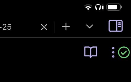
I’d like the Obsidian Sync status icon to be always visible instead of hidden behind the 3-dot invisible swipe-out right menu, so I can know ASAP if there’s a sync error, and to avoid editing files that might be out of sync.
When I move to a different device I’m often editing the same file (my daily note). I appreciate Obsidian Sync’s ability to merge conflicting changes, but sometimes it makes a small mess (like extra blank lines or repeated text), so I wait for Sync to complete before I edit.
Also I often pull out my phone, note something, and put it away quickly. Sometimes I put the phone away before Sync has finished uploaded the new changes. This would happen less if the Sync icon were always visible.
On desktop I can glance at the always-visible status icon, but on mobile I have to open the sidebar. It’s a small action, but it adds friction over the many times times I do it each day. The icon is small, and there’s room for it in the app header — even on my phone, which is one of the smallest currently available.
An interesting alternative proposal is to use a banner/alert:
It might be possible for a CSS snippet to reposition the sync icon. I don’t have the gumption to explore that now, but I plan to someday if the problem persists.
+1
I can never exit the app right after typing but always have to wait 1-3 seconds for sync to finish, because every time I exit the app it immediately gets backgrounded and sync activity stops, leading to possible sync conflicts.
Sync resumes normally when I open Obsidian again, though sometimes with 20 seconds delay.
iPhone 11, iOS 15.3.1
This has been happening from the start.
Currently the icon overlaps its neighbors, but I’m able to tap them both so I’m using it. I’ll try to tweak it someday. For now, this is a big improvement!
no warranty for damages, this is gonna be scuffed
/* attempt to display sync icon on mobile while drawer is closed */
:is(.is-mobile, .is-phone) .workspace:not(:has(.workspace-drawer-backdrop)) .workspace-drawer.mod-right {
display: flex !important;
overflow: visible;
left: 100%;
}
:is(.is-mobile, .is-phone) .workspace:not(:has(.workspace-drawer-backdrop)) .workspace-drawer.mod-right .workspace-drawer-inner {
overflow: visible;
}
:is(.is-mobile, .is-phone) .workspace:not(:has(.workspace-drawer-backdrop)) .sync-status-icon {
position: absolute;
left: calc(-1 * var(--size-4-16));
top: var(--size-2-2);
}
you can fiddle with the positioning by changing the left declaration in the last ruleset
i did this all with mobile emulation so it’s not surprising that the real value that works comfortably in the layout is different
also, this does technically make it so that the drawer itself is always present, just offscreen instead of not displayed
whether that produces side effects, i can’t say, so just be aware of that
… --size-4-16 corresponds to 64px, just for comparison
higher values make it go farther left, lower goes closer to the edge
EDIT: Christian_S notes that using --size-4-8 moves the icon to the right edge of the screen. Discord
For now I’m going with -1 * 36px (I tried putting it between the 3-dot and the reading mode icon which it looks like is what you did, but it felt too cramped to me). For top I did 49px on iPad Air 4 (to move it down next to the the 3-dot instead of the sidebar button) and 9px on iPhone 13.
I tried moving it down to the lower right corner. It looked pretty good, but the keyboard covers it and it’s more glanceable up top anyway.
Now I want to learn how to move the 3-dot menu left or right so I can space things more evenly, and then I think I’ll be done.
The -1*37px and -5 move it all the way to the top right corner on my iPhone 11.
One could also consider moving it left next to the left sidebar button , but I’m very happy now with the implementation.
Btw I haven’t discovered any other issues or things breaking so far
Edit: hail to the sailkite
This is brilliant! Thank you to everyone in this thread for the good ideas.
I’ve added some CSS to nudge the “three dots” icon to the left so there’s some breathing room between it and the checkmark. For me, this makes it easier to press the icon I intend.
Please see the attached screenshot from my Android phone and the CSS code below. (You may need to play with the 23px in the code to suit your screen.)
The change ceases to apply when I open the left sidebar, which looks awkward but doesn’t cause any practical problems. It’s more noticeable on my tablet; on the phone the sidebar covers it so I only see it during the transition. EDIT: Actually it’s not that awkward. At some point in my number adjustments it caused an overlap, but now it only causes some movement.