For now I’m going with -1 * 36px (I tried putting it between the 3-dot and the reading mode icon which it looks like is what you did, but it felt too cramped to me). For top I did 49px on iPad Air 4 (to move it down next to the the 3-dot instead of the sidebar button) and 9px on iPhone 13.
I tried moving it down to the lower right corner. It looked pretty good, but the keyboard covers it and it’s more glanceable up top anyway.
Now I want to learn how to move the 3-dot menu left or right so I can space things more evenly, and then I think I’ll be done.
The -1*37px and -5 move it all the way to the top right corner on my iPhone 11.
One could also consider moving it left next to the left sidebar button , but I’m very happy now with the implementation.
Btw I haven’t discovered any other issues or things breaking so far
Edit: hail to the sailkite
This is brilliant! Thank you to everyone in this thread for the good ideas.
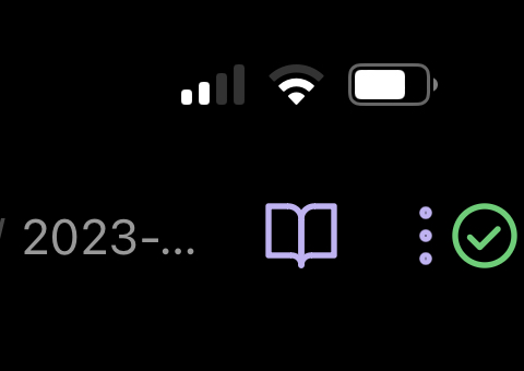
I’ve added some CSS to nudge the “three dots” icon to the left so there’s some breathing room between it and the checkmark. For me, this makes it easier to press the icon I intend.
Please see the attached screenshot from my Android phone and the CSS code below. (You may need to play with the 23px in the code to suit your screen.)
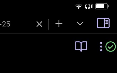
The change ceases to apply when I open the left sidebar, which looks awkward but doesn’t cause any practical problems. It’s more noticeable on my tablet; on the phone the sidebar covers it so I only see it during the transition. EDIT: Actually it’s not that awkward. At some point in my number adjustments it caused an overlap, but now it only causes some movement.
There are infinite possible features and only a handful of developers. Not all users use Sync and it’s already possible to check the sync status by swiping open the right sidebar (which has no visible control on phones — argh! ). And the small screen space of phones forces tough decisions.
If you’d like to set separate values for iPad and iPhone, on each of the starting lines with :is, you can remove both conditions (.is-mobile, .is-phone) and use just (.is-phone) or (.is-tablet) to distinguish between the two. You’ll need to duplicate the code. This works with dynamically resizing the window with stage manager on iPad, when it is switches to a phone size it uses the correct one.
I leave here the CSS classes for each icons related to Obsidian Sync. You should be able to change the icons to your favorites and customize them further!
For convenience, here is my current full version of the snippet, which incorporates changes discussed above:
/*
Display sync icon on mobile while drawer is closed.
Numbers may need to be tweaked for each device.
Original version kindly provided by sailKite. "no warranties for damages, this is gonna be scuffed" https://discord.com/channels/686053708261228577/702656734631821413/1078468316592615514
*/
:is(.is-mobile, .is-phone) .workspace:not(:has(.workspace-drawer-backdrop)) .workspace-drawer.mod-right {
display: flex !important;
overflow: visible;
left: 100%;
}
:is(.is-mobile, .is-phone) .workspace:not(:has(.workspace-drawer-backdrop)) .workspace-drawer.mod-right .workspace-drawer-inner {
overflow: visible;
}
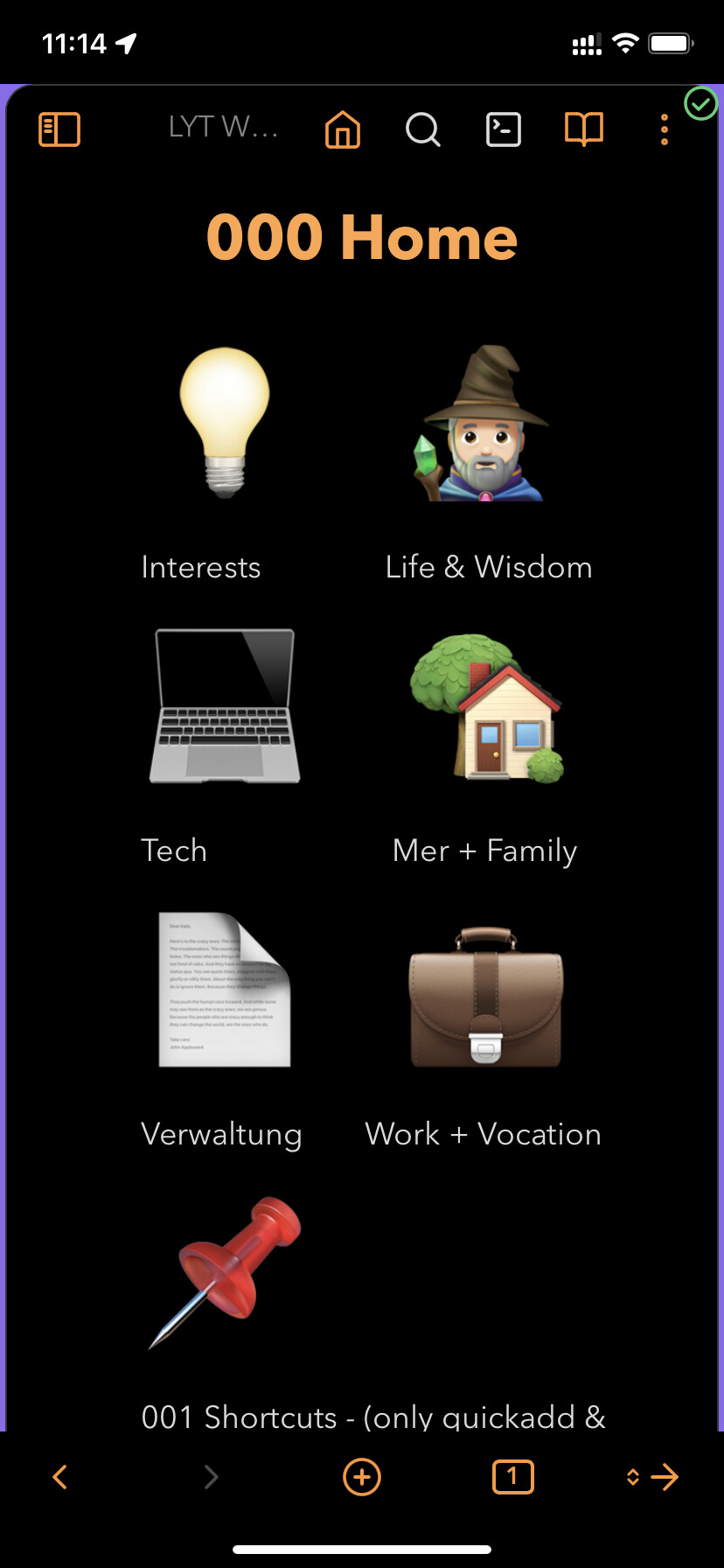
:is(.is-mobile) .workspace:not(:has(.workspace-drawer-backdrop)) .sync-status-icon {
position: absolute;
left: calc(-1 * 52px); /*74*/
top: 52px;
}
:is(.is-phone) .workspace:not(:has(.workspace-drawer-backdrop)) .sync-status-icon {
left: calc(-1 * 46px); /*74*/
top: 12px;
}
/* Move 3-dot menu to make room for Sync icon. (Courtesy of jijo https://forum.obsidian.md/t/feature-make-sync-icon-always-visible/31780/12) */
:is(.is-mobile) .workspace:not(:has(.workspace-drawer-backdrop)) .view-actions {
padding-right: 32px;
}
:is(.is-phone) .workspace:not(:has(.workspace-drawer-backdrop)) .view-actions {
padding-right: 23px;
}
(I’m also using snowynest’s animation from the post before this one but I keep it in a separate snippet.) EDIT 2023-10-18: Rotation animation is now a default feature.
Occasionally the icon gets layered on top of the menu icon, but rotating the device fixes it.
The CSS snippet is super useful! Have you been able to work out why the icon occasionally gets layered on top of the menu icon? That’s happening on my iPhone and is a bit annoying. It’s otherwise pretty perfect.