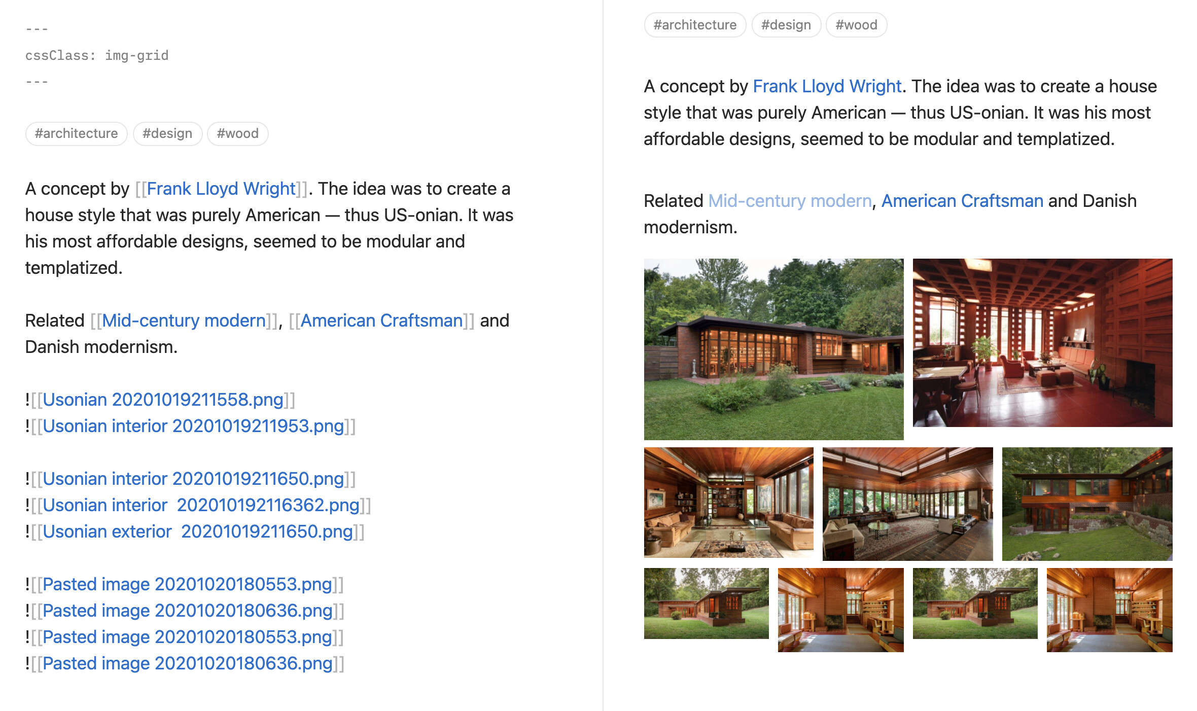
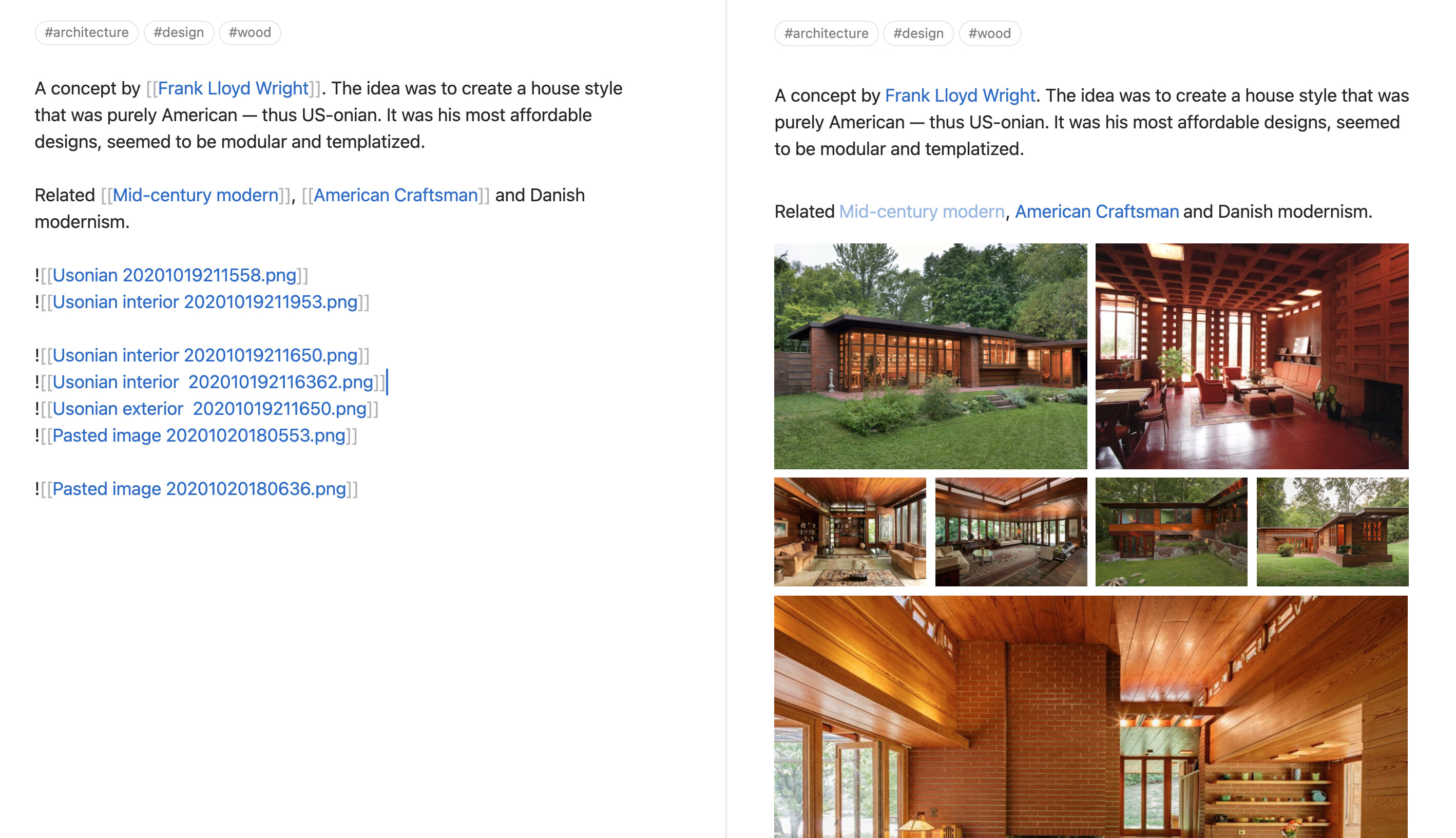
A simple snippet that you can pair with the new cssclass YAML code (as of 0.9.19). Add cssclass: img-grid to your front matter to display images in columns. Pairs nicely with Image zoom: click + hold to expand images
Saving the snippet (0.9.19+)
Save this snippet as img-grid.css and add it to .obsidian/snippets folder in your vault. You can then turn it on from the Appearance settings.
/* Updated for Obsidian 0.9.22 and up */

.img-grid .markdown-preview-section img:not([width]),
.img-grid .markdown-preview-section video {
    width:100%;
}
.img-grid .markdown-preview-section > div {
    display:flex;
}
.img-grid .markdown-preview-section > div > .internal-embed {
    flex:1;
    margin-left:-0.5rem;
    padding:0 0.5rem 0.5rem 0.5rem;
}
.img-grid .markdown-preview-section > div > *:not(div) {
    margin-block-start: 0rem;
    margin-block-end: 1rem;
}
.img-grid .markdown-preview-section > div hr {
    width:100%;
}
/* These lines make every image the same height */
.img-grid .markdown-preview-section > div > .internal-embed img:not(:active) {
    object-fit:cover;
    height:100%;
}
Usage
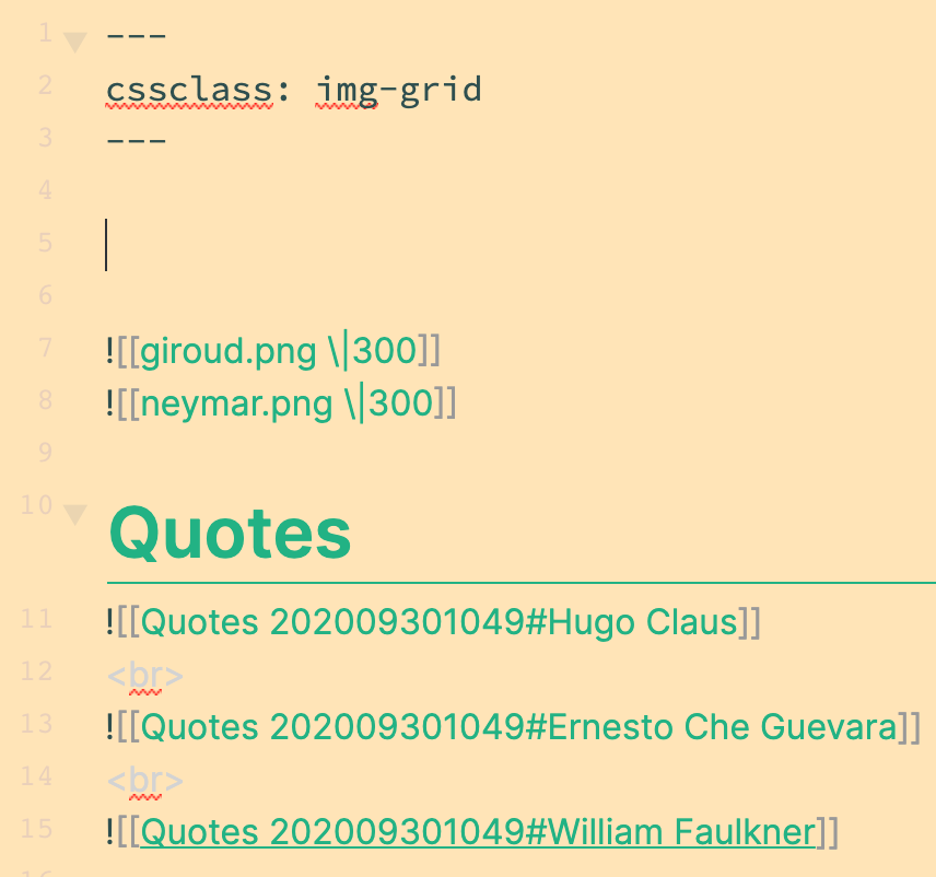
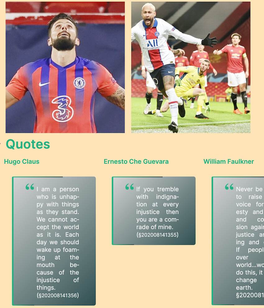
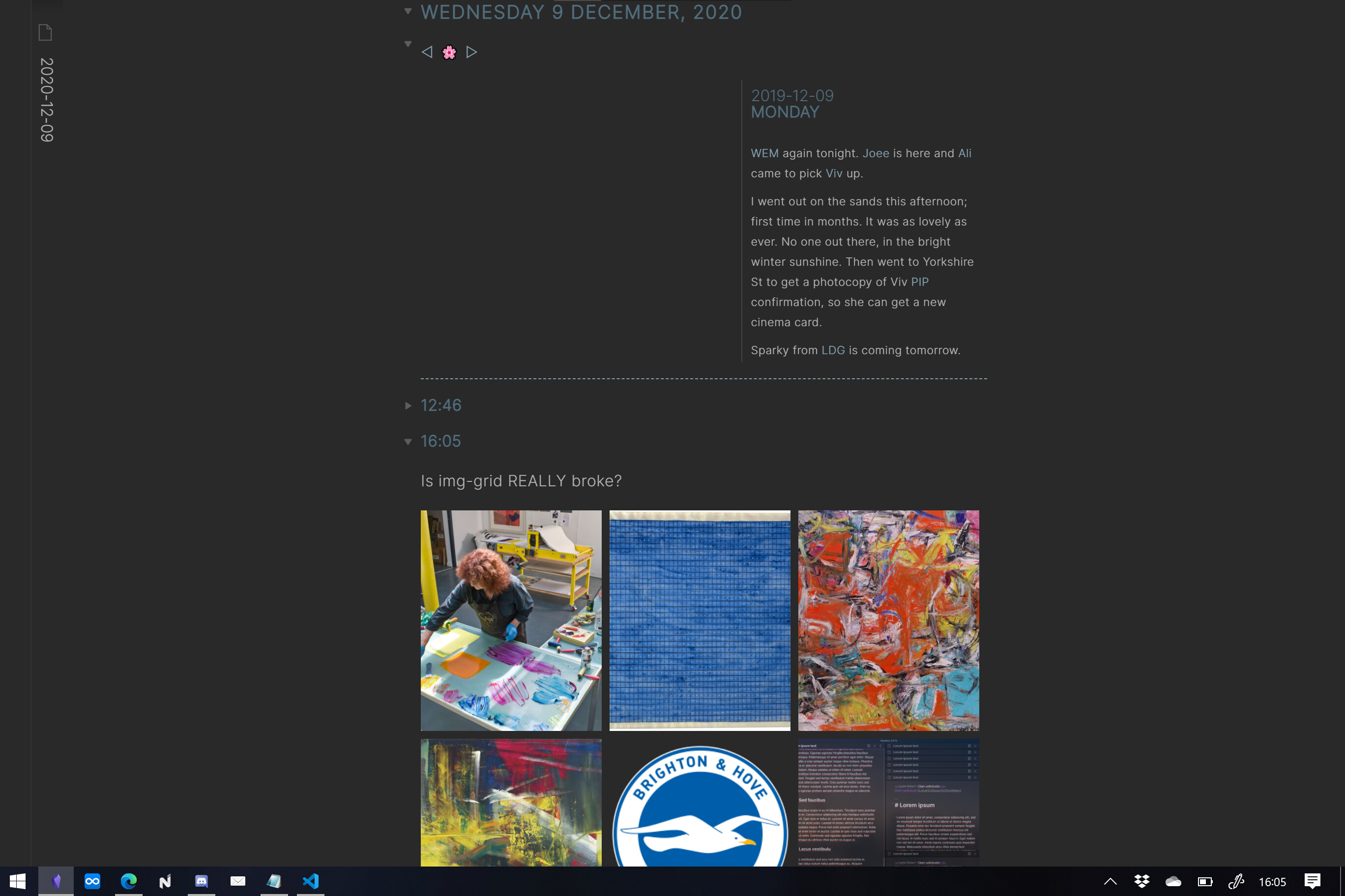
In edit mode, add cssclass: img-grid to your frontmatter. Then simply group your images by adding an extra line break between each row. The code will automatically create equal size columns for each image.
If you would like the images in each cell to be the same height add these extra lines of code. Note that this will crop the image a bit if they are not all the same aspect ratio.
/* For Obsidian 0.9.22 and up */
/* These lines make every image the same height */
.img-grid .markdown-preview-section > div > .internal-embed img:not(:active) {
    object-fit:cover;
    height:100%;
}
You would need to add an extra line break between block quotes.
Unfortunately there isn’t a CSS selector that can detect the contents of each paragraph section.
Edit: are you running the latest version of the code? I made some small tweaks. If you can share an example of what you see in edit and preview that could help.
The issue here is using the <br> tags because Obsidian will interpret those as elements in the same text block. You have to separate them without the HTML
Hmm after playing around with this, the Headings suffer from spacing issues. This is due to the global display: flex. If only we could only use the display: flex for the .markdown-preview-sections that do contain images and nothing else, this would work perfectly.
I agree with you. It’s not perfect given the limitations of the CSS selectors available. If you want to refine this code, you can add top/bottom margins and padding to headings within the .img-grid .markdown-preview-section so that it matches up perfectly.
Thanks @kepano, that gets the grid back nicely. Something else is going on though. I suspect it might be unavoidable…but… can be excluded from the elements covered by the snippet, as it is messing with my headings at the top, and the ‘On This Day’ thing someone
It might be avoidable by adding extra line breaks (no <br> tag just an extra blank line) between the elements that you want on separate rows. This is the same issue as Klaas’ above.
The reason this is happening is that that the snippet naively takes any elements that are in the same text block and puts them side by side. I haven’t figured out a clever way to do this only for images.
“naïve code” I love it! Could you explain what this does…
.img-grid .markdown-preview-section img:not([width]),
.img-grid .markdown-preview-section video {
width:100%;
}
…like, to a six year old. I’d like to learn this stuff a bit, rather than come running to ‘Dad’ every time!
This code makes images or videos fill the width of their column/cell. You might not notice this if you are using large images, but it’s relevant for smaller ones.
It ignores images that have a width explicitly defined by the user which is what the :not([width]) is for.