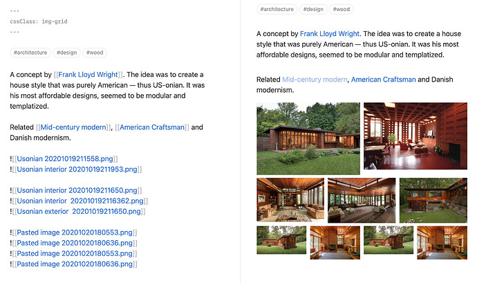
I have an alternative solution that is super simple, and not thoroughly tested. It can be combined with the new cssClass YAML tag to make sure it doesn’t break your other pages templates. In this example I am using cssclass: img-grid to avoid leakage but you can remove that class and apply it everywhere.
See the separate thread I created for this: https://forum.obsidian.md/t/display-side-by-side-image-grid-css-snippet/9359
.img-grid .markdown-preview-section {
    display:flex;
}
.img-grid .markdown-preview-section > .internal-embed {
    flex:1;
    margin-left:-0.5rem;
    padding:0 0.5rem 0.5rem 0.5rem;
}
.img-grid .markdown-preview-section > *:not(div) {
    margin-block-start: 0rem;
    margin-block-end: 1rem;
}
.img-grid .markdown-preview-section hr {
    width:100%;
}
.img-grid .markdown-preview-section img:not([width]) {
    width:100%;
}
Then in edit mode simply group your images and the code will automatically create columns.
You can also pair this with my image zoom snippet! Image zoom: click + hold to expand images
