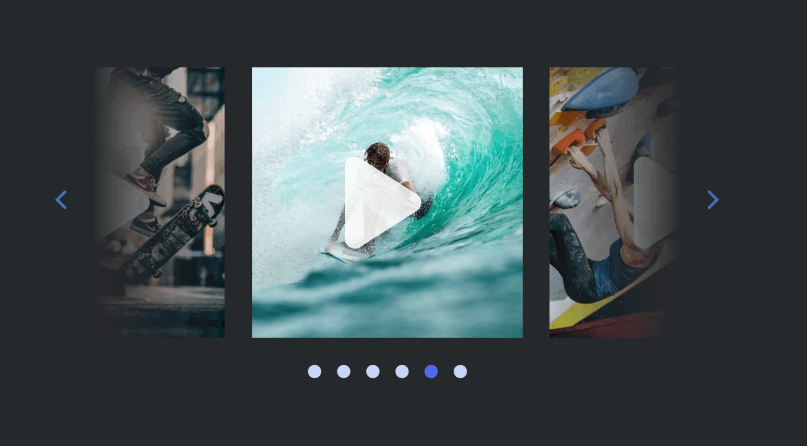
I also tested Image Grids, and…
Image Grids are implemented using Cssclass, which means that the effect that makes Image Grids work applies equally to all images within a single file. In real-world conditions, however, some images need to be placed individually, others in pairs, and others in groups of three. In other words, the effect does not need to be applied equally to all images, but it is applied nonetheless. Unfortunately, it still lacks the flexibility that Notion has. It may be a necessary workaround, but for me personally, it is not a replacement for the full functionality of placing images in Grid format.
Perhaps I am incorrect in some respects. I did not want to install the entire theme, so I simply took the piece of code responsible for Image Grids and applied it as a CSS Snippet.
I generally don’t use the Cssclass function, and I don’t want to clutter up my file metadata with it, so if I use CSS, I use universal CSS that works as desired throughout the entire vault, without having to apply situational CSS to each file individually.
In any case, thank you for what is available. It is probably difficult to achieve anything more with CSS.
I don’t know how useful this will be, but ChatGPT recently gave me this code for Image Grids.
In general, the images themselves are placed correctly—the size of the images changes dynamically depending on their amount.
But the problem is that for some reason I can’t click on any line, on any block after the images. The line simply doesn’t become active, as if I’m not clicking at all.
For me, this CSS snippet is too massive and complex, so instead of trying to understand and correct it, I decided to just accept the lack of convenient media file handling and live with the inconvenience.
/* Image Grid for Obsidian — final attempt
   - Keeps text untouched
   - Works when images are direct .internal-embed siblings OR when each image is in its own <p>/.cm-line
   - Equal-width columns for 2, 3, 4 images (override order: 4 > 3 > 2)
   - Requires :has() support (recent Obsidian builds)
*/

:root { --img-grid-gap:32px; }

/* -------------------------
   1) Basic image styling
   ------------------------- */
.internal-embed.image-embed img {
  display: block;
  width: 100%;
  height: auto;
  object-fit: contain;
  border-radius: 6px;
}

/* Keep internal embeds themselves neutral by default (no global layout changes) */
.internal-embed.image-embed {
  box-sizing: border-box;
  margin: 0;
  padding: 0;
}

/* -------------------------
   2) Case A — images are direct siblings:
   Make direct .internal-embed siblings inline-level, then set widths
   ------------------------- */

.internal-embed.image-embed {
  display: inline-block !important;
  vertical-align: top;
  max-width: 100%;
}

/* 2 images in a row (applies to both items in the pair) */
.internal-embed.image-embed:has(+ .internal-embed.image-embed),
.internal-embed.image-embed + .internal-embed.image-embed {
  width: calc((100% - var(--img-grid-gap)) / 2) !important;
}

/* 3+ images override (3 in a row) */
.internal-embed.image-embed:has(+ .internal-embed.image-embed + .internal-embed.image-embed),
.internal-embed.image-embed + .internal-embed.image-embed:has(+ .internal-embed.image-embed),
.internal-embed.image-embed + .internal-embed.image-embed + .internal-embed.image-embed {
  width: calc((100% - (2 * var(--img-grid-gap))) / 3) !important;
}

/* 4+ images override (4 in a row) */
.internal-embed.image-embed:has(+ .internal-embed.image-embed + .internal-embed.image-embed + .internal-embed.image-embed),
.internal-embed.image-embed + .internal-embed.image-embed:has(+ .internal-embed.image-embed + .internal-embed.image-embed),
.internal-embed.image-embed + .internal-embed.image-embed + .internal-embed.image-embed:has(+ .internal-embed.image-embed),
.internal-embed.image-embed + .internal-embed.image-embed + .internal-embed.image-embed + .internal-embed.image-embed {
  width: calc((100% - (3 * var(--img-grid-gap))) / 4) !important;
}

/* Add horizontal gap visual (works well with inline-block widths above) */
.internal-embed.image-embed { margin-right: var(--img-grid-gap); }
.internal-embed.image-embed:last-child { margin-right: 0; }

/* -------------------------
   3) Case B — images each inside their own paragraph (or .cm-line)
   We target paragraphs / cm-line blocks that contain ONLY an image embed,
   convert those paragraph blocks to inline blocks so adjacent paragraphs can sit horizontally,
   and then size them with the same rule-set as above.
   ------------------------- */

/* Selector for "image-only" paragraph (reading view) */
.markdown-preview-view p:has(> .internal-embed.image-embed):not(:has(> :not(.internal-embed.image-embed))) {
  display: inline-block;
  vertical-align: top;
  margin: 0;
  padding: 0;
  box-sizing: border-box;
}

/* Selector for "image-only" cm-line (live preview / source view) */
.markdown-source-view.is-live-preview .cm-line:has(> .internal-embed.image-embed):not(:has(> :not(.internal-embed.image-embed))),
.markdown-source-view.mod-cm6 .cm-line:has(> .internal-embed.image-embed):not(:has(> :not(.internal-embed.image-embed))) {
  display: inline-block;
  vertical-align: top;
  margin: 0;
  padding: 0;
  box-sizing: border-box;
}

/* Make the paragraph/.cm-line wrappers behave like the direct-embed widths above */

/* Two adjacent image-only paragraphs -> each ~50% */
.markdown-preview-view p:has(+ p:has(> .internal-embed.image-embed):not(:has(> :not(.internal-embed.image-embed)))):has(> .internal-embed.image-embed),
.markdown-preview-view p + p:has(> .internal-embed.image-embed):not(:has(> :not(.internal-embed.image-embed))) {
  width: calc((100% - var(--img-grid-gap)) / 2);
  margin-right: var(--img-grid-gap);
}

/* Same for live-preview cm-line pairs */
.markdown-source-view.is-live-preview .cm-line:has(+ .cm-line:has(> .internal-embed.image-embed)):has(> .internal-embed.image-embed),
.markdown-source-view.is-live-preview .cm-line + .cm-line:has(> .internal-embed.image-embed),
.markdown-source-view.mod-cm6 .cm-line:has(+ .cm-line:has(> .internal-embed.image-embed)):has(> .internal-embed.image-embed),
.markdown-source-view.mod-cm6 .cm-line + .cm-line:has(> .internal-embed.image-embed) {
  width: calc((100% - var(--img-grid-gap)) / 2);
  margin-right: var(--img-grid-gap);
}

/* 3 adjacent image-only paragraphs (each ~33%) */
.markdown-preview-view p:has(+ p:has(+ p:has(> .internal-embed.image-embed))):has(> .internal-embed.image-embed),
.markdown-preview-view p + p:has(+ p:has(> .internal-embed.image-embed)),
.markdown-preview-view p + p + p:has(> .internal-embed.image-embed) {
  width: calc((100% - (2 * var(--img-grid-gap))) / 3);
  margin-right: var(--img-grid-gap);
}

/* live-preview 3-chain */
.markdown-source-view.is-live-preview .cm-line:has(+ .cm-line:has(+ .cm-line:has(> .internal-embed.image-embed))):has(> .internal-embed.image-embed),
.markdown-source-view.is-live-preview .cm-line + .cm-line:has(+ .cm-line:has(> .internal-embed.image-embed)),
.markdown-source-view.is-live-preview .cm-line + .cm-line + .cm-line:has(> .internal-embed.image-embed),
.markdown-source-view.mod-cm6 .cm-line:has(+ .cm-line:has(+ .cm-line:has(> .internal-embed.image-embed))):has(> .internal-embed.image-embed),
.markdown-source-view.mod-cm6 .cm-line + .cm-line:has(+ .cm-line:has(> .internal-embed.image-embed)),
.markdown-source-view.mod-cm6 .cm-line + .cm-line + .cm-line:has(> .internal-embed.image-embed) {
  width: calc((100% - (2 * var(--img-grid-gap))) / 3);
  margin-right: var(--img-grid-gap);
}

/* 4+ chains: you can copy the pattern above and change the math; here is 4 */
.markdown-preview-view p:has(+ p:has(+ p:has(+ p:has(> .internal-embed.image-embed)))):has(> .internal-embed.image-embed),
.markdown-preview-view p + p + p + p:has(> .internal-embed.image-embed),
.markdown-preview-view p + p + p:has(+ p:has(> .internal-embed.image-embed)) {
  width: calc((100% - (3 * var(--img-grid-gap))) / 4);
  margin-right: var(--img-grid-gap);
}
.markdown-source-view.is-live-preview .cm-line:has(+ .cm-line:has(+ .cm-line:has(+ .cm-line:has(> .internal-embed.image-embed)))):has(> .internal-embed.image-embed),
.markdown-source-view.is-live-preview .cm-line + .cm-line + .cm-line + .cm-line:has(> .internal-embed.image-embed),
.markdown-source-view.is-live-preview .cm-line + .cm-line + .cm-line:has(+ .cm-line:has(> .internal-embed.image-embed)),
.markdown-source-view.mod-cm6 .cm-line:has(+ .cm-line:has(+ .cm-line:has(+ .cm-line:has(> .internal-embed.image-embed)))):has(> .internal-embed.image-embed),
.markdown-source-view.mod-cm6 .cm-line + .cm-line + .cm-line + .cm-line:has(> .internal-embed.image-embed),
.markdown-source-view.mod-cm6 .cm-line + .cm-line + .cm-line:has(+ .cm-line:has(> .internal-embed.image-embed)) {
  width: calc((100% - (3 * var(--img-grid-gap))) / 4);
  margin-right: var(--img-grid-gap);
}

/* Remove trailing right margin on last item in a chain to avoid overflow */
.internal-embed.image-embed:last-child,
.markdown-preview-view p:has(> .internal-embed.image-embed):not(:has(+ p:has(> .internal-embed.image-embed))),
.markdown-source-view.is-live-preview .cm-line:has(> .internal-embed.image-embed):not(:has(+ .cm-line:has(> .internal-embed.image-embed))) {
  margin-right: 0;
}

/* Add horizontal spacing without shrinking images */
.internal-embed.image-embed + .internal-embed.image-embed {
  margin-left: 32px !important; /* change this to desired spacing */
}

/* Optional: also vertical spacing for wrapping images */
.internal-embed.image-embed {
  margin-bottom: 8px !important; /* space between rows if images wrap */
}


/* -------------------------
   Notes:
   - This intentionally DOES NOT change line-height, text alignment, or widths of text paragraphs.
   - If your images are all inside one paragraph already (e.g. `![[a]] ![[b]] ![[c]]`) the direct-sibling rules will apply.
   - If your images are each on their own Markdown line (each gets its own <p>/.cm-line), the "image-only paragraph" rules apply.
   - If your Obsidian's Chromium doesn't support :has(), these selectors will be ignored (no harm).
*/
