The new tabs feature is very useful, but like an internet browser, you can accumulate tabs very quickly. This makes it very difficult to scan, re-order and navigate them.
Proposed solution
If we could have the tabs displayed vertically - as is possible in the Microsoft Edge and Vivaldi browsers (or extensions for other browsers) - it would solve all of the problems.
The tab bar is also collapsible, but shows in full when you hover, then hides again.
It can also be scrolled within, like other pane - such as the Files or Search tabs (animated gif below - click to watch).
In fact, perhaps the best way to implement it is to make it use the same mechanism as the various side panel widgets, meaning that we could drag its icon around or put it in the left or right side panel. (this is what I’m referring to)
The new Tab Stack mode is a sort of workaround, but not really - it becomes unusable beyond maybe 10 or 15 tabs because of the large amount of vertical white/dead space. Also, it is hard to read the titles with their text being vertically-oriented
Love the idea.
It could be a vertical tabs stack for each open pane.
I guess the question is, can Obsidian handle 20 to 100 open notes at the same time?
(I tend to get excessive with open tabs if I can)
Yeah, I like that idea to have a stack for each pane - it’s probably the only way to do it?
As for performance limits, that’s probably very dependent on each computer… I’m not sure that’s the concern of Obsidian though, just as it isn’t the concern of any web browser. If your computer starts to chug, then you have to clean up your tabs or upgrade your RAM… All Obsidian should care about (and does a great job with!) is making it all run as efficiently as possible.
Though, I suppose a REALLY advanced mechanism could be to automatically put tabs to “Sleep”, as is possible in Microsoft Edge. That’s probably way beyond our current scope or needs though.
Another thought about this - perhaps it would be challenging to have vertical tab lists/stacks shown for each pane. So, maybe it could just be a floating tab stack modal that displays when you either
hover the tabs,
hover the left edge of the pane, or
click a button in the left side of the horizontal tab list
Or something else to that effect, such that the tabs take up even less space.
Or maybe there could be one vertical tab stack that is shown in/available from the left sidebar but the actual tabs shown in it reflect the active pane? I don’t know if that would be useful of confusing…
I just came up with this idea once I tried the 1.0 version, this chromium-edge-like vertical form is more suitable for displaying the long titles (current solution looks a little bit redundant)and convenient for moving tabs out to new windows
any news about this idea, I have a pretty small screen( 13.3 inch ), tabs or stack view takes too much spaces when I have 13 or 14 of notes opening, so this vertical tab view is very important to me.
A simpler approach would be to include a user-selectable vertical tab width. For my needs, there is too much whitespace there. So, instead of having this…
Then, to reduce the “noise” from the compact spacing, dim the font color on the vertical tabs to reduce the contrast from the background color so that it pulls less on your focus. (Maybe also reduce the vertical tab font size.)
This simple tweak will help the use case when there are a manageable number of tabs (say, under a dozen), but will not help for use cases where one has dozens of tabs. But, I think having control of the compactness will be quite helpful to many users.
Text to be written vertically in a tab stack would be nice as an interim as well. Having to tilt my head to the side to read is a little disorientating haha
I created a small CSS code that fixes the text orientation. It will be included within my CyberGlow theme’s next update which is partly focused on stacked tabs, but until then here is that code that I mentioned so you don’t need to tilt your head and break your neck trying to read the tabs.
Can load this as a snippet CSS file with any theme you want.
Edit: This is for the default font, using custom font for the UI might not work well, so you may need to alter the code a bit to make it fit with your desired font.
@kazzy Nice one! I’m prefer how it looks with just using Koncham Workspace with its default behaviour and then hiding the tab bar with Hider.
However, when you hide the tab bar, this seems to make it very cumbersome to use panes, which is a non-starter for me. This is because you cannot drag from or right click on the center tab/vertical tab list. You can only open a note in a new pane from other sidebar panels (Drag or Click from Files or Search)
But, also, the vertical tab list gets sort of cluttered when you have multiple panes open, each with multiple tabs. There’s no delineation/indication for which pane a tab is in.
All in all, I’ll leave Koncham Workspace open for a bit but will likely just turn it off and hope that this functionality can get implemented in a slicker way at the Obsidian-core level.
Well I too faced those difficulties - but for me the real problem was the inability to pin or close panes from the vertical tabs list. I had to re-enable the native tabs to do that.
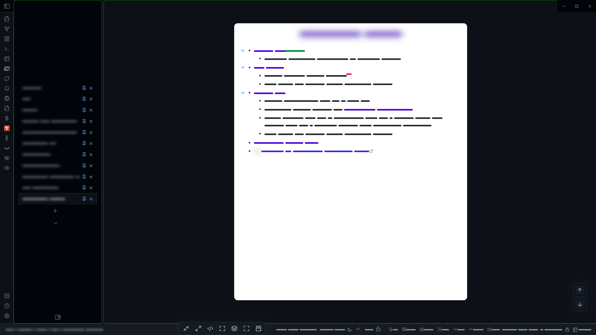
So here’s a brand new solution that I simply love!
It refashions the native tab-bar into cool vertical tabs, with very little drawbacks and absolutely no loss of functionality.
The icon to enable the right side-panel is appears at the bottom of the tab-list, instead of the top-right.
In horizontal split-mode, the tab-list for the right-pane, seems to get in the way. i now prefer to use the vertical split mode exclusively.
I have not tried opening a gazillion tabs, so I don’t know how well it will scroll - maybe just add overflow:scroll if it doesn’t work (sorry, feeling a bit lazy at the moment to try it out and add the fix myself, plus very much excited at the new look!!)
To hide the tab-list, for say, a canvas - one has to use the hider-plugin to toggle the tab-bar. I prefer to do it via a cMenu entry at the bottom instead of remembering another shortcut.
I have added some cosmetic improvements as per my taste - and they go well with the dark-theme, but they can be easily removed.
I hope this will inspire someone to make a plugin with an improved UX.
So, without further ado, presenting the new “Native Vertical Tabs”:
I like this idea. I’d like to see a choice of being able to put the vertical tabs in either the left or the right panel. I definitely wouldn’t want it taking up space in the editing window, even if it were collapsible.
Sorry for off-topic maybe, but I found this page when was searching for a way to make tabs vertical in the Window mode. Just like in Sublime Text by default. Would be useful, because when you use a Window with horizontal tabs (even when there are few, 3-4), you just can’t see titles of them, because, well, it’s a small window.
(Maybe someone who will implement topic feature would make it also for Window mode)