Tabs in multiple rows

before - smooshed tabs:

after - grows into multiple rows:

css:

.workspace .mod-root .workspace-tab-header-container {
  display: table;
}

.workspace .mod-root .workspace-tab-header-container-inner {
  flex-wrap: wrap;
}

.workspace .mod-root .workspace-tab-header {
    flex: none !important;
}

.titlebar .workspace-tab-header-tab-list,
.titlebar .workspace-tab-header-new-tab,
.mod-root .workspace-tab-header-tab-list,
.mod-root .workspace-tab-header-new-tab {
    display: table-cell;
}

The height of the tab container auto-adjusts if the tabs spill into multiple rows.

Maybe it could be improved by some level of flex in the tab-header to take up a certain amount of space until it spills over to the next row.

hmmm or auto-adjust to the size of the title of the tab would be nice

16 Likes

Great, thanks!

edited original post to add .workspace .mod-root to the first two rules. It fixes some issues with tabs in new windows, and makes the selector more specific to not change other “tabs” in the application

and here’s another mod to make the tabs more compact

.workspace .mod-root .workspace-tab-header {
    width: unset;
    max-width: var(--tab-width);
}

.workspace-tab-header-inner {
    width: unset;
}

Before:
image

After:
image

I set max-width to --tab-width instead of --tab-max-width since it looks better to me

4 Likes

styling a bit more

  • removing tab list button (I don’t use it)
  • adding a border around the tabs and tweaking other bits that affect it’s appearance
  • getting rid of some padding to make the tabs more compact

image

.workspace .mod-root .workspace-tab-header-container {
  display: table;
  height: unset;
}

.workspace .mod-root .workspace-tab-header-container-inner {
  flex-wrap: wrap;
  margin: unset;
  padding: unset;
}

.workspace .mod-root .workspace-tab-header {
  flex: none !important;
}

.titlebar .workspace-tab-header-new-tab,
.mod-root .workspace-tab-header-new-tab {
  display: table-cell;
  padding: unset;
}

.titlebar .workspace-tab-header-tab-list,
.mod-root .workspace-tab-header-tab-list
{
  display: none;
}
.workspace .mod-root .workspace-tab-header {
    width: unset;
    max-width: var(--tab-width);
    border: 1px solid var(--color-base-50);
}

.workspace .mod-root .workspace-tab-header-inner::after {
    width: 0px;
}

body {
    --tab-outline-color: unset;
}
4 Likes

Great improvements. Thanks

The thing it can’t seem to do right now, is move tabs from row 1 to another row. Like when you click and hold and drag a tab.

Very nice Improvement!
THANKS

1 Like

yeah it’s been a bit of a game changer for me. I now only need 2 windows open

  • 1 for the main window, with max ~3 panes
  • 1 pop-out window for canvases so they can take up the full screen width

fore example, right now I have

  • 14 tabs in first pane (4 rows)
  • 9 tabs in 2nd pane (2 rows)
  • 13 tabs in 3rd pane (5 rows)

I love how the rows are compact and can be different heights per pane

It seems like it would be nice to be able to re-arrange the tabs properly (it’s a bit finicky, I think you can either drag a tab anywhere in the first row, sometimes to the end of the Nth row, and always to the end of the last row), but I haven’t found myself needing it. And the constraint creates a bit of a workflow:

  • click “+” to focus the desired pane and open a new tab at the end, then open or create a new note, etc.
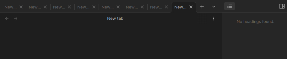
  • older tabs = top left, newer tabs = bottom right
  • kill off old tabs as you go from from the top to the bottom

Aaaaaaaaah my eyes are bleeding! :wink:

This is all really useful so thanks to everyone who has contributed in this thread.

I have had a play around but have an issue which I’m not sure how to resolve.

When I select a tab in the second row, the top row collapses (see screenshots below)


Does anyone have a fix for this?

hmm strange you see the left and right pane collapse those buttons at the top

are you using the same css from my last post?

I’m not sure what to suggest other than poke around with at it with the development tools (Ctrl+Shift+I), use the select element tool to pick one of the partially hidden things, and then see if you can un-hide it by messing with the css

another difference for me is I’m using Appearance > Window frame style = Native frame.

1 Like

Thank you for your resonse Zerkshop. Yes - I’m using your css from the last post.

You’ve cracked it! The above issue occurs when “Hidden (default)” is selected for the Window Frame Style; both other options seem to correct the issue.

Thanks again :slight_smile:

1 Like

Yes, I’ve had this issue ever since the release of 1.0. It has nothing to do with the “tabs in multiple rows” CSS.

Unfortunately, changing the “Window Frame Style” doesn’t fix things. All modes suffer from the issue of the entire page shifting up.

I love this, but it makes the the little arrow that accesses the menu to bookmark or stack tabs go away. Is there way to bring that back?

I think it might be this part. You can try deleting this or other chunks that have display: none

Yep, that’s it. Problem is that the fix breaks the feature:

It creates an extra row for the collapse indicator to sit by itself.

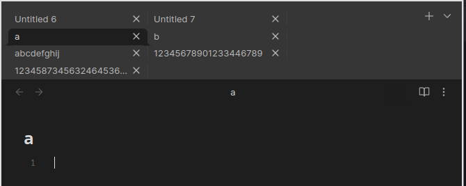
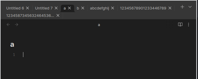
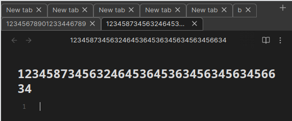
I’ve had a play around and have added some css code to the above. I wanted to increase the width of tabs with more text in so I would be able to see longer titles. To do this, I updated “.workspace .mod-root .workspace-tab-header” to:

.workspace .mod-root .workspace-tab-header {
    flex: none !important;
    width: unset;
 /* max-width: fit-content;	*/  /* this can be used so that the max width will wrap to fit in the content	 */ 
    min-width: 20px; /* set the minimum width here */
    max-width: 300px; /* set the maximum width here */
    border: 1px solid var(--color-base-50);
}

I also found a way to wrap the tabs around to multiple lines if the maximum length set was exceeded:

/* Override the "white-space: nowrap" property for all instances of .workspace-tab-header-inner-title */
div.workspace-tab-header .workspace-tab-header-inner-title,
div.pinned-items-container .workspace-tab-header-inner-title,
div.vault-tabs-container .workspace-tab-header-inner-title {
  white-space: initial !important;
}

I am a css beginner so a lot of this was found through trial and error (+ChatGPT) so I probably won’t be able answer any questions on the above, but I hope someone finds it useful :slight_smile:

*Edit: Added in code-blocks back-ticks for readability.

1 Like

Have you checked your theme?

I’ve just tried that fix on Minimal and it works fine now.

The latest update in 1.3.7 “Tab close button is now hidden for inactive tabs and will only appear on hover. This creates more space for file names inside the tab.”

This was not a good experience for me, since it shifts the sizes of the tabs as you move your cursor along them, sometimes pushing a tab into the next row momentarily, etc.

Here’s a quick fix to keep the tab close button always:

.workspace .mod-root .workspace-tab-header:not(.is-active) .workspace-tab-header-inner-close-button {
    display: flex;
}

or otherwise can just get rid of the tab close button in all cases, and use middle click mouse to close tabs (but careful on linux, though this should be solved)

.workspace .mod-root .workspace-tab-header.is-active:hover .workspace-tab-header-inner-close-button, .workspace .mod-root .workspace-tab-header.is-active .workspace-tab-header-inner-close-button {
    display: none;
}