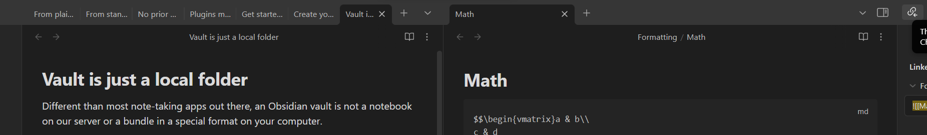
When too many tabs are visible in the tab header, their titles will be barely readable because they are squished so tightly together.
This is manageable when only one file is opened, but gets really annoying when two or more files are open at the same time in the vertical window allignment.
Proposed solution
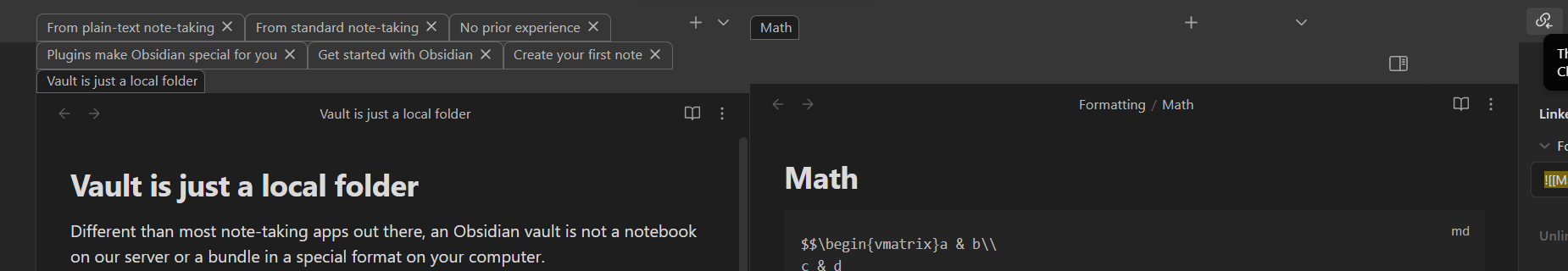
Letting tabs expand into multiple rows would fix this issue, because it opens up more space for the titles of the tabs.
Thank you for sharing the CSS. I’ve borrowed and modified it a bit, using a flex layout. If the tabs are fixed, they will automatically move to the front. Additionally, the tab styles are inspired by the BT theme settings. Here is the modified style I made:
An alternative workaround for the problem is to set a minimum tab size and scroll when the width of all the tabs exceed the available space.
/* Changes tab squish behavior from the chrome-like default (where they squish down really tiny) to firefox's (where they have a minimum size and then scroll).

Courtesy of @.bast. who wrote it for themself. https://discord.com/channels/686053708261228577/707816848615407697/1233953573851762769 */

.workspace .mod-root .workspace-tab-header {
    min-width: 100px;
}
Hey, this code to make the tab width grow/shrink automatically has been working great for a really long time, but seems like a new update just came out and now it shrinks all of my tabs so that they are incredibly small (narrow). I tried width: fit-content; but that didn’t help. Any idea how to get the tabs to autoresize properly again?
(I am experiencing this across multiple vaults on multiple devices - Mac, PC, iOS. Running version 1.8.4)
I’m currently trying a new strategy, perhaps similar to vertical tabs plugins, but simply using bookmarks:
Use bookmarks as tabs. E.g. a structure like:
Tabs
2025-02-27
some canvas
group
tabs…
group
group
etc.
(future date) - possibly do this weekly or monthly? You’ll end up with a sort of snapshot history of what files you had open, and avoid baggage.
pin/unpin tabs as needed. This keeps them “open” even if you click on a tab in your bookmark tree. Useful cause we want to treat the bookmarks as tabs, where clicking a bookmark will open files in a new tab without navigating away from anything you are working on, and much faster without the extra steps of opening a new tab and changing focus
Keep only a few tabs open at once. Bookmark them under a context/category and close them. It’s just a click away to resume. This lets you keep some structure/order not possible with tabs (and annoyingly broken with the multi-row CSS) and avoid files open multiple times etc.
I also have been creating bookmark structures that are basically like “folders” but where notes can live under multiple categories. So those are still independent from this “tabs” section of my bookmarks. It’s just another redundant way to look up info by category instead of “what I’m working on right now”
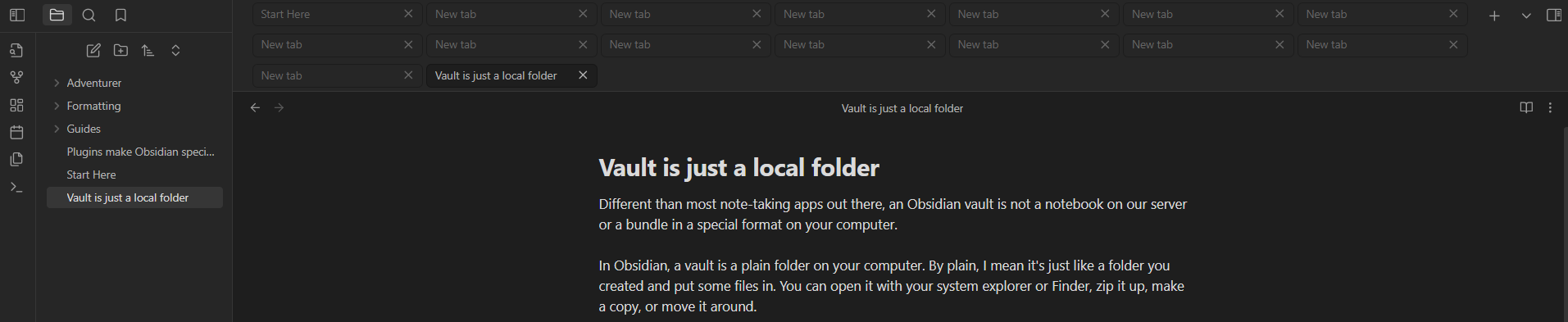
Stacked tabs are not just ugly yo look at but eat valuable vertical space, which is usually shorter than monitors are large.
As @zerkshop already mentioned, the community plugin “vertical tabs” or the core bookmark feature are much better solutions.
To improve tab management, tabs should act like folders, where you would add tabs to tab containers, and get a popout widget to make sub-tabs visible if you hover over the visible “container” tab.