Yes. One by one. The outcome isn’t perfect. kepano will do this better than I.
1 Like
Hope you get better soon brothaman, sorry to hear that.
And thank you for replying ![]() .
.
Thank you. That’s very kind. I am on the good way, and Obsidian keeps me busy and distracted !
1 Like
Dear @ryanjamurphy the moderator;
Thank you for sharing your nice tweak for “cards-style” transclusions.
I was totally fascinated by your animated Gif example.
I applied your snippet to mine (I have other working custom snippets),
but nothing was changed visually by enabling the snippet.
I suspected myself by using only light theme. Also I also tested by disabling my several snippets and theme-related plugins but it didn’t help.
I assumed that this is because of big mismatch in time between current version of minimal theme and published date of your post.
If my issue is caused by that reason, maybe you already developed the updated version of snippet which is perfectly compatible with the latest version of minimal theme.
Can I ask sharing the snippet? I have no background of coding and not familiar with css but I’m learning now.
Thank you for reading this!

Ooh this one’s noice! Btw what font are you using here? I like your colors, looks a bit like mine ![]()
Hii Ryan!
I’ve been using your snippet forever.
It was essential while I was working on my final paper.
However, ever since I updated both the Obsidian app and the Minimal theme… I can’t get it to work… I’m not very good with css
Is there a way to fix this?
Please, I really love/need this snippet ![]()
1 Like
TY Jeff for sharing your experience. can you share your used code at journal? that date view part. big “Friday” is amazing. Tanks ![]()
The big Friday is just an H1:
.markdown-preview-view h1, .markdown-preview-view h2, .markdown-preview-view h3, .markdown-preview-view h4, .markdown-preview-view h5 {
  margin-block-end:0.4em;
  margin-block-start:0.75em;
}

.empty-state-title,
.markdown-preview-view h1,
.HyperMD-header-1,
.cm-s-obsidian .cm-header-1 .cm-hmd-internal-link {
  font-family:"PP Neue Montreal TT",sans-serif;
  letter-spacing:0.08em;
  font-size:3.059em;
  font-weight:300;
  text-transform: capitalize;
  /*background-color: var(--interactive-a);*/
  color:var(--interactive-accent);
  text-align:center;
  border-bottom:none/*!important*/;
  padding-top: 15px;
  padding-bottom: 5px/*!important*/;
}

.markdown-preview-view h1 {
  margin-top: 0px/*!important*/;
  padding-top: 15px;
  padding-bottom: 5px/*!important*/;
}
The next line (the date) is an H5:
/* ==== H5 ==== */

.markdown-preview-view h5,
.HyperMD-header-5,
.cm-s-obsidian .cm-header-5 {
  font-family:"PP Neue Montreal TT",sans-serif;
  font-variant: unset;
  letter-spacing:0.05em;
  color:var(--interactive-accent);
  font-weight:350;
  font-size: 1.3em;
  text-align: center;
  padding-bottom:0.1em;
}
Some of my other snippets are posted earlier in this thread (date oct 21)
3 Likes
Thank You Bro. Great Job ![]()
I really like your dashboard setup. Would you mind sharing how you did it? Thank you.
1 Like
I downloaded the .css and placed it in my snippets folder, everything worked except for tags and bookmark, could you help me, I don’t know much about customizing. Can somebody help me?
What exactly didn’t work? Can you show a screenshot? I am using the same CSS and it is still working for me
I like your theme, it looks neat. By the way, what font did you use? I really like it.
This is a great thread which I can’t believe I haven’t stumbled upon before. So cool to see other Minimal Theme setups.
For dark mode, I love the Ayu colour scheme. I find the blue to to be quite soft and the colours feel comfortable to look at during the night and don;t lead to eye strain.
For light mode, I appreciate the Sky colour scheme for the same reason: it is soft and easy to look at. The off-white, slightly creamy tones are less pronounced than Flexoki, which I would otherwise use for a change. On that note, I advocated for a Flexoki colour scheme before and it was my default for a long time, but I find it more opinionated than Sky and Ayu. This is not a bad thing but, as a PhD researcher and full-time consultant, my head is too full of opinions as it is and lately I find these more subtle themes to be a balm for my eyes and thinking.
Noteworthy base elements include:
- Courier Prime for the text font
- Default setting for the interface font (but if I need a change, I use Myriad Pro)
- Obsidian frame for the Window frame style: I really like how this creates focus for me on the text; I used to prefer that the left and right sidebars be the same colour which I feel enhances that elements of drawing the gaze to the centre, but since using the Obsidian frame style, I’ve come to appreciate the aesthetic for how clean it looks.
- Show tab title bar is enabled because I appreciate the padding it creates between the first line of text and the top of the editor frame
- Default font size and zoom level
- Accent colour provided by the mentioned colour schemes
For myself, I use Hider to hide other elements, translating into greater minimalism in both my UI and my actual use of Obsidian.
One other change I would mention is that I like all heading levels to be the same size. That isn’t reflected in my screenshots because I can’t remember how to achieve that by injecting CSS into Style Settings, which is necessary because when using Style Settings built-in adjustments, the padding and heading sizes are not actually equal when adjusted to be.

5 Likes
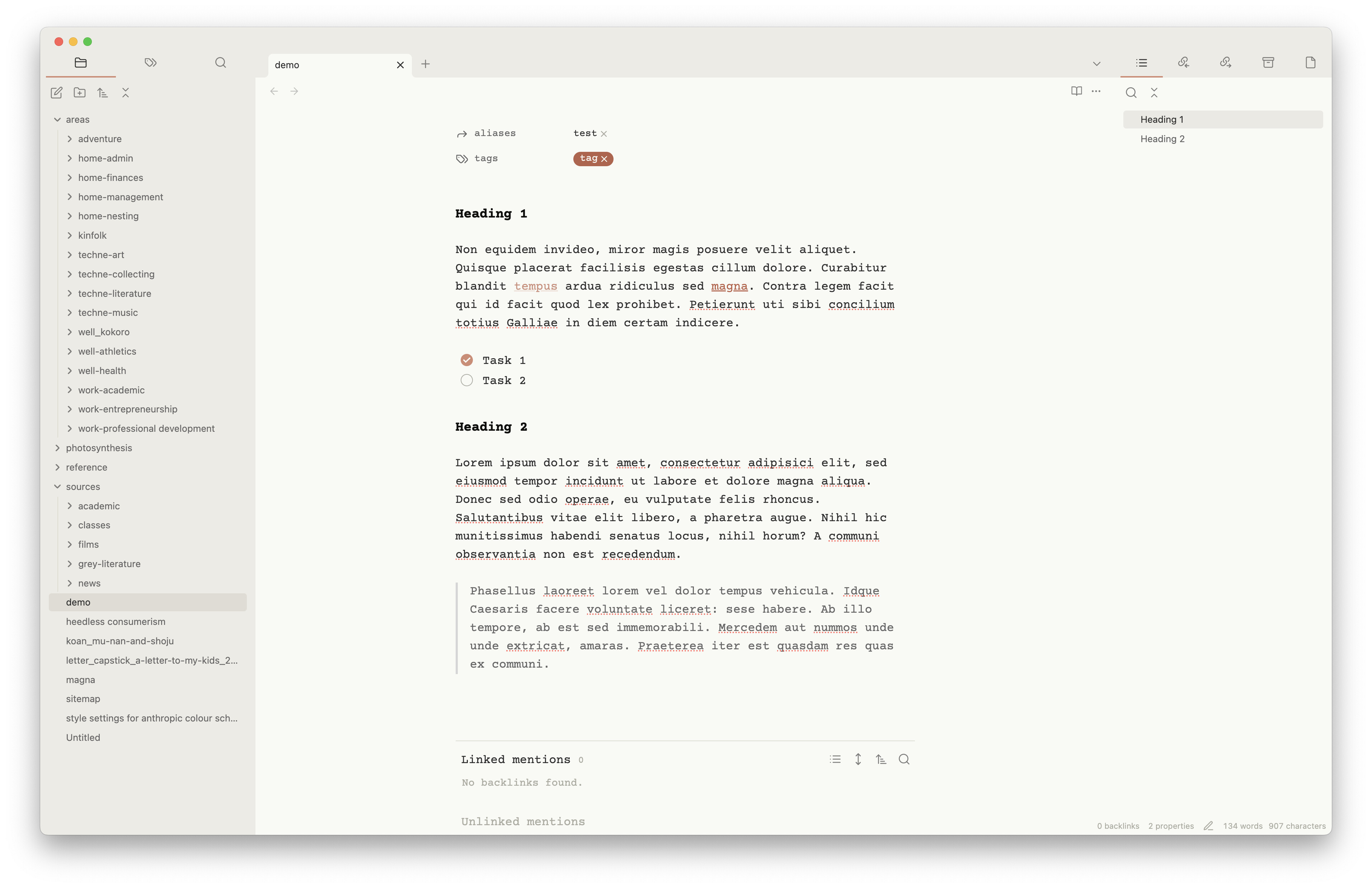
Using Style Settings, I created a colour scheme based on Anthropic. The font doesn’t match Anthropic’s because I prefer Courier Prime, but this is easily modified.
Light mode
Dark mode
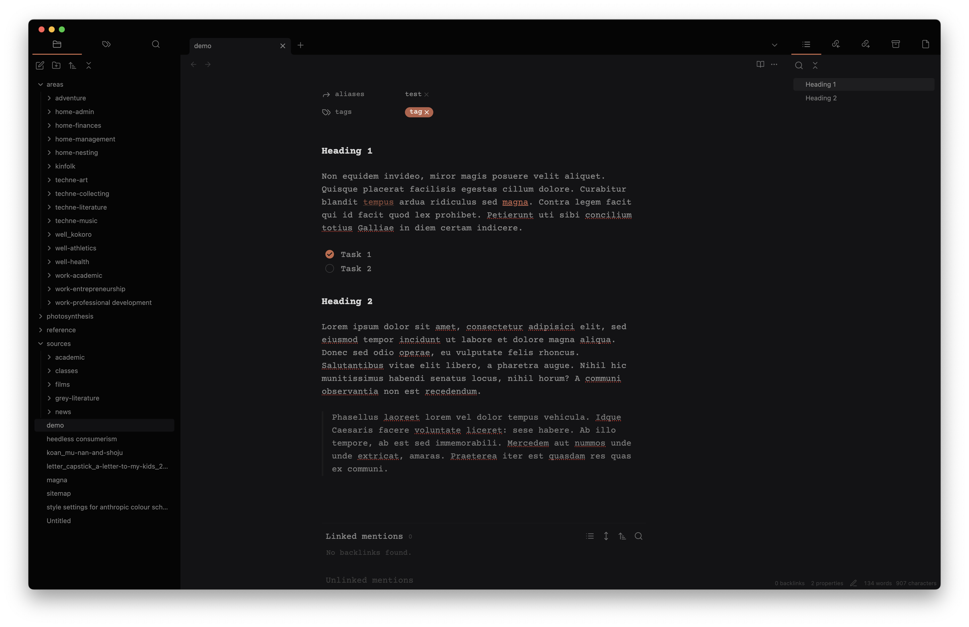
Style Settings
{
  "minimal-style@@window-title-off": true,
  "minimal-style@@metadata-add-property-off": true,
  "minimal-style@@metadata-heading-off": true,
  "minimal-style@@metadata-dividers": false,
  "minimal-style@@metadata-label-width": 10,
  "minimal-style@@h6-variant": "normal",
  "minimal-style@@h5-variant": "normal",
  "minimal-style@@h4-variant": "normal",
  "minimal-style@@h6-weight": 400,
  "minimal-style@@h5-weight": 500,
  "minimal-style@@h4-weight": 500,
  "minimal-style@@h3-weight": 600,
  "minimal-style@@h2-weight": 600,
  "minimal-style@@h1-weight": 600,
  "minimal-style@@h1-l": false,
  "minimal-style@@image-radius": 5,
  "minimal-style@@image-blend-light": false,
  "minimal-style@@zoom-off": false,
  "minimal-style@@image-grid-fit": "cover",
  "minimal-style@@sidebar-tabs-names": "tab-names-off",
  "minimal-style@@sidebar-tabs-style": "sidebar-tabs-underline",
  "minimal-style@@trim-cols": false,
  "minimal-style@@tabs-style": "tabs-default",
  "minimal-style@@h6-font": "\"\"",
  "minimal-style@@h1-font": "Courier Prime",
  "minimal-style@@base@@light": "#ECEBE4",
  "minimal-style@@bg1@@light": "#F9F9F6",
  "minimal-style@@ax1@@light": "#BE634A",
  "minimal-style@@tx1@@light": "#2F2F2F",
  "minimal-style@@blockquote-border-color@@light": "#D6D6D6",
  "minimal-style@@blockquote-border-thickness": 3,
  "minimal-style@@blockquote-font-style": "italic",
  "minimal-style@@h1-color@@light": "#10100F",
  "minimal-style@@h2-color@@light": "#10100F",
  "minimal-style@@h6-color@@light": "#10100F",
  "minimal-style@@h5-color@@light": "#10100F",
  "minimal-style@@h4-color@@light": "#10100F",
  "minimal-style@@h3-color@@light": "#10100F",
  "minimal-style@@tag-color@@light": "#F9F9F6",
  "minimal-style@@tag-background@@light": "#B86048",
  "minimal-style@@tag-background-hover@@light": "#B860482B",
  "minimal-style@@tag-border-width": "0",
  "minimal-style@@hl1@@light": "#DBA99A",
  "minimal-style@@base@@dark": "#0A0A0B",
  "minimal-style@@bg1@@dark": "#131315",
  "minimal-style@@ax1@@dark": "#BE634A",
  "minimal-style@@blockquote-border-color@@dark": "#1C1C1C",
  "minimal-style@@h1-color@@dark": "#D6D6D6",
  "minimal-style@@h2-color@@dark": "#D6D6D6",
  "minimal-style@@h3-color@@dark": "#D6D6D6",
  "minimal-style@@h4-color@@dark": "#D6D6D6",
  "minimal-style@@h5-color@@dark": "#D6D6D6",
  "minimal-style@@h6-color@@dark": "#D6D6D6",
  "minimal-style@@tag-color@@dark": "#F9F9F6",
  "minimal-style@@tag-background@@dark": "#B86048",
  "minimal-style@@tag-background-hover@@dark": "#B860482B",
  "minimal-style@@tx1@@dark": "#8C8C8C"
}
4 Likes
Sorry for posting again in such short order since my last update, but I wanted to share this altered Outline View which I think suits Minimal Theme quite nicely.
Using this snippet from @ariehen I was able to remove the active header highlighting as well as the arrows and replace with a single line that moves depending on which header is active (same function as the highlighting).
Then using Style Settings, I made the Border color the same as the Primary color to hide the indentation lines.
.workspace-leaf-content[data-type="outline"] .tree-item-self.is-active {
    color: var(--nav-item-color-active);
    background-color: transparent;
    border-left: 1px solid;
    /*border-radius: 0;*/
}
.workspace-leaf-content[data-type="outline"] .tree-item-self.is-active {
    color: var(--nav-item-color-active);
    background-color: transparent;
    border-left: 1px solid;
    border-radius: 0;
}
.workspace-leaf-content[data-type="outline"] .tree-item-icon {
    opacity: 0;

    &:hover {
        opacity: 1; }
}

Interesting, I hadn’t considered a left border like that. My outline tab is styled like this:
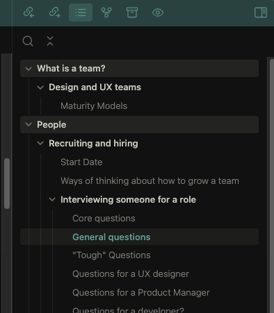
The snippet styles anything that is at the top level (h1) with the light gray background, and also makes anything that has subheadings the strong white colour. Currently selected/active heading gets the accent colour. I find all of this gives just enough visual structure to the outline that I find it much more useful.
For anyone that wants it, here’s the snippet file:
outline-tweaks.css (784 Bytes)
2 Likes
Does anybody know the CSS snippet to get text labels for primary navigation?