It is a setting available in the Minimal Theme plugin.
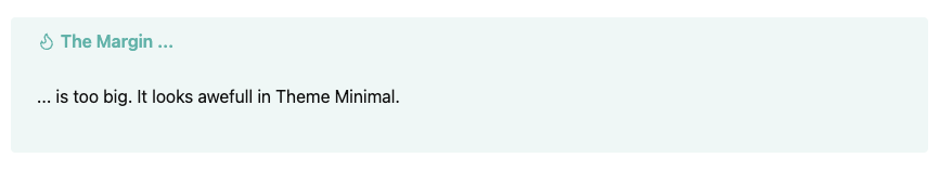
For whatever reason, the callouts in minimal theme are bigger than needed.
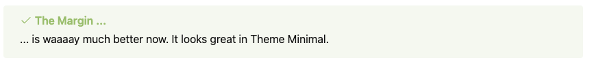
I added this snippet to the snippet folder, to make callouts looking “great again”.
.callout-content p {
    margin-block-start: 4px;
    margin-block-end: 4px;
}
4 Likes

Few tweaks to heading colors using the Style Settings Plugin
Then I’m using a cut down Snippet of the Cybertron theme which uses DM Sans as the main font. I didn’t like everything in the Cybertron theme so I took a lot of styles out plus by setting Minimal as primary I can customise it still.
cyber-theme.css (676.2 KB)
The thing that keeps me on Minimal is Cards and Table Helper Classes - Tables - Minimal Documentation
I haven’t seen any other theme be able to replicate the Table Classes which are necessary for Dataview Tables
If I could add some AnuPpuccin elements into Minimal it would be awesome (rounded callouts, styled properties box, etc)
Made a video on how I set it up

Like everything I try to make subtle changes every now and then but it seems to be working for me as the Vault is evolving

1 Like
Does anyone know how to change the background color of the sidebar?
Using the Minimal theme in light mode with “Light mode background contrast” set to High contrast. Have Style Settings and Minimal themes settings installed but can’t seem to find a setting/color that matches this.
It does change when changing between the built-in color schemes so it should be possible!
In minimal, you can use --bg2
--bg2: var(--background-secondary);
There are other ways to achieve this depending on what you want to do
Hello , i really like your two columns presentation. Is-it just with the minimal theme ? Or with mcl snippets ? Or a plugin?
With just the image and text wrapping, like with author images, Minimal theme is enough. The one with the callout for summary is MCL Multicolumn
1 Like
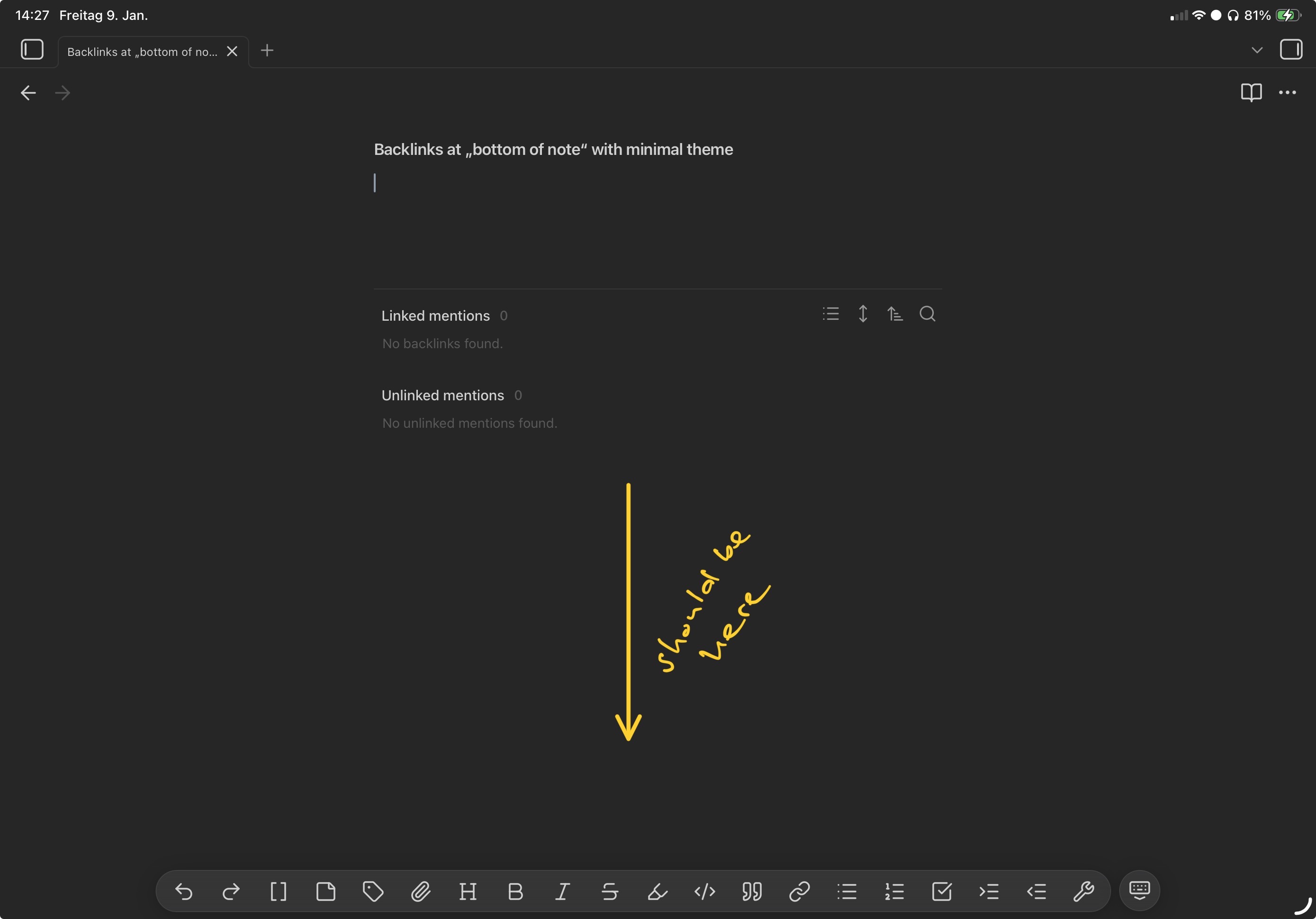
The backlinks at the bottom of the note aren‘t really at the bottom of the note when using Minimal Theme but rather at a fixed distance below the end of the note. This results in the backlinks being in the top half of the screen when creating a new note which triggers my claustrophobia.
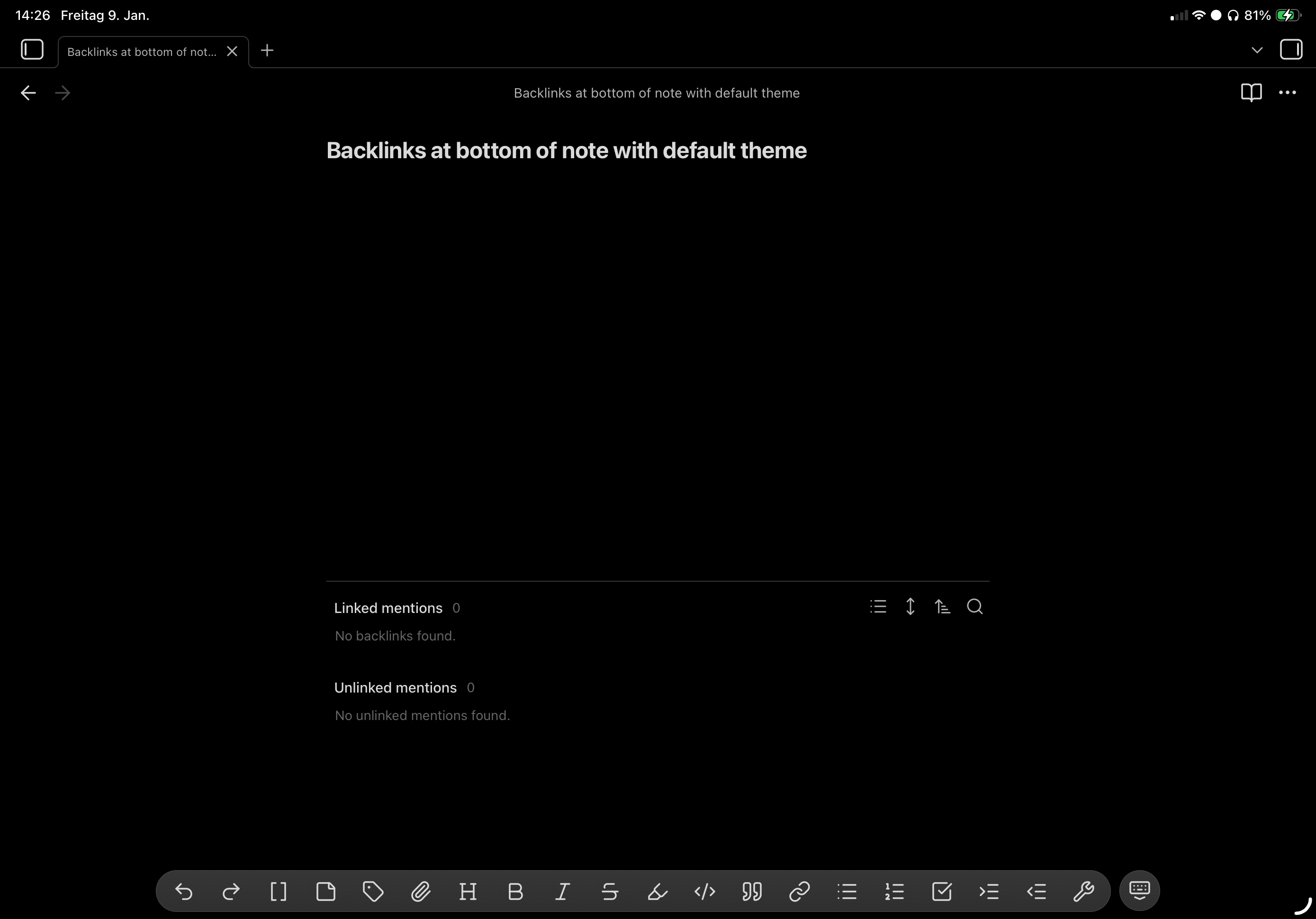
In comparison the Default Theme does it properly. It even adjusts to the virtual keyboard, sliding up when the keyboard is shown.
Same behavior on iPad and iPhone in a clean vault.
I didn‘t find any mention in the Minimal Theme Settings, Style Settings or in the forum. Any idea? Maybe a CSS to disable Minimal Theme‘s behavior?