pzol
December 4, 2021, 6:37am
1
I mostly use fronmatter only to define aliases for my notes, so I define it once and then usually it just uglifies my note
Toggle/show frontmatter in live preview via the three dot menu (similar to toggle backlinks in document)
Css hack - but that doesn’t remove the gutter triangle
div.is-live-preview span.cm-hmd-frontmatter { display: none; }
Is there a way to hide the frontmatter in regular preview mode (not live)? I’d like to be able to do this too.
Settings → Editor → Show frontmatter
Hm, thanks, that doesn’t work. That was already off, but it’s still showing up.
This might be down to a theme. If you are using a theme, does it work if you turn the theme off? It if does, you might be able to tweak the theme with some custom CSS. Probably worth checking / eliminating as a possible cause.
Angel
Good idea, thanks, so I turned off the theme, all snippets and all plugins but it still shows up…
Mmmm, as a test, does it show up if you add some front matter in the help vault?
Angel
EDIT: Using aliases? This post might help:
Try this css snippet (I didn’t try it, not sure if works):
.frontmatter-container {
display: none;
}
Curious. Using aliases? If yes, this post might help:
Try this css snippet (I didn’t try it, not sure if works):
.frontmatter-container {
display: none;
}
Angel
I can confirm your workaround works. And I agree with your proposed solution.
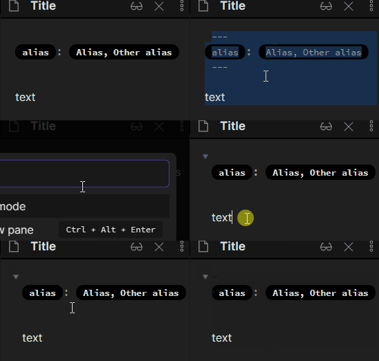
Here’s my little CSS to make live preview mode look a bit more like reading view.
Showing here live preview and source view, without and with folds.
.is-live-preview .cm-line .cm-hmd-frontmatter {
  color: var(--text-muted);
}
.is-live-preview .cm-line:not(.cm-active) > .cm-hmd-frontmatter:not(.cm-meta) {
  font-size: 0.8em;
  color: inherit;
  font-weight: 600;
  border-radius: 0.8em;
  padding: 0.2em 0.8em;
  background-color: var(--background-secondary-alt);
}
.is-live-preview .cm-line > .cm-hmd-frontmatter:not(.cm-meta) .cm-selection,
.is-live-preview .cm-line > .cm-hmd-frontmatter:not(.cm-meta).cm-selection {
  color: var(--text-muted);
  background-color: var(--text-selection) !important;
  font-weight: initial;
}

.is-live-preview .cm-line:not(.cm-active) .cm-hmd-frontmatter.cm-def {
  visibility: hidden;
}
.is-live-preview .cm-line .cm-hmd-frontmatter.cm-def .cm-selection {
  visibility: visible;
}
Farrukh
January 11, 2023, 7:48am
12
This worked better than anything else. Never mind for the gutter space.
ize
January 18, 2023, 7:55pm
13
Thank you SO much for that code! Works like a treat!
I don’t think that can be done from CSS unfortunately, but someone else might have an idea.
The plugin “Toggle meta YAML” does this.
You can pair it with the commander plugin to make it a clickable option in your workspace.
Nice! Gonna try it tomorrow.
With properties introduced in Obsidian 1.4, this is largely obsolete.
For styling properties I recommend this:
With all the new Properties coming on the block, ahem in your notes, you may wonder: do I want the full red carpet experience or the exposed brick for the front? Okay, I’ll stop.
The first place you are going to want to check is Settings -> Editor -> Properties in document.
Visible: The default setting.
Hidden: The Properties view interface is hidden in both Reading View and Live Preview.
Source: The Properties view interface is rendered in Reading View, and shown as raw YAML in Live Preview.
…
This is what I use now to achieve a similar effect as before:
/* no heading, no folding */
.metadata-properties-heading {
  display: none;
}
/* no add button */
.metadata-container .metadata-add-button {
  display: none;
}

/* no bottom margin / padding (where it meets the note) */
body {
  --metadata-padding: var(--size-4-2) 0 0 0;
}
.metadata-container {
  margin-block-end: 0;
}

/* pill-like */
.metadata-property[data-property-key='aliases'] .multi-select-pill {
  font-weight: var(--font-semibold);
  background-color: var(--color-base-30);
  padding: var(--tag-padding-y) var(--tag-padding-x);
}
This is implemented with the hidden option.