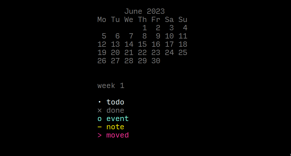
I ran into this cool idea yesterday while doing research into mapping BuJo methods onto plain text:
Source
I’m using the minimal theme and I was wondering if there’s any way to change the text colour of alternate checkboxes? For instance, I see that - [-] has the text greyed out, so I’m assuming there’s a way to do that with other types of alternate checkboxes, too.
Thanks in advance!
ariehen
February 17, 2024, 12:54am
746
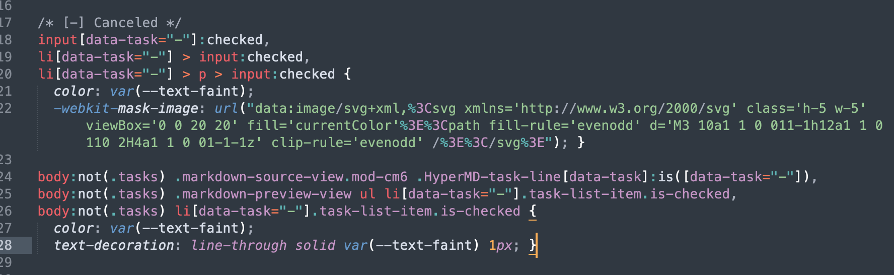
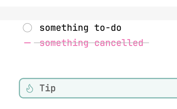
Looking at how Minimal does it , you could make a CSS snippet to override Minimal’s color: var(--text-faint); for the canceled checklists.
/* [-] Canceled */
input[data-task="-"]:checked,
li[data-task="-"] > input:checked,
li[data-task="-"] > p > input:checked {
  color: hotpink;
  -webkit-mask-image: url("data:image/svg+xml,%3Csvg xmlns='http://www.w3.org/2000/svg' class='h-5 w-5' viewBox='0 0 20 20' fill='currentColor'%3E%3Cpath fill-rule='evenodd' d='M3 10a1 1 0 011-1h12a1 1 0 110 2H4a1 1 0 01-1-1z' clip-rule='evenodd' /%3E%3C/svg%3E"); }

body:not(.tasks) .markdown-source-view.mod-cm6 .HyperMD-task-line[data-task]:is([data-task="-"]),
body:not(.tasks) .markdown-preview-view ul li[data-task="-"].task-list-item.is-checked,
body:not(.tasks) li[data-task="-"].task-list-item.is-checked {
  color: hotpink;
  text-decoration: line-through solid var(--text-faint) 1px; }
2 Likes
holroy
February 17, 2024, 12:56am
747
You beat me to it, @ariehen .
Based upon using Minimal theme in default, I played around and found what I needed to add my own custom icons as alternative checkboxes, and I found that I need two sections with a total of 6 CSS selectors to properly define them.
2 Likes
ariehen
February 17, 2024, 1:00am
748
That’s great info as well!
1 Like
ryadaj
March 19, 2024, 7:46pm
750
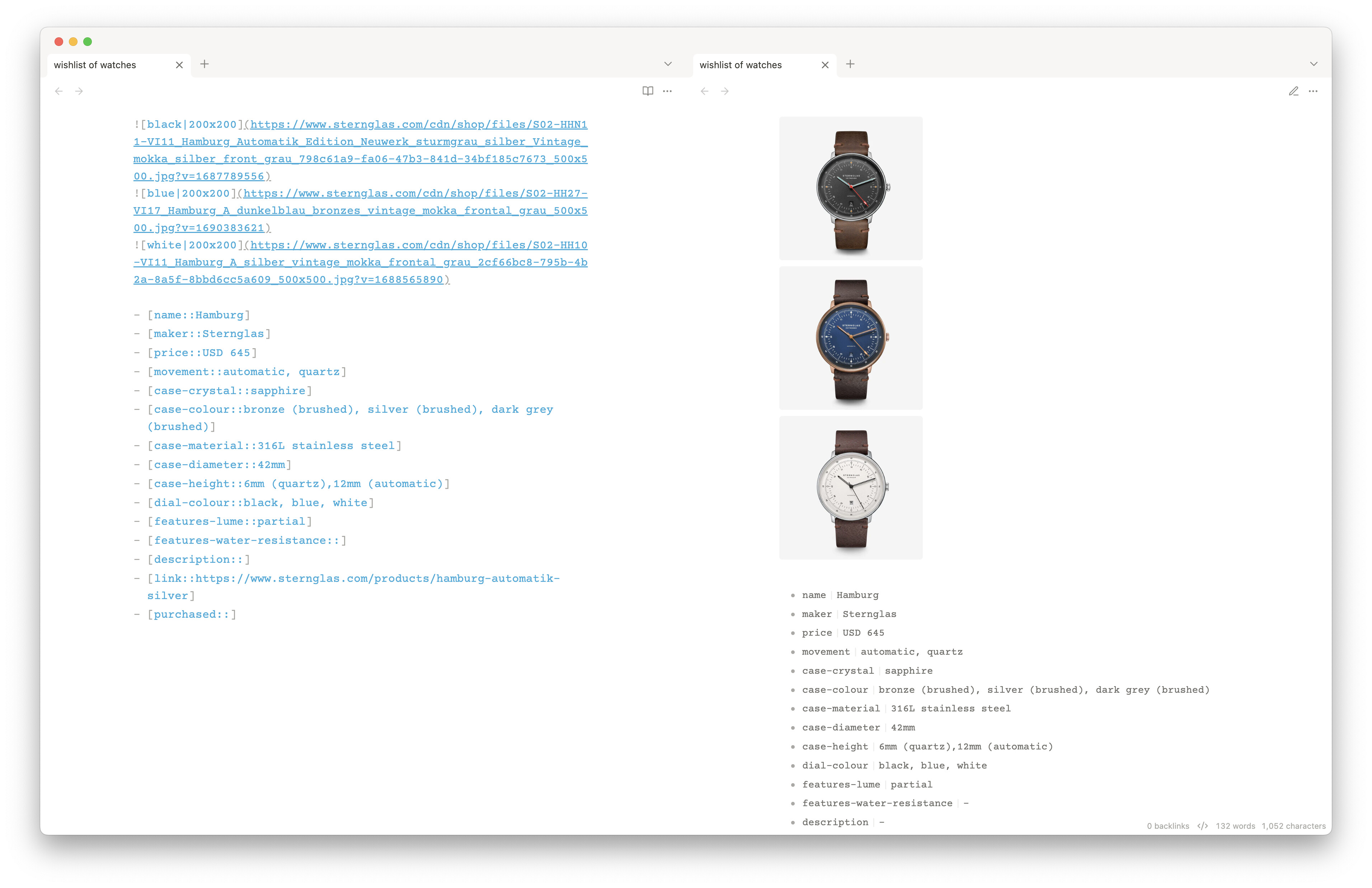
Does the image grids feature work with external images? I have it enabled in Minimal Theme Settings and the images are arranged consecutively.
edit 2024-03-20: never mind due to Is there a way to use image grid with standard markdown syntax · Issue #657 · kepano/obsidian-minimal · GitHub
edit 2024-04-06: never mind again due to recent update which allows for expanded image grid functions including Markdown links; thanks Kepano!! Release 7.5.4 · kepano/obsidian-minimal · GitHub
Koen
July 3, 2024, 4:01pm
752
Is there a way to rotate table headers 90 degrees? I would like to have vertical table headers instead of horizontal headers, so that I can have a very small column width.
Thank you!
Is there a way to make the “Breadcrumb Trail” at the top of the note always visible? On the default theme at the top of a note it will show the directory a note is stored in (for Example Notes / Daily / 08-14-2024) that is clickable so you can navigate to each folder. In Minimal theme, this only appears when you mouse over that section of the screen. I’m guessing a setting is available somewhere to toggle this but I can’t seem to find it (and I’m not sure what Obsidian calls this section; breadcrumb, folder structure, something else. Any ideas?
1 Like
Finally found it in Style Settings. For posterity:
Style Settings > Minimal > Titles > Tab title visibility > Change to “Visible”
Sharing my versions that don’t affect the tab container (tab switcher) background:
Right sidebar matches left
body {
  --custom-sidebar-bg: var(--background-secondary);
}

.workspace-split.mod-horizontal.mod-left-split,
.workspace-split.mod-horizontal.mod-right-split {
  background-color: var(--custom-sidebar-bg) !important;
}

.mod-left-split .workspace-leaf-content,
.mod-right-split .workspace-leaf-content,
.mod-left-split .view-content,
.mod-right-split .view-content,
.mod-left-split .workspace-tab-header-container,
.mod-right-split .workspace-tab-header-container {
  background-color: var(--custom-sidebar-bg) !important;
}

.mod-left-split .workspace-leaf-content > *,
.mod-right-split .workspace-leaf-content > *,
.mod-left-split .workspace-tab-header-container > *,
.mod-right-split .workspace-tab-header-container > * {
  background-color: var(--custom-sidebar-bg) !important;
}
[Minimal] Right sidebar matches left.css (783 Bytes)
Sidebars à la default theme
[Minimal]_Sidebars_à_la_default_theme.css (1.6 KB)
body {
    --titlebar-background: var(--background-primary) !important;
    --titlebar-background-focused: var(--background-primary) !important;
}

.workspace-tab-header-container,
.workspace-tab-header-container::before,
.background-secondary-remover .workspace-split.mod-left-split .workspace-tabs.mod-top .workspace-tab-header-container,
.background-secondary-remover .workspace-split.mod-left-split .workspace-tabs.mod-top .workspace-tab-header-container::before,
.background-secondary-remover .workspace-split.mod-left-split .workspace-tabs.mod-top .workspace-tab-container-inner {
    background-color: var(--background-primary) !important;
}

.background-secondary-remover .mod-left-split .workspace-tabs.mod-top .workspace-tab-header-container {
    padding-left: 0;
    padding-right: 0;
    border-bottom: none;
}

.background-secondary-remover .workspace-tab-container-before,
.background-secondary-remover .workspace-tab-container-after {
    display: none !important;
}

.is-hidden-frameless:not(.minimal-dark-black):not(.colorful-frame):not(.minimal-dark-tonal):not(.minimal-light-white) .workspace-ribbon.mod-left:not(.is-collapsed) {
    --titlebar-background: var(--background-primary) !important;
}

body:not(.sidebar-color) .mod-right-split {
    --background-secondary: var(--bg2) !important;
}

body:not(.sidebar-color) .mod-right-split :not(.mod-top) .workspace-tab-header-container {
    --tab-container-background: var(--background-secondary);
}

body:not(.sidebar-color) .workspace-split .workspace-tabs:not(.mod-top) .workspace-tab-header-container {
    background-color: var(--background-secondary) !important;
}
Also improved your version to target the leftmost element in the tab container when the left sidebar is collapsed:
Matching background for sidebars & tab container
body.is-focused .titlebar,
body.is-focused .workspace-ribbon.mod-left {
   --titlebar-background: var(--bg2) !important;
}

/* Add styles for unfocused state */
body:not(.is-focused) .workspace-ribbon.mod-left {
   --titlebar-background: var(--bg2) !important;
}

/* Target the :before pseudo-element specifically */
.workspace-ribbon.mod-left.is-collapsed:before {
   background-color: var(--bg2) !important;
}

.sidebar-toggle-button,
.workspace-tabs.mod-top {
   --tab-container-background: var(--bg2) !important;
}

.workspace-tab-header-container {
   --titlebar-background-focused: var(--bg2) !important;
}

body.is-focused {
   --titlebar-background-focused: var(--bg2) !important;
}

body:not(.sidebar-color) .mod-right-split {
   --background-secondary: var(--bg2) !important;
}

body:not(.sidebar-color) .mod-right-split :not(.mod-top) .workspace-tab-header-container {
   --tab-container-background: var(--bg2);
}
[Minimal] Matching background for sidebars & tab container.css (925 Bytes)
Custom plugin for Minimal Theme to update accent color based on current view (Reading/Live Preview/Source):
A frustrating irk of Obsidian is constantly toggling between reading and editing modes – either trying to edit while in reading mode, or forgetting to switch to reading mode when just browsing. Visually conflicting icons certainly don’t help. This little irk of mine turned into a totally-not-worth-the-time-investment ‘development’ of a custom plugin while possessing zero coding knowledge, w/ the help of a little chatbot you might’ve heard of. Thank goodness for AI assistance!
[macOS]
I find t…
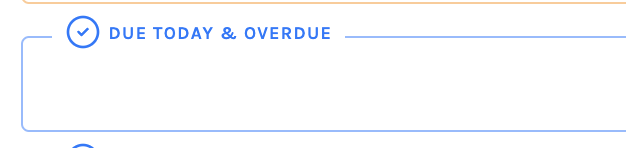
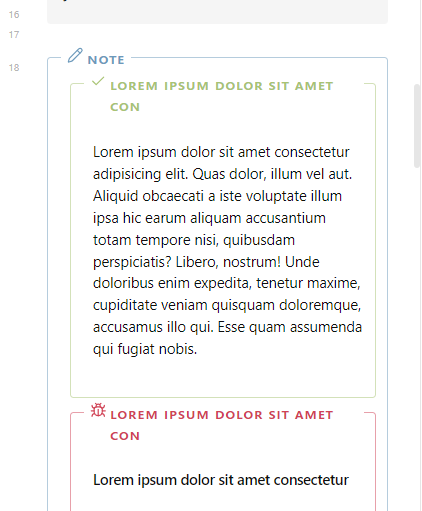
I use callouts a lot, especially to visually group queries. And I prefer the outlined style because I find it less distracting.
However, the fontsize title component of the outlined style is just too small for my aging eyes.
I cannot for the life of me figure out what style setting or css variable to alter, to make that font larger.
Can anyone explain briefly how to do that?
ariehen
November 8, 2024, 12:26pm
758
I think I know what area you mean, but can you share a screenshot (pointing out the area/title) just to be sure?
See the image below. The text DUE TODAY AND OVERDUE is far too small.
ariehen
November 10, 2024, 10:25pm
760
Give this a go:
.callouts-outlined .callout-title-inner {
    font-size: 1.4em; /* px value is also fine here */
}
1 Like
That worked great!
Thanks!
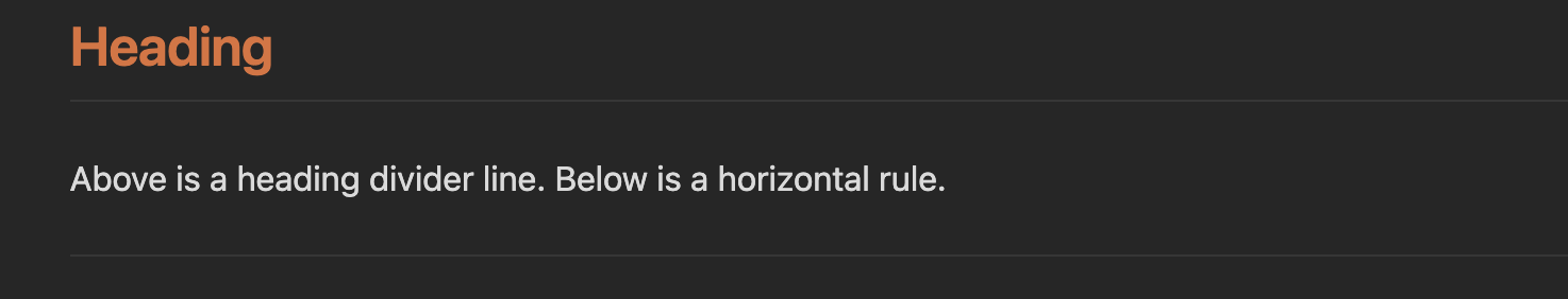
This snippet makes horizontal rules a bit thinner—to match the width of heading divider lines (that can be enabled in Style Settings ):
CSS snippet
1px_horizontal_rule.css (213 Bytes)
.cm-line.hr {
  max-height: 1px;
  border-bottom: 1px solid var(--background-modifier-border);
}

.markdown-preview-view hr {
  height: 1px;
  border: none;
  background-color: var(--background-modifier-border);
}
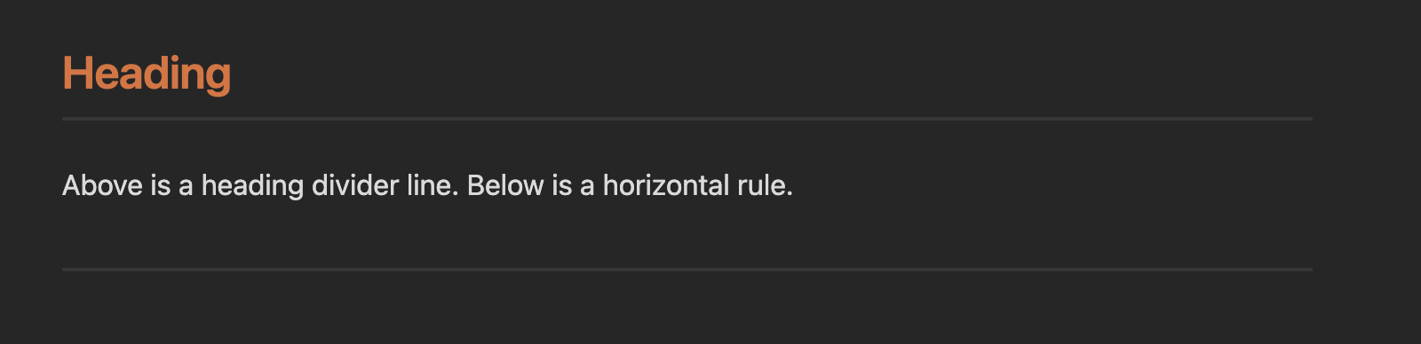
Alternatively, this snippet makes divider lines thicker—to match the width of horizontal rules:
CSS snippet
[Minimal]_2px_heading_divider_lines.css (1019 Bytes)
/* Define heading divider width variable */
:root {
 --heading-divider-width: 2px;
}

/* Apply to headings */
.h1-l .markdown-reading-view h1:not(.embedded-note-title),
.h1-l .mod-cm6 .cm-editor .HyperMD-header-1 {
   border-bottom: var(--heading-divider-width) solid var(--h1l);
}

.h2-l .markdown-reading-view h2,
.h2-l .mod-cm6 .cm-editor .HyperMD-header-2 {
   border-bottom: var(--heading-divider-width) solid var(--h2l);
}

.h3-l .markdown-reading-view h3,
.h3-l .mod-cm6 .cm-editor .HyperMD-header-3 {
   border-bottom: var(--heading-divider-width) solid var(--h3l);
}

.h4-l .markdown-reading-view h4,
.h4-l .mod-cm6 .cm-editor .HyperMD-header-4 {
   border-bottom: var(--heading-divider-width) solid var(--h4l);
}

.h5-l .markdown-reading-view h5,
.h5-l .mod-cm6 .cm-editor .HyperMD-header-5 {
   border-bottom: var(--heading-divider-width) solid var(--h5l);
}

.h6-l .markdown-reading-view h6,
.h6-l .mod-cm6 .cm-editor .HyperMD-header-6 {
   border-bottom: var(--heading-divider-width) solid var(--h6l);
}
1 Like
 I was going to be a little lazy and refer to my own answer from some time ago: