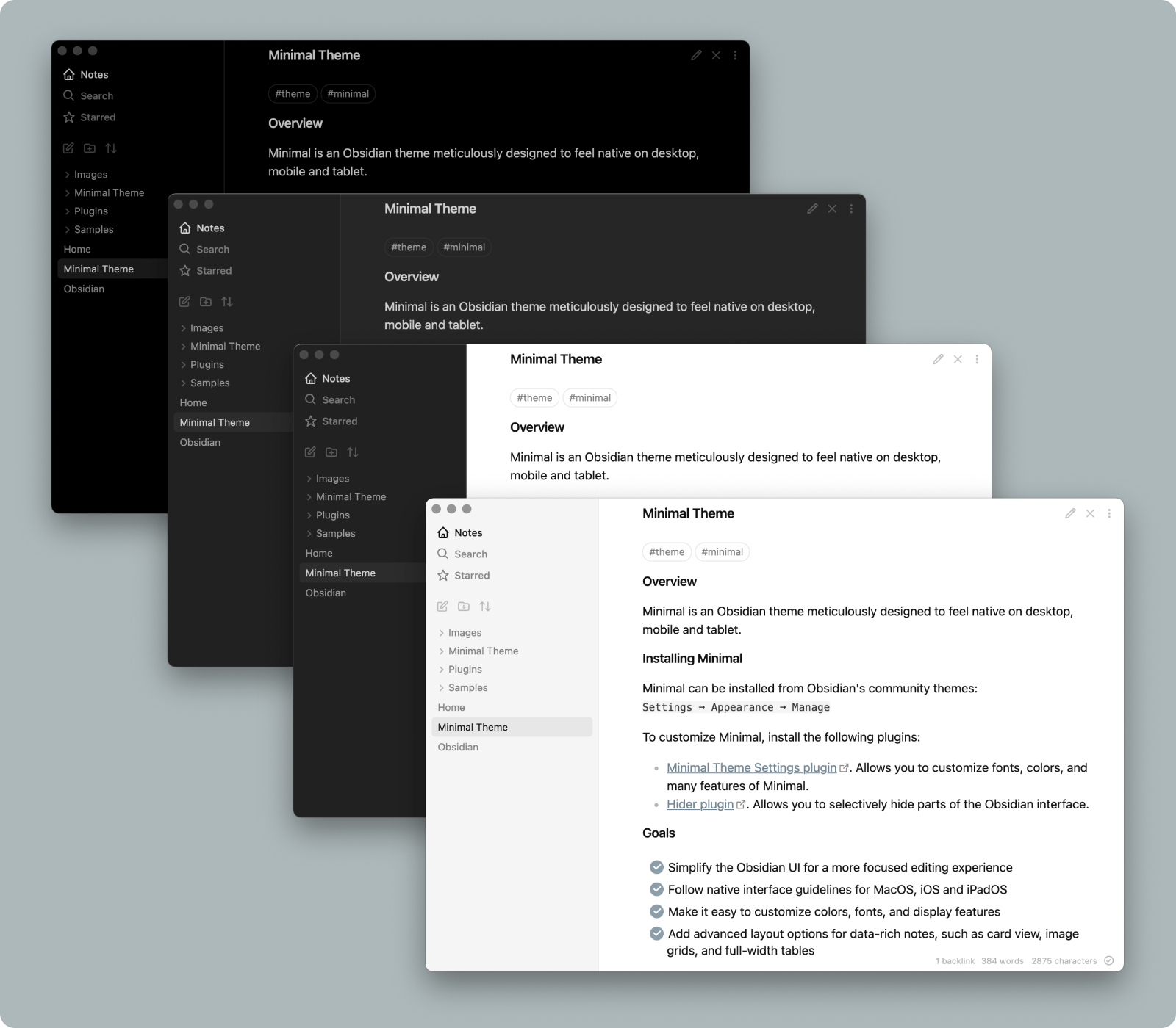
I just recently started using Obsidian (love it!) and have a question regarding the current Minimal theme and screenshots displayed on the Minimal Guide website.
I completed the following steps outlined on the website:
I then Configured Obsidian for a more “macOS-native appearance”:
Obsidian Appearance settings
Hider plugin settings
Minimal Theme Settings plugin settings
However, for the Minimal Theme Settings plugin, when I turned on “Text labels for primary navigation” the interface does not look the same as the screenshots displayed on the Minimal Guide website.
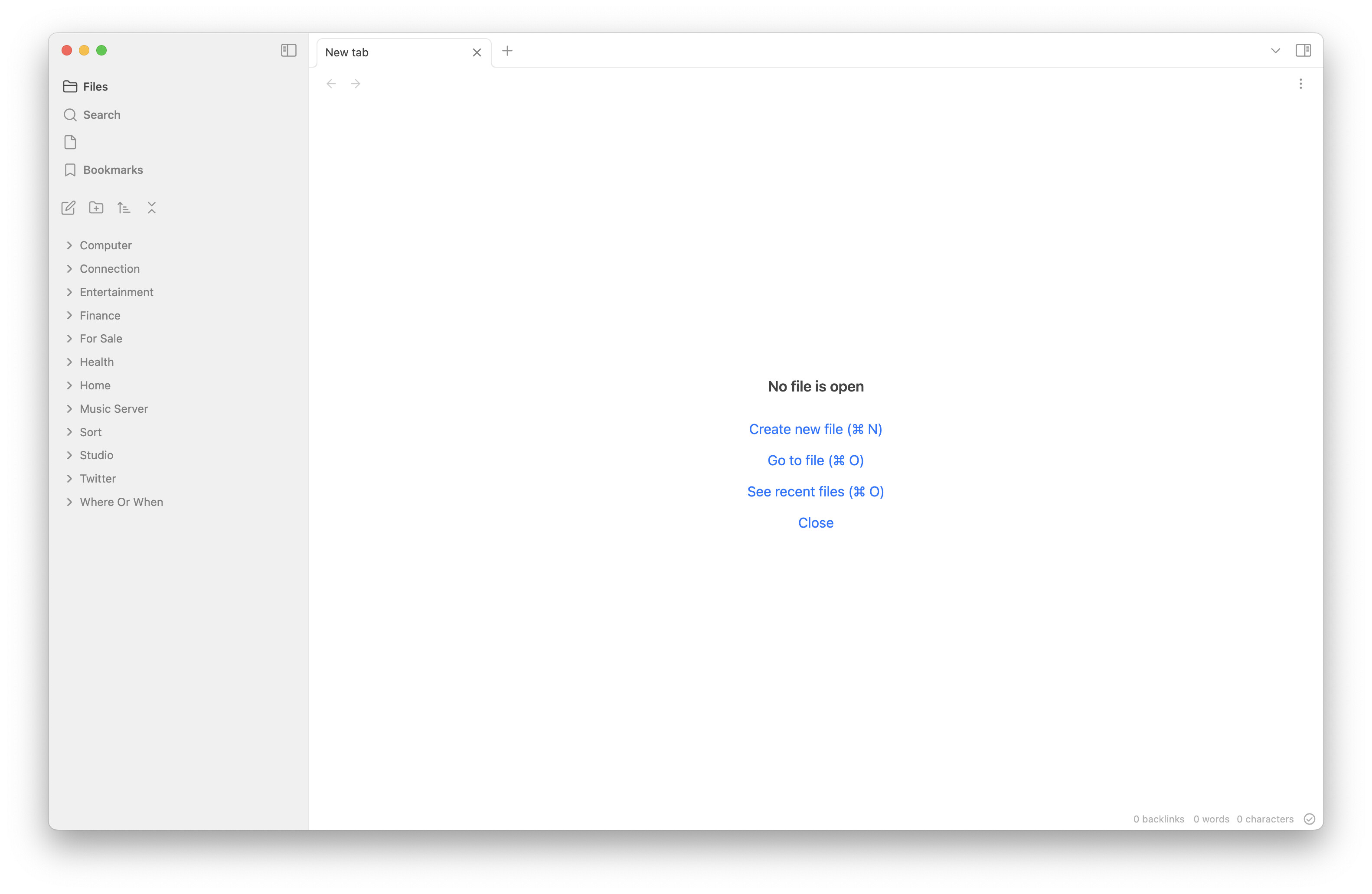
Instead of a House icon labeled “Notes” … I have a Folder icon labeled “Files”.
The Magnifying Glass icon labeled “Search” is next.
Instead of a Star icon labeled “Starred” … I have a Document icon with no label … and clicking on that icon displays a message “Plugin no longer active. The plugin that created this view (starred) has gone away.”
Below that is a Bookmark icon labeled “Bookmarks” and I’m wondering if that provides the same function as the non-existent Starred icon/label?
Is this difference due to the passing of time? Since it appears that the Minimal Theme was created in 2020.
And how do I remove the non-functional Document icon?
Hey everyone, is there any way to pinpoint the css bits that render the code blocks in the reading view? I quite like them and I am trying to replicate them in a simple website project of mine.
Hi all, I’ve combed through the Style Settings and tried almost all of them, but can’t seem to figure out how to change the color of the line that separates the main viewer window and the sidebar, does anyone have insight into how to change this?
The color is set in Style Settings → Interface colors → Border color
if you want to create a snippet for it, the better approach is to target the variable directly, which needs to be done separately for light and dark mode:
Really loving minimal! Just one quick question, would it be possible to change the background color of the right sidebar like in fig. A?(like the default theme, but also with the tab bar as well)
on a side note, both answers above don’t answer @evanjohnson’s question, @ScottKillen’s snippet only changes some of the borders (fig. B) and @kepano’s setting doesn’t change anything related to the question (fig. C)
If you type Ctrl-Shft-I, the inspection dialog will open. You can your the selector pointer (top left of the inspector window) to select the element you want to change. Then you can replace the element in the snippets we provided.
Hi! I’m having a problem with how minimal theme invers colors for pdf files, which for me is undesirable behaviour as it messes out images inside. Is it possible to disable this color-inversion for pdfs without switching the whole theme to light mode?
Hi kepano! I’m back on the Minimal theme yet again because I need cards. How do I disable the reduced opacity of images in dark mode, please? I’m a sewist so I need to be able to match fabric colors by their images. Thank you for your awesome work!
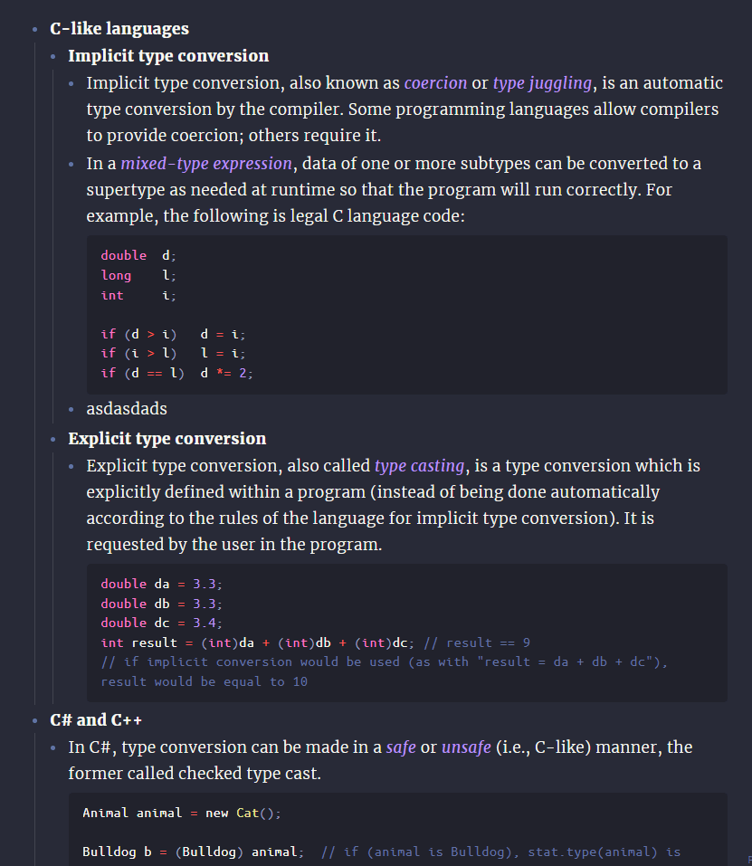
Hi! Here’s an improvement for spacing of list elements I’d like to share. It involves a concept in visual design which tells that inner spacing of an element must not be equal or greater than its outer spacing.
So this CSS does exactly that:
body.minimal-theme {
    --list-spacing: 0!important;
    --list-spacing-1: 0.4rem;
    --list-spacing-2: 0.3rem;
    --list-spacing-3: 0.2rem;
}

div > * > li:not(:last-child) { /* All level 1, excluding last */
    margin-bottom: var(--list-spacing-1);
}

div > * > li > * > li:first-child { /* All first level 2 */
    padding-top: var(--list-spacing-2);
}

div > * > li > * > li:not(:last-child) { /* All level 2, excluding last */
    margin-bottom: var(--list-spacing-2);
}

div > * > li > * > li > * > li:first-child { /* All first level 3 */
    padding-top: var(--list-spacing-3);
}

div > * > li > * > li > * > li:not(:last-child) { /* All level 3, excluding last */
    margin-bottom: var(--list-spacing-3);
}
Now all list items have spacing based on their hierarchy. I did 3 levels, because further you simply have your line height (that prevents list items from collapsing). It may not look like much, but in the long run this actually helps traversing through large nested lists.
You can fiddle with the variables for greater effect. Mine are hand-tuned to match fonts I use and the rest of my settings.
Would you ever consider making block width an optional feature, then? I’m finding it very difficult to use Vim bindings when I can’t easily see which lines of text line up with which numbers. This theme does a lot of things I really like – the checkbox icons especially are indispensable – but this one limitation is impactful enough that I’m facing the unhappy prospect of disabling the theme and cobbling together the features I need out of a heap of CSS snippets.
For some reason, the numerals in ordered lists are being controlled by the “Faint text color” setting. I noticed this because the numbers were so much darker than the text. I can lighten “Faint text color,” but then it wouldn’t have the dim color for empty checkboxes, disable statuses, etc.
Assuming something is wrong, how can I fix this?
Is there some reason why the number color is not controlled by the “normal text color” setting?