You would need to do this via a CSS snippet if you want full control.
Hi! Is it possible to have the option to make internal link uppercase in the style settings?
For example on Sanctum theme there’s this option:
Thank you very much.
cards are really great!![]()
I wonder if it could present Masonry Layout ?
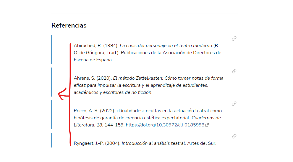
Is there a way to adjust the padding of the backlinks? I’ve activated “backlinks in document”. In edit mode the Linked mentions are aligned to the very left of the page, while in reading mode they are aligned to the text in the page
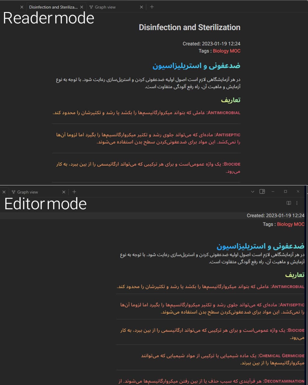
Edit mode
Reading mode
Hello. First, sorry for the bad English. Second. With the new update the space between the margin and the text in links like “![[]]” was increased and I wanted to know how to reduce it. Thanks.
I am not sure if I understand you well, but it may have to do with a setting in the Style Settings plug-in.
If you open the basic Minimal Style Settings, then Embeds and transclusions, then enable Use strict embed style globally.
Thank you very much for answering. Enabling Use strict embedding style globally only removes the blue horizontal line (which I also wanted).
I actually want to remove (or reduce) the indent/margin
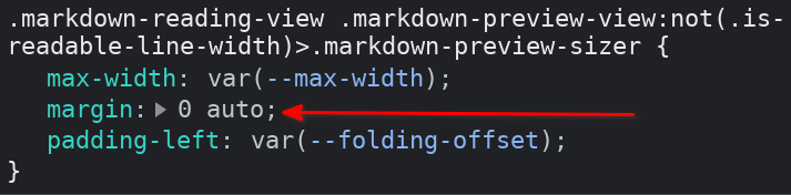
I have the same problem as @brucvas, with extremely-indented embeds in reading mode. From the inspector, I determined that it’s attributable to this CSS which applies to a div inside the embed and sets the horizontal margins to auto. The effect is that it calculates an uncomfortably large left margin for embeds if you have something like max-width: 88% (the default).
(Consequently, the embeds even get more and more indented the more you widen the window, because of auto.)
An additional data point: the problem only exists if Obsidian’s core setting Editor > Display > Readable line length is turned off.
1 Like
Thank you very much @tsion. Changing the margin to 0 solved my problem. ![]()
.markdown-reading-view .markdown-preview-view:not(.is-readable-line-width)>.markdown-preview-sizer {
	max-width: var(--max-width);
	margin: 0;
	padding-left: var(--folding-offset);
}
I use RTL language and new to obsidian. there 2 problems with the minimal theme which is as follows:
1 - The margin on the right side is adjacent to the borders of the note, as in the picture
2 - When I put callout it appears in the center of the page
thank you
Hello! Is there anyway to adjust the look of checkboxes so it looks more like the default theme (in editing view source mode)? The first picture is with Minimal Theme while the second picture is when I switch over to the default theme.
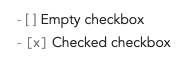
FYI, this issue in the default theme also affects Minimal:
Noticed that the problem was gone today when updating, and checked the release notes for the latest version 6.2.3:
Also fixed formatting of empty tasks in editor to use monospace like the default theme, to better align checked/unchecked checkboxes.
… so thank you ![]()
Hello, does everyone know how to export minimal theme image grids on pdf? For example on reading view I see two images side-by-side but on pdf exported they are just one after the other like obsidian standard theme. Is it possible to “fi” this?
Thank you @kepano , I’ve read the link you provided but there is no fix from what I understood or not?
That’s correct, it’s an outstanding feature request that hasn’t been implemented yet. Without it, helper classes cannot be applied to PDFs.
1 Like
Oh ok, I’ll wait then. Unfortunately from a PDF exporting standpoint obsidian lack quite a bit, not having the option to produce clickable internal link too. Let’s see if this will be implemented. Thank’s @kepano for your help.
Hello I hope I’m not posting my problem in the wrong thread.
I Love Minimal Theme but there is a problem which is really annoying. I use RTL and whenever I’m in editor mode all texts are aligned to right. here is an example:
can someone please help me fix this?