This has been hurting my brain recently. I made a mockup to show a potential solution:
I really hope this can be fixed BEFORE Obsidian Publish is updated to match the new v1.0 default theme - I foresee this being very confusing to my readers.
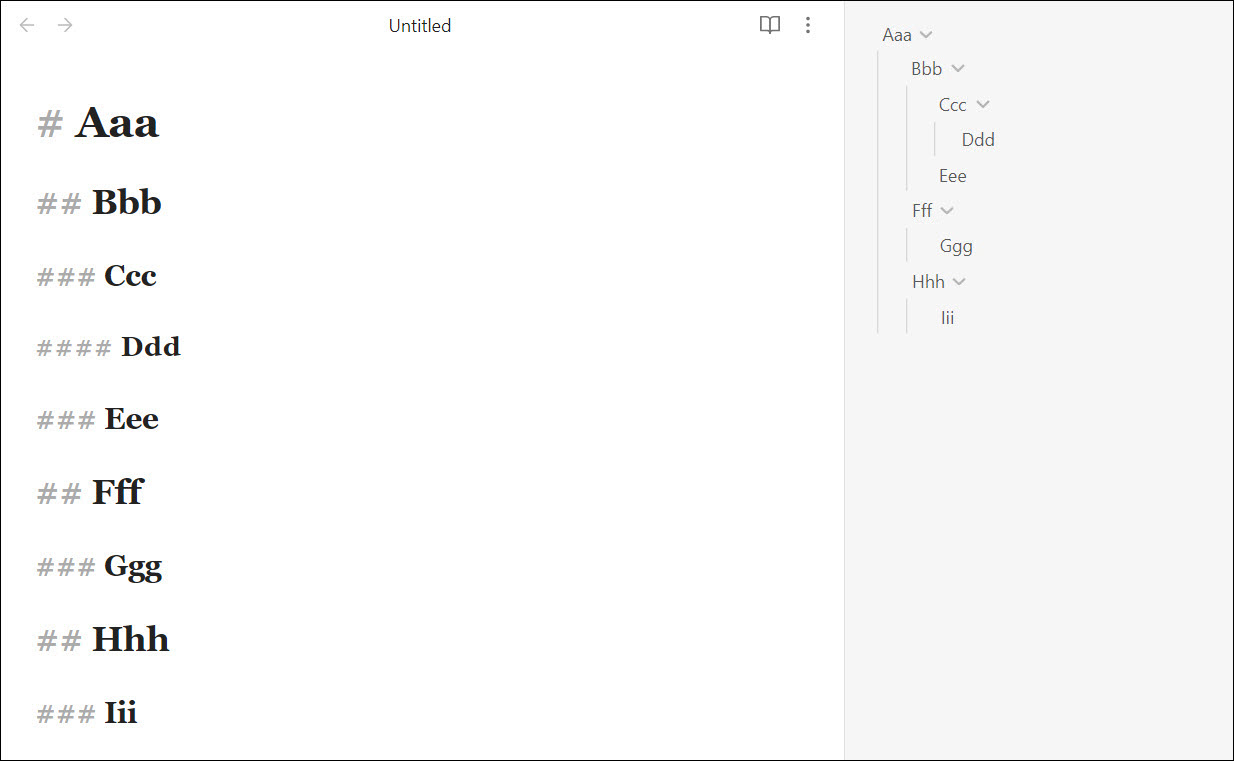
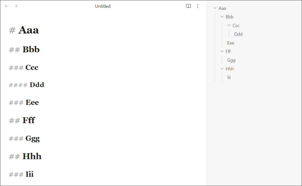
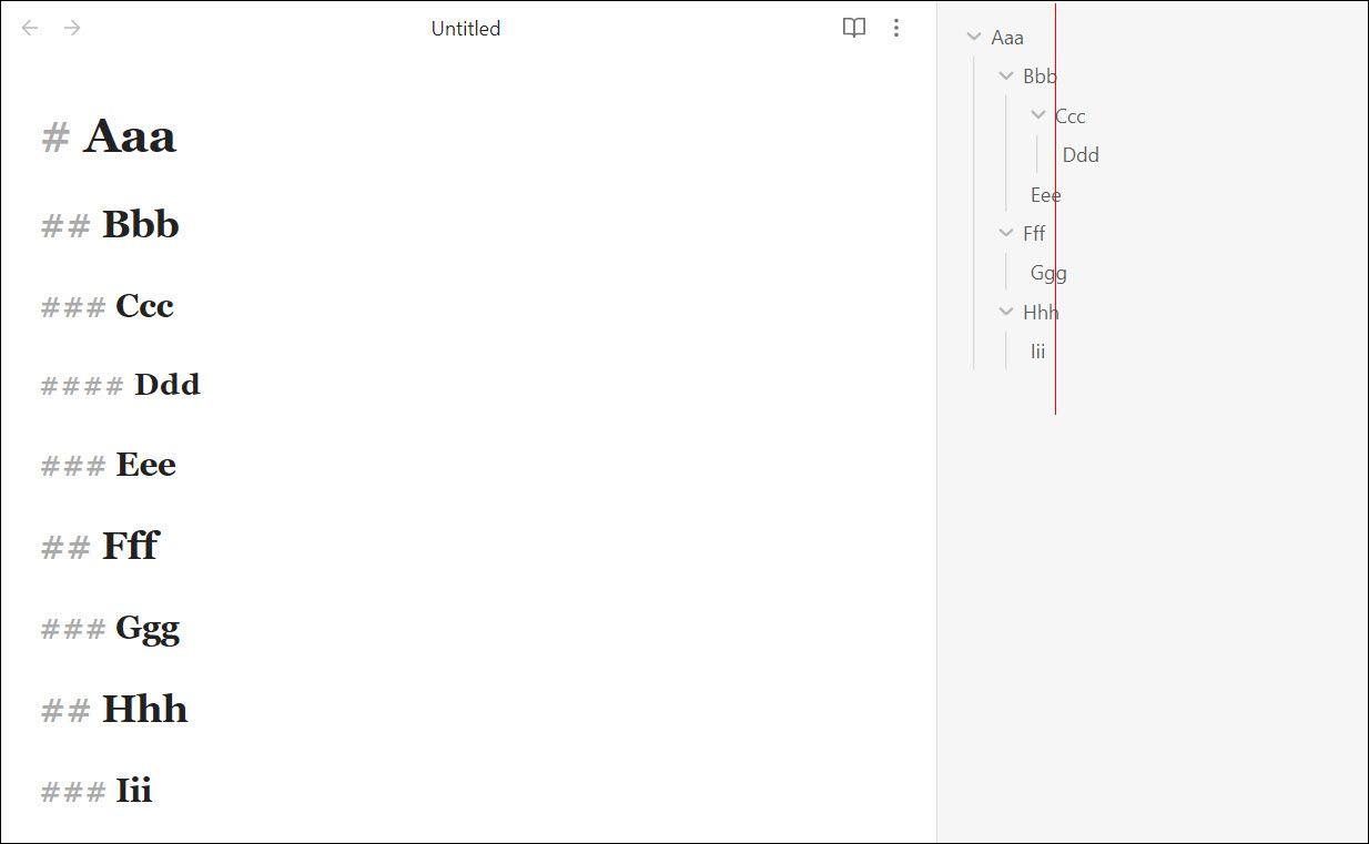
Current situation:
Problems with current situation:
-
Ccc(h3) should be on same level asEee,Ggg, andIii, but instead,Ccc’s arrow icon is aligned with those headings, which IMO is very visually confusing:
- Slicing it another way:
Bbb,Eee,Fff,Ggg,Hhh, andIiiare all almost aligned, even though they are a mix of h2 and h3. Meanwhile,Ccc, another h3, is way out on its own (and it’s almost aligned withDdd, an h4…):
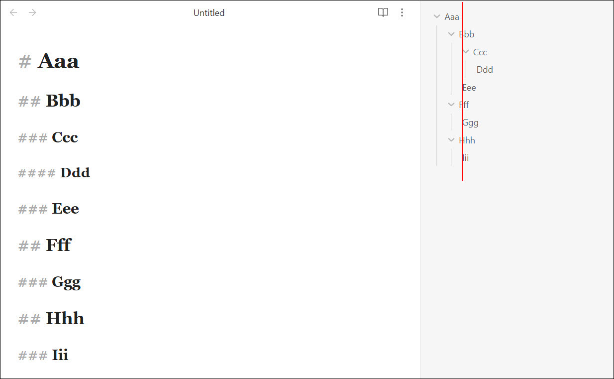
Solution:
- Move the arrow icon to the right side, make the indent levels wider overall, and align them by their first character: