I’d also love to see this changed - it’s very confusing.
Outline formatting is misleading/misaligned when only some nodes have children (heading indentation)
Great suggested fix.
Use case or problem
I recently started to use Obsidian as a university note-taking tool. What I always did with other tools was to use the index of each document as a unique source of truth, and rely on its hierarchical structure to describe its content.
My mental representation of the documents is often related to this structure. Just by looking at the index, I can quickly understand the content and quickly find information. This also helps me indirectly with memorization.
I’m struggling to have the same experience with obsidian since I found the current index Layout very confusing.
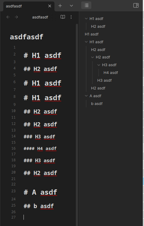
Up to now, if a heading is composed of some sub-headings, a small arrow appears on its left to represent if these sub-headings are currently hidden or visible in the index.
This arrow forces the text to be shifted to the right, making the parent heading aligned with the sub-headings. Visually, this introduces a lot of friction when iItry to scan the index.
Here’s a visual example of obsidian compared to Microsoft Word
Word 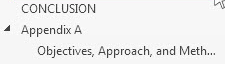
Obsidian 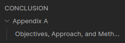
Here we can see how “Appendix A” is shifted, making it seems like a sub-heading of “Conclusion”, at the same level as “Objectives, Approach…”.
Proposed solution
Take the same approach as Microsoft Word, and align the headings.
3 Likes
By Index, do you mean the File Explorer or the Outline?
Either way, FWIW, this is controlled by CSS. Different themes might be better for your preferences.
This is the same as Outline formatting is misleading/misaligned when only some nodes have children (heading indentation)
And I strongly agree, having an accurate visual representation of the document hierarchy is crucial for cognition. This bug adds tremendous cognitive load. I am trying not to become a pest about it, but personally this bug has been quite devastating. I look at the outline 100+ times per day, so it really adds up.
I have sometimes been using this plugin as a workaround, but it has other issues, and also can’t be opened on a per-pane basis. GitHub - guopenghui/obsidian-quiet-outline: Improving experience of outline in Obsidian
2 Likes
He’s referring to the outline. I’ve tried several different 3rd party themes in hopes that one would fix this, but none of them override the current design. Also, I politely but firmly dispute that this is a matter of preference. It goes against all design principles related to hierarchy, and against the psychology of visual perception.
1 Like
Sentiment linked to the relevant bug report. I’m merging this thread into it.
It looks like it won’t be fixed soon, so I’m about to ask the CSS wizards in the Obsidian Discord’s #appearance channel for a snippet to fix it.
3 Likes
+1 to this.
As long as I’ve been using the obsidian outline, my brain never adjusts to the weird indenting
Just now I had a "Oh did I accidentally make this a level 2 heading? That’s weird. Oh, right, it’s that weird indenting issue.
I’d love a CSS solution if anyone figures it out
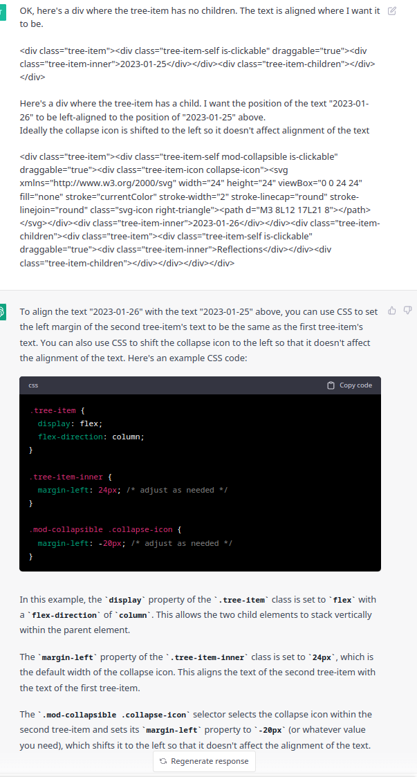
OK I got it! …with a little help from ChatGPT (I just gave it a couple examples of the divs and told it what I wanted it to do)
compare the result to the screenshot in my previous reply
The solution I went with is to move the collapse icon to the left, and to not move anything else
The snippet:
/* for outline and tags */
.mod-collapsible .collapse-icon {
  margin-left: -16px; /* adjust as needed */
}

/* for files and folders */
.nav-folder .collapse-icon {
  margin-left: -16px;
}
I found the margin of -16px looks exact for me.
Edit, better screenshots:
Before
After
7 Likes
This is a great solution. THANK YOU.
That snippet alone is already 95% production-ready. The spacing/margins just need a little extra polishing by a designer to make it 100%.
![]()
1 Like
But only the
.mod-collapsible .collapse-icon {
  margin-left: -20px; /* adjust as needed */
}
part was needed. And tweaking the value
5 Likes
That is wild.
So, for those who want to fix the problem without delving into the details of Obsidian mechanics. Here is the instruction that worked for me (thanks to the commenters above for the solution):
Create an indentation_fix.css file in your Vault, in the folder “.obsidian\snippets”.
The contents of the file should be as follows:
/* Fixes problem with indent in Outline for empty and non-empty headings */
.mod-collapsible .collapse-icon {
  margin-left: -16px; /* adjust as needed */
}
Launch Obsidian. In Settings — Appearance — CSS snippets apply your newly created indentation_fix.css.
If the alignment is not perfect, replace -16px in the file with -20px or something.
PS. I still don’t understand how zerkshop managed to find out from ChatGPT the exact place in css where changes should be made. I tried using ChatGPT, but he didn’t even understand my problem.
1 Like
I crafted some CSS to give all the non-collapsible items in the tree a nice bullet point and fixed up the alignment:
.tree-item {
  position: relative;
}
.tree-item-icon {
  position: absolute;
}
.tree-item-inner {
  margin-left: calc(2.5 * var(--size-2-3));
}
.tree-item-self {
  position: relative;
}
.tree-item-self::before {
  content: '';
  mask: url("data:image/svg+xml,%3Csvg viewBox='0 0 24 24' xmlns='http://www.w3.org/2000/svg'%3E%3Ccircle cx='12' cy='12' r='12' fill='currentColor' /%3E%3C/svg%3E%0A") no-repeat 50% 50%;
  mask-size: cover;
  left: 11px;
  width: calc(.25 * var(--nav-item-size));
  height: calc(.25 * var(--nav-item-size));
  position: absolute;
  top: 50%;
  transform: translateY(-50%);
  background-color: var(--collapse-icon-color);
  opacity: 0.85;
}
.tree-item-self.mod-collapsible::before {
  display: none;
}
.tree-item-children {
  padding-left: 0;
}
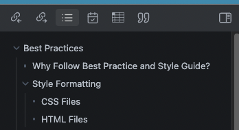
8 Likes
+1 to everyone saying the default behaviour is confusing and reduces the effectiveness of the outliner. Bug or not, it’s a UX issue
I’ve been using @valkyrie’s snippet. Perfect fix.
1 Like
Great! Thank you!!!
For the very lazy:
Put
outline-indentation-correction.css (952 Bytes)
into the folder “.obsidian\snippets”.
Launch Obsidian. In Settings — Appearance — CSS snippets to enable your newly created css.
If the alignment is not perfect, replace -16px in the file with -20px or something.
1 Like
Are you aware that this is solved? It will be minimal work for the Obsidian team to integrate this fix.
You are free to use this workaround. A more permanent solution will worked in the following months.
4 Likes
Great! Thank you. ![]()