Quick Intro:
I’ve been using Obsidian & Obsidian Sync for a few weeks now (moving here from iOS Notes and Evernote). I have spent some time noting down my feedback over the last few weeks, and will now try my best to separate my feature requests into separate posts so to make it easier for others to contribute opinions to the discussion, and for the dev team to be able to digest each request more easily.
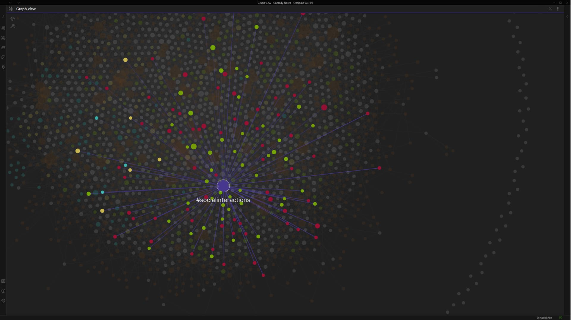
I’ll start with the Graph View since it is by far my favorite feature and the reason I moved to Obsidian:
It is AMAZINGGGGGGGGGGGGGGGGGGGGG! I am getting jittery with excitement just thinking about it! I was browsing my notes and using the graph view to check out connections as to how a story would lead into another and I could not believe my eyes, it was working so well showing relationships between notes I would have never seen before and in such a natural organic way! I just want to scream out to the world AHHHHH LOOK AT OBSIDIAN IT IS SO AMAZING!!!
Graph View Improvement requests:
These are predominantly for the desktop/PC version, but may automatically affect the mobile app as well:
-
(1) Tapping or left clicking a note (a node) in the graph view should default (or have the option to have it default) to opening in a separate pane.
Each time you tap/click on a different note, that new note should appear in the secondary pane. Each time you click on a subsequent note, it will open in the secondary pane (in place of the previous note that displayed in the secondary pane).
This way, you can keep navigating and zooming throughout your graph and click on various notes for more details without constantly being forced away from the graph view. Being forced away from the graph view is very disruptive to the workflow when you’re trying to identify connections between notes, gather ideas, and also continuously look at the same part of the graph (since when you are forced to away from the graph view and then return to it, the camera resets its position). -
(2) Left clicking a node should keep that node and its links highlighted.
In the graph view, when you move your mouse over a node that belongs to a tag, it very nicely highlights that node purple, and highlights all the connected lines purple to show which notes have that tag.
It would be great if clicking on that node would cause it to remain purple, so that you can easily find which notes are related to that tag and then click on the note. Currently, the moment you let go of the hover, the purple lines disappear, and now it becomes difficult to remember which notes were associated with that tag among the clutter of all the other notes in the graph view. -
(3) The middle mouse button should always perform the drag/pan action in the Graph View.
Currently, if you have your cursor on a node and click the middle mouse button, it selects that node just as if you had left clicked it. It would be better if the middle mouse button had the distinct function of panning only. This especially makes a difference when the graph view is very congested, where left-clicking would result in inadvertently clicking on a node even when you intended to drag/pan. -
(4) “Text fade threshold” should be a bit more discriminating.
Currently, it really just decides how much to fade or not fade the text. Instead, it should let us prioritize what appears by default, and then what appears after we zoom in a bit more. For example, it would be great if this feature allows the Note titles to be in view at all times, and then only as we start zooming in do the nodes that represent Tag names start to appear. The lower the threshold setting, the more quickly the nodes with Tag names start to have their Tag names become visible. Conversely, maybe someone would prefer the nodes with Tag names to be more visible at first, and only upon zooming in do the Note Titles start to appear. -
(5) Ability to customize the color of nodes that represent Tags. Currently it’s only brown. If I had to pick just one color though, brown is fine. But customizability would be preferred. (nice to have feature, I wouldn’t consider it required)