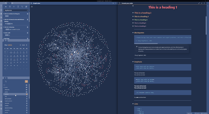
Vileplume - a dark theme

A dark theme for those who appreciate poisonous Pokemon!
Based on the lovely Nord theme

Please try it by browsing for it in Community themes in Obsidian!

Alternatively, you can try downloading it manually below :grinning:

Goals

  • Take advantage of the incredible colour balancing talent of Ken Sugimori’s pokemon designs
  • Have the lowest specificity possible - enable users to OVERRIDE Vileplume easily with their own CSS.
  • Add moments of delight throughout the entire Obsidian experience, taking inspiration from the Pokemon games, but without alienating those who don’t care for Pokemon.

Planned features

  • Light mode
  • Get rid of all the !important's
  • VS Code theme
  • Better highlighting and contrast - still some areas of low contrast/poor accessibility
  • New icons
  • Translucency support - this mode doesn’t look great with this theme at present
4 Likes

It looks incredible!!

3 Likes

Love it!

1 Like

Looks nice, but left nav pane is far to light and the text almost unreadable

1 Like

Yes please. For example in lines 430 - 453 I have deleted !important next to the font size as it was interfering with my snippet to reduce the size of the header hashes.

I don’t like to mess in the original theme’s code, but there does not seem a way around it in this case.

1 Like

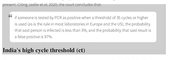
Why is there a grey border around a transclusion/embed in a note exported to PDF?

image

Hi Klaas. How are you exporting to PDF?

@hungsu: yes.

Perhaps I should be more clear. What operating system are you on, and what tool are you using to read the PDF?

Below is my result, on Windows, with Adobe Acrobat.

Can you share with me the markdown you’re using?

I am on MacOS 10.14.6 - Mojave, and to read the PDF I use Skim, a MacOS-only PDF reader.

As for the sharing the markdown, I am not sure what you mean, but here is the quote plus the 2 normal markdown lines above it.

The court stated, the test’s reliability depends on the number of cycles used and the viral load present. Citing Jaafar et al. 2020, the court concludes that:

> if someone is tested by PCR as positive when a threshold of 35 cycles or higher is used (as is the rule in most laboratories in Europe and the US), the probability that said person is infected is less than 3%, and the probability that said result is a false positive is 97%. <div class="signature"><span style="font-size:20px">Portuguese appeals court</span></div>

I am not sure I have provided it in the right way. If you need more, let me know.

@hungsu I sent you the whole .md file via DM.

hi @hungsu , just to say thank you. your theme looks beautiful :slight_smile:

2 Likes

Thanks @hungsu for the beautiful theme, and for fixing the list alignment bug so quickly after I reported it!

Wish that themes would prompt you to update so that everyone gets the improved version.

Make sure you :purple_heart: this feature request…

1 Like

Hello. Love the theme.I would like to modify it a little… how can I

  1. Change H1 to be the same font as H2 ?
  2. Reduce the font size for every header, by 1 or 2?
  3. Make the hash (#) in front of headers smaller and a lighter shade of the heading colour?

Thanks!

@smooth_black_rock click on the Github link in the topmost comment here. That will take you to an interesting collection of CSS snippets, including for headings.

Thanks for the tip. I tried randomly playing around with the CSS…to no avail. I have no experience with it. Perhaps someone with knowledge of how this works might be able to point me to the line where I can play around. I’ve attached the file.
Vileplume - orig.css (16.1 KB)

@smooth_black_rock did you really check out the Github site? Did you open the Headers.md file? Did you scroll down that file a bit?

If so, you would have seen the code for Coloured headings for editor and preview in Dracula, which shows code like:

.cm-header-1, .markdown-preview-view h1
{
  font-family: var(--font-family-editor);
  font-weight: 500;
  font-size: var(--font-size-h1);
  color: var(--text-title-h1);
}

You can leave off font-weight and color, and you have the answer to your questions 1 and 2.

For the hash size here is the code:

.cm-s-obsidian pre.HyperMD-header > span > span:first-child {
  font-size: 5px;
}

Your suggestion doesn’t work. This is the section I see in Vileplume.css:

.cm-header-1.cm-header-1,
.markdown-preview-section.markdown-preview-section h1 {
    font-family: var(--font-title);
    font-weight: 400;
    text-shadow: 1px 1px rgba(0,0,0,0.05),
    2px 2px rgba(0,0,0,0.05),
    3px 3px rgba(0,0,0,0.05),
    4px 4px rgba(0,0,0,0.05),
    5px 5px rgba(0,0,0,0.05),
    6px 6px rgba(0,0,0,0.05),
    7px 7px rgba(0,0,0,0.05),
    8px 8px rgba(0,0,0,0.05),
    9px 9px rgba(0,0,0,0.05)
}

Removing font-weight doesn’t fix it and there is no color reference.

I added your second code block to the bottom of the file and it doesn’t change anything either.

Am I editing the correct file?

@smooth_black_rock does this do it:

.cm-header-1.cm-header-1,
.markdown-preview-section.markdown-preview-section h1 {
    font-family: Arial; /* replace with your font of choice */
    font-size: 18px; /* replace with your font of choice */

You also asked about the hash: does my code in the previous comment work for that?

Neither of those work. I attached the css file up thread in case you would like to see the structure. I can program Python but css is a complete mystery to me, unfortunately.