Theme: Prism

Github Hero Image

Prism aims to be a Comprehensive, Highly-Customisable and Elegant Light/Dark Theme for Obsidian.

:sparkles: Key Features

:100: Complete Platform Support

Platforms

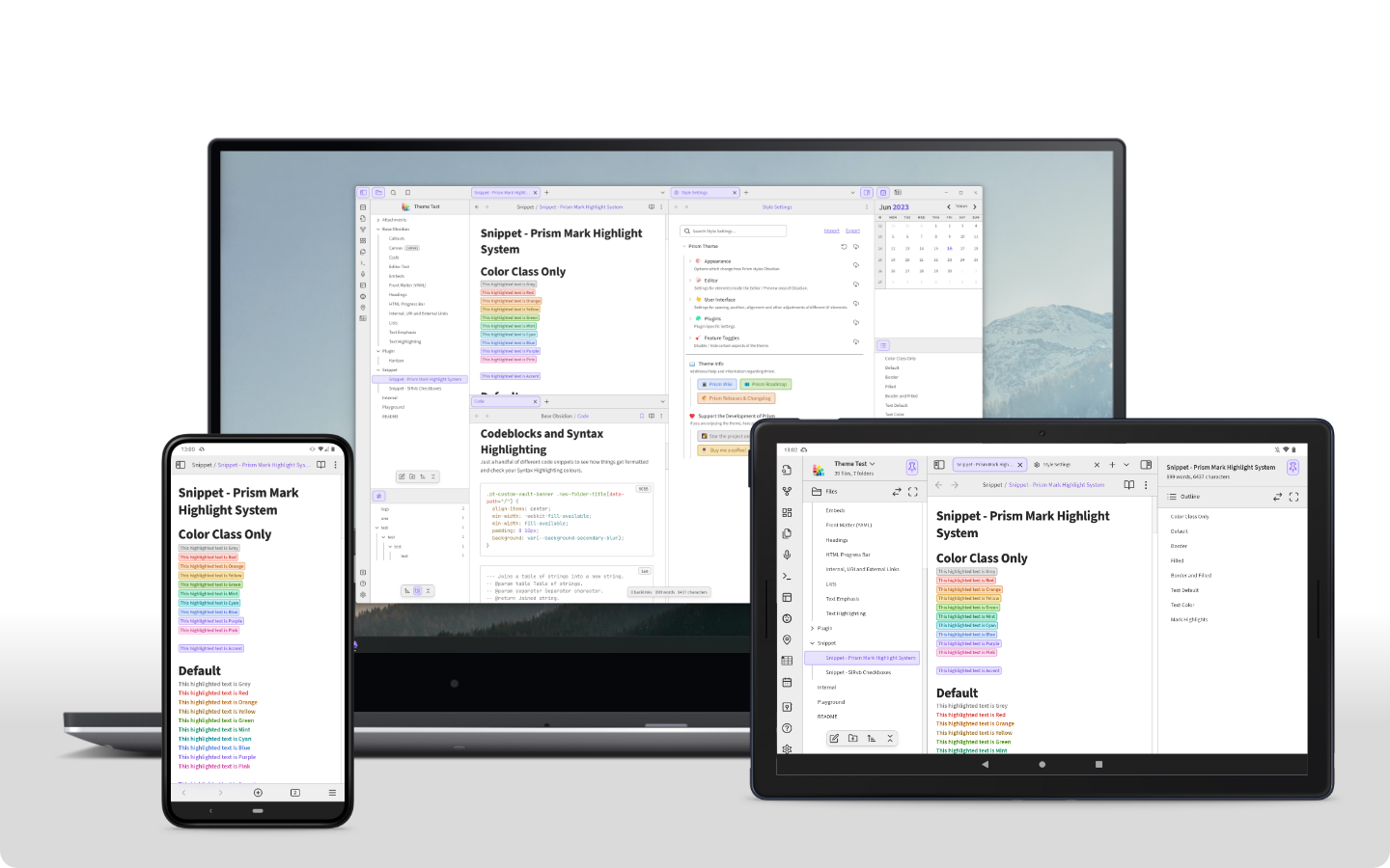
Prism is designed to work across all platforms and operating systems Obsidian is available on (Desktop, Phone and Tablet).

:sunny: 
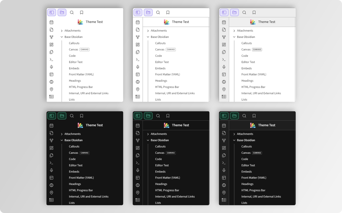
5 Light Colour Schemes

Light Colour Schemes

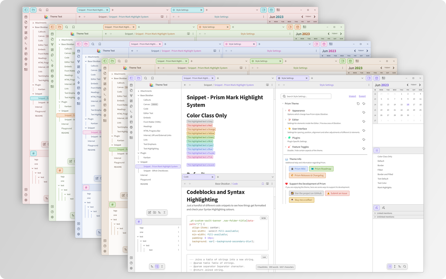
(Front to Back: Swan, Latte, Periwinkle, Pistachio and Peach)

:new_moon: 5 Dark Colour Schemes

Dark Colour Schemes

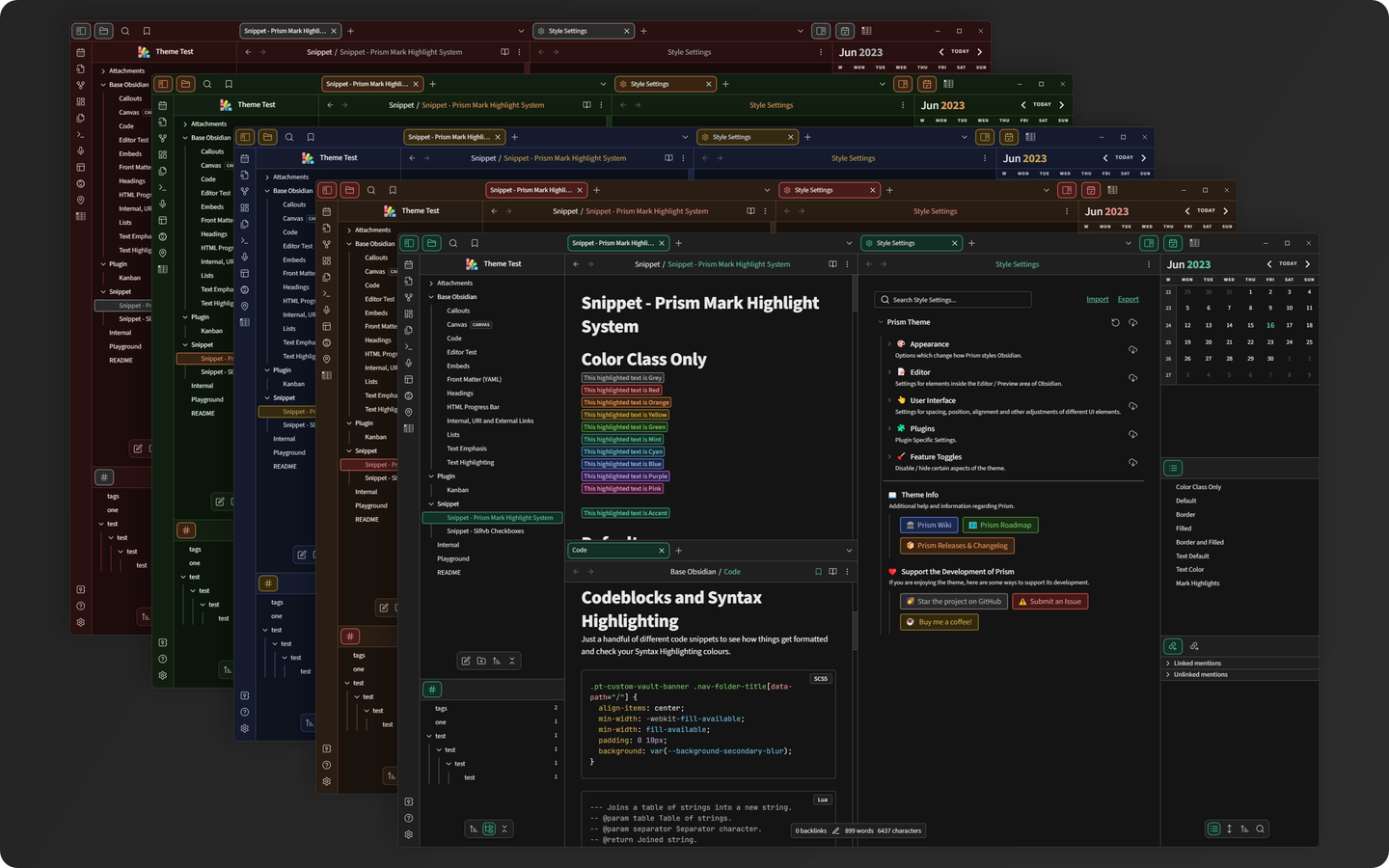
(Front to Back: Raven, Mocha, Indigo, Pine and Cherry)

:books: 
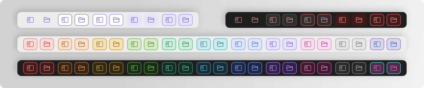
3 Colour Scheme Styles

Colour Scheme Styles

(Left to Right: Minimal, Border and Two Tone & Border)

:rainbow: 5 Accent Styles and 10 Preset Colours + Option for Custom Colours

Accent Styles and Colours

(Top Row: Accent Styles, Last 2 Rows: Available Colours + Custom Option)

:bookmark_tabs: Highlight System based on the <mark> tag

The Highlight System comes with 4 different styles and an option to change the text colour independently from the other adjustments.

Usage examples and explanation available in the Wiki Guide.

Mark Highlight Styles and Colours

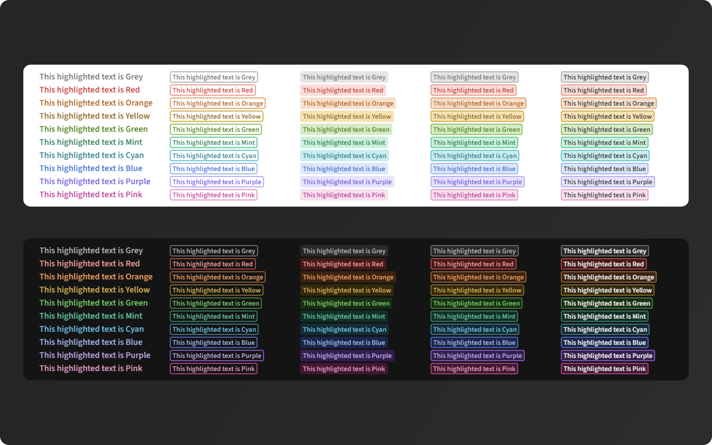
(Start to Finish: None, Border, Filled, Border & Filled, Text Colour option)

:toolbox: Customisation Options

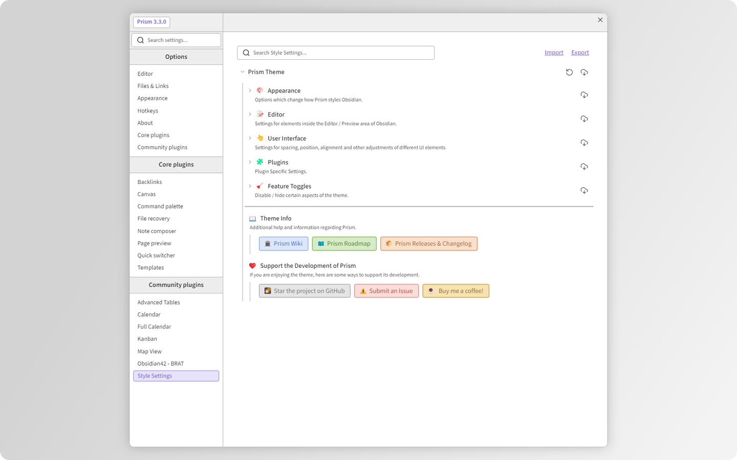
Options for position, alignment, modification of various elements and plenty more available via the Style Settings plugin!

Style Settings

:rocket: Getting Started

:hammer_and_pick: Install the Style Settings Plugin (:warning: Required)

  1. Open Obsidian and go to Settings.
  2. Click on the Community plugins tab.
  3. Click on the Browse button.
  4. In the Search community plugins... Search Box, search for Style Settings.
  5. Click the Install button.
  6. Click the Enable button once the plugin is finished installing.

:gem: Install the Prism Theme

  1. Open Obsidian and go to Settings.
  2. Click on the Appearance tab.
  3. Click the Manage button.
  4. In the Filter... Search Box, search for Prism.
  5. Click the Install and use button.

I highly recommend for you to go through the options available in the Style Settings to make the theme fit you just right!

:jigsaw: Supported Plugins

Checkout the full list in the Supported Plugins section of the Wiki. These plugins have been checked to work correctly and might have additional settings in Style Settings.

If you have any issues with the plugins mentioned above or would like another plugin to be supported by the theme Submit an Issue regarding it.

:scissors: Snippets

Theme features which you can import as snippets into Obsidian are located in the Snippets Folder. These features have been requested by users for use in other themes and for additional interoperability between themes.

:open_book: Wiki

The theme has a Wiki which includes additional detailed descriptions for theme specific features and customisation options.

:hammer_and_wrench: Contributing

Currently the theme is being designed for desktop and mobile use (Phone and Tablet). The theme has been tested on Windows 11 and Android Phone/Tablet.

If you want to provide specific feedback or report an issue please use Issues.

Although I don’t prohibit pull requests, the theme is quite complex with a lot of intricate setup to keep in mind when adding features. I’d recommend submitting an Issue if you encounter any. I’ll try my best to stay on top of the most pressing ones!

Otherwise you are welcome to contact me through the channels mentioned below to discuss anything regarding the theme.

:mailbox_with_mail: Contact

Feel free to reach out to me via the Official Obsidian Discord Channel:

Discord

:mega: Acknowledgments

Special thanks to the following people:

  • The developers of Obsidian.md for providing an amazing tool free of charge!
  • @mgmeyers for Style Settings and Kanban Plugins that are the backbone of this theme! Also thank you for addressing some issues I’ve encountered with Style Settings while developing the theme.
  • @chrisgrieser for the Hue slider gradient code.
  • @tingmelvin for helping me debug issues.
  • On recommendation from @valentine195 - Previously used Esbuild config was originally based on @jdanielmourao’s Sanctum theme setup.
  • @Sailkite for the initial snippet which Coloured Folders feature is based on.
  • The Obsidian Community over at Discord for endless inspiration to improve the theme!

:memo: License

The Theme contains Base64 embedded versions of the following fonts:

The default Vault Banner Icon Opened Folder icon has been sourced from Icons8.

The Theme code is distributed under the MIT License. See LICENCE for more information.

:link: Useful Links

Github Repository - Prism Theme
Report Issues / Request Features - Prism Theme Issues/Feature Request
Latest Releases - Prism Theme Releases

:orange_heart: Support the Development!

Star the Prism Theme Repository

GitHub Repo stars

If you enjoy using Prism, please consider donating

20 Likes

image

How can the 2 gaps, indicated by the white arrows (sorry, I did not know how to give them a different color) be closed?

In other words, at the top the purple box should border the pink status bar (Mac), and on the right it should border the edge of the screen.

The border around UI elements can be tweaked in Style Settings (User Interface → Window Adjustments → Window Gap (px)). How come you don’t have the sidebar on the right or the Titlebar in Obsidian? The gap is set to be there to help with having an edge for resizing the workspace windows. It’s setup to go around the entire note window because of how windows sit next to each other when you open more notes to the sides or above/below.

1 Like

@Damikiller37 thanks, that worked. I set the gap to its minimum, which is 1 instead of zero, I cannot reach zero, so there is still a tiny gap. Why?

Regarding the sidebar on the right, it is hidden because I only use it occasionally. I have bound a hotkey (⌃ ⌥ R) to it.

As for the titlebar, I have it hidden with the Hider plug-in.

Hi @Damikiller37 , thanks for this great theme. Prism is my favorite (Pine flavor), and I’m now using it as my default theme (along with Style Plugin).
However, I have a problem. Perhaps I’m slightly color blind, but I have difficulty seeing and finding the cursor. Are there any ways I can emphasize the cursor? Thanks in advance, and I look forward to future improvements!

@elefant

Fat cursor:

.cm-cursorLayer .cm-cursor {
  border-left-width: 5px;
}

As I mentioned the reason why the gap needs to exist is because that’s where the resize handles for the Workspace windows are. If it was 0 you would be stuck with the window size that is set when you open multiple notes and now way to change it. I’ve tried to tackle this issue some time ago and it’s proven to be very tricky with how you can place notes any way you like. Also I’ve not really accounted for people removing the Titlebar or the sidebars.

As @Klaas mentioned you can temporarily use his code as a snippet. I’ll see what I can do with it to make it more prominent (Color? Thickness? Faster animation?).

OK, thanks for the explanation, I understand. 1 as a minimum makes sense now.

It might be something to consider, seeing Hider has been installed 35,000 times.

@Damikiller37 I checked the Style Settings but could not find it: how can I hide/eliminate the relationship lines in bullet point lists?

@Klaas I haven’t done any customisation for the Relationship lines in Bullet point lists. They have been natively added fairly recently in Obsidian. I could look into adding a toggle to remove them if that’s something that is brought up more frequently. For now you should be able to remove them with this snippet:

.markdown-source-view.mod-cm6 .cm-indent::before,
.markdown-rendered.show-indentation-guide li > ul::before,
.markdown-rendered.show-indentation-guide li > ol::before {
    display: none;
}

P.S. A lot of existing Prism customisation focused on the UI and Plugins so any Editor specific improvements / feature requests are welcome. I’ve been careful not to create a kitchen sink of features on the mentality of “because I can” and rather add things that people actually want and will use. I also try to avoid adding things which are specific to a user or two, because in most cases those can be solved by a snippet.

@Damikiller37 I checked it out in the native Settings, and indeed, the feature is there is called Show indentation guides. So I just toggled it off.

I am surprised they added that to the native settings, but at least it is togglable.

As for your feature policy, that seems to be a sensible one, and you have done a good job with the theme.

2 Likes

Hi there! I love the theme so far, but I’m having an issue with changing the graph line colors. I’m just using the snippet:

.graph-view.color-line {
color: #a3a0fc;
}

And it works on default theme and other themes, but something in Prism seems to override it and make it gray. How would I go about changing the line color?

@enzorocksmith try adding !important to the 2nd line:

color: #a3a0fc !important;

1 Like

Worked, thanks for the fix :slight_smile:

I’ve added this as a feature alongside all the other Graph customisations in Style Settings. It will be available in v2.1.0 when it’s released.

1 Like

:gem: Prism v2.1.0

:star2: New and Improved
• Mobile is now officially supported :partying_face:. Let me know if you have any issues. Tested on Android phone and tablet.
• Styling for the Query block. Visually matches embedded backlinks.
• Styled the Empty State container element.
• Added Custom Icons for the Dangling Links Nav Buttons.
• Increased the contrast of Text Selection Background in Light Themes.
• The Gutter Line Numbers are now back to being top aligned the same way as default theme.
• Replaced the default Vault Banner icon with embedded SVG. Theme works fully offline now :partying_face:.

:toolbox: Added to Style Settings
• Option to change the Header Text Colour (Editor ➜ Headers ➜ Header Text Color).
• Option for Custom Readable Line Length (Editor ➜ Custom Readable Line Length(px)).
• Option for Graph Lines Customisation (Appearance ➜ Graph Color Customisation ➜ Light/Dark Theme ➜ Graph Lines Color).

:jigsaw: New Supported Community Plugins
• Query Control.

:warning: Breaking Changes
You will likely need to set the following again. Sorry!
• The way Graph colours are set in the code have been reworked.
• Header Margin renamed to Header Padding and now works in all views.

:adhesive_bandage: Fixes
• Fixed the lack of top padding inside of callouts.
• Reverting from using font-variation-settings to font-weight due to it’s incompatibility with Mobile and prior issues caused by it.
• Fixing a typo for the Emoji font used in Style Settings headers.
• Fixing wrong classes used for background colour.
• Background colour inside tables now matches in all views.

:hammer_and_wrench: Behind the Scenes
• Over 14k downloads now :star_struck:.
• Theme size: From 11918 to 13762 lines | From 1396kb to 1478kb.

:link: Github Release Link

:iphone:Mobile Showcase
https://imgur.com/a/C5OcSoW

:coffee: Support Prism Development

Unfortunately the theme still doesn’t work for iOS. Below is a screenshot of my homepage on mobile. As you can see, nothing is showing up.

:gem: Prism v2.1.1

Quick Fixes

  • Fixed workspace rendering issues on iOS; Edit views should now display correctly.
  • Other small fixes related to iOS and mobile in general.

If you encounter other issues with mobile (iOS specifically) let me know :slightly_smiling_face:

In dark mode I am using the Pine theme (I love it), but selecting text needs a higher contrast, while the global search box could also do with a background color change.