But if I try to hover over the H1 title, the text will be aligned to the left, if the mouse move out , it aligned to center again. How can I fix it out?
Currently, you can adjust the colours and font families for some parts as you like. Besides, you may want to remove the background images or add a set of random background images. Now you can do it effortlessly.
Great that gives so much more possibilitys to people who have no experience with css or anything like that.
However i still got a few css-snippets i would like to use. One adds a css-class with a special font. Since the new update that snippet doesnt work anymore. I assume thats beacause the style-settings-plugin overwrites all fonts in the end? Is there a possibility to load teh snippet as the last obejct so the css-class can set the font for specific files?
Using the Style Settings plugin, if I want to change the Main font, where do I need to put the font so that it is picked up by the plugin and can be used?
If I understand your question correctly, I believe you just need your desired font to be registered by your OS. For example, in macOS, I think you can either open Font Book and use File>Add Fonts… or just double-click on the font file and choose “Install Font” on the dialog box that appears. In Windows 10, right-click the font file and choose “Install” or drag fonts into the system fonts folder (“C:\Windows\Fonts” by default).
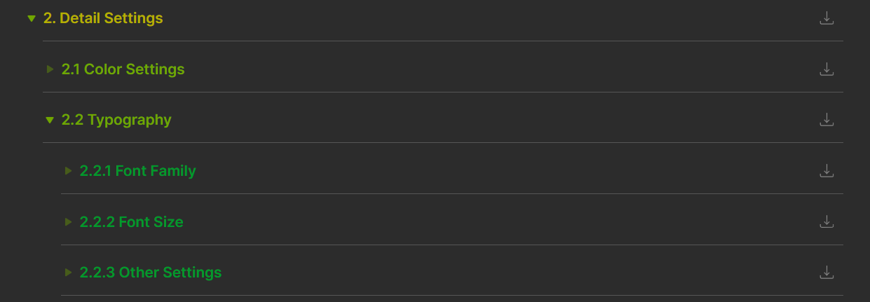
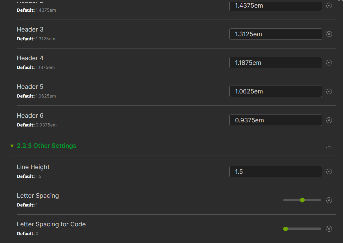
Thank you for your feedback. Now you can adjust the font sizes in the Style Settings plugin, as shown below. If they cannot meet your need, or you want some other options, please let me know. Have fun!
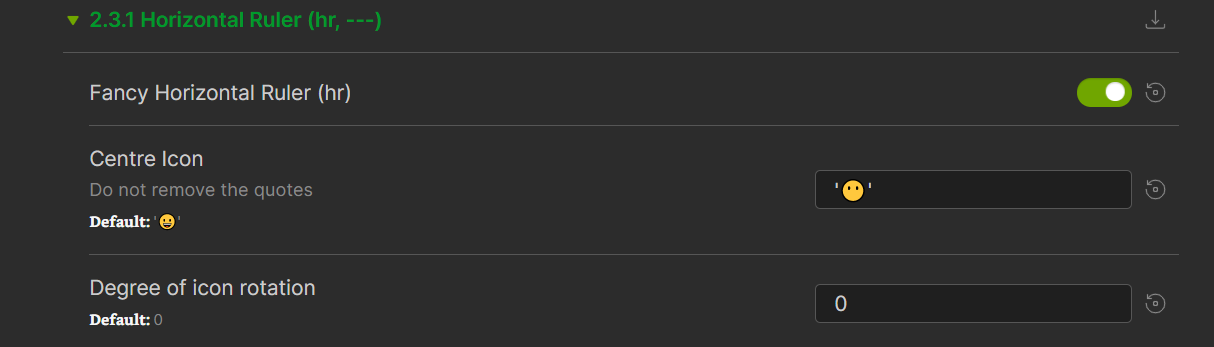
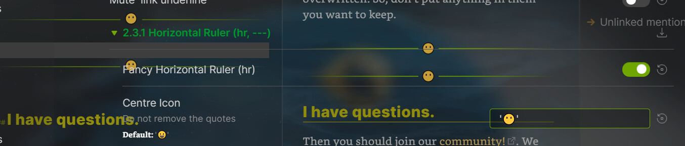
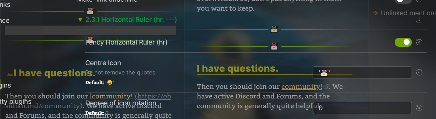
Now you can get a fancy horizontal ruler (hr) in the Style Settings plugin, as shown below. Moreover, you can change the centre symbol as you like. Hope you will like it!
First of all, thank you so much for this versatile and awesome theme.
There seems to be a problem with the last update, though.
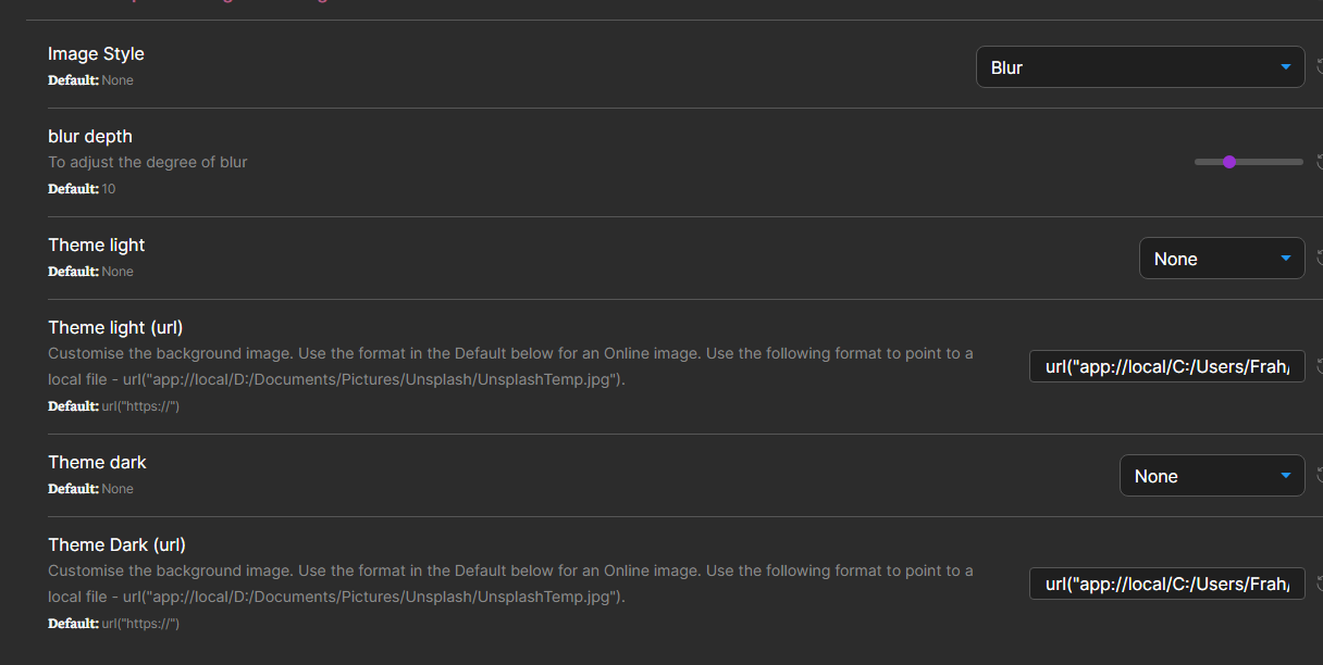
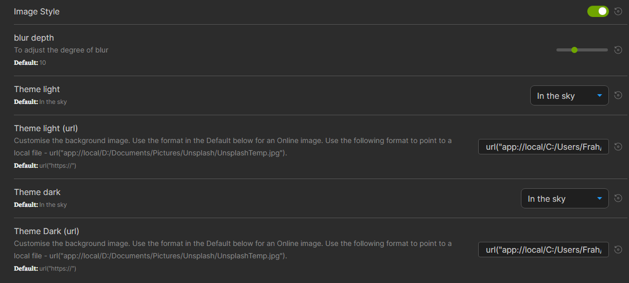
While before I was able to use a local image as background, now it looks like it’s no longer possible.
May be related to the fact that previously there was an option to pick the image style (none, blur etc.) while now there is only an on/off switch. You are also forced to select one of the Default images while previously there was an option to select “None”.
Thank you for liking Topaz. I am trying to optimise and re-construct the setting options. And some settings have not been thoroughly tested. I am sorry about some bugs at the moment.
I have fixed the bug you mentioned. Now, the priority of custom backgrounds images [via url(" ") ] has been increased so that you don’t need to select the option “None” first above.
If there are other issues, please don’t hesitate to let me know, and I will fix them as soon as possible.
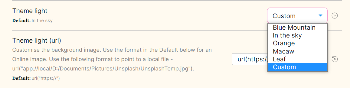
Since the approach mentioned above conflicts with the embedded images, you can now select the “Custom” on the list, followed by typing the image address to use the background images you like. Have fun!
Now, you can use the Style Settings plugin to select the style of the Kanban plugin as you like. Moreover, the Calendar plugin’s style can also be adjusted in Style Settings at present.
Hey I’m amazed by all the possibilitys and we now have with the theme and all the effort you put in there. So again a big thanks from my side It just gets better and better.
Since you asked I’ve noticed a few things:
It would be cool to add custom css-classes. Currently I have one as an css-snippet that would changes the font in my daily notes, but that doesnt work anymore.
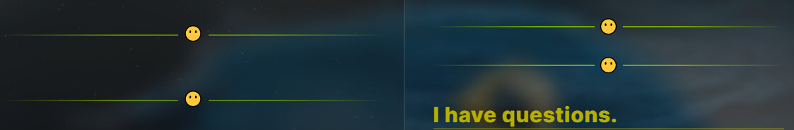
I realy like the aestetics of the new triple-dash-line (or horizontal ruler - - - ) with the gradient. I also like to have an emoji in the centre of it but would also appreciate the option to have a gradient-line without any emoji in the centre.
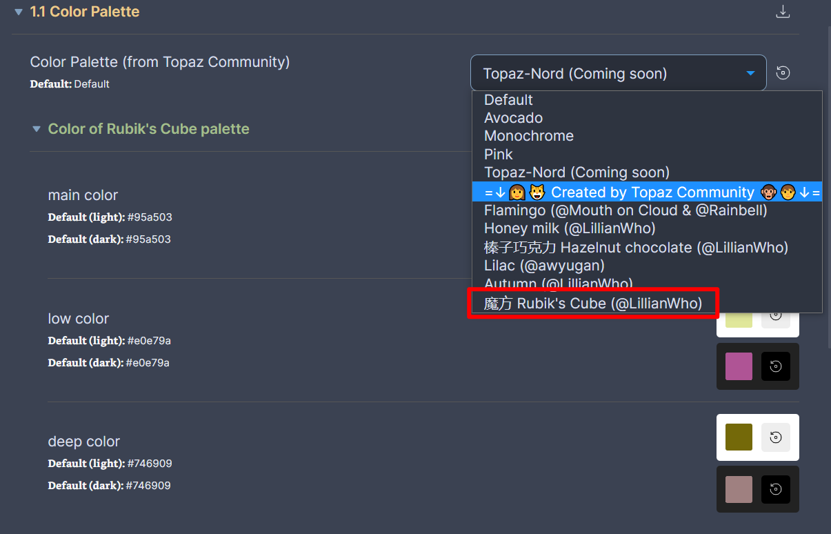
Is there a way to define a personal color-palette?
Last thing are the new checkboxes. I like both options of theme, the square ones and the circular ones with the animation. However they are a bit bigger then the font wich lets them look a bit off. So I would appreciate if the size of them would change with the font size. Or, if thats to hard to achieve, it would help them look more consistent with the rest of the theme, if the text next to them would be centred in regards to the checkboxes (currently the text next to the checkboxes is alligned with the bottom of the checkbox), so that there is more symmetry.
Okay thats a lot here. I’m sorry for that. Just want to reasure you, that the theme allready looks so incredebly polished and playful. And with all the new options we now also have the possibility to play arround with it. So thank you again very much!
Hi, First and foremost, I want to thank you for the immense effort and time that you have invested in creating this theme. I just wanted some help with regard to embeds. I am not very well versed in Obsidian-specific terminology or CSS so I will try to explain my query in as much detail as I can.
This is how an embedded note looks like in the default obsidian theme. Essentially, the embedded note is like a small portal that displays a small portion of the note and I can scroll down the embedded note if I want to read the rest of it.
However, upon applying the Blue Topaz theme, the scroll functionality is no longer available and the entire embedded note is shown. I am not sure if this has happened because of the live preview update or if it is because of a recent update of the theme. Regardless, I would really like to retain the scroll functionality and smaller embeds as navigating notes gets really cumbersome if the entire embeds of huge notes are shown. Is there any way in which I can achieve that by tweaking the css? Thanks.
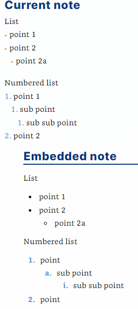
On my setup I seem to see different rendering for bullets and list numbers depending on whether I’m in the editing view with live preview or in the reading view. This also seems to mean that embedded notes look different to the rest of the note when I’m in the editing view (they look like reading view notes).
Is there any way to get them looking more consistent? (I prefer the look in reading view) Edit: I realise it might be hard to make them look identical, but getting the bullets to be the same colour and roughly the same size would be great, and similarly making the list numbers have the same level of bold-ness.
Thank you for your reply. I hope you will always enjoy the theme!
For you mentioned:
Could you please provide me with your CSS snippet so that I can modify it to suit the latest Blue Topaz?
Now you get it, and you can even pick four colors for it to get a fancy line.
A simple approach to get a DIY palette is to choose the “Rubik’s Cube” option in 1.1 Color Palette, and pick some colors you like in “Color of Rubik’s Cube palette”, as shown below.
I adjust the checkboxes’ sizes. I hope you think they’re okay now. However, it may be difficult to achieve that changing the checkboxes’ sizes with the font size.

 It just gets better and better.