Things I have tried
I tried using this CSS snippet shared in another post, but I couldn’t get it to display as shown in the screenshots. (The tick mark was still visible and didn’t scale with the box.) Next, I tried incorporating this CSS snippet, but now I just have two tick marks in a single checkbox.
What I’m trying to do
I’m trying to fit linked checkboxes inside tables as tidily as possible, displaying either a proportionately-sized tick mark or no tick mark at all.
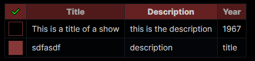
This is more or less what I’m after (found here)
N.B. Getting the matching colours to work as well would be absolutely spiffing, but my primary concern is the checkbox formatting.
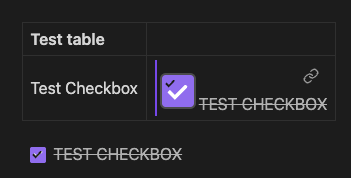
But, this is all I can manage to get. Notice the two tick marks in both checkboxes. There’s the purple bar on the left that I can’t figure out how to get rid of either, as well as the link icon and the associated text—I would think this all falls under text-decoration, but it isn’t included in the original snippet, and it didn’t have any effect when I tried it in various places. It’s possible the other user simply didn’t label any of the checkboxes in the document and that’s how the checkbox is inside the table unlabelled, but then I still don’t know how to fix the rest of it anyway.
I suppose I could try hiding the default checkboxes entirely and building custom checkboxes, but I don’t know Obsidian markdown well enough to know if that would even work.
Any help with this greatly appreciated!