this is very well made and functionally works well for a tab grouping solution I’ve been looking for, thank you!
Usually I keep the number of open tabs low, for practical reasons.
Still, sometimes it happens to me too to have a lot more tabs open than I like, so a tab-group would come handy.
- Why not adding a visual representation of favorites/bookmarks as tab-groups ? (grouped favourites)
- Also, it should be possible to show and hide tab-groups on demand (to declutter the tab bar) - if you don’t need them.
Usually bookmarked notes are references you keep for some time, before you find better/ more specific sources.
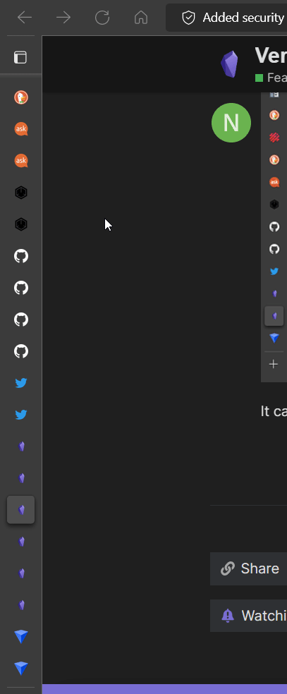
Hi, I’m the developer of Vertical Tabs. Just in case you haven’t try it yet: Vertical Tabs can organize your tabs into groups and hide/show these groups on demand. You may install it from here if you like.
I’m working on the feature of bookmarking tab groups right now. ![]()
Before I made this plugin, I was doing this from time to time, which sometimes becomes a time wasting process for me. I have to go through tons of tabs and decide if I still need it for each one of them.
Now with Vertical Tabs, you are able to group your tabs based on the contexts, like areas or projects. After finished a task, you may simply close a group. You may focus on the group you are working on with the Zen Mode. No more brain power wasting!
Sounds great, thanks for sharing with us!
Looking forward for the grouped bookmarks ![]()
1 Like
Go ahead and update! It is finally there! After a lot of trial and error. Cheers! ![]()
1 Like
Oh my! I didn’t expect this feature so soon, sounds great
Thanks for updating us, need to try your plugin tonight ![]()
1 Like
Use case or problem
The new tabs feature is very useful, but like an internet browser, you can accumulate tabs very quickly. This makes it very difficult to scan, re-order and navigate them.
Proposed solution
If we could have the tabs displayed vertically - as is possible in the Microsoft Edge and Vivaldi browsers (or extensions for other browsers) - it would solve all of the problems.
e.g.
Normal
Vertical
The tab bar is also collapsible, but shows in full when you hover, then hides again.
It can also be scrolled within, like other pane - such as the Files or Search tabs (animated gif below - click to watch).
In fact, perhaps the best way to implement it is to make it use the same mechanism as the various side panel widgets, meaning that we could drag its icon around or put it in the left or right side panel. (this is what I’m referring to)
Here’s one of many articles that describes the usefulness of vertical tabs in more detail: You Should Switch to a Browser With ‘Vertical Tabs’
Current workaround
The new Tab Stack mode is a sort of workaround, but not really - it becomes unusable beyond maybe 10 or 15 tabs because of the large amount of vertical white/dead space. Also, it is hard to read the titles with their text being vertically-oriented
45 Likes
Love the idea.
It could be a vertical tabs stack for each open pane.
I guess the question is, can Obsidian handle 20 to 100 open notes at the same time?
(I tend to get excessive with open tabs if I can)
1 Like
Yeah, I like that idea to have a stack for each pane - it’s probably the only way to do it?
As for performance limits, that’s probably very dependent on each computer… I’m not sure that’s the concern of Obsidian though, just as it isn’t the concern of any web browser. If your computer starts to chug, then you have to clean up your tabs or upgrade your RAM… All Obsidian should care about (and does a great job with!) is making it all run as efficiently as possible.
Though, I suppose a REALLY advanced mechanism could be to automatically put tabs to “Sleep”, as is possible in Microsoft Edge. That’s probably way beyond our current scope or needs though.
Another thought about this - perhaps it would be challenging to have vertical tab lists/stacks shown for each pane. So, maybe it could just be a floating tab stack modal that displays when you either
- hover the tabs,
- hover the left edge of the pane, or
- click a button in the left side of the horizontal tab list
Or something else to that effect, such that the tabs take up even less space.
Or maybe there could be one vertical tab stack that is shown in/available from the left sidebar but the actual tabs shown in it reflect the active pane? I don’t know if that would be useful of confusing…
I just came up with this idea once I tried the 1.0 version, this chromium-edge-like vertical form is more suitable for displaying the long titles (current solution looks a little bit redundant)and convenient for moving tabs out to new windows
1 Like
any news about this idea, I have a pretty small screen( 13.3 inch ), tabs or stack view takes too much spaces when I have 13 or 14 of notes opening, so this vertical tab view is very important to me.
1 Like
loved this idea
1 Like
A simpler approach would be to include a user-selectable vertical tab width. For my needs, there is too much whitespace there. So, instead of having this…
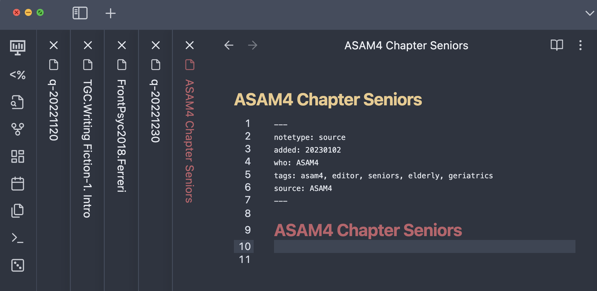
…the user can shrink it to this…
Then, to reduce the “noise” from the compact spacing, dim the font color on the vertical tabs to reduce the contrast from the background color so that it pulls less on your focus. (Maybe also reduce the vertical tab font size.)
This simple tweak will help the use case when there are a manageable number of tabs (say, under a dozen), but will not help for use cases where one has dozens of tabs. But, I think having control of the compactness will be quite helpful to many users.
2 Likes
+1
Text to be written vertically in a tab stack would be nice as an interim as well. Having to tilt my head to the side to read is a little disorientating haha
1 Like
I created a small CSS code that fixes the text orientation. It will be included within my CyberGlow theme’s next update which is partly focused on stacked tabs, but until then here is that code that I mentioned so you don’t need to tilt your head and break your neck trying to read the tabs.
Can load this as a snippet CSS file with any theme you want.
Edit: This is for the default font, using custom font for the UI might not work well, so you may need to alter the code a bit to make it fit with your desired font.
.workspace .mod-root .workspace-tabs.mod-stacked .workspace-tab-container .workspace-tab-header-inner-title{
    text-orientation: upright;
    letter-spacing: -3px;
text-transform: uppercase;
}
1 Like
I’d love this but I feel like they would need to rearrange quite a bit of the UI/sidepanels.
Actually, there is a plugin to show vertical panes/tabs: obsidian-koncham-workspace
It does pretty much what is being requested in this thread.
Here are some steps to improve the UX further:
- Drag the koncham section out of the side-bar and dock it as a separate pane
- Install the Obsidian Hider plugin to hide the native tab-bar
- Install the Obsidian Hover Editor plugin
- Then opt to convert the “Centre Panes” pane to a hovering editor
- Pin the hover editor (click pin icon on top left) - you can now place it anywhere you find convenient
- Use the following CSS snippet to beautify the tabs look (this can also be used without the hover editor)
Cons:
- To switch tabs, you need to double-click the tab-names
- One of the tabs in the list will always be “Centre Panes” (this can probably be remedied by a CSS hack)
.koncham-workspace.koncham-workspace-root-panes {
	height: 100% !important;
    position: relative;
    display: flex;
    align-items: center;
}

.koncham-workspace.koncham-workspace-root-panes .nav-folder-children {
	margin: 0.5em auto;
	cursor: pointer;
}

.koncham-workspace.koncham-workspace-root-panes .nav-file {
	background: white;
	border: 2px solid #00b7ff7d;
	margin: 0.5em;
	cursor: pointer;
}

.koncham-workspace.koncham-workspace-root-panes .nav-file-title:hover,
.koncham-workspace.koncham-workspace-root-panes .nav-file-title.is-active {
	background: #edfaff;
}

.koncham-workspace.koncham-workspace-root-panes .nav-file-title-content {
	margin: auto;
	font-size: 14px;
	cursor: pointer;
}
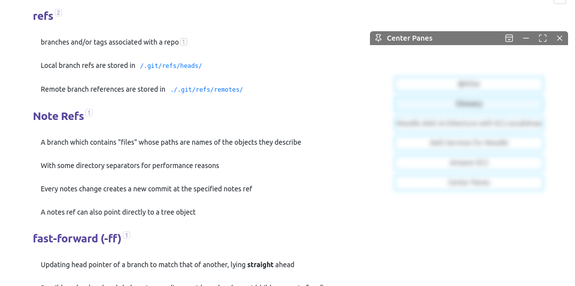
In the image below, I have pinned the “Centre Panes” hovering editor and parked it in the right top corner.
5 Likes
@kazzy Nice one! I’m prefer how it looks with just using Koncham Workspace with its default behaviour and then hiding the tab bar with Hider.
However, when you hide the tab bar, this seems to make it very cumbersome to use panes, which is a non-starter for me. This is because you cannot drag from or right click on the center tab/vertical tab list. You can only open a note in a new pane from other sidebar panels (Drag or Click from Files or Search)
But, also, the vertical tab list gets sort of cluttered when you have multiple panes open, each with multiple tabs. There’s no delineation/indication for which pane a tab is in.
All in all, I’ll leave Koncham Workspace open for a bit but will likely just turn it off and hope that this functionality can get implemented in a slicker way at the Obsidian-core level.
not quite vertical, but maybe this can be of use to further hack on: Tabs in multiple rows
2 Likes