I started using Minimal recently and quite like it. Many thanks!
When using alternate checkboxes in an outline, is there a way to avoid the added hanging indent? These seem like a great alternative to full-blown callouts, especially in outlines.

I started using Minimal recently and quite like it. Many thanks!
When using alternate checkboxes in an outline, is there a way to avoid the added hanging indent? These seem like a great alternative to full-blown callouts, especially in outlines.

I believe this is a CodeMirror bug, if you reload the note the indent should appear correctly.
Sure enough! I was just coming back to say it looks fine in the reading view. But you are correct - switching away and back to the file clears it up too. Thank you!
Regarding bolding not showing up — In the style settings plugin (style settings > Text) bold had been set to a weight of 1000, changing to 600 got bolding back.
I had not changed this setting so who knows what was up there
Is there a way to change scrollbars back to original obsidian? The current ones are so tiny and useless.
If you prefer a more native scrollbar style I recommend the Native Scrollbars plugin by mgmeyers.
Also note that the scrollbar in Minimal has almost the same grabbable size as the default theme. You don’t have to have to click exactly on the scrollbar, anywhere in that area works.
I have tried Native Scrollbars, they are too big and ugly, specially on small windows like sidebars, the color don’t match the theme etc. But they are easy to use, only plus for that.
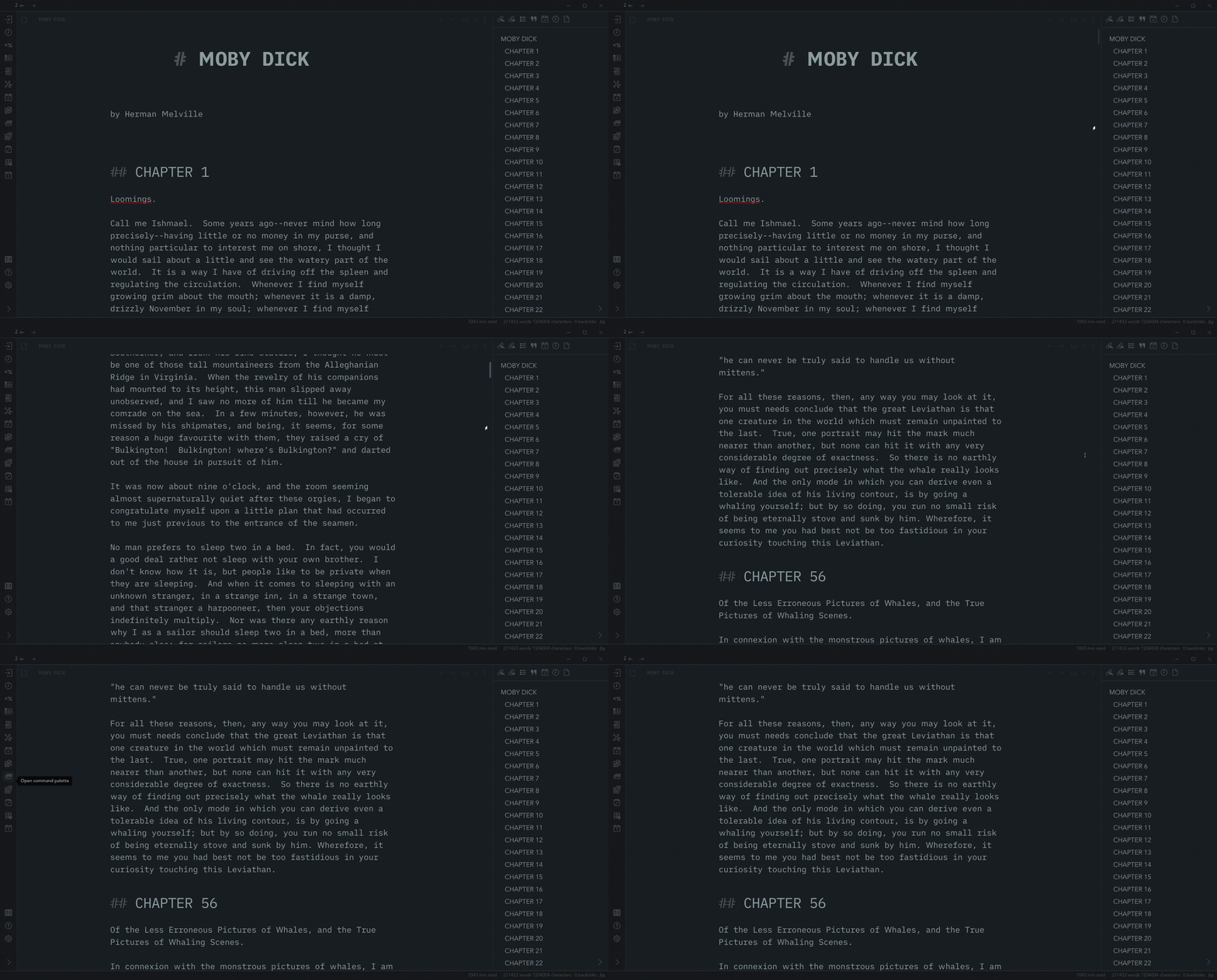
That is weird I am pretty sure the default scrollbars are much bigger , obvious and grabbable than minimal for me.
minimal theme:
Default vault
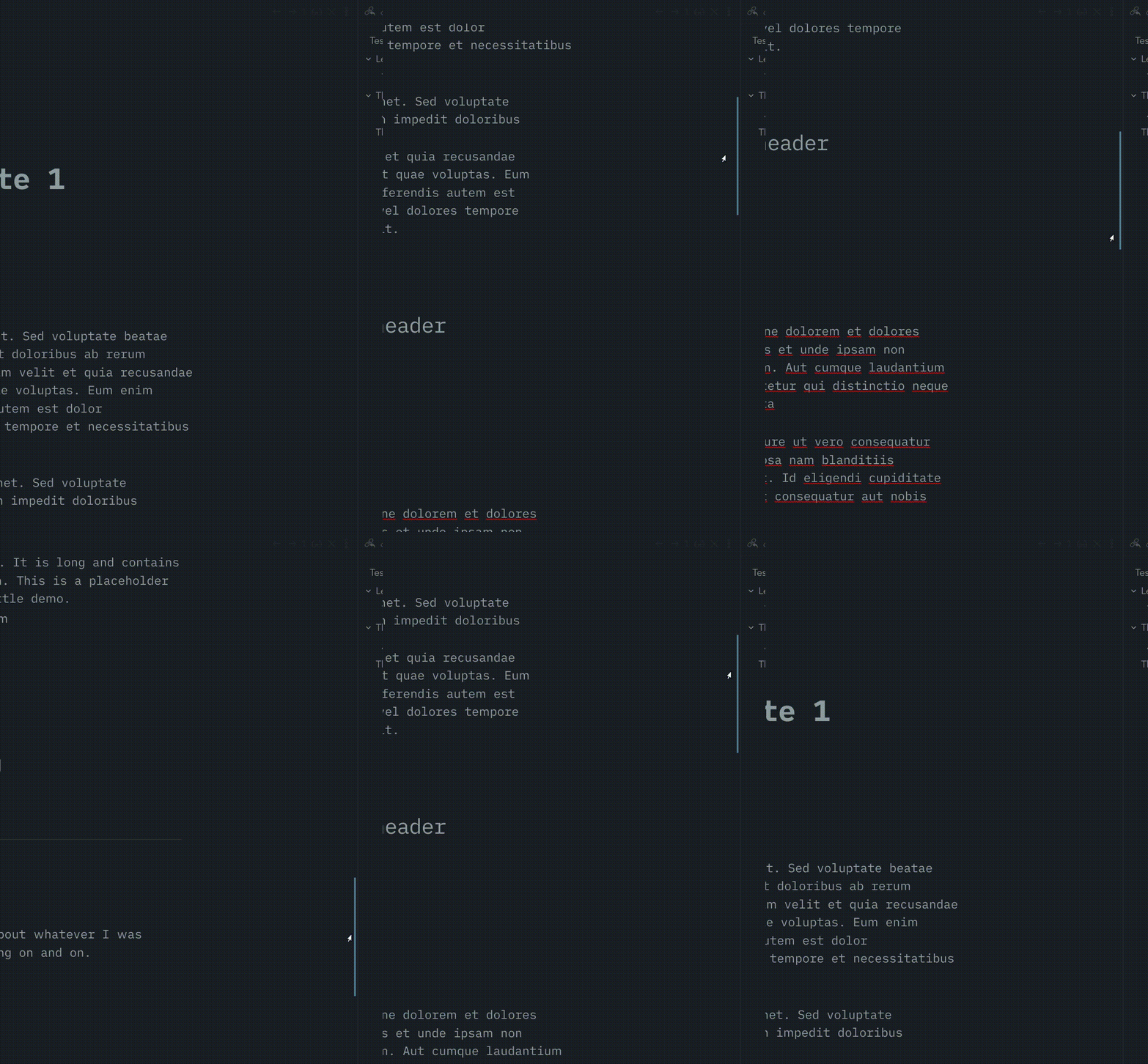
I’ll share the scrollbar snippet I use. It keeps the scroll bars mostly invisible, but they have a width that is still easy to grab. I’m open to suggestions to make it better, but this works well for me on a 4k screen. I admit with a very long document it can be hard to know where the indicator is, but just clicking on the “track” brings it to your pointer while moving you up or down the document.
You can see in the screenshot that the selection track is wide, and in the gif you can see the thumb is hidden until hover. The color is not hard coded, so it works on light and dark mode. It’s the interactive-accent color you use, or change it in the css to whatever.

::-webkit-scrollbar {
    visibility: hidden;
    width: 25px !important;
}

::-webkit-scrollbar:hover {
visibility: initial;
}

::-webkit-scrollbar-thumb {
    visibility: hidden;
    background-color: var(--interactive-accent) !important;
    border-left: 18px solid transparent;
    border-radius: 0px !important;

}


::-webkit-scrollbar-thumb:hover {
    visibility: initial;
    background-color: var(--interactive-accent) !important;
    border-left: 18px solid transparent;
    border-radius: 0px !important;

}
@TRU Thank you, that is very cool, but as you said finding the scrollbar is the big problem (it is the long documents where we need scrollbar after all). Maybe you can add a feature to make it visible when mouse approach the bar. Or hitting a button or hotkey to show it. If that could be implemented it is going to be awesome.
You can add this bit of css to target just the scrollbar in the main editor panel, and make it visible. I stripped out the color, so it takes the default minimal theme subdued look. If you want it wider again, just remove the transparent border. That is what is hiding the extra clickable area.
The scrollbars in the sidebars will still only show on hover. And seriously if anyone has better css for this than post it, because mine is a mess just to get the job done-ish.
As for hitting a button or something like that, I think you would need a plugin. That is beyond me. This is just a css snippet. Maybe look into using vim keybindings to navigate the document. I rarely use the scrollbars myself, page up and page down work for me, or the outline to jump to headings.
.cm-scroller::-webkit-scrollbar-thumb {
    visibility: initial;
    border-left: 18px solid transparent;
    border-radius: 0px !important;
}
I think you are right, but why not make the thumb visible when hovering on scrollbar instead of thumb itself( ::-webkit-scrollbar-thumb:hover) . i don’t know css much but i guess that should be possible (without needing a plugin), and it solves how to finding the thumb issue
also how i can change it to show it in preview mode too?
.cm-scroller::-webkit-scrollbar-thumb {
    visibility: initial;
    border-left: 18px solid transparent;
    border-radius: 0px !important;
}
PS. can you add the same for vertical scrollbars?
This works for my configuration. It isn’t perfect. Maybe someone will come up with a better way. If not I’ll look at making the “pop-in” smoother, if I can figure it out. I’m not a developer, and I hit my max time for procrastinating with css for a while.
Anyway I made the thumb height 100% to catch the hover, and back to auto otherwise. Kind of works. Because I want the extra wide clickable width, it feels a bit fidgety at first, but I’m use to it after messing around for about an hour.
I didn’t realize there even are horizontal scrolls because everything is flexible or truncated. Sorry, don’t know what to do with them. I never see them.

::-webkit-scrollbar-thumb {
    visibility: hidden;
    border-left: 16px solid transparent;
    border-radius: 0px !important;
    height: 100%;
}

::-webkit-scrollbar-thumb:hover {
    visibility: initial;
    border-left: 16px solid transparent;
    border-radius: 0px !important;
    height: auto;
}
Having an issue with the Minimal Theme using YAML cssclass on a note. Hopefully someone can point me in the right direction.
---
cssclass: test
---
in the front matter of a note.
test css snippet enabled:
.markdown-source-view.test {
  background-color: orange;
  font-size: 10px;
  font-family: Calibri; }
The background-color field works fine; I can change it to green, red, etc, and the change shows up immediately so I know the snippet is being read. Changing font-size and font-family have no effect when using the Minimal Theme. Changing to the default theme allows me to adjust background-color, font-size, and font-family with no issues.
Seems the Minimal Theme is overriding(?) some, but not all parts of the snippet. Any ideas?
Thanks.
edit: Forgot to mention Obsidian is in safe mode (no community plug-ins).
Sorry I missed the notification.
This works perfectly just what I had in mind. Thank you very much
I find it really difficult to use this theme with readable line length on, because the line numbers are so far away from the text, stuck to the left edge. I just can’t trace which line has which number.
Is there any chance for a setting that would allow moving the line numbers closer to the text like it is in the default theme?
Have you considered using Active line highlighting?
Unfortunately it is not possible to move the line numbers because it conflicts with the Block width feature. Block width requires lines to be able to spann 100% of the pane, which means line numbers would not be consistently aligned. See 5.2 release notes.
If you want to highlight lines on hover I have written a snippet for you below:
.cm-content > *:hover {
  background-color:var(--active-line-bg);
  box-shadow:-25vw 0px var(--active-line-bg), 25vw 0 var(--active-line-bg);
}
Aw, bummer. But thanks for the snippet. I’ll try it out, hopefully I can get used to it this way!
Is it normal that text color in Command Palette is whitesmoke? It makes it unreadable.
Is there a way to change it? (I tried to find appropriate setting in theme settings and style settings plugins but either it is not there or I missed it)
Are you able to reproduce this in a new vault? Do you have any snippets or plugins that could be causing this?
Hi, is anyone else experiencing issues with displaying images with Minimal?
In my main vault, I’ve added some style settings (all done through Style Settings plugin or Minimal Theme Settings plugin), but no additional “custom” CSS. Some images are distorted in edit mode -
I thought it was something to do with my settings, but when I try in a test vault (no plugins or styling) with Minimal, there is also distortion -
This doesn’t happen with other themes (or default) with the same notes and images. Any ideas?
Thanks!