You can turn off maximize media in Minimal Theme Settings
Thanks for the quick reply @kepano !
That was my first thought and I switched that setting off, but no change. I’ve restarted and quit Obsidian several times and also restarted my Mac. Still no joy…

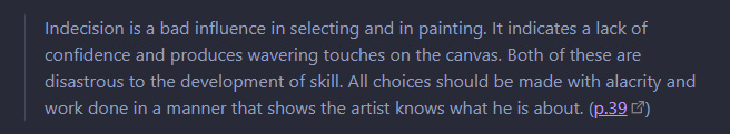
So, this appears to be an issue with the Readwise Official plugin and how it displays images. Something happens when using Minimal Theme, but it’s not a universal issue and is confined to Readwise notes/pages. Not a Minimal issue per se, please ignore!
1 Like
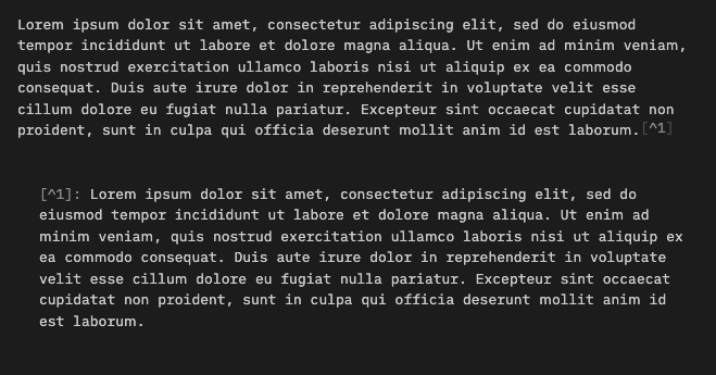
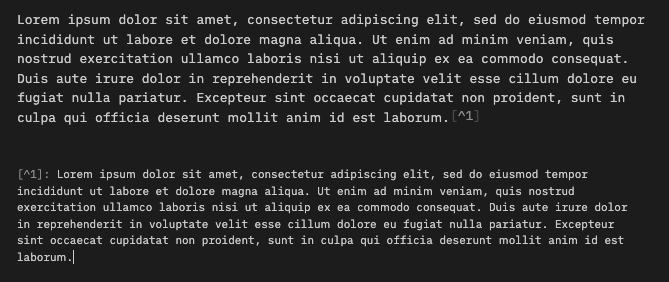
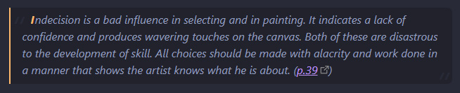
I updated to the latest version of Obsidian, and also switched from the legacy editor to the new editor, and (in source mode) I encountered two changes:
- Font size for footnotes became smaller and no longer indented.
- There’s now a vertical line infront of the > sign for block quotes.
How can I fix this to how it was before? See screenshots below.
Before:
After:
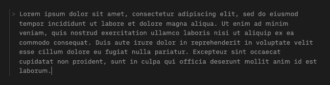
Remove line:
Hi everyone! I have a quick CSS question. Apologies I know very little about typography and CSS so hope you guys can help me out. I recently updated my minimal theme settings plugin to v 5.3.2 because I also updated Obsidian to v 15.6 but this brought with it a change in fonts for edit mode which I want to change back.
Previously my edit mode/live preview mode fonts looked like this:
Now they look like this:
So, to my eyes, the new changes make the font body font “thinner”, as well as the headings at h1 to h3 level. How my fonts look now (the second picture) was basically how the minimal theme used to look in read mode before the updates. I just never turned on read mode because I liked the thicker fonts better.
I used to control the font by: (1) naming the font for edit mode in minimal theme settings as “Arial” and (2) using the following CSS snippet to preserve the h1 to h3 headings even when minimal gets updated. My understanding of the CSS (can’t remember where I assembled it from) is that it will make the default font the font for h1 to h3 headings but bolder and thicker. But now even though my font is named as Arial and my snippet is activated, the my current Obsidian view looks like the second picture instead of the first picture.
Anyone have any advice on how to tweak this?
CSS Snippet in Question
/* Headings and fonts */

h1,h2,h3,h4,h5,strong {font-weight:var(--bold-weight);}
h1,h2,h3,h4 {letter-spacing:-0.02em;}

body, input, button  {
  font-family:var(--font-ui);
}

.popover,
.vertical-tab-content-container,
.workspace-leaf-content[data-type=markdown] {
  font-family:var(--text)
}
body, input, button,
.cm-s-obsidian .cm-formatting-hashtag,
.cm-s-obsidian {
  font-size:var(--font-normal);
  font-weight:var(--normal-weight);
  line-height:var(--line-height);
  -webkit-font-smoothing:subpixel-antialiased;
}
.markdown-source-view,
.cm-s-obsidian .cm-formatting-hashtag,
.cm-s-obsidian {
  line-height:var(--line-height);
  font-family:var(--text-editor);
}
.cm-s-obsidian .cm-header,
.cm-s-obsidian .cm-strong {
  font-weight:var(--bold-weight);
}
.cm-formatting-header,
.cm-s-obsidian .cm-formatting-header.cm-header-4,
.cm-s-obsidian .cm-formatting-header.cm-header-5,
.cm-s-obsidian .cm-formatting-header.cm-header-6 {
  color:var(--text-faint);
  font-weight:var(--bold-weight);
}
.view-header-title,
.file-embed-title,
.markdown-embed-title {
  letter-spacing:-0.02em;
  text-align:left;
  font-size:1.125em;
  font-weight:var(--bold-weight);
}
.empty-state-title,
.markdown-preview-view h1,
.HyperMD-header-1,
.cm-header-1 {
  letter-spacing:-0.02em;
  font-size:28px !important;
  font-weight:var(--bold-weight) !important;
}
.markdown-preview-view h2,
.HyperMD-header-2,
.cm-header-2 {
  letter-spacing:-0.02em;
  font-size:22px !important;
  font-weight:var(--bold-weight) !important;
}
.markdown-preview-view h3,
.HyperMD-header-3,
.cm-header-3 {
  letter-spacing:-0em;
  font-weight:var(--bold-weight) !important;
  font-size:18px !important;
}
.markdown-preview-view h4,
.HyperMD-header-4,
.cm-header-4 {

  font-variant: normal !important;
  color:var(--text-normal) !important;
  font-weight:var(--bold-weight) !important;
  font-size:18px !important;
}
.markdown-preview-view h5,
.HyperMD-header-5,
.cm-header-5 {

  font-variant:small-caps;
  text-transform:lowercase;
  letter-spacing:0.05em;
  color:var(--text-normal);
  font-weight:300 !important;
  font-size:16px !important;
}
.markdown-preview-view h6,
.HyperMD-header-6,
.cm-header-6 {


  font-variant:small-caps;
  text-transform:lowercase;
  letter-spacing:0.1em;
  color:var(--text-muted);
  font-weight:400 !important;
  font-size:14px !important;
}
I experimented some with the Developer Tools and figured out the following:
- The left border for blockquotes can be removed with this change:
/* (Border-left changed to 0px) */
.markdown-source-view.mod-cm6 .HyperMD-quote {
    background-color: transparent;
    color: var(--text-blockquote);
    font-size: var(--blockquote-size);
    font-style: var(--blockquote-style);
    border-left: 0px solid var(--quote-opening-modifier);
}
- The size of the footnotes can be changed with this:
/* (Font-size changed from -2 to 0) */
.cm-s-obsidian .HyperMD-footnote, .footnotes {
    font-size: calc(var(--font-adaptive-normal) - 0px);
}
This seems to work!
But I still can’t figure out how to get the footnotes to indent as shown in my previous post. I tried padding-left: 45px; in the above snippet but it didn’t work. Could anyone help me with this last issue? I’d really appreciate it.
Minimal seems like a good theme, but the high contrast hurts my eyes.
Previously I was using this theme (no longer being updated): https://forum.obsidian.md/t/atom-theme-fork-enhanced/
Is there an easy CSS fix to bring the background & sidebar colors in Minimal Theme more in line with the other theme (i.e. to reduce the contrast a bit)?
My old theme:
Minimal:
Please read the documentation
1 Like
Missed that - my mistake - thank you.
Greatly fond of Minimal – beautiful, refined and so versatile. Many thanks for your efforts – and consistent comittment to the community - this is inspiring.
Would like to report two small graphic infelicities, both appear to be in combination with the new Open-in-New-Window function and with the Sliding Panes Plugin installed.
- The header’s title and the menu buttons collide.
- The sub-menu in the new window appears somewhat clipped
(See attached screenshots)
Settings:
- Sliding Panes enabled
SlidingPanes Settings: Toggle Rotated Headers" is on; (= Headers act as spines)
Swap rotated headers: both options have the same result, i.e. colliding titles and buttons
Sliding Panes spine width is 28
macOS 15.4 / Obsidian 0.15.7 | Installer 0.15.6
Thanks for looking into this.
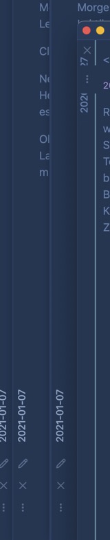
Hi everyone, I like to using this theme, but have some part, what I try to adjust by snippets. On my screenshot you can see a page which have an embed another page. How can I get rid of the left padding from this embed part?
iPadOS 15.6, Obsidian 1.3.0 (63), Minimal theme 5.3.1
Use strict embeds
1 Like
Yes, I use it. But that is just remove the left border from the embed part and the padding still there (see the red rectangle in my previous post).
Lovely theme!
Would it be possible to add the accent color to the title bar border (below the pane title)? An option to turn this off and on in the “Minimal Theme Settings”-Plugin would be nice imho.
Without the accent color I find it hard to spot the active pane sometimes.
1 Like
Hey guys! I have a question (I’m kind of new to obsidian and everything) and dunno if this is the best place, but here it goes. It’s about the Minimal Theme Cards. I’ve searched a lot and didn’t find any resolution. How can I use covers with local image files? I understand the cssClasses, the “!()[]” structure to external links and how this is a dataview issue, not a Minimal’s one. I believe the point is the concatenation between the dataview “code” and the metadata in the card’s note. Have anyone had success using local images in the card’s cover?
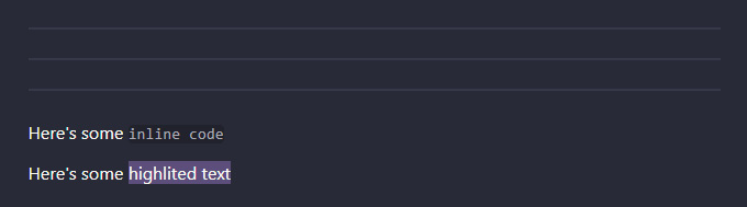
Hey folks, love the theme. The only thing that bothered me was the preview popover, so I tweaked it. Here’s the CSS with some examples before and after:
/* Preview popover -- Bigger height limit + bigger fixed width
This also makes block preview height fit to its content (blocks are usually pretty small) */
.popover.hover-popover {
  max-height: 65vh;
  width: 500px;
}

/* Preview popover (page + block) -- This makes above h/w adjustments work */
.popover.hover-popover .markdown-embed {
  height: fit-content;
}

/* Preview popover (page) -- Without this no vertical scrollbar
Doesn't work with vh for some reason */
.popover.hover-popover .markdown-embed .markdown-embed-page {
  height: 500px;
}

/* Preview popover (page + block) -- Bottom padding tweak*/
.popover .markdown-embed .markdown-preview-view {
  padding-bottom: 15px;
}

/* Preview popover (image) -- Remove space at the bottom,
caused by the default <img> box model */
.hover-popover.image-embed img {
  display: block;
}

/* Preview popover (image) -- Limits the size of the popover to the dimensions of the image */
.hover-popover.image-embed {
  max-height: fit-content;
  min-height: fit-content;
  width: fit-content;
}
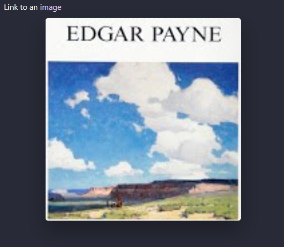
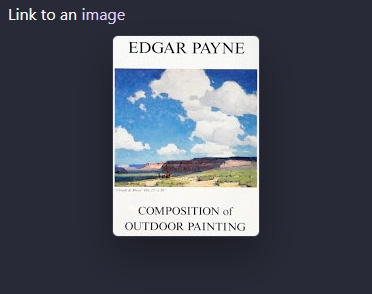
Page preview:
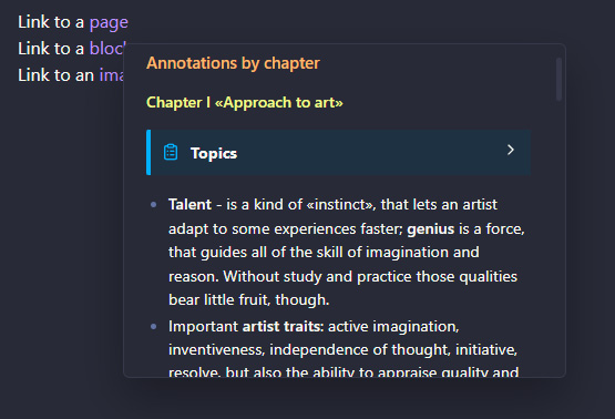
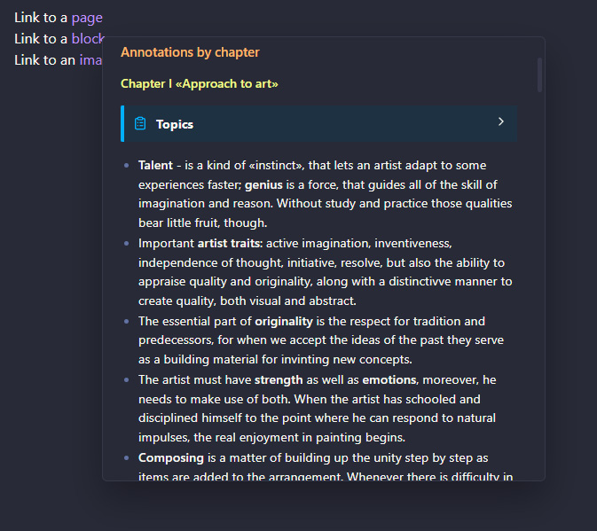
Block preview:
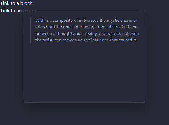
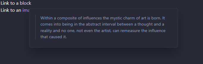
Image preview:
1 Like
A little sumthn extra tho 
Blockquotes
/* Blockquotes -- Embellishments and several tweaks */
.markdown-preview-view blockquote {
  position: relative;
  margin-top: 1em;
  padding: 5px 10px 8px 17px;
  font-style: italic;
  font-weight: 400;
  background-color: var(--background-secondary);
  border-color: var(--h2-color);
  border-left-width: 2px;
  border-radius: 0 7px 7px 0;
}

/* Blockquotes -- Slightly visible double quotes before and after content */
.markdown-preview-view blockquote::before,
.markdown-preview-view blockquote::after {
  position: absolute;
  font-size: 3em;
  color: var(--background-primary);
}

.markdown-preview-view blockquote::before {
  content: '“';
  top: -0.2em;
  left: 0.02em;
}

.markdown-preview-view blockquote::after {
  content: '”';
  bottom: -0.7em;
  right: 0.1em;
}

/* Blockquotes -- Initial caps */
.markdown-preview-view blockquote p::first-letter {
  margin-left: 12px;
  margin-right: 1px;
  font-weight: 700;
  color: var(--h2-color);
}
And some miscellanea
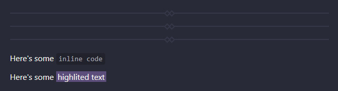
/* Inline `code` elements have a padding */
p > code,
h1 > code,
h2 > code,
h3 > code,
.cm-s-obsidian span.cm-inline-code {
  padding: 3px 5px;
}

/* Horizontal padding for ==highlights== */
.markdown-rendered mark {
  padding: 0 3px;
}

/* Horizontal rule -- Simple embellishments and a vertical margin tweak */
.markdown-preview-view hr {
  display: block;
  position: relative;
  margin: 24px 0;
  overflow: visible;
}

.markdown-preview-view hr::before,
.markdown-preview-view hr::after {
  content: "";
  position: absolute;
  width: 5px;
  height: 5px;
  background-color: var(--background-primary);
  border: 2px solid var(--background-modifier-border);
  transform: rotate(45deg);
}

.markdown-preview-view hr::before {
  left: 50%;
  top: -5px;
}

.markdown-preview-view hr::after {
  right: 50%;
  top: -5px;
}
Not the best looking styles prob but you get the idea.
Regarding my post on popup previews, I went ahead and fixed several things:
- fixed overflow on long block previews and heading previews:
when content is larger than 65vh, scrollbar is on now - limited maximum image preview to 95vh
This replaces the previous CSS:
/* Preview popover -- Bigger height limit + bigger fixed width
This also makes block preview height fit to its content
(blocks are usually pretty small) */
.popover.hover-popover {
  max-height: 65vh;
  width: 500px;
  overflow: auto;
}

/* Preview popover (page + section + block ) -- Adjusts popup height
according to content height */
.popover.hover-popover .markdown-embed,
.popover.hover-popover .markdown-embed .markdown-embed-page,
.popover.hover-popover .markdown-embed .markdown-embed-header {
  height: fit-content;
}

/* Preview popover -- Bottom padding tweak*/
.popover .markdown-embed .markdown-preview-view {
  padding-bottom: 15px;
}

/* Preview popover (image) -- Remove space at the bottom,
caused by the default <img> box model */
.hover-popover.image-embed img {
  display: block;
}

/* Preview popover (image) -- Limits the size of the popover
to the dimensions of the image, but not more than 100vh */
.hover-popover.image-embed {
  max-height: 95vh;
  min-height: fit-content;
  width: fit-content;
}
4 Likes
Hi all
First many thanks for this really nice theme. Everything works fine with the documentation and i could made it as i like it.
One thing i would like to know, if it’s possible, to change the position from the edit/preview button from top to bottom like the „things“ theme.
Pls forgive my dumb question, I’m working with Obsidian just a couple of weeks.
Thx
Any idea if it’s possible to change link color ONLY for internal links and not http (or viceversa)?