With ‘Show editing mode in status bar’ set to ON in Editor settings, three problems arise:
While the icon in the status bar reflects the current view, the top-right icon shows the mode you will switch to if you press it. Visually, the two icons conflict, which often leads to confusion, even if you’re an experienced user. (“Wait, what mode am I in again? Am I reading or editing?”) This is poor design. This sentiment is shared, for example, here and here.
There’s no reason why these two toggles should be separate at all as they accomplish the same function; the second button is redundant. (Currently, the top-right toggle offers a binary choice of ‘Reading’ vs ‘Live Preview’, while the status bar toggle also offers “Source mode”.)
It takes an additional click to switch to source mode, when a single click should do.
I completely forgot about mobile when requesting this A segmented button would be too clunky on a small screen w/o a major UI overhaul. I’ll reframe this request to a redesign of the status bar toggle then! I’ll leave the original post as is because I do believe the issue w/ conflicting icons is a valid one.
Saw someone sharing the same paint point on Discord:
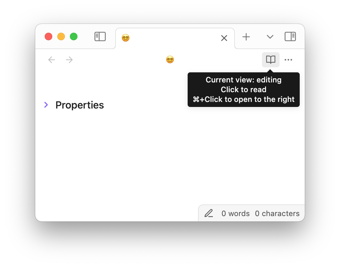
I don’t know whether there are design best practices for this, but in most Obsidian themes including the default one, the icon at the top right for switching between Reading View and Editing View throws me off.
I keep looking at it as an indicator of which view I’m already in, rather than the view that will activate if I click on it.
This icon is inconsistent with the one below on the status bar, to boot, which always shows the view you’re already in.
I find myself going for themes like Blue Topaz and Shimmering Focus, which better works with my brain in that single and admittedly small aspect. But it’s big enough of a throw-off that I’m wanting to avoid checking out other themes even for fun, like Baseline.