How to style GANTT chart (mermaid)?

Description of issue

Hello,

I have recently started experimenting with GANTT charts in Obsidian. It seems useful since you can create internal links, as per this post:

I understand from reading past posts that we may have the possibility to alter the dimensions of the GANTT in the future, or zoom in, etc.

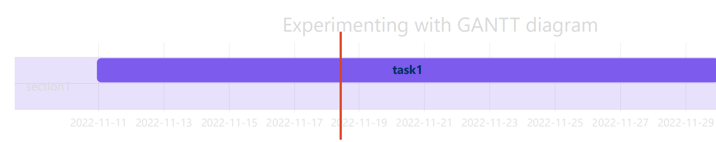
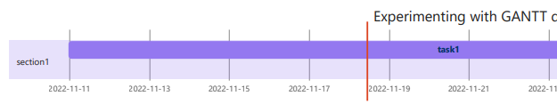
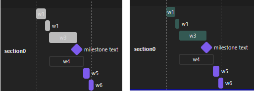
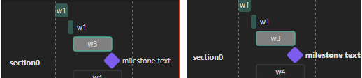
Currently, I am fine with the display, since at this stage I would like it to be a part of some activity reports when exporting PDF. This is what it looks like:

What I have tried so far

I tried applying styling according to instructions here:

but with no success, since this does not seem to work with GANTT charts.

I also tried applying some CSS snippets, but I have 0 experience with CSS, HTML, etc. I took some inspiration from this post:

But was not successful in applying the styling as per the mermaid documentation:

I then thought about changing the Obsidian appearance, thinking that would affect the styling of the GANTT chart, and therefore making the rendered image in the PDF more readable. And voila!

image

As you can see, it helped fix the appearance upon exporting to PDF.

Remaining question

However, it would be nice not to have to change the Obsidian appearance every time I want to export. So the question remains: How do I style the GANTT chart? I can break down my question as follows:

  1. Could someone provide a working CSS snippet for changing the following:
    1.1 grid.tick
    1.2 grid.path
    1.3 .taskText
    1.4 .taskTextOutsideRight
    1.5 .taskTextOutsideLeft
    1.6 todayMarker
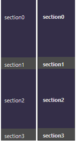
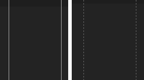
  2. Is it possible to change the section colors or task colors? If so, can this be done through a CSS snippet?
  3. Is it possible to change the styling of specific sections, tasks, milestones, etc.?

Thank you very much for having the patience to read through this.

3 Likes

Sample code:

```mermaid
gantt
dateFormat  YYYY-MM-DD
title       GANNT

section section1
w1   :done, w1, 2022-11-01, 2022-11-06
w1   :done, w2, after w1, 2d
w3  :done, w3, after w2, 2022-11-23
m1 :milestone, m1, 2022-11-23 , 0d
w4 :active, w4, after w2, 2022-11-27
w5 :w5, after w4, 3d
w6 :w6, after w5, 2d

section section2
c1   :c1, 2023-01-16, 2023-01-28

section section3
dp1   :active, dp1, 2022-11-01, 2022-11-25
dp2   :dp2, after w6 dp1, 2022-12-23
dp3   :dp3, 2023-01-16, 2023-03-31
m2    :milestone, m2, 2023-03-31, 0d
dp4   :active, dp4, 2022-11-01, 2023-03-31

section section4
md1  :md1, 2023-03-01, 2023-03-31
1 Like

A year ago, I tried something. But after that I never used mermaid again… and I already forgot everything.

But I leave here the css file I created for these tests. See if it there’s anything useful.

mermaid.css (1.3 KB)

1 Like

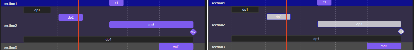
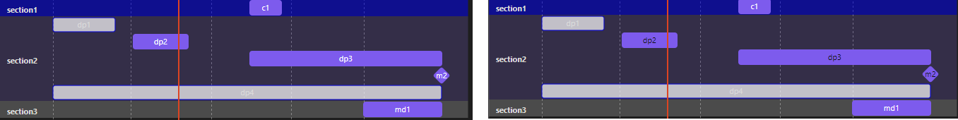
@ZKE , Have you seen through this by @mnvwvnm ? It does indeed seem to change most of the stuff you want changed, so it’s just a matter of adapting to your own color scheme?

Is there still any element you want changed, which he has targeted in that CSS file?

Do you know how to navigate the Developer tools sidepanel, and how to locate various elements of your document within that?

1 Like

Hello @mnvwvnm , and thank you very much for the attached CSS code, it works just fine, except for the last part:

  /* MERMAID */
  /* center graphics in page and font-size */
  /*.mermaid {
    display: flex !important;
    justify-content: center;
    font-size: 12px;
  }

, which I could not figure out.

I am sharing my experience here in case anyone is interested:

  1. All of the section titles can be styled together using:
.mermaid .sectionTitle {
	font-weight: 700;
}

image

  1. All of the milestone texts can be styled together using:
.mermaid .milestoneText {
	font-style: normal !important;
}

image

  1. Individual sections can be styled using:
.mermaid .section0 {
	fill: gray !important;
	opacity: 0.05 !important;
}

.mermaid .section1 {
	fill: blue !important;
	opacity: 0.5 !important;
}

  1. The grid lines can be styled using:
.mermaid .grid .tick line {
	stroke: gray !important;
	stroke-dasharray: 3;
	opacity: 1 !important;
}

image

  1. Done/active/crit/doneCrit/active/Crit/task categories can be styled by section using:
.mermaid .done0 { 
	stroke: none !important;
	fill: #4DAB9A !important;
	opacity: 0.4 !important;
}

image

You can replace done0 with active0 / crit0 / doneCrit0 / activeCrit0 / task0.

Example:

.mermaid .task2 {
	fill: white !important;
	stroke: blue !important;
	stroke-width: 1.2 !important;
	opacity: 0.7 !important;
}

  1. Similarly, task or milestone text can be modified by section using:

.mermaid .taskText2 {
fill: #0F0F0F !important;
}

  1. Individual tasks can be styled using:
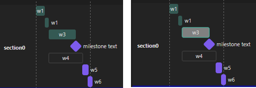
.mermaid #w3.done0 {
	stroke: #4DAB9A !important;
	fill: grey !important;
	stroke-width: 1.5 !important;
	opacity: 1 !important;
}

"""You could also write simply #w3 or #w5 - without .done0
You can also list multiple tasks in one go - #w3.done0, #w4, w5 {
You can also style milestones this way

image

  1. You can style the text of individual tasks/milestones using:
.mermaid #m1-text.milestoneText {
	font-weight: 800 !important;
}

image

2 Likes

Hello @holroy,

I don’t know how to navigate the Developer tools sidepanel very well, but I have played around with the CSS supplied by @mnvwvnm , and it will indeed be sufficient for my purposes.

Thanks!

1 Like

This topic was automatically closed 7 days after the last reply. New replies are no longer allowed.