Write normal text, bullet point lines and checklist lines in Live Preview.
Expected result
I would expect the bullet point and checklist lines to be aligned identically, with just a different icon (a bullet point, a checkbox or a custom checkbox).
Also, as I prefer using a monospaced font for overall layout clarity (and it’s pretty much necessary for tables), I would like the horizontal alignment of bullet and checklist lines to match regular text.
Actual result
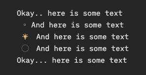
The horizontal alignment of regular text, bullet points and checklists are all different. Also, the margins between bullet points and text and checklist icons and text are very different. It almost looks like the checklist item is one indent level down from bullet points.
In Live Preview (which is the only mode I use), the problem is most obvious. In Reading View, they are almost aligned, but not quite.
Attached is a screenshot to illustrate the problem:
Bullets take up a - amount of space.
Tasks take up a - [ ] amount of space.
The alignment isn’t ideal, but bug reports aren’t considered using community themes.
I’d add your source text (see Forum use and formatting tips), screenshots using the default theme/restricted mode/no snippets, and your debug info (cmd/ctrl + p > Show debug info).
Okay, I tried to follow your instructions as I understood them. Unfortunately I can’t edit the original post anymore, so here’s a new one.
I don’t think the point that “- [ ]” takes up more space than “-” is valid, because the Live Preview doesn’t work like that anywhere else. (A heading with ### is aligned exactly as a heading with #, because the hashes are hidden.)
Source
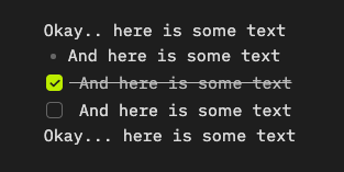
Okay.. here is some text
- And here is some text
- [x] And here is some text
- [ ] And here is some text
Okay... here is some text
Debug
SYSTEM INFO:
	Obsidian version: v1.1.16
	Installer version: v1.1.9
	Operating system: Darwin Kernel Version 20.6.0: Thu Mar  9 20:39:26 PST 2023; root:xnu-7195.141.49.700.6~1/RELEASE_X86_64 20.6.0
	Login status: logged in
	Catalyst license: supporter
	Insider build toggle: off
	Live preview: on
	Legacy editor: off
	Base theme: dark
	Community theme: none
	Snippets enabled: 0
	Restricted mode: on
And here’s a screenshot, now with the Default theme, snippets off and restricted mode on:
This seems like a simple thing but it’s actually a very complex problem couponded by the fact that obsidian is at its core a plain text editor and live preview is a light layer on top of it to fake the reading expirience (and we wanna keep it that way).
Yeah, I did have a hunch this has something to do with the underlying architecture…
But ok, I’ll open a feature request in any case, maybe at some point it makes sense to fix it