Use case or problem
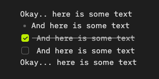
Making text look nicer, especially in Live Preview, where this problem is most visible. In the case of checklists vs bullets, checklist lines almost look like they are one indent level down from bullet lines, which is also an information clarity issue.
This problem is especially apparent when using a monospaced font (which is my preference for several reasons).
I have been informed that there is an architectural reason behind this, so it’s not a trivial thing to implement. But, perhaps it will be feasible at some point, so I am adding a feature request.
See the screenshot for a demonstration of the problem:
Related feature requests (optional)
Can’t find a related FR, but I made a bug report earlier: