In any text note, the text that i’m typing eventually gets to bottom line. From there, the window is scrolling with each new line, but the focus generally stays with the bottom line of Obsidian window.
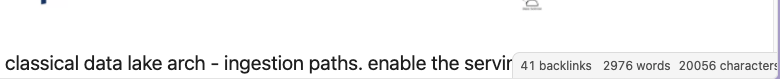
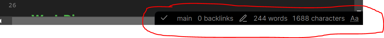
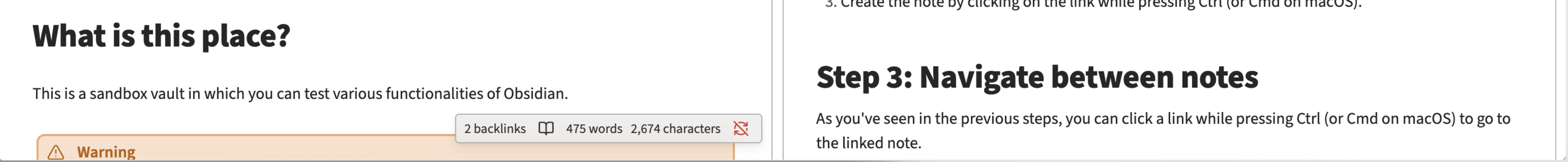
The problem is that bottom line has a counter panel (Backlinks, Words, Characters) that occupies a part of the line. For split-screen scenarios (having a video call + using Obsidian for notes) it occupies almost entire line.
This panel obscures text and it’s not visible what I’m typing.
I’m used now to press Enter like 10 times to create space and get away from the bottom panel with Backlinks count. Still, before I know it, I land at the last line again.
Expected result
The panel with Backliks, Words, Characters disappears if there is active text being typed in that line. Or any other outcome that does not hide actively typed text behind an overlay panel.
Actual result
I can’t see anything that I type in the last line. The text editor always lands me in the last line as I type more text. It makes Obsidian unusable.
Environment
Operating system: MacOS Monterey 12.6.2
Debug info:
SYSTEM INFO:
Obsidian version: v1.1.9
Installer version: v0.15.9
Operating system: Darwin Kernel Version 21.6.0: Sun Nov 6 23:31:16 PST 2022; root:xnu-8020.240.14~1/RELEASE_X86_64 21.6.0
Login status: not logged in
Insider build toggle: off
Live preview: on
Legacy editor: off
Base theme: light
Community theme: none
Snippets enabled: 0
Restricted mode: on
When I have my Obsidian resized vs full screen and am typing in a note, as the lines and cursor move down, they are obscured by the lower status bar. The only way to see this information is either carriage returns, or using full screen. The only effect of plugins is how wide the status bar is.
I considered whether this might be plugin specific and opened an issue with the developer of Better Word Count. However, this persists in restricted mode; it is not plugin related. I considered if a feature request, however, status bars should not risk covering input areas.
This isn’t always a problem, but when typing a lot of text, the cursor ends up at the bottom of the window, and I can’t see what I’m typing at the ends of lines.
Things I have tried
I can manually scroll the text insertion point above the status bar, but it’s weird that I need to do that to see what I’m typing.
I could use a plugin like Obsidian Typewriter Mode, but that seems like swatting a fly with a baseball bat (and I prefer to let the text insertion point move around the window as needed).
Is there a simple way to make Obsidian handle long taskbars more gracefully?
I loaded the Typewriter Mode plugin, and it really is way more than I need. However, if I disable typewriter mode and set Keep above and below to two lines, it accomplishes what I want. Still seems like there should be a way to avoid the problem without a plugin, but maybe that’s just me.
I could be mistaken, but I think it’s always been like that.
You won’t really notice (even with some extra items in there) using one tab group, readable line length enabled, and if your main window is a decent size, but if you have a few tab groups (vertical splits) open, a smaller view port, etc., you will.
@ariehen Yep–I figured the behavior wasn’t new, and most of the time it isn’t a problem. However, I run a few plugins that display information in the status bar, which extends it into the text area, even when I have the right sidebar open. I also figured there was a way to fix it in CSS but didn’t know where to look.
Looks like there was an older bug report and WhiteNoise merged a few different posts mentioning the same issue. Have a scroll up for other CSS options – if nothing is to your liking we can try a different snippet route or you can hang in there a bit for the team’s solution.
@ariehen I played a bit with the CSS and found the following:
Your CSS appears to work with the Default theme.
The Minimal theme (which I use) overrides the taskbar background color.
The Minimal Theme Settings plugin has a switch for a minimal (default) or full width taskbar.
At this point, unsetting the taskbar position in a CSS snippet or turning off the minimal taskbar in Minimal Theme Settings both accomplish what I wanted.
BTW, the MySnippets plugin is great for experimenting with formatting. I also use it to turn on formatting that roughly matches our standard formatting for knowledgebase articles at work—there are a couple of different formats, and MySnippets makes it easy to switch back and forth. I could use the cssclasses property as well, just haven’t set that up.
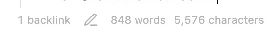
<When typing in the note edit pane, as the text reaches the bottom, it gets obscured by the bottom information ribbon seen here:
when a new line is added, auto scroll works and the page scrolls down, but whenever I’m typing in that very bottom line, I can’t see what I’m typing because it’s actually behind the ribbon thing (in the screenshot above)!
Did you follow the troubleshooting guide? [Y/N]
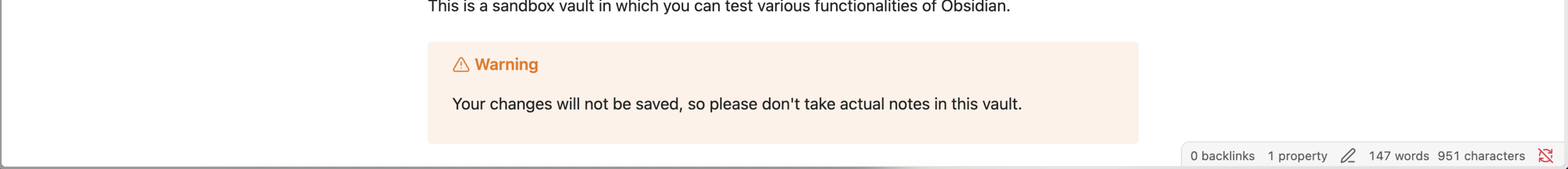
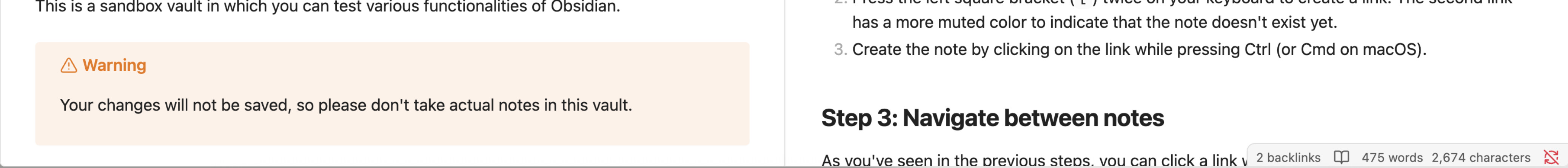
Yes, this issue also occurs in the sandbox vault and in the default theme
Expected result
I’d like the app to automatically scroll up so that the bottom-most line when editing is above that information ribbon, to ensure it never gets obscured behind it.
Actual result
the text is obscured by the information ribbon until a new line break occurs, then I can see the previously-obscured text.
Environment
SYSTEM INFO:
Obsidian version: v1.10.6
Installer version: v1.10.6
Operating system: Darwin Kernel Version 25.1.0: Mon Oct 20 19:33:00 PDT 2025; root:xnu-12377.41.6~2/RELEASE_ARM64_T6020 25.1.0
Login status: not logged in
Language: en
Insider build toggle: off
Live preview: on
Base theme: adapt to system
Community theme: Minimal v8.1.2
Snippets enabled: 0
Restricted mode: on
RECOMMENDATIONS:
Custom theme and snippets: for cosmetic issues, please first try updating your theme and disabling your snippets. If still not fixed, please try to make the issue happen in the Sandbox Vault or disable community theme and snippets.