The following CSS Snippet allows you to create in-margin and in-line collapsible color notes (blocks). It is partly based on Amaroks CSS for Anki cards here, and mklepaczewski’s proposal for ‘Notice blocks’ here.
Collapsible notes can be embedded next to text, as well as below it, and are displayed when you hover over them.
The color of each block class can be customized from the same .css file (see indication there), as well as the maximum width of the blocks (also indicated in the .css). Similarly, in the .css file you can add new block classes with different color schemes and responsiveness to the mouse pointer, binding them to different instructions to call these new classes (e.g., see below the ‘note-coll-broad blocks -rainwh’).
The appearance is as follows, with an example of a note folded to the margin, the same note but expanded, a second note folded but inline, and the latter also expanded. These notes are being used here as an informative legend for images, but their use could be different. Edit mode on the right, Preview mode on the left.
When sidenotes are expanded, they can cover a portion of the text or image in the main section of the note. To achieve this, I prefer to put ‘auto’ where you set width below .app-container pre.language-note-collapsible:hover { .
Whatever the case, these are just the styles that I like and can be modified in the .css file.
It is also important to note that these blocks do not allow you to include links, labels, headings, or formatting of bold, italics, etc. They are extremely simple and rigid in this sense. They can be useful just to draw attention to certain text within them, giving a function to each of the colors used.
My CSS to be embedded in the snippets folder is as shown below:
/*  COLLAPSIBLE INLINE AND SIDENOTES  */

.app-container pre[class*="language-note-"] {
  border: 0px solid;
}

/* Make the first line of note bold */
*[class*="language-note"]::first-line {
  font-weight: bold;
}
.app-container pre[class*="language-note-"] code[class*="language-note-"] {
  color: rgba(0, 0, 0, 0.781);
  text-shadow: 0 0 2px rgba(0, 0, 0, 0);
  background-color: transparent;
  white-space: pre-wrap;
  /* css-3 */
  font-family: var(--default-font);
  font-size: smaller;
}

/** Collapsible Sidenote Default
----------------------------------------*/

.app-container pre.language-note-collapsible {
  border-color: #016ea6;
  background-color: #d8dfec; /* Crown Paint Mount Fuji (change color here) */

  padding-top: 0.001em;
  width: 265px;
  height: 53px;
  position: relative;
  right: 220px;
  max-width: calc(0.66 * var(--line-width));
  min-width: 3em;
  z-index: 2;
  position: relative;
  margin-left: -6em;
  margin-top: -3em;
}

.app-container pre.language-note-collapsible:hover {
  height: auto;
  width: 280px; /* Set the maximum width here, 'auto' for wide cards */
  z-index: 3;
}

/** Collapsible Inline note Default
----------------------------------------*/

.app-container pre.language-note-collapsible-in {
  border-color: #016ea6;
  background-color: #d8dfec; /* Crown Paint Mount Fuji (change color here) */
  padding-top: 0.2em;
  height: 7em;
  padding-top: 0.2em;
}

.app-container pre.language-note-collapsible-in:hover {
  height: auto;
  width: auto;
}

/** Collapsible Sidenote Broad Rainwashed
----------------------------------------*/

.app-container pre.language-note-coll-broad-rainwh {
  border-color: #016ea6;
  background-color: #d1e0d9; /* Duron Rainwashed */

  padding-top: 0.001em;
  width: 290px;
  height: 53px;
  position: relative;
  right: 240px;
  max-width: calc(0.66 * var(--line-width));
  min-width: 3em;
  z-index: 2;
  position: relative;
  margin-left: -6em;
  margin-top: -3em;
}

.app-container pre.language-note-coll-broad-rainwh:hover {
  height: auto;
  width: auto;
  z-index: 3;
}
Collapsible sidenotes
For default collapsible sidenotes you need to use:
```note-collapsible
This will appear in bold

This will not appear in bold. This is a Default sidenote and all its color and dimension characteristics can be modified in the .css.

```
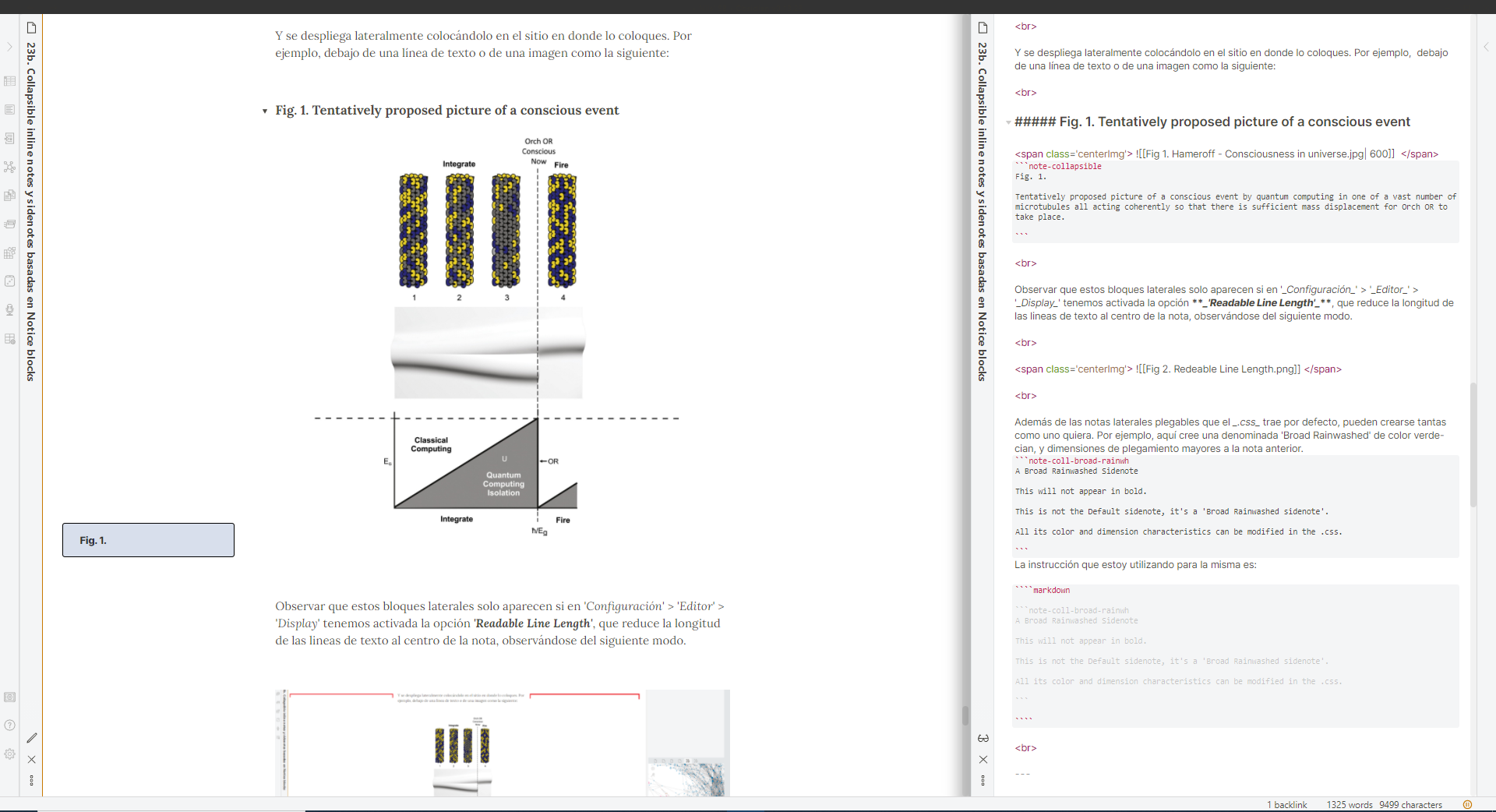
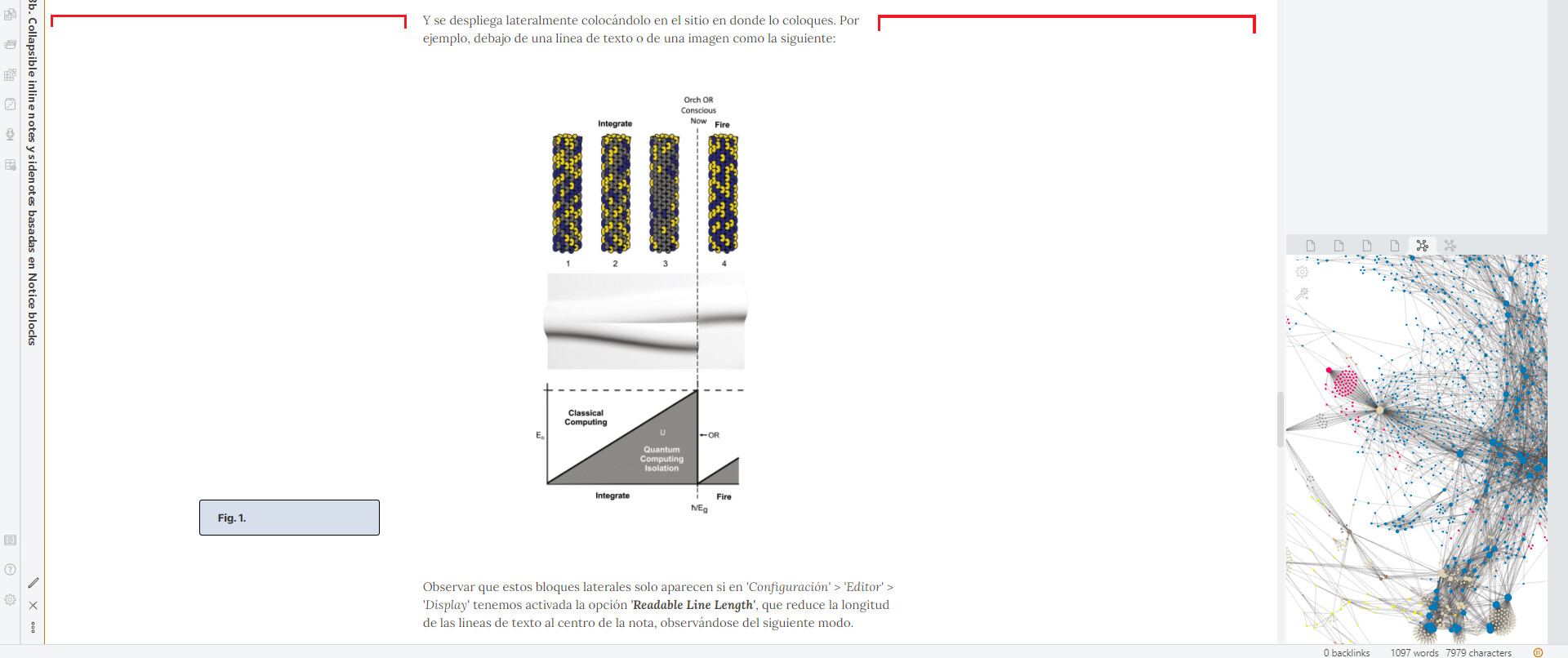
And it unfolds laterally it in the point where you place it (as in Fig. 1a and 1b)
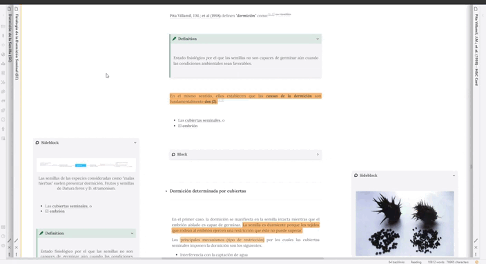
Note that these side blocks only appear if in ‘Configuration’ > ‘Editor’ > ‘Display’ we have the ‘Readable Line Length’ option activated, which reduces the length of the text lines to the center of the note, observed as follows.
In addition to the default collapsible sidenotes that the .css comes with, you can create as many block classes as you want. For example, here create a class called ‘Broad Rainwashed’ that is cyan-green in color, and has larger fold dimensions than the first one.
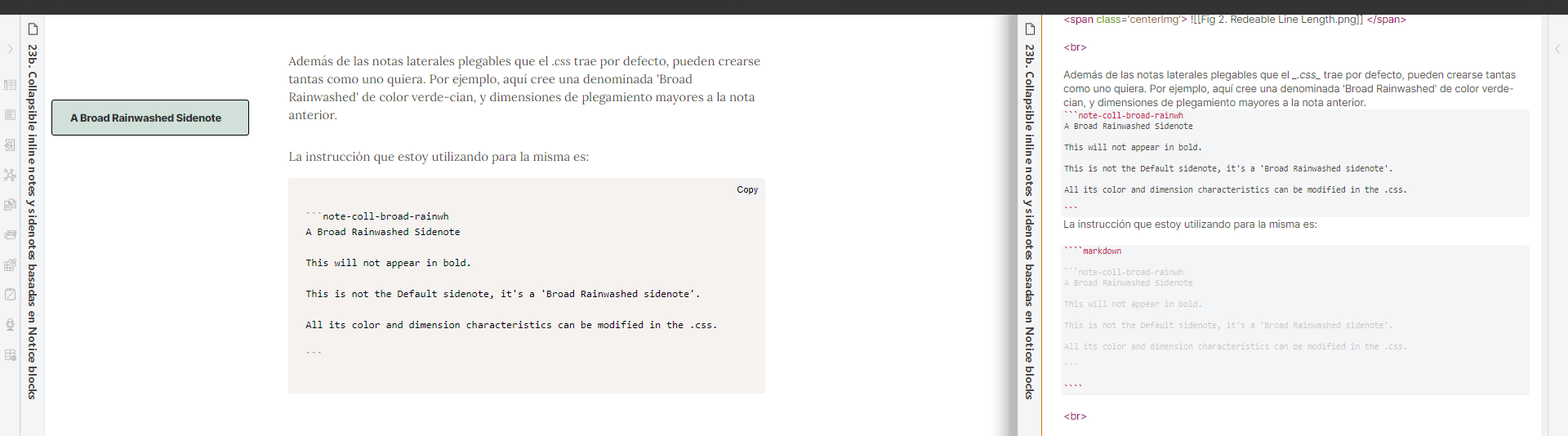
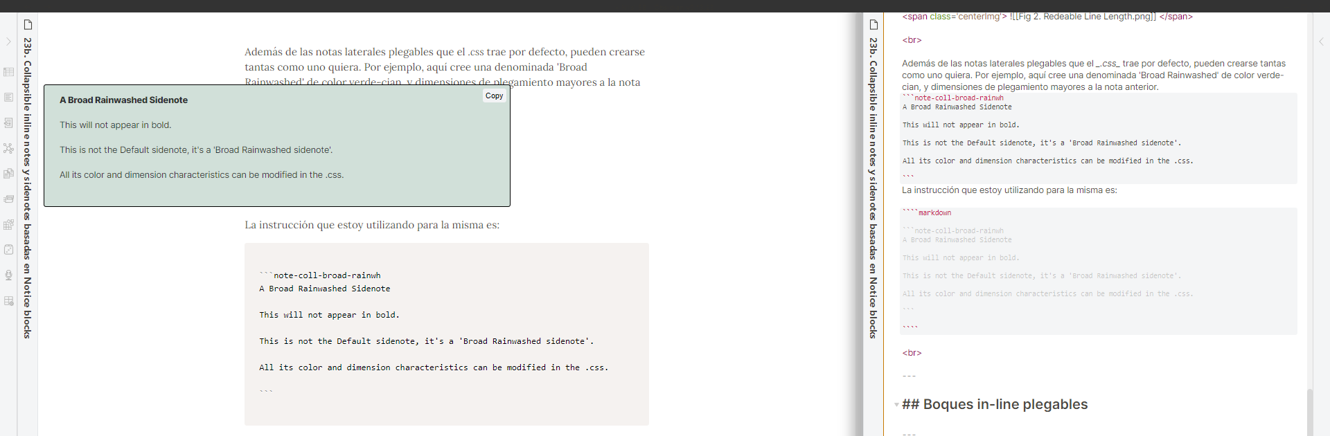
The instruction I am using for it is:
```note-coll-broad-rainwh
A Broad Rainwashed Sidenote

This will not appear in bold.

This is not the Default sidenote, it's a 'Broad Rainwashed sidenote'.

All its color and dimension characteristics can be modified in the .css.

```
You can play with it since it comes with the CSS.
Collapsible in-line notes
For foldable in-line notes:
```note-collapsible-in
This will appear in bold

This will not appear in bold. This is a Default in-line note and all its color and dimension characteristics can be modified in the .css.
```
I hope you like this contribution. It works at least for the standard and Ars Magna themes. Report any bugs, and any help is welcome to improve this implementation!
Nils


