Building on top of this great idea, I have made some adjustments to Calibre their ‘styling’ and the iframe itself.
This is my new ‘literature note’ taking flow. Specifically when I’m ̶b̶e̶h̶i̶n̶d̶(?) in front of the computer.
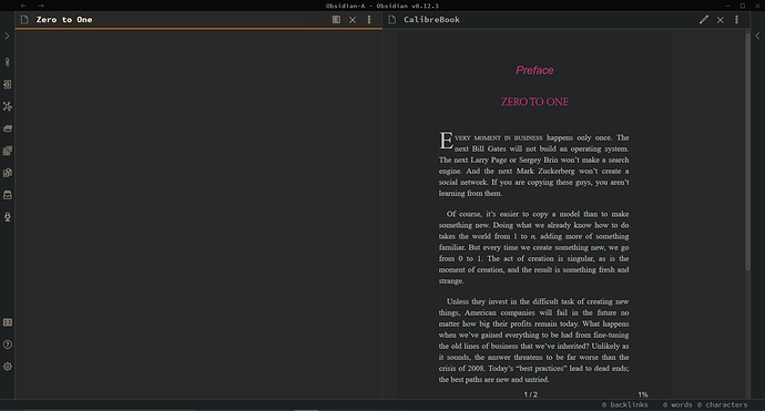
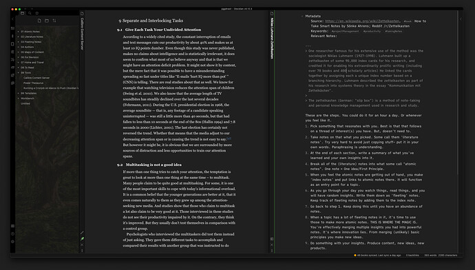
This is what it looks like. Calibre Content Server on the left. Normal note on the right.
 Activate Calibre’s content server in the Calibre app under “Connect/share”
This is how I added a ‘good looking’ calibre to my Obsidian:
// Styled this iframe to "fit the whole note container". Don't use Andy Mode? Try changing the top property to reveal the menu bar.
<iframe src="http://127.0.0.1:8080/" style="position:fixed; top:0; left:32px; bottom:0; right:0; width:100%; height:100%; border:none; margin:0; padding:0; overflow:hidden;">
    There is something wrong with the iframe.
</iframe>
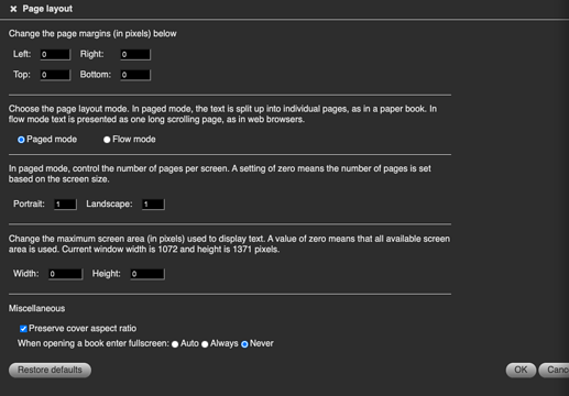
Next is fixing Calibre their front-end. Right click on an open book. Go to ‘preferences’ → ‘page layout’ and set everything to 0 except for the paged mode. Put 1s there.
Hit “OK”.
Add the following CSS to “Styles” in the same menu after you right clicked.
body {
    color: rgba(255,255,255, 0.95);
    background-color: #202020 !important;
    text-align: left !important;
    line-height: 1.6;
    text-indent: 2em;
    max-width: 85ch;
    font-family: 'Georgia', serif;
    -webkit-font-smoothing: antialiased;
    -moz-osx-font-smoothing: grayscale;
}

body p, ul, ol, blockquote {
    max-width: 640px;
    margin: 0 auto;
}

blockquote span {
    font-size: 1rem;
}

h1,
h2,
h3,
h4,
h5,
h6 {
    color: rgba(255,255,255, 0.95);
    text-align: center;
    max-width: 640px;
    margin-left: 0 !important;
    width: 100%;
    display: block;
}

[class*="calibre_"] {
    margin-left: auto;
    text-align: left;
}
That should give you a nice clean reading experience. Experiment with any of the settings and CSS to get your own preferences in here.
Let me know if I can help you with something!
Ps. The same trick with the full-screen iframe I did with https://www.powerthesaurus.org/. Now I have a built-in Thesaurus  Opens with a cmd-o → Thes…

 . I tried a few iframe options but couldn’t get it to look right.


