+1
Text to be written vertically in a tab stack would be nice as an interim as well. Having to tilt my head to the side to read is a little disorientating haha
+1
Text to be written vertically in a tab stack would be nice as an interim as well. Having to tilt my head to the side to read is a little disorientating haha
I created a small CSS code that fixes the text orientation. It will be included within my CyberGlow theme’s next update which is partly focused on stacked tabs, but until then here is that code that I mentioned so you don’t need to tilt your head and break your neck trying to read the tabs.
Can load this as a snippet CSS file with any theme you want.
Edit: This is for the default font, using custom font for the UI might not work well, so you may need to alter the code a bit to make it fit with your desired font.
.workspace .mod-root .workspace-tabs.mod-stacked .workspace-tab-container .workspace-tab-header-inner-title{
    text-orientation: upright;
    letter-spacing: -3px;
text-transform: uppercase;
}
I’d love this but I feel like they would need to rearrange quite a bit of the UI/sidepanels.
Actually, there is a plugin to show vertical panes/tabs: obsidian-koncham-workspace
It does pretty much what is being requested in this thread.
Here are some steps to improve the UX further:
Cons:
.koncham-workspace.koncham-workspace-root-panes {
	height: 100% !important;
    position: relative;
    display: flex;
    align-items: center;
}

.koncham-workspace.koncham-workspace-root-panes .nav-folder-children {
	margin: 0.5em auto;
	cursor: pointer;
}

.koncham-workspace.koncham-workspace-root-panes .nav-file {
	background: white;
	border: 2px solid #00b7ff7d;
	margin: 0.5em;
	cursor: pointer;
}

.koncham-workspace.koncham-workspace-root-panes .nav-file-title:hover,
.koncham-workspace.koncham-workspace-root-panes .nav-file-title.is-active {
	background: #edfaff;
}

.koncham-workspace.koncham-workspace-root-panes .nav-file-title-content {
	margin: auto;
	font-size: 14px;
	cursor: pointer;
}
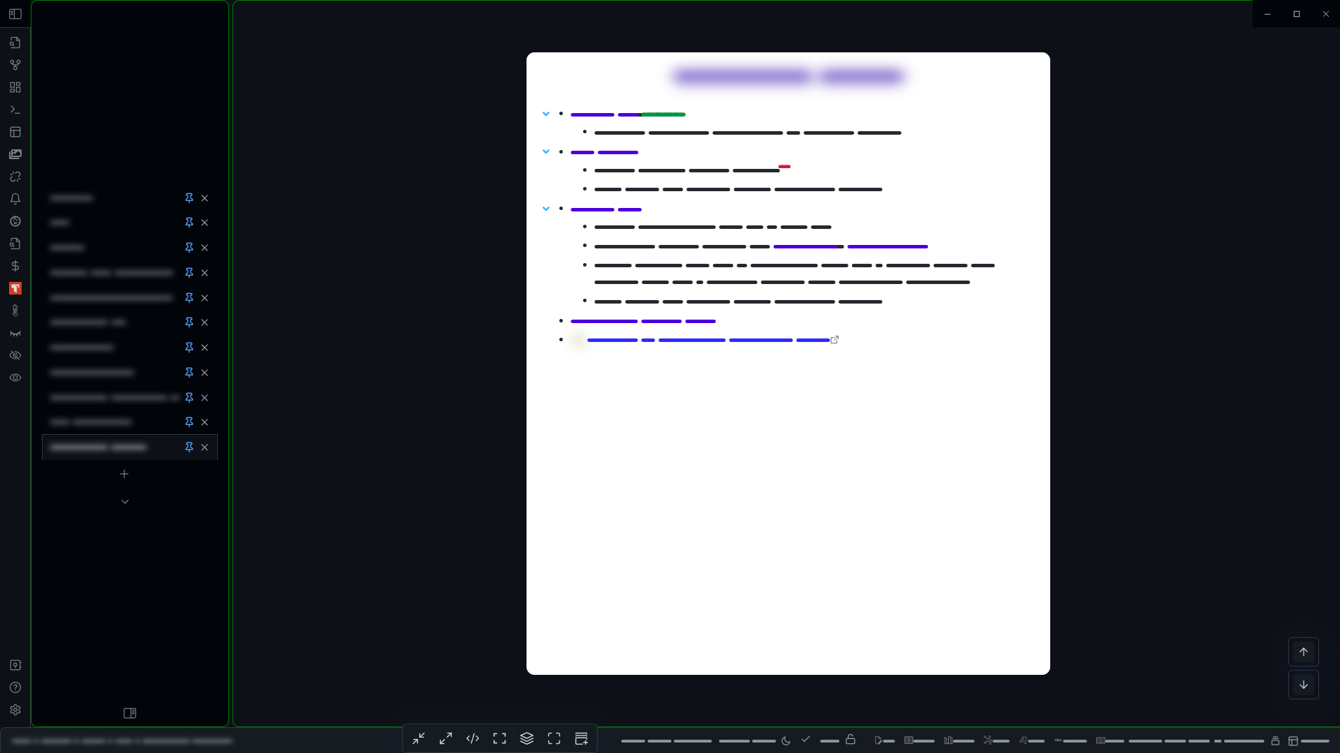
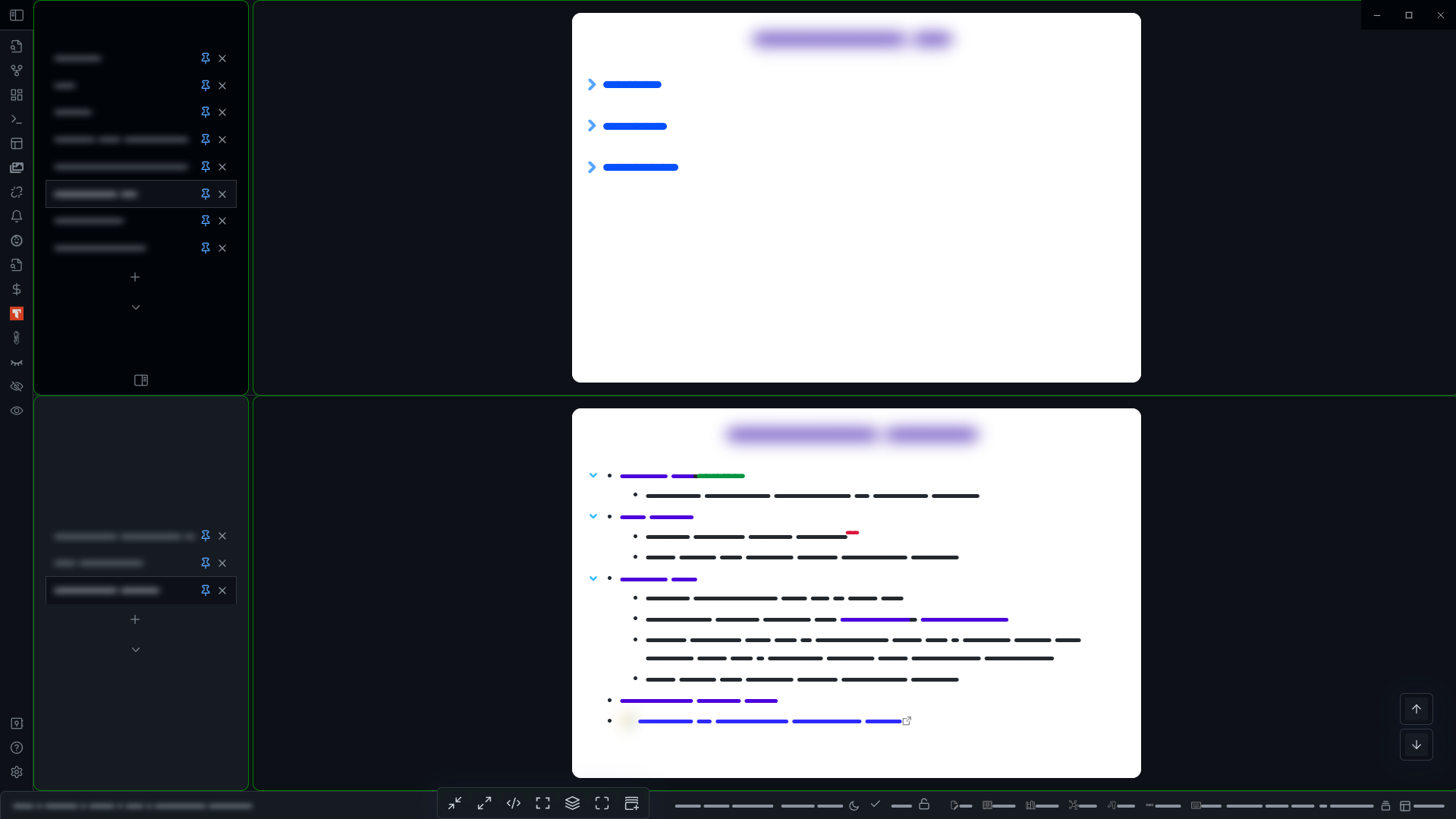
In the image below, I have pinned the “Centre Panes” hovering editor and parked it in the right top corner.
@kazzy Nice one! I’m prefer how it looks with just using Koncham Workspace with its default behaviour and then hiding the tab bar with Hider.
However, when you hide the tab bar, this seems to make it very cumbersome to use panes, which is a non-starter for me. This is because you cannot drag from or right click on the center tab/vertical tab list. You can only open a note in a new pane from other sidebar panels (Drag or Click from Files or Search)
But, also, the vertical tab list gets sort of cluttered when you have multiple panes open, each with multiple tabs. There’s no delineation/indication for which pane a tab is in.
All in all, I’ll leave Koncham Workspace open for a bit but will likely just turn it off and hope that this functionality can get implemented in a slicker way at the Obsidian-core level.
Well I too faced those difficulties - but for me the real problem was the inability to pin or close panes from the vertical tabs list. I had to re-enable the native tabs to do that.
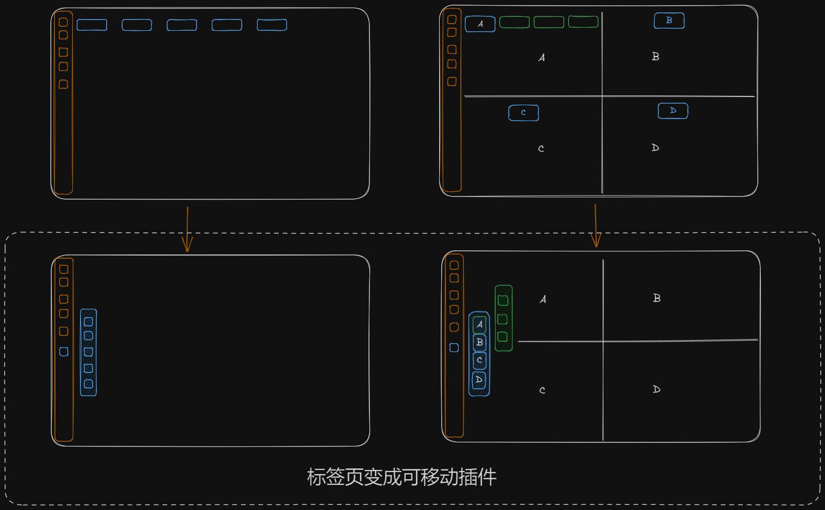
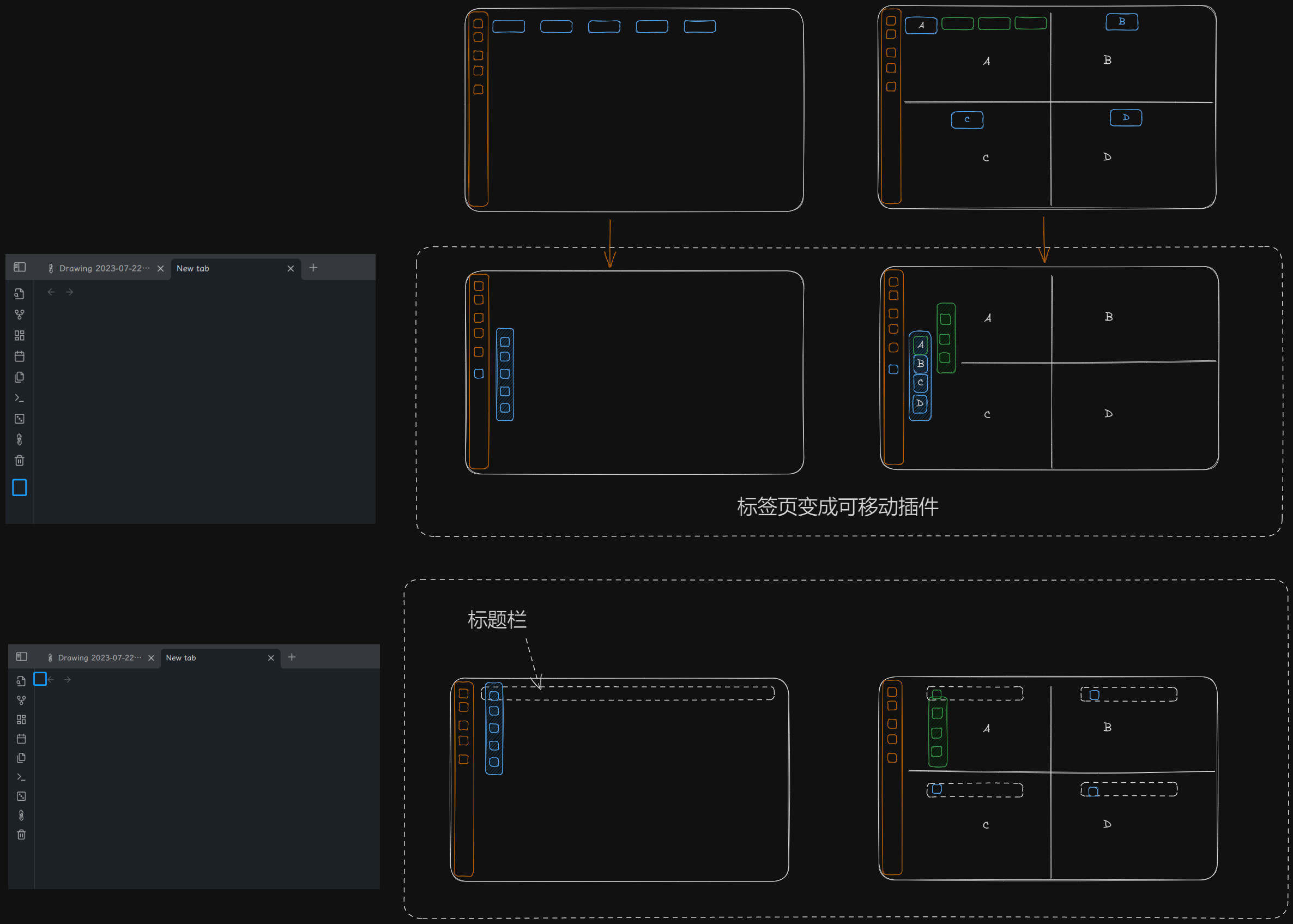
So here’s a brand new solution that I simply love!
It refashions the native tab-bar into cool vertical tabs, with very little drawbacks and absolutely no loss of functionality.
The only drawbacks I can see:
overflow:scroll if it doesn’t work (sorry, feeling a bit lazy at the moment to try it out and add the fix myself, plus very much excited at the new look!!)I have added some cosmetic improvements as per my taste - and they go well with the dark-theme, but they can be easily removed.
I hope this will inspire someone to make a plugin with an improved UX.
So, without further ado, presenting the new “Native Vertical Tabs”:
.mod-root .workspace-tabs {
    flex-direction: row;
}

.workspace .mod-root .workspace-tab-header-container {
    flex-direction: column;
    height: -webkit-fill-available;
    width: fit-content;
    padding-right: 0;
    padding-left: 0 !important;
    border: 1px solid green;
    border-radius: 10px;
}

.workspace .mod-root .workspace-tab-header-container-inner {
    margin-top: auto;
    flex-direction: column;
    /*border: 1px solid #57a5ff;*/
    margin-left: 1px;
    margin-right: 1px;
}

.workspace .workspace-split.mod-root .workspace-tab-header {
    min-width: 250px;
    padding: 7px 5px;
}

.workspace .mod-root .workspace-tab-header {
    min-width: 300px;
    padding: 7px 5px;
}

.workspace .mod-root .workspace-tab-header-inner-title {
    font-size: 15px;
}

.workspace .mod-root .workspace-tab-header-container-inner .workspace-tab-header {
    max-height: 50px !important;
    border-radius: 0;
}

.workspace .mod-root .workspace-tab-header .workspace-tab-header-inner-close-button {
    display: flex !important;
}

.mod-root .workspace-tab-header-inner {
    width: -webkit-fill-available;
}

.mod-root .workspace-tab-header-spacer {
    display: none;
}

.mod-root .workspace-tab-header-tab-list {
    justify-content: center;
    margin-left: -10px;
    margin-bottom: auto;
}

.mod-root .workspace-tab-header-new-tab {
    justify-content: center;
}

.is-hidden-frameless:not(.is-fullscreen)
.workspace-tabs.mod-top-right-space
.workspace-tab-header-container:after {
    display: none;
}
.is-hidden-frameless:not(.is-fullscreen)
.workspace-tabs.mod-top-right-space
.workspace-tab-header-container {
    padding-right: 0;
}

.workspace .mod-root .workspace-tab-header::before,
.workspace .mod-root .workspace-tab-header::after,
.workspace .mod-root .workspace-tab-header-inner::after {
    display: none;
}


#cMenuModalBar {
    bottom: 1px !important;
    left: 30%!important;
}
I like this idea. I’d like to see a choice of being able to put the vertical tabs in either the left or the right panel. I definitely wouldn’t want it taking up space in the editing window, even if it were collapsible.
Sorry for off-topic maybe, but I found this page when was searching for a way to make tabs vertical in the Window mode. Just like in Sublime Text by default. Would be useful, because when you use a Window with horizontal tabs (even when there are few, 3-4), you just can’t see titles of them, because, well, it’s a small window.
(Maybe someone who will implement topic feature would make it also for Window mode)
Great work. Do not support scrolling up and down if there are too many tabs. looking forward to a full-grown plugin for this
I really like this! The only thing that seems broken is scrolling. Did you have any luck adding it @kazzy?
Any news regarding the vertical tabs plugin?
I just found a plugin for this purpose, the function is still primitive, yet have great potential, 【feature request】Support functional pages created by other plugin such as ‘Calendar’ page created by the full calendar plugin · Issue #15 · hdykokd/obsidian-vertical-tabs-view (github.com)
Great idea, haven’t seen anything like this before.
I’m REALLY liking this plugin so far. The dev is very responsive to feature requests as well. Definitely check it out
This is really great! The only issue I’ve found is that I can’t seem to rearrange the tabs. Do you have a solution for that?
hi - thanks for trying it out!
I haven’t had time to look more into this feature.
You can only drag a tab to the bottom of the list, that means you have to shift one-by-one. Better way is to just switch-off vertical tabs and rearrange and switch back-on.
I know this solution is worse than the problem - but I really can’t dedicate more time to this atm.
I am working on ways to get a viable clean column-layout for notes. All the solutions I have seen so far include adding markers or using code-blocks - which I don’t like.
That’s all for now and apologies for providing a half-feature!
I appreciate the response.
And even with this caveat, this is still 10 times better than horizontal tabs! I can’t imagine going back to not using it.