I want to use valuable screen space.
Just a suggestion how it could look like:
If it is difficult to wrap eventually long header around the icon which unfolds right bar, then the icon can display over the text and disappear when we do not hover cursor nearby.
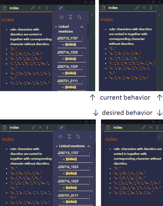
Drag backlinks pane/tab to left sidebar. Right sidebar disappears completely when it does not contain any pane/tab.
Seeking further improvement in
I have dragged backlinks tab to from right left sidebar to Utilize wasted screen space along right edge on small screen, because I mostly do not need to see search and backlinks at the same time.
When I have search tab in left sidebar displayed, how do I switch to “starred” or “backlinks” tab by keyboard without having to mouse click on corresponding tab?
I can have them displayed half height of screen each but that limits view of each on small screen.
If there is a reliable sequence of “blin…
“Toggle right sidebar”
Keywords: bar, button, fold, hide, layout, ribbon, show, side, slide, unfold, window
7 Likes
At the very least the “folded/collapsed” sidebar doesn’t need to have such a large indicator. It could stand to be thinner.
The California Coast Theme behaves like your proposed solution.
I’m not sold on the theme fully, so I extracted and modified the relevant parts into a CSS snippet.
/* from California Coast theme > main css > Default ribbon sidedock icons section */
/* https://github.com/mgmeyers/obsidian-california-coast-theme/blob/main/src/010-main.css#L2645 */
/* cleaned up from most (potentially too much) things */

.workspace-ribbon.mod-right .workspace-ribbon-collapse-btn {
  display: flex;
  align-items: center;
  justify-content: center;
  position: static;
  height: unset;
  width: unset;
  top: unset;
  line-height: 0;
  padding: 4px 6px;
  margin: 0;
  border: 1px solid transparent;
  border-radius: 3px;
  opacity: 1;
  z-index: 9;
}

.workspace-ribbon.mod-right {
  opacity: 1;
  height: unset;
  position: absolute;
  width: unset;
  top: 66px;
  z-index: 9;
  right: 0;
  background: transparent;
  border-right: 0;
  margin-right: 12px;
}

.mod-right:not(.is-collapsed) ~ .workspace-split.mod-right-split {
  margin-right: 0;
}

.side-dock-ribbon.mod-right {
  border-left: 0;
}

.is-mobile .side-dock-ribbon.mod-right {
  border-right: 1px solid var(--background-secondary-alt);
  padding: calc(env(safe-area-inset-top) + 4px) 0
    calc(env(safe-area-inset-bottom) + 4px) env(safe-area-inset-left);
}

/* default, collapse and hover colors */

.workspace-ribbon.mod-right .workspace-ribbon-collapse-btn {
  color: var(--text-muted);
  background-color: var(--background-secondary);
}
.workspace-ribbon.mod-right .workspace-ribbon-collapse-btn:hover {
  background: var(--background-secondary-alt);
}
.workspace-ribbon.mod-right:not(.is-collapsed) .workspace-ribbon-collapse-btn {
  background: var(--background-secondary-alt);
}
.workspace-ribbon.mod-right:not(.is-collapsed)
  .workspace-ribbon-collapse-btn:hover {
  background: var(--background-secondary);
}
1 Like
I do not see where this made any difference to the CA theme. What was the expected result?
It wasn’t supposed to. It’s a small extract from the theme that does the thing in the request for people (like me) who don’t want the whole theme.
Also, I updated the snippet with modifications I made since.