Not all Typography changes are in this CSS as they are done through the Style Setting Plugin
Edit: Added another CSS to make Frontmatter look clean and nice, updated links to the repo that is connected to my CSS files, and will update as I make changes.
If you want the beautiful Bear Sans UI font, the best way would be to download Panda and get it from the App’s content (Panda.app → Contents → Resources)
It’s their custom font, but I guess it’s ok to use it personally.
Very nice design. For anyone who can’t get the Bear font, Atkinson Hyperlegible is freely available and very clean and clear. I particularly like having a slashed zero to distinguish 0 from O.
I find Cascadia Mono better legible than Atkinson Hyperlegible. The only thing I prefer in AH is that fractions, such as ¾ are better legible. That is just my view, of course, many people agree with you on AH.
@anon12638239 yes, that is what I mean. I used to hate monospace, and the 1st I used to do in an app is replace it with a variable width font. But, that/I changed gradually.
What I like about certain monospace fonts (Space Mono, B612 Mono, MonoLisa are some others) is that the letterspacing is just that bit wider, and the letter shapes are easier to read.
Heck, I even set the font to monospace in my Dark Reader extension, which thus converts web page text to monospace.
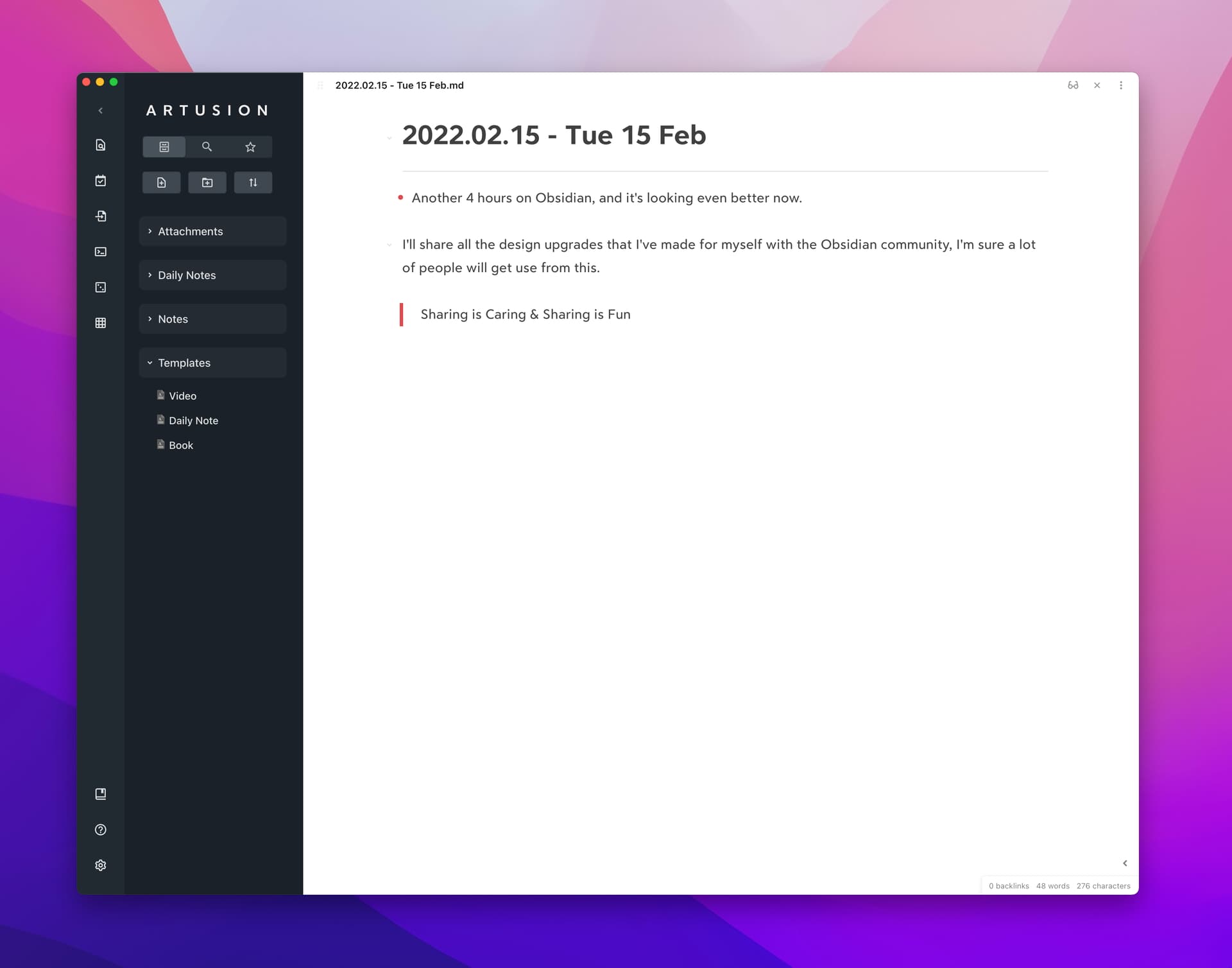
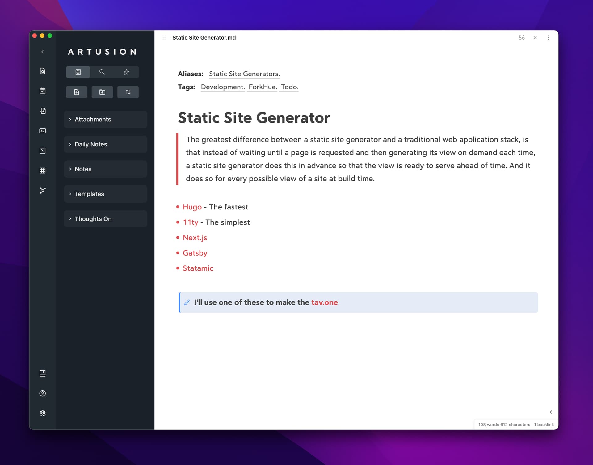
This is by far the most beautiful Obsidian theme I’ve seen, and reminders me of my beloved Bear app. Too bad this hasn’t been updated to work with the latest versions. Is there anything like this out there?
Is this ready as a theme? I like the look of it, however, the css now no longer works and some files are no longer available. Can someone make this into a proper theme?