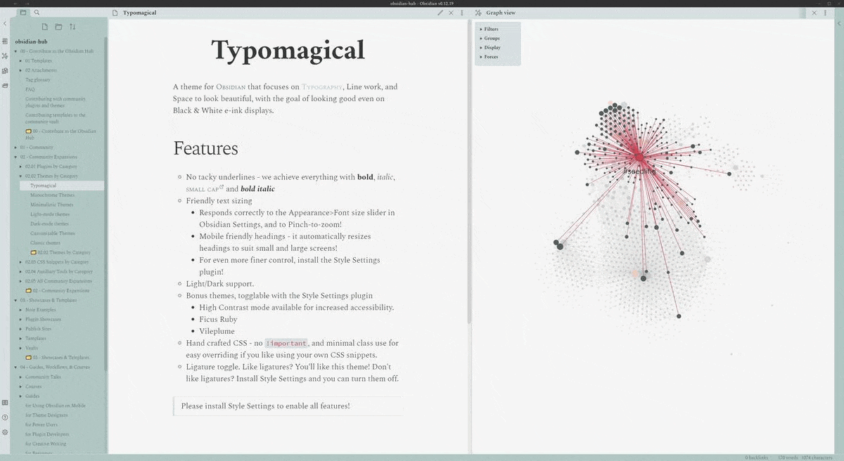
Hello all - I’d like to introduce my submission which didn’t quite make Obsidian October - Typomagical!
An Obsidian theme for typographic appreciators, with support for Style Settings by mgmeyers, with the goal of looking good even on Black & White e-ink displays.
Responds correctly to the Appearance>Font size slider in Obsidian Settings, and to Pinch-to-zoom!
Mobile friendly headings - it automatically resizes headings to suit small and large screens!
For even finer control, install the Style Settings plugin!
Light/Dark support.
Bonus themes, togglable with the Style Settings plugin
High Contrast mode available for increased accessibility.
Ficus Ruby
Vileplume
Hand crafted CSS - no !important, and minimal class use for easy overriding if you like using your own CSS snippets.
Ligature toggle. Like ligatures? You’ll like this theme! Don’t like ligatures? Install Style Settings and you can turn them off.
Why make this?
I feel that Obsidian is an app about Writing AND Reading, and its themes should pay more attention to the beauty of the typography of your work, less about icons or buttons or toolbars of the interface.
How to use it
Open the Appearance tab in Obsidian
Click the Manage button
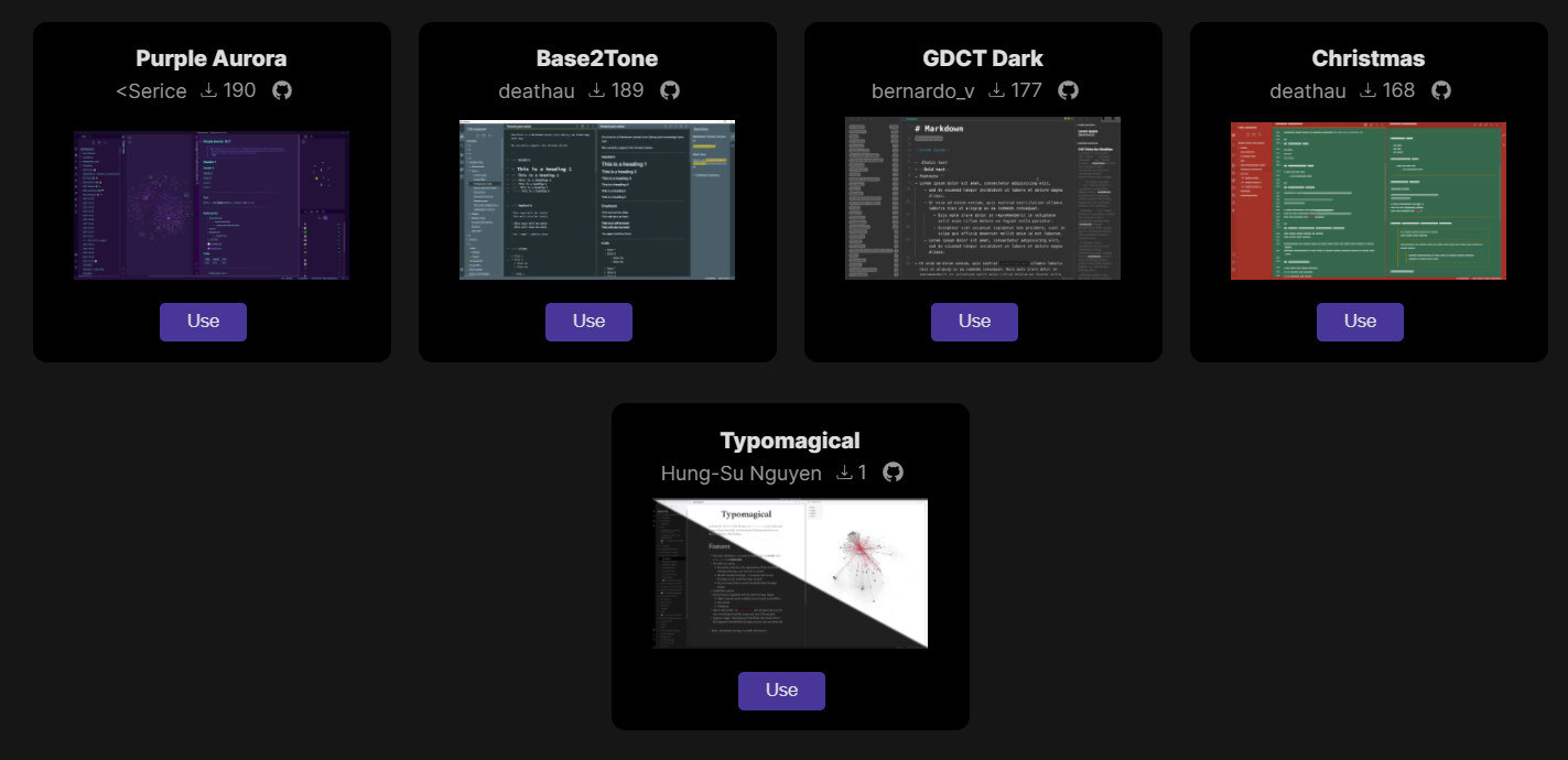
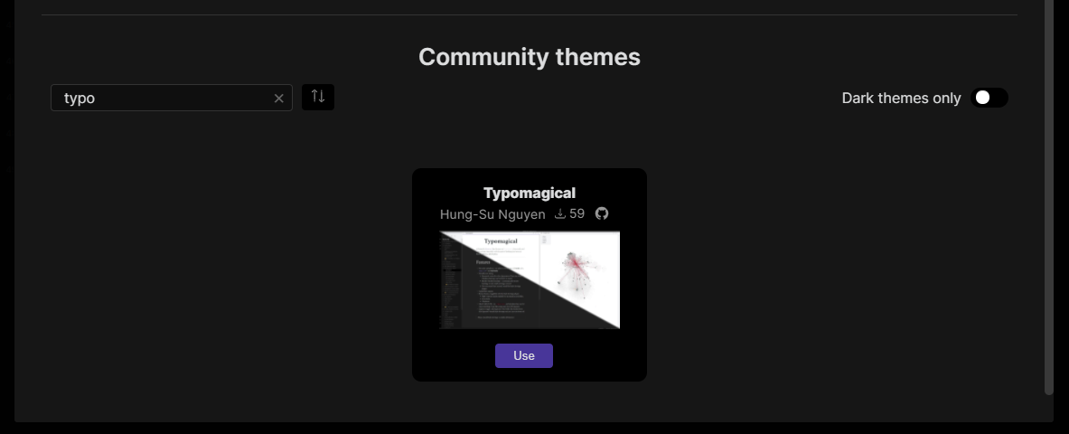
Use this search box to find “Typo”, then click “Use”
Vertical typographic rhythm. You may notice that after adding some headings to your document, the tempo of the lines of writing are no longer even. Above is a good example of consistent vertical typographic rhythm, where adding any kind of element preserves rhythm, indicated by the blue lines.
Thank you and @Klaas for the genuine support. It seems that my themes continue to fly under the radar of the community while other themes track gigantic amounts of attention. But if you like this theme, that’s enough for me! I’ll continue to build fixes, improvements, and colour palettes!
For people who first find your theme via the forum, you might edit your first post to indicate that the theme has been approved and added to the browser.
This is wonderful! Makes the Obsidian experience so much more enjoyable.
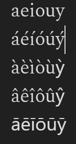
I have one small request, and I have no idea if this is feasible. I noticed the font doesn’t handle some special characters very well. I type in other languages sometimes, and they come out looking a little strange. Is there any way this could be fixed in a future update? Screenshot to illustrate:
Thank you so much for the detailed message! Yes, I took a bit of a shortcut and chose a font variant that only has plain latin characters. But I believe it also comes in other variants, I would just have to choose the right one!
Could I ask you a favour? Could you send me some sample text where those characters look strange?
That’s totally understandable. I work in Latin, which has only been easy to type on a computer for a decade or so. I have Latin print works that mess up the fonts like this
Here is a text and a screenshot of how it renders.
aeiouy
áéíóúý
àèìòùỳ
âêîôûŷ
āēīōūȳ
And a screenshot of how it renders:
So you can see that accents are fine, graves and circumflexes are fine except for y, and macrons are all off. I haven’t tested any other symbols.
FWIW I use Arabic and Chinese, too, and those render just fine as far as I can tell.
Thank you so much for the sample! Made debugging this very easy I’ve just pushed up a fix that I think will work, could you use the Update button in theme manager to try it out?
desired palettes: Obsidian Nord & Ono Sendai;
would like to see instructions or tool(s) for modifying palettes, and/or changing fonts…
(also, do you know whether sans-serif is ever \with\ ligatures?)
Nice theme, I like how it leaves a lot of the default Obsidian underpinnings. Most of the settings don’t work for me on Windows, and Headings styles only work on H1.

 ) Obsidian.
 It seems that my themes continue to fly under the radar of the community while other themes track gigantic amounts of attention. But if you like this theme, that’s enough for me! I’ll continue to build fixes, improvements, and colour palettes!