Theme: MagicUser

Theme update 8.0.0 → 8.4.0

Improvements

  • Style Settings - new preset theme: MagicUser Moon

MagicUser Moon preset theme

  • Style Settings - select folder and file icons colors

file folder icons colors

  • Source mode with monospaced font.

  • Style Settings - customize code font.

  • Style Settings - icons for light and dark modes (sun for the light mode and moon for the dark mode)

Style Settings - light and dark mode color indicators

  • Style Settings - removed UI basic settings (easier to use and less clicks to navigate)

v8.4.0

  • Style Settings - collapse indicator color

  • Style Settings - accent color to display the default values

  • Other small adjustments (padding, new variables etc)

I hope you enjoy.

All the best

4 Likes

this theme is awesome!
I use mostly light with pink accent color - looks awesome.
both light and dark looks consistent and usable, which is rare.

the only feature I missed after swithing to this theme from “lyt mode” was ability to highlight active tab in stacked mode, so I made it with this css snippet:

.workspace-tabs.mod-stacked  .workspace-tab-header.mod-active {
  border-left: 3px solid var(--interactive-accent);
}
3 Likes

@ll14m4n Thank you very much for the kind words and for using the theme. Much appreciated. Also, thanks for sharing your css snippet.

I will add other snippet so you can highlight just the background of the active tab (stacked mode). If you think the border is distracting, just use the snippet below.

.workspace-tabs.mod-stacked  .workspace-tab-header:not(.mod-active) {
  background-color: var(--mu-background-color-2) !important;
}

Of course you can combine both snippets. Below is an example of thinner border and background color of active tab (stacked mode). It works in light and dark modes, also when using the preset themes available using the Style Settings plugin.

.workspace-tabs.mod-stacked  .workspace-tab-header.mod-active {
  border-left: 1px solid var(--mu-vault-title);
}

.workspace-tabs.mod-stacked  .workspace-tab-header:not(.mod-active) {
  background-color: var(--mu-background-color-2) !important;
}

If you think this option should be included in the theme by default, please let me know.

All the best

2 Likes

Thanks.

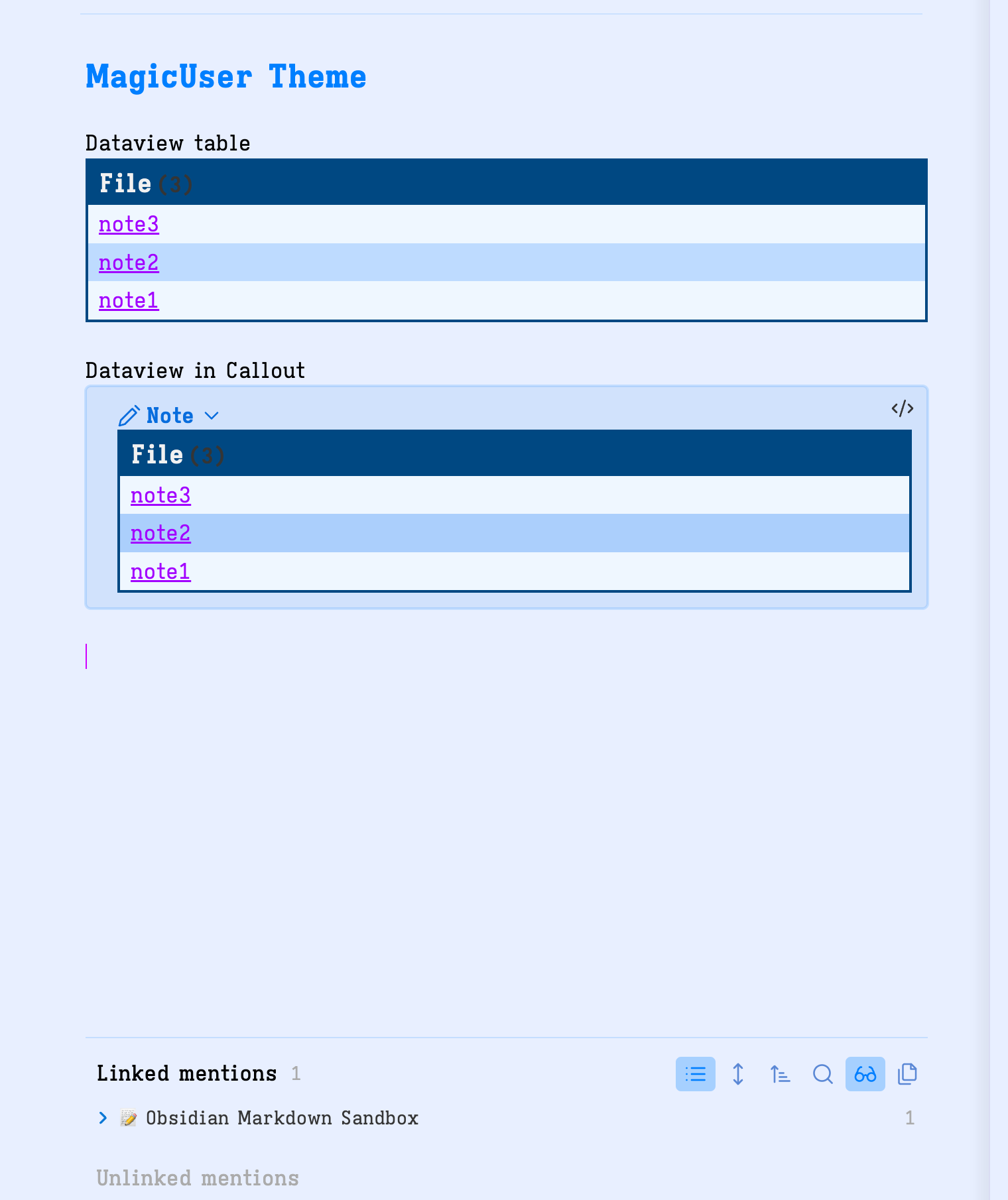
I have a question regarding tables and dataview tables. It turns out that black span.dataview.small-text black is not very readable on blue blackground. Of course I can hotfix this with a snippet, but may be you consider to fix this as well in future versions.

Also I use dataview tables inside callout blocks to collapse long queries. And for me original borderless tables looks more neat inside callout block… what do you think about that?
Is it posible to make table styling optional in Style settings?

I haven’t figured out hot to do this yet myself via css snippet. It seems that I need to edit the theme file itself… :thinking:


1 Like

After applying the scientific trial-and-error method :smile:, I obtained the following results:

snippet:

.theme-light th {
    background-color: var(--mu-background-color-1) !important;
    color: inherit !important;
    text-align: left;
    border-bottom: 2px solid var(--mu-titlebar-background) !important;
}

.theme-light table {
    border: none;
}

.theme-light tr:nth-child(even) {
    background-color: var(--mu-background-color-2) !important;
}

.theme-light tr:nth-child(odd) {
    background-color: var(--mu-background-color-1) !important;
}
1 Like

Please try theme version 8.8.0. Let me know if it is working well for you. Adjusted the display of the calendars as well

1 Like

The new theme version will keep the usual display of tables in non-dataview tables (with dark blue table headers, th).

I tested inside callouts and it is working for me. Please let me know.

All the best

Great! Thank you for the quick update.
Table inside callout now looks tidy and it preserves callout’s background color.

1 Like

@ll14m4n Thanks for the suggestion and feedback. Much appreciated :+1:
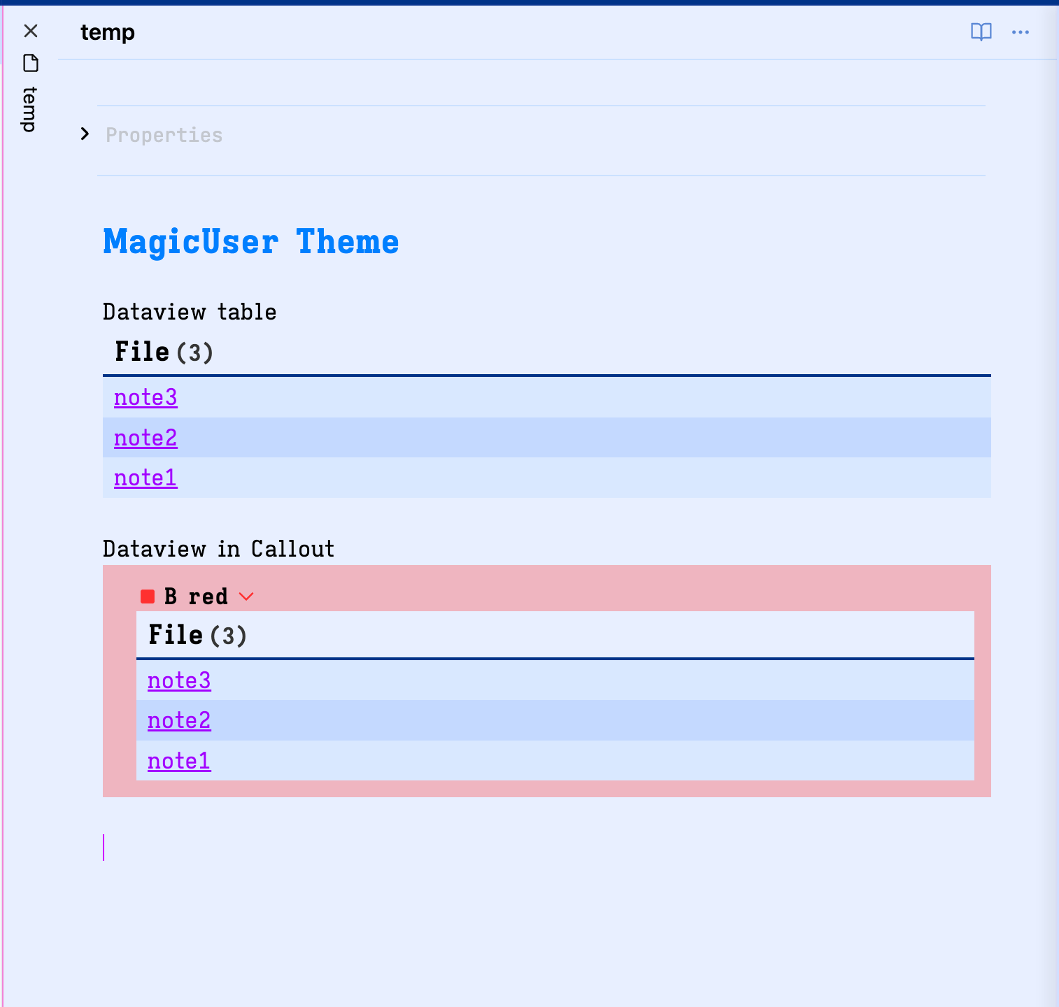
. If you have other suggestions, please let me know.

All the best

Theme update 9.0.0

MagicUser Theme - Plugins Compatibility

Improvements

  • Plugins compatibility adjustments: Full Calendar and Kanban.

  • Markdown tables adjustments.

  • Input date background color.

Style Settings - New Options

  • UI SettingsMain Theme Options - stacked mode tabs: border width of active tab (0 = no border).

  • UI SettingsMain Theme Options - stacked mode tabs: border color of active tab (independent colors for light and dark modes).

Community Plugins Compatibility

  • Style Settings

  • Dataview

  • Kanban

  • Calendar

  • Full Calendar

  • Tasks

If you encounter any theme issues using a plugin, please let me know.

I hope you enjoy.

All the best

3 Likes

Theme update 10.1.0

Improvements

Dark side bar light mode

MagicUser theme - Style Settings - dark sidebar - light mode

  • Dark sidebar (light mode) - 7 themes (main theme and preset themes, Style Settings).
  • Adjustments to improve Kanban plugin layout.
  • Tables adjustments in reading mode.
  • Reading indicator rounded corners and slider adjustments (Style Settings).

All the best

2 Likes

Theme update 11.0.0

Improvements

Rainbow folders

  • Style Settings: Rainbow colored background folders (001-,01- to 08-,008-)

    • When activated, this mode will highlight the background of folders starting with the numbers “01-” and/or “001-” to “08-” and/or “008” (according to the order of rainbow colors plus the gray color, 8th color). It will work with folders starting with “01 Folder name” to “08 Folder name”.

    • All subfolders will have the same color of the top folder.

Folder name:

Number + (space) and/or
Number + - (hyphen or minus)

Example:
01 Folder name or 01-Folder name

Activate this mode using the Style Settings plugin:

UI SettingsIcons and Folders → Rainbow colored background folders

  • Sidebar open folder area (open folder highlight area).

Sidebar open folder area

  • Style Settings: select sidebar open folder area border color.

  • Style Settings: select sidebar open folder area background color.

  • Style Settings: hide sidebar open folder area.

Fixes:

  • Style Settings: Removed addCommand / shortcuts

All the best

2 Likes

Note that with rainbow folders enabled (Style Settings), you can create multiple folders starting with 01 up to 08 (also 001-008).

All folders starting with 01 or 01- will appear in red color (sidebar), 02 in orange color and so on.

01-Folder A (red)
01-Folder B (red)
02-Folder C (orange)
02-Folder D (orange)
03-Folder E (yellow)

This way you can create colored folders only in the folders/topics you want, it is not automatic rainbow colors (in all folders). I hope you enjoy.

All the best

2 Likes

Theme update 11.1.0

MagicUser - Neon mode

MagicUser - Neon mode - gif

  • Style Settings: Neon mode (headings)
  • Outline: indent guides colors (same colors as file explorer indent guides).

All the best

Theme update 11.2.0

Improvements

Reading glow

  • Reading Mode: Reading glow effect to highlight important areas (click on the content - reading mode).

  • Style Settings: Reading glow color (7 colors).

  • Style Settings: Reading glow border size.

  • Style Settings: Reading glow corners size (0 = square corners).

This effect was removed after version 8.6.1 but it is back - improved version. I hope you enjoy

All the best

Theme update 11.3.0

Improvements

Dataview tables to cards

  • Dataview tables to cards. Add cssclasses property (with cards class) on the note you want to transform the dataview tables to cards. This cards class was inspired by @kepano excellent Minimal theme, but it is a different code and look. I hope you also find it useful.

  • The default cards class will add 3 columns maximum. If you want just 2 columns add cards cards2 (cssclasses property).

---
# Display dataview tables to cards (2 columns)
cssclasses:
- cards
- cards2
---
  • You can add 5 additional classes: cards1, cards2, cards3, cards4 and cards5 (corresponding to the number of columns - 1 to 5 columns). I think this is easy to remember and implement.
---
# Display dataview tables to cards (5 columns)
cssclasses:
- cards
- cards5
---

  • Images inside cards will adjust to the size of the card.

  • These cards were tested also in callouts dataview tables.

  • Dataview: Comments in italic (live preview).

All the best

2 Likes

Theme update 11.4.0

Improvements

Search

Global search highlight, same note search, linked mentions and outline text highlight improvements.

  • The search result text in live preview, source and reading modes will appear in black text color with highlighted background (default is yellow, but you can select any highlight color using the Style Settings). In live preview and source modes, the text will also appear underlined to be easier to find. It works for all types of text (normal text, bold, italic, links, tags, code and headings).

Note: The underline will be the same color of your text cursor/caret color.

  • In reading mode, no underlined text during a search, just the highlighted text.

  • Outline highlight: When you click on the item (using the outline) it will highlight the text the same way (search). I think it will be easier to read, especially when using different colors for H1-H6 titles (normal mode and neon mode).

  • Dataview: primary and secondary alt-backgrounds improvements.

Fixes:

  • Media callout black color display (reading mode).
  • MagicUser Room Lamp preset theme (dark mode): improved caret color. Easier to see.

All the best

2 Likes

Theme update 12.0.0

Improvements

Style Settings:

  • Advanced UI Settings Improvements
    • New submenu: Hide UI Elements (the hide and auto-hide features are more organized in this submenu).

Advanced UI

  • New: Compact command palette and prompts (toggle). When activated, the prompts will have a compact size at the bottom part of the screen (e.g. command palette).

Compact Prompts

  • New: Transparent menus, modals and prompts (toggle). Transparency level adjustment (slider). You can control the transparency level of the menus, modals and prompts.

MagicUser - Transparent Menus, Modals and Prompts

  • New Preset Themes: MagicUser BG Series (BG = backgrounds)
    • BG Night
    • BG Synth (80s style)
    • BG Dreams (80s style)
    • BG Slide
    • BG Classic

MagicUser BG Preset Series

The light mode version of the MagicUser BG themes is the same. The dark mode version is the one with custom background.

I was born in the 70s, so I was heavily influenced by the 80s style and music. I had to add some details to the theme as a small tribute to those great times and it is dedicated to those who feel the same way about the 80s. I hope it helps to bring some extra joy to your activities. Don’t forget to activate neon mode at night :+1:

I hope you enjoy

All the best

5 Likes

Theme update 12.2.0

Improvements

New: Outline Neon Mode

Outline Neon mode

  • Neon text border highlight. This mode makes h1-h6 a different size than Neon mode. Outline Neon mode enlarges titles for effortless reading (note the size of h4-h6 headings). Smoother neon effect on text. Choose your preferred style.

The image was compressed (also small size), but hopefully it will give an idea of the effect.

New: Neon glow controller (slider)

Neon glow controller

  • Adjust the neon glow intensity to match your style. It also controls Outline Neon mode glow.

Why these Neon modes?

Sometimes a little change in text mode can add that extra motivation/joy to keep focusing our attention on the topic. If you find it distracting, simply don’t enable it. I think it’s good to have some tools available.


Thank you note

A special thanks to @cameron for your inspiring video showcasing the MagicUser theme on Animal Cracker Studios. It motivated me to add the new outline neon mode and the neon modes glow controller. Thanks, Cameron!


All the best

1 Like