I’ve done a similar graph related to a gym workout, where there was multiple scales and stuff related to the workouts. Please do check that out as well, as the simplified version below here.
The gist of the tracking is to build an ordinary query which lists all the values we want to graph, and then to adapt the surrounding code to pick the correct columns for presentation, and the right axis if you’ve got varying scales.
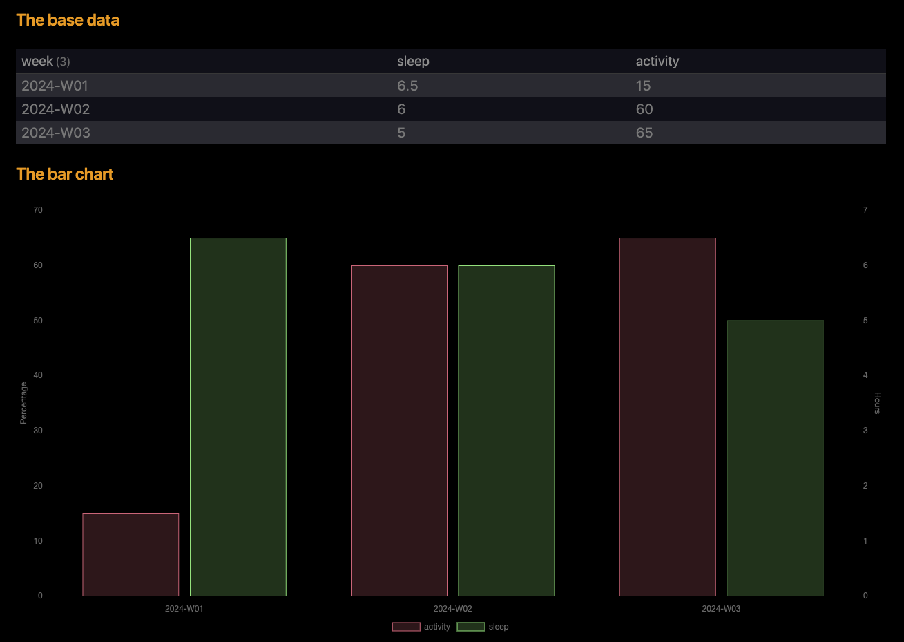
Here is my simplified version for just two data sets (and in a bar format):
## The base data
```dataview
TABLE sleep, activity
FROM "Daily Notes/2024"

GROUP BY dateformat(file.day, "yyyy-'W'WW") as week

FLATTEN sum(nonnull(rows.sleep))/length(nonnull(rows.sleep)) as sleep
FLATTEN sum(nonnull(rows.activity))/length(nonnull(rows.activity)) as activity
```

## The bar chart
```dataviewjs
const result = await dv.tryQuery(`
  TABLE activity, sleep
  FROM "Daily Notes/2024"
  GROUP BY dateformat(file.day, "yyyy-'W'WW") as week

  FLATTEN sum(nonnull(rows.sleep))/length(nonnull(rows.sleep)) as sleep
  FLATTEN sum(nonnull(rows.activity))/length(nonnull(rows.activity)) as activity
`)

const myHeaders = result.headers
const myLabels = result.values.map(d => d[0])
const myData = result.values[0].map((_, colIndex) => result.values.map(row => row[colIndex]))

const chartData = {
  type: 'bar',
  data: {
    labels: myLabels,
    datasets: [{
      label: myHeaders[1],
      data: myData[1],
      backgroundColor: 'rgba(255, 99, 132, 0.2)',
      borderColor: 'rgba(255, 99, 132, 0.9)',
      borderWidth: 1,
      yAxisID: 'left-y-axis'
    }, {
      label: myHeaders[2],
      data: myData[2],
      backgroundColor: 'rgba(99, 255, 132, 0.2)',
      borderColor: 'rgba(99, 255, 132, 0.9)',
      borderWidth: 1,
      yAxisID: 'right-y-axis'
    },
    ]
  },
  options: {
    plugins: {
      legend: {
        position: 'bottom'
      }
    },
    scales: {
      'left-y-axis': {
        title: {
          display: true,
          text: "Percentage"
        },
        type: 'linear',
        position: 'left'
      },
      'right-y-axis': {
        title: {
          display: true,
          text: "Hours"
        },
        type: 'linear',
        position: 'right'
      }
    }
  }
}

window.renderChart(chartData, this.container)
```
Which produces this output in my test scenario:
The javascript might seem overwhelming, but it’s not as hard to modify as it might seem at first. Most of the stuff is to be left as is for most of the time. If you want to add another data set you need to do the following:
- Change the query so it has the extra data set. If you add it at the end you’re making life simpler for yourself…
- Locate the
datasets: area in the script, and copy one of these blocks after the others:
 {
      label: myHeaders[2],
      data: myData[2],
      backgroundColor: 'rgba(99, 255, 132, 0.2)',
      borderColor: 'rgba(99, 255, 132, 0.9)',
      borderWidth: 1,
      yAxisID: 'right-y-axis'
    },
- Change the
[2] on the first two lines to match the column number of your query (remember it starts at 0 for the first column)
- Change the colors to something you like
- Change the
yAxisId to either right-y-axis or left-y-axis, depending on which range your new data set is in.
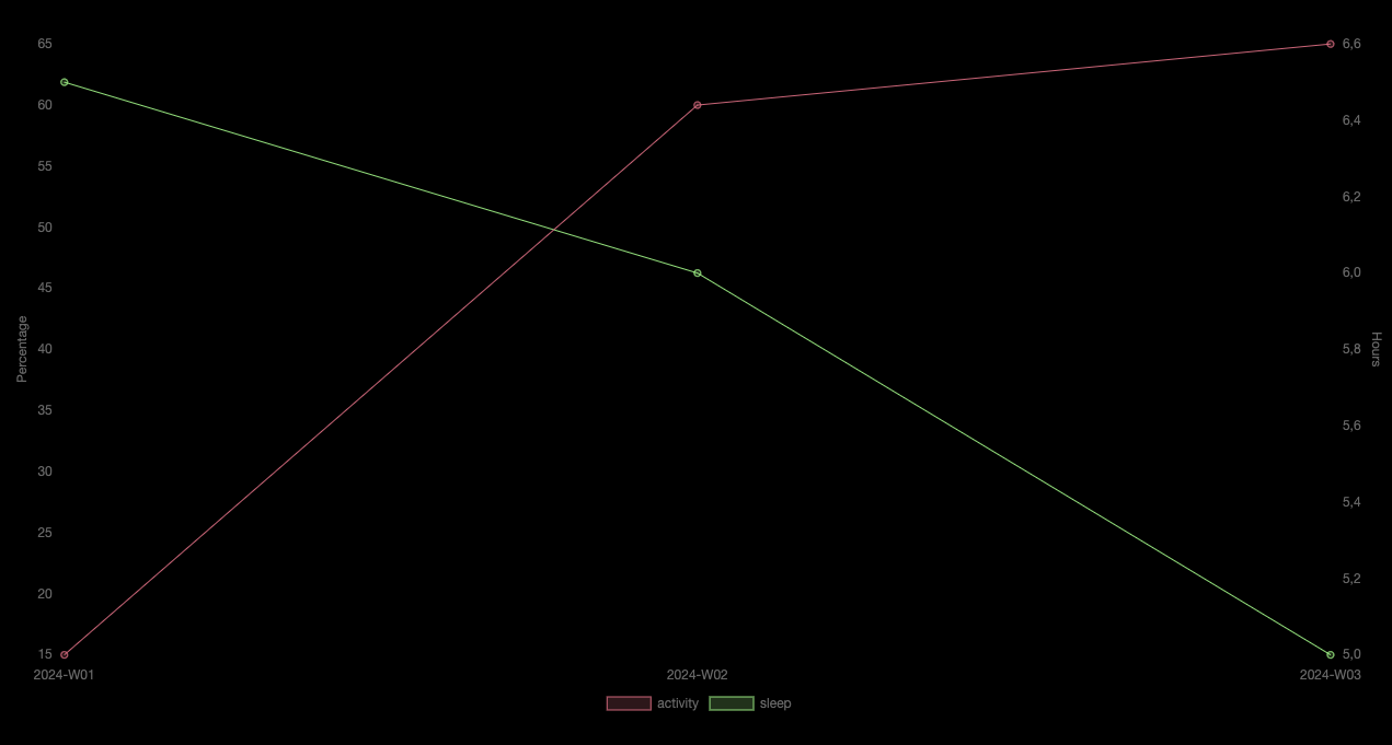
Watch your new and improved bar chart in reading mode or live preview
Some comments on the query
I’ve changed the query slightly into:
```dataview
  TABLE activity, sleep
  FROM "Daily Notes/2024"
  GROUP BY dateformat(file.day, "yyyy-'W'WW") as week

  FLATTEN sum(nonnull(rows.sleep))/length(nonnull(rows.sleep)) as sleep
  FLATTEN sum(nonnull(rows.activity))/length(nonnull(rows.activity)) as activity
```
Changes I’ve done:
- I change the dateformat ever so slightly to become “2024-W01”, so as not to confuse a date week string with the month variant of “2024-01”
- I’ve also used
file.day which uses a date from either within the file name of your date note, or from a date property. If this doesn’t work in your case, feel free to change it back to file.cday
- You used
FLATTEN ... as Count (and Tot) multiple times, which I feel is kind of sketchy since you redefine the value over and over again. To make it a little cleaner I just calculated the value in one go
- I’ve used
nonnull(rows.propertyName) to allow for the propertyName not to exist (or not have value) in your daily notes. I explicitly tested against this, and without the nonnull( ... ) the query excluded the entire week from my result
- When we do
GROUP BY it changes the first column from the file.link into the expression we’re grouping on. So no need to do the TABLE WITHOUT ID week, when we can simply do GROUP BY ... as week
I’ll try later on to see how hard it is to transform this bar chart of multiple categories into a line chart, but I’m running a little out of time for today’s answering…