… in case they don’t bring it back you can implement it yourself …
On Android Mobile the setting …
… has now disappeared from my Android phone.
… is still there on my Android Tablet and Chromebook.
[… so screen size rather than mobile per se seems to be the deciding factor of this change]
However I can make it reappear on my Android phone by making Android “think” that I have a tablet …
For this you need to have enabled developer options.
(… Tap “About Phone/Build number” seven times.)
In developer options scroll down to Smallest width
e.g. on my Android phone I have
Smallest width:
411 dp
On Android the pivot figure is 600 dp.
… anything below Android thinks you have a phone.
… anything above Android thinks you have a tablet.
So I set it to 610 dp (from 411 dp)
Now when I reload Obsidian(no need to reboot the phone) …
… it has a tablet layout with tabs on top and …
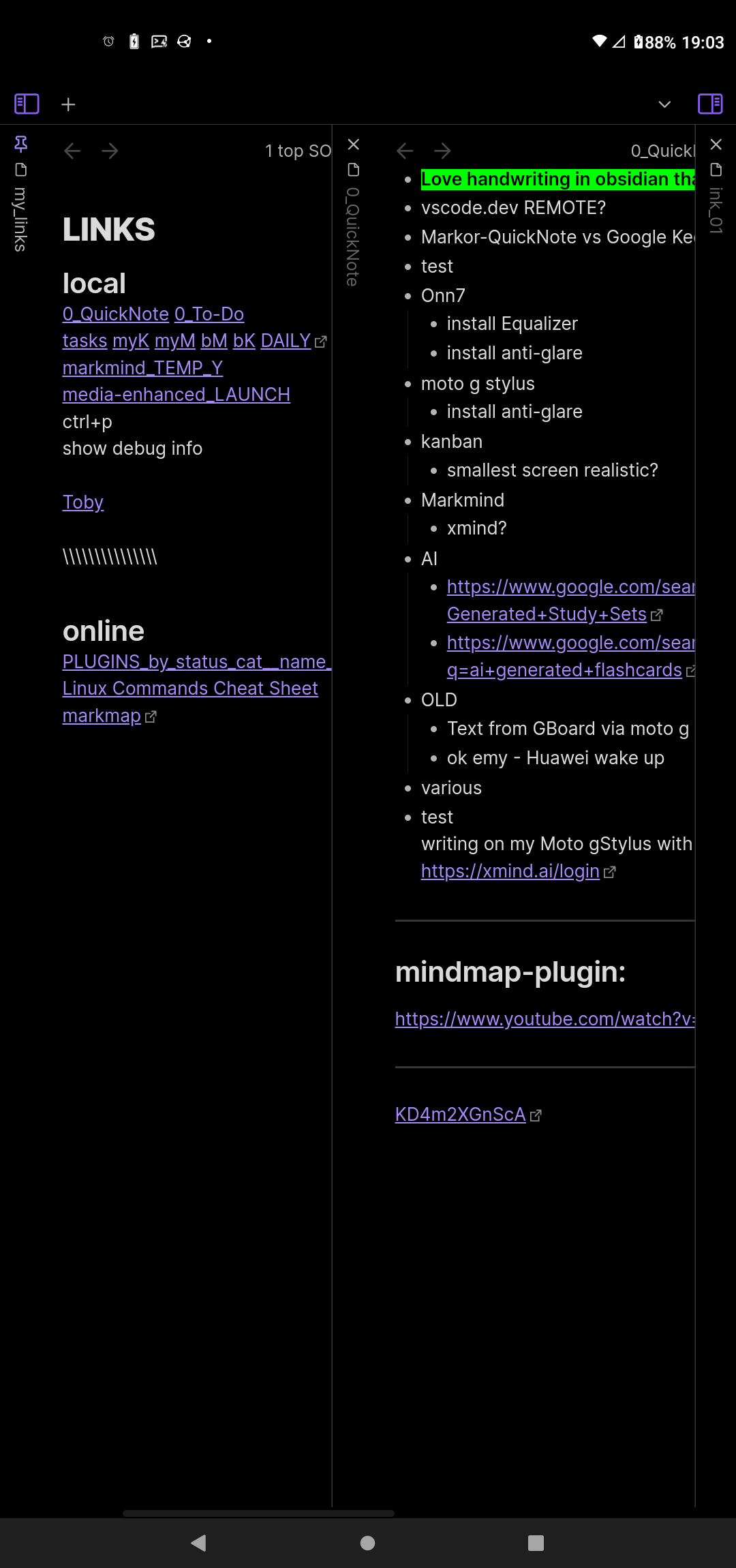
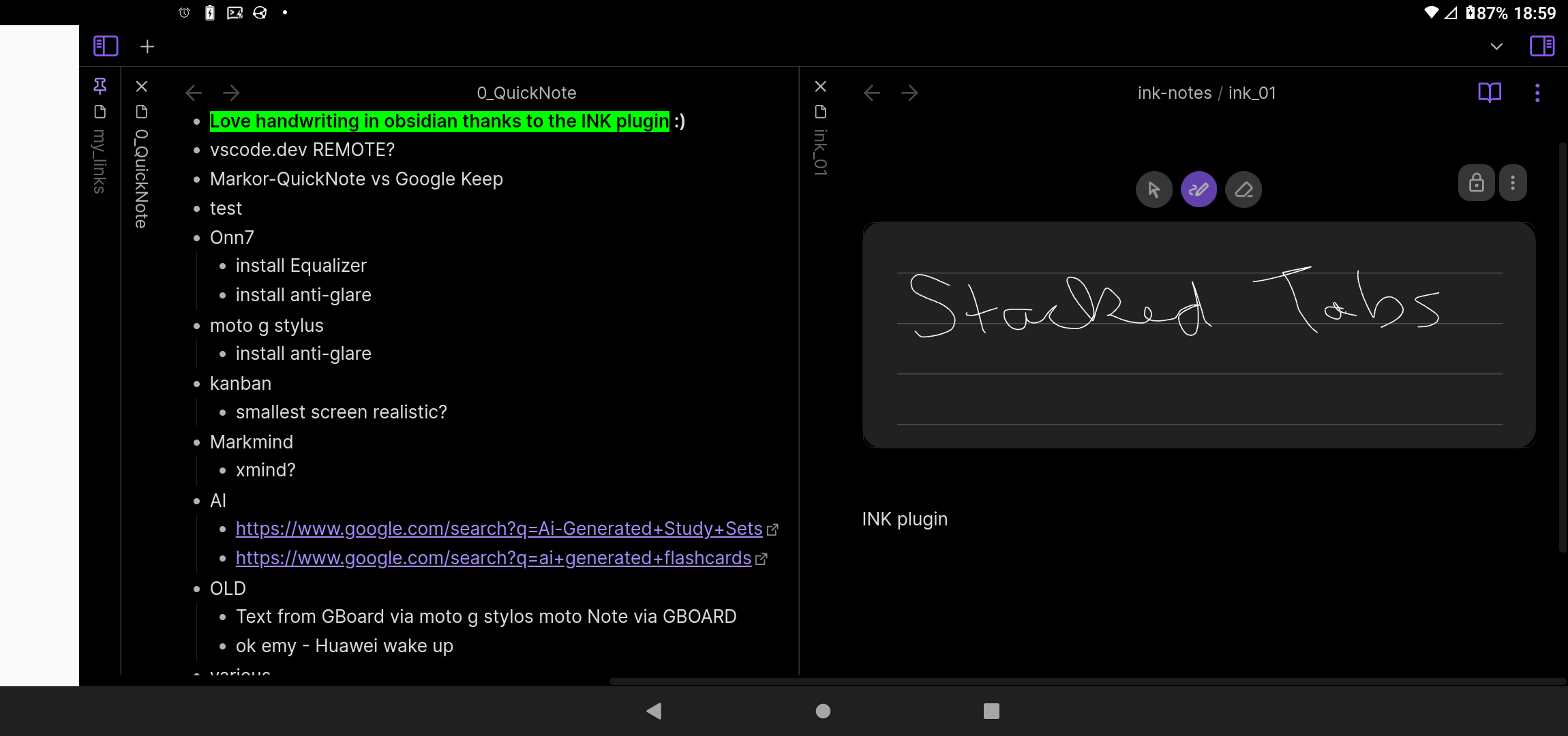
ctrl+p toggle stacked tabs
ctrl+shift+s (my personal hotkey)
stacked tabs icon
… are all back
… split right & split down also reappear.
This developer setting needs to be set each time you reboot the phone …
i.e. you can try it and you’ll be back to normal after a reboot.
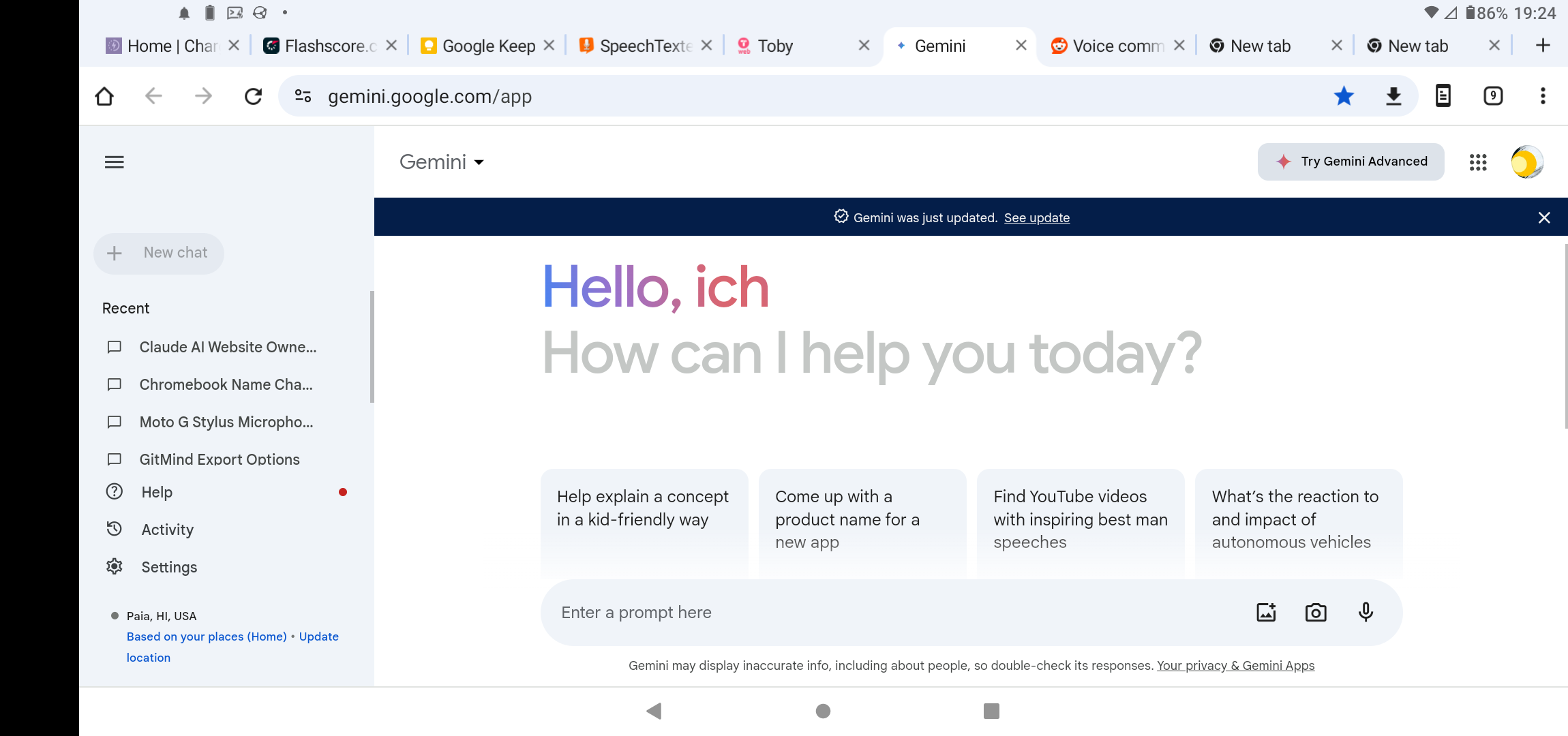
CARE: this setting affects everything on your phone … e.g. your Android browser will also have a tablet layout.
PS:
… you can alternate between the two layouts by changing the dp in developer options and reloading Obsidian without needing to reboot.
… I’ve used the opposite on my small 8.4" Android tablet in the past when I wanted my browser to have a phone interface by setting the dp below 600 at 590.
… mentioned this in a reply to kepano on Mastodon.
… some screenshots
Obsidian_Stacked_Portrait
Obsidian_Stacked_Landscape
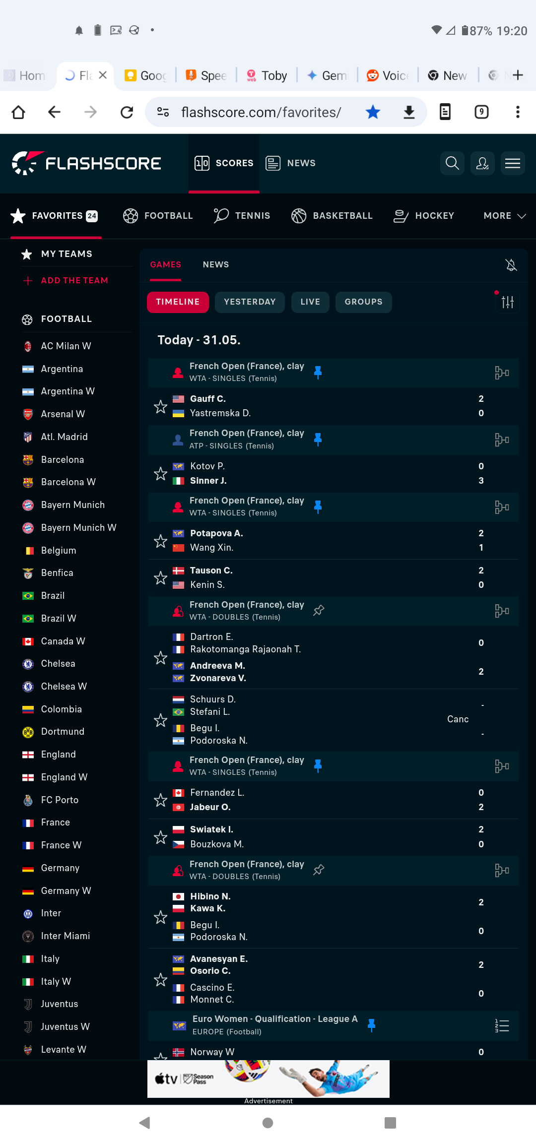
I also like Chrome this way …
Chrome_Portrait
Chrome_Landscape