I don’t know whether UX/accessibility issues better to be reported as bugs or feature requests. In my mind they are not logic bugs per se, but they make available features unusable. So, I guess I put this into bugs.
Steps to reproduce
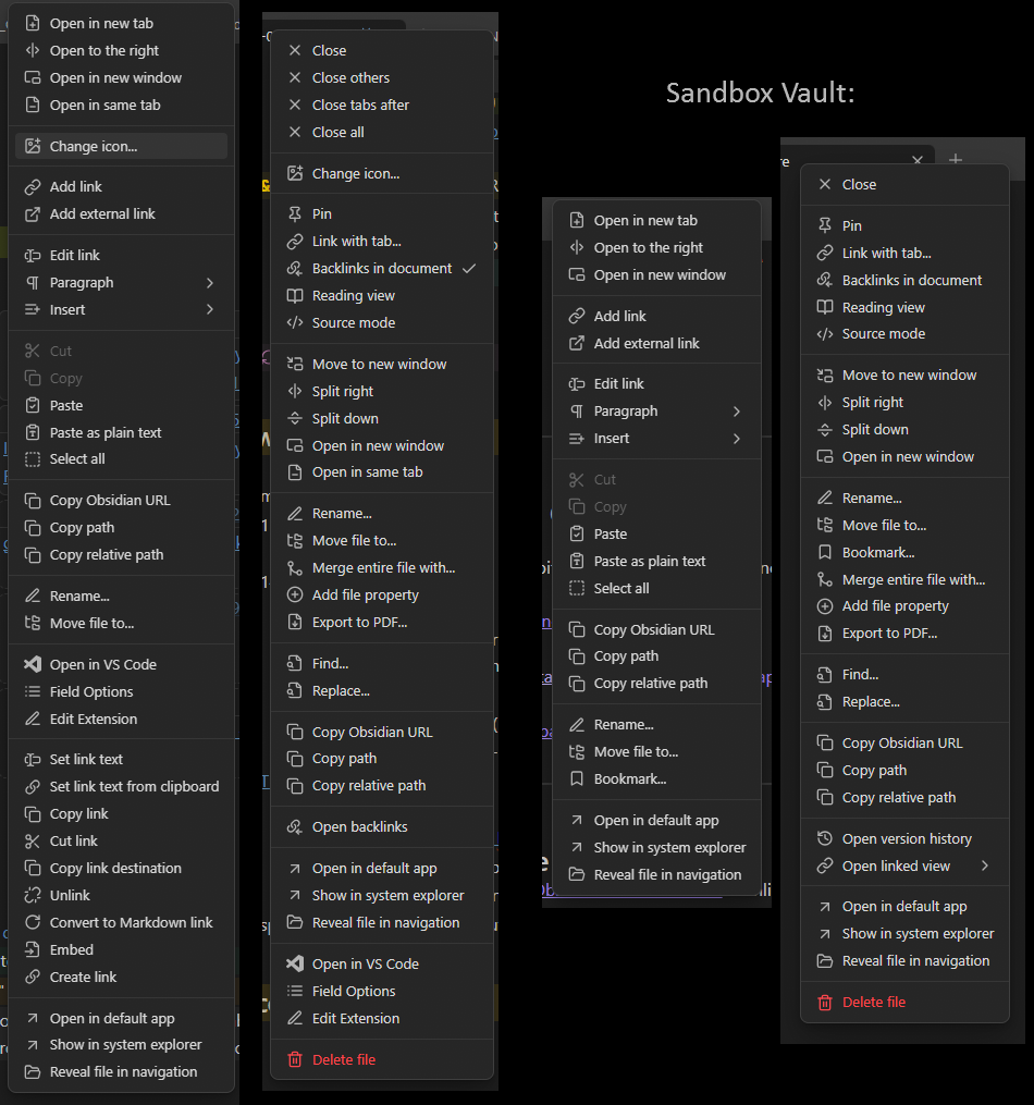
Open the Sandbox Vault on PC (I’m using Windows).
Right click on the “Start Here” tab to see the opened file context menu.
Right click on “[[No prior experience|I have no prior experience]]” internal link to see the internal link context menu.
Did you follow the troubleshooting guide? [Y/N]
Not applicable
Expected result
I expect controls I can comprehend and use efficiently.
Actual result
Accessibility issue. I’m overwhelmed and can’t comprehend the long list of items with no obvious structure. Every time it takes long time to find the item I need or to see whether what I’m thinking about is available at all.
Who are most likely to suffer like me: anyone with neurodiversity, information processing challenges (ADHD, ASD, likely some other diagnoses)
Environment
SYSTEM INFO:
	Obsidian version: v1.9.10
	Installer version: v1.8.4
	Operating system: Windows 10 Pro 10.0.19045
	Login status: not logged in
	Language: en
	Insider build toggle: off
	Live preview: on
	Base theme: adapt to system
	Community theme: none
	Snippets enabled: 0
	Restricted mode: off
	Plugins installed: 0
	Plugins enabled: 0

RECOMMENDATIONS:
	none
Additional information
Real vault menus on the left, sandbox on the right.
Sandbox menu of internal links is at the limit of what I can process comfortably.
What I’d like to see:
- better organization of the menus, so I could understand the logic of what is expected to be where. Even if there is some logic currently, I can’t comprehend it;
- visual cues for said organization - such as named groups, submenus;
- guidelines for plugin authors about how to maintain healthy menus, with some level of enforcement.
I opened the issue for the Links plugin as a major UX abuser, but I also need the awareness of the Obsidian team.