Share your Minimal Theme screenshots/configuration

A couple of weeks ago I launched the Minimal Theme Settings plugin which added lots of customization options for colors and typography in Obsidian.

I love seeing screenshots of how people are using the theme, as it gives ideas for improving it in the future. If you’re a Minimal theme user, I’d love to see your favorite setup in light/dark mode!

17 Likes

4 Likes


I like the minimal theme very much and have some suggestions

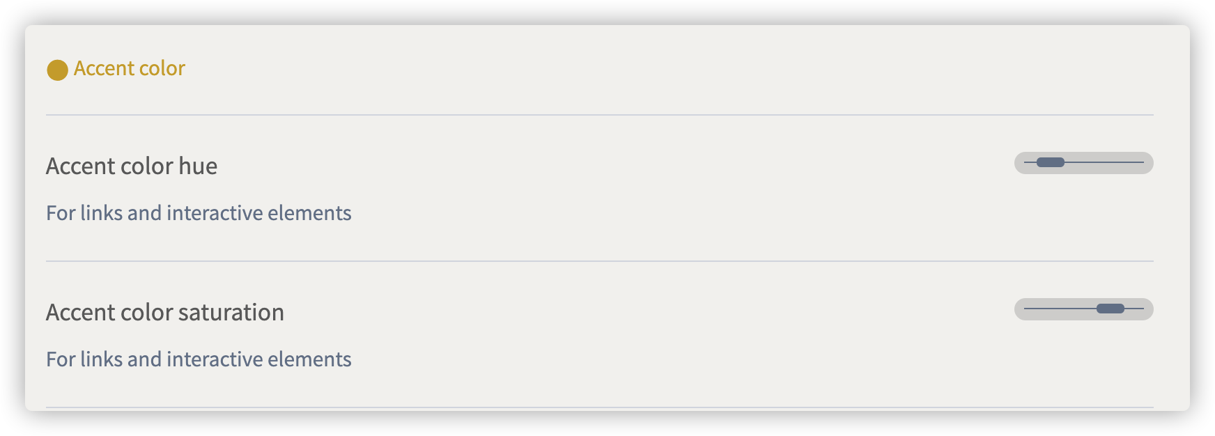
  1. the accent color setting supports manual color input. And add a title color setting ,Bold title
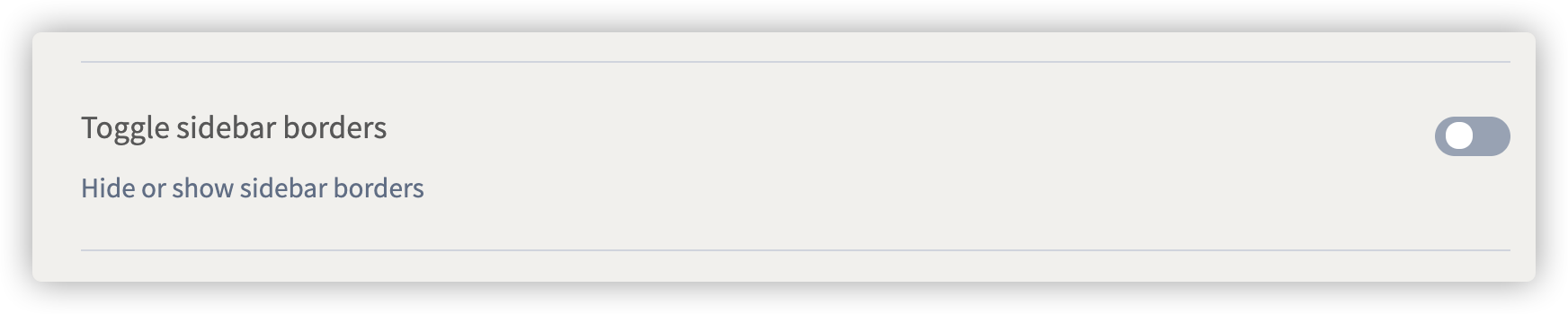
  2. Version 2.41 seems to have removed the option of minimal borders. I only found the previous style by modifying CSS. But it is troublesome and I hope to restore this function.
  3. In addition, can the background support texture patterns or texture pictures? I want to set the background to paper texture
  4. Regarding the inconsistency of line height, I wonder if it can be improved
    Link: On the question of line wrap height

I’m so excited for this thread! I love the Minimal theme and it has really changed the game for me.

This is what a typical workspace looks like for me. I only use dark mode. You’ll see some familiar plugins! I usually make some tweaks to the CSS such as decreasing the overall contrast between the text and the background, adding color headings, changing some parts of header H4-H6 to support ligatures, etc. I personally need to have more color in my documents as an accessibility issue, so that’s why I add that in.

The hider and Minimal settings plugin really has saved me so much time. Before that I’d have to alter the CSS for many other aspects (like the app ribbon, focus mode, removing link underlines, etc) while making sure line by line that anything I changed didn’t erase new changes to the layout.

If there’s anything else useful to share, I’m happy to do so.

13 Likes

I’ve been loving Minimal since it launched, and it’s only gotten better. Thanks, @kepano!

I’ve made a few custom CSS tweaks, namely to get a different UX for embeds…

I use lots of block references to help with task management. These tweaks make transclusions/embeds appear as “cards”, which helps me to remember that they exist as layers apart from the current note. It works really well in nested transclusions, too.

If anyone wants what I’ve done, you can use the upcoming CSS snippets feature to enable/disable these edits…!

/* Transcluded notes embeds */

.markdown-preview-view .markdown-embed {
  padding:0 calc(var(--nested-padding) / 2) 0 var(--nested-padding);
}
.markdown-embed-title {
  line-height:18px;
  height:24px;
  display: none;
}
.markdown-embed .markdown-preview-sizer {
    padding-left: 1em !important;
    padding-top: .5em !important;
    min-height: 0em !important;
}
.markdown-embed .markdown-preview-sizer:first-child ul {
  margin-block-start:2px;
}
.markdown-embed .markdown-preview-section:last-child p,
.markdown-embed .markdown-preview-section:last-child ul {
  margin-block-end:2px;
}
.markdown-embed-link,
.file-embed-link {
  top:0px;
  right:0;
  text-align:right;
}
.file-embed-link svg,
.markdown-embed-link svg {
  width:16px;
  opacity:0;
}
.markdown-embed:hover .file-embed-link svg,
.markdown-embed:hover .markdown-embed-link svg {
  opacity:1;
}
.markdown-preview-view .markdown-embed-content > .markdown-preview-view {
  max-height: none !important;}
.markdown-embed .markdown-preview-view {
  padding:0;}
.internal-embed .markdown-embed {
  border:0;
  border:.5px solid var(--background-tertiary);
  border-left:2px solid var(--text-accent);
  border-radius:0;
  padding-left: 0;
  background-color: var(--background-primary-alt);
  box-shadow: 0 1px 3px rgba(0,0,0,0.12), 0 1px 2px rgba(0,0,0,0.24);
  transition: all 0.3s cubic-bezier(.25,.8,.25,1);
}
.internal-embed .markdown-embed:hover {
    box-shadow: 0 14px 28px rgba(0,0,0,0.25), 0 10px 10px rgba(0,0,0,0.22);
    transform: translate3d(0px, -3px, 0px);
}
br + .internal-embed {
    margin-top: -1.75rem;
}
.markdown-embed-title ~ .markdown-embed-link,
.internal-embed[src*="#"] .markdown-embed-link {
  right:0 !important;
  width:3%;
}

.internal-embed:not([src*="#^"]) .markdown-embed-link {
    left: auto;
}
.internal-embed[src*="^"] .markdown-preview-sizer {
    padding-left: .25em !important;
    padding-top: 0 !important;
}
li > div.internal-embed {
    display: inline-flex;
    width: 99%
}

li .internal-embed .markdown-embed {
    width: 99%;
}

.markdown-embed-title {
  line-height:18px;
  height:24px;
  display: none;
}
.markdown-embed .markdown-preview-sizer {
    padding-left: 1em;
    padding-top: .5em;
}

.popover {
  box-shadow:0 20px 40px var(--background-modifier-box-shadow);
  pointer-events:auto !important;
  border:1px solid var(--background-modifier-border);
}
.popover .markdown-embed-link {
  display:none;
}
.popover .markdown-embed .markdown-preview-view {
  padding-bottom:1em;
}
.popover.hover-popover .markdown-embed .markdown-embed-content {
  max-height: none !important;
}

.popover.hover-popover .internal-embed[src*="^"] .markdown-embed {
    height: 100%;
    max-height: none;
}

.popover.hover-popover .internal-embed[src*="^"] {
    height: 3.25em;
}

.popover.hover-popover {
  max-height:40vh;
}

Edit: fixed an issue with the sidebar

21 Likes

Big fan of your contributions!

I have been riffing off of the minimal theme for probably a few months now to create an experience focused on writing. Have made countless changes and still working through a few bugs I introduced but I have been very happy with where it is headed.

Edit mode

Preview mode

Search

Dark Mode

Responsive Width

Working Draft of CSS attached:
obsidian.css (26.1 KB)

19 Likes

That looks awesome! I have been meaning to try moving the headings into the gutter. I’ll be curious to see how you did it.

Two questions: do you also use the Settings plugin? Do you try to bring the latest changes into your fork?

2 Likes

Thanks!

I haven’t yet had a chance to fully reconcile this yet with your new plugins but I would love to work together to do that. I copied over some of your latest chromeless styling from github into my CSS but haven’t done much beyond that. Excuse the mess in my css file, I am a designer and haven’t written so many lines of CSS in a long time.

I am really happy with the headings in the gutter but it has some quirks, it is not 100% pixel perfect and it did break foldable headings in edit mode. I could not figure out for the life of me how to fix this so I simply disabled it for now. I am hoping this is something that we can either refine with CSS or ask the developers to support more natively as an option.

I feel like with your settings plugins, it might not be too bad to support a visual spectrum between your default minimal style and something more like what I have above with

  • a choice of font
  • variable font size
  • headings in gutter on/off
  • full screen search on/off
  • etc
1 Like

Out of curiosity, have you styled the Settings modal to go full screen as well?

No but I did use a different font there that made it a bit nicer: Inter

Have not spent as much time styling the settings as I don’t go there so often.

1 Like

Wow, this looks very good

1 Like

Easy to install yourself—just add the CSS to the Minimal theme! (Or, in the upcoming update, add it as a snippet so that it’s easy to keep whenever you get @kepano’s latest update.)

@Ryan314> How did you get the ‘yellow’ shades?

Big fan of your work @kepano.

I’ve only made a couple of tweaks, lightly colouring headers for better distinction and adding @ryanjamurphy’s beautiful transclusion snippet.

Light mode

Dark mode

Again, thanks for all you do. The minimal theme makes working in Obsidian a joy.

13 Likes

Can you please share your CSS tweaks? In particular how you changed H1,H2… colors. I love how your theme looks either in dark or light mode!

If anyone wants to create their own custom color scheme for Minimal, I made a Dracula skin with variables for pretty much every element, which should be quite easy to modify to your own taste.

Dracula Skin Snippet for @kepano’s Minimal Theme

6 Likes

Thanks a lot for making the theme @kepano

I did add some css to mimic the WYSISYG editor (not perfect but kind of ok for my workflow)

Here is my CSS snippet

div:not(.CodeMirror-activeline) > .CodeMirror-line span.cm-formatting-task,
div:not(.CodeMirror-activeline) > pre:not(.HyperMD-table-row) span.cm-formatting-link,
div:not(.CodeMirror-activeline) > .CodeMirror-line span.cm-formatting-code,
div:not(.CodeMirror-activeline) > .CodeMirror-line span.cm-formatting-strikethrough,
div:not(.CodeMirror-activeline) > .CodeMirror-line span.cm-formatting-strong,
div:not(.CodeMirror-activeline) > .CodeMirror-line span.cm-formatting-em,
div:not(.CodeMirror-activeline) > .CodeMirror-line span.cm-formatting-highlight,
div:not(.CodeMirror-activeline) > .CodeMirror-line span.cm-formatting-header,
div:not(.CodeMirror-activeline) > .CodeMirror-line span.cm-formatting-quote,
div:not(.CodeMirror-activeline) > .CodeMirror-line span.cm-formatting-link-string,
div:not(.CodeMirror-activeline) > .CodeMirror-line span.cm-formatting-link-string ~ span.cm-url {
    display: none !important;
    position: relative;
}

.external-link::before {
    display: none !important;
}

.cm-hmd-indent-in-quote {
    padding-left: 0.8em;
}

div:not(.CodeMirror-activeline) > .CodeMirror-line span.cm-formatting-code-block,
div:not(.CodeMirror-activeline) > .CodeMirror-line span.cm-hr {
    font-size: 0%;
}

span.cm-hr:before {
    content: "";
    display: block;
    background: var(--text-faint);
    height: 1px;
    opacity: 30%;
}

.collapse-indicator,
.CodeMirror-foldgutter-open,
.CodeMirror-foldgutter-folded {
    visibility: hidden;
}

div:not(.CodeMirror-activeline) > .CodeMirror-line span.cm-formatting-task.cm-property + .cm-list-1::before,
div:not(.CodeMirror-activeline) > .CodeMirror-line span.cm-formatting-task.cm-property + .cm-list-2::before,
div:not(.CodeMirror-activeline) > .CodeMirror-line span.cm-formatting-task.cm-property + .cm-list-3::before {
    content: "●";
    color: var(--text-faint) !important;
}

div:not(.CodeMirror-activeline) > .CodeMirror-line span.cm-formatting-task.cm-meta + .cm-list-1::before,
div:not(.CodeMirror-activeline) > .CodeMirror-line span.cm-formatting-task.cm-meta + .cm-list-2::before,
div:not(.CodeMirror-activeline) > .CodeMirror-line span.cm-formatting-task.cm-meta + .cm-list-3::before {
    content: "○";
    color: var(--text-muted) !important;
}

div.CodeMirror-activeline > .CodeMirror-line span.cm-formatting-task.cm-property + .cm-list-1::before,
div.CodeMirror-activeline > .CodeMirror-line span.cm-formatting-task.cm-property + .cm-list-2::before,
div.CodeMirror-activeline > .CodeMirror-line span.cm-formatting-task.cm-property + .cm-list-3::before,
div.CodeMirror-activeline > .CodeMirror-line span.cm-formatting-task.cm-meta + .cm-list-1::before,
div.CodeMirror-activeline > .CodeMirror-line span.cm-formatting-task.cm-meta + .cm-list-2::before,
div.CodeMirror-activeline > .CodeMirror-line span.cm-formatting-task.cm-meta + .cm-list-3::before {
    content: "";
}

.view-header-title-container:after,
.view-action[aria-label^="Preview"],
.view-action[aria-label^="Close"],
.view-action[aria-label^="More options"] {
    display: none;
}
9 Likes

Shout out to Donella! Systems work is my main area of research & practice.

3 Likes

I like how you’re displaying your daily tasks on the left. How are you doing it? Is that using todoist sync plugin?

@gandalfthegrey Thanks. I just drag the daily node (in edit mode) to the left pane and let the “Minimal Theme” of @kepano takes care of the rest. I also added some CSS for cm-header-6 which I used only to mark date and time.

2 Likes