Reading mode: Don't strike-through nested checkboxes when outer checkbox is checked

Use case or problem

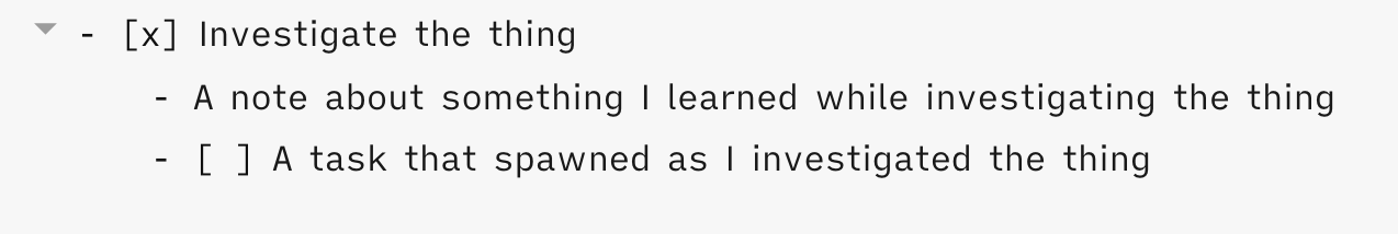
In my daily notes, I will sometimes nest TODO items under one another, for instance if I encounter a new task to track within the context of another task.

In such cases, marking the outer task as complete results in the sub-task(s) being struck through in preview mode.:

Proposed solution

I would prefer for the indented bullets and checkboxes underneath a completed task to be not struck through.

Current workaround (optional)

None. I deal with it.

Related feature requests (optional)

In the second screenshot above, I would also like the nested bullet to be rendered as a list item (i.e. with a bullet). But this might be an issue with the theme I’m using rather than Obsidian itself.

4 Likes

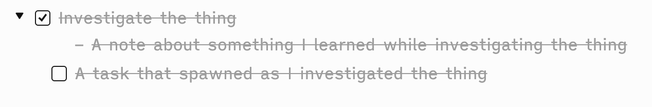
Update: I upgraded to 0.9.12 right after posting this and it looks like the nested list item is rendered with a bullet glyph. The indentation is a little odd, though:

1 Like

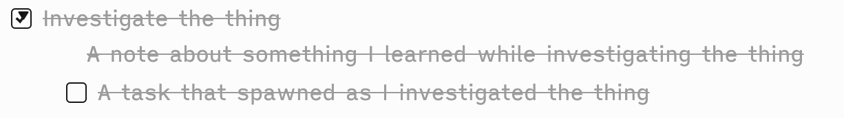
It seems it’s not easily possible to remove strikethrough from child elements without removing it from the full block.
But if it’s acceptable - the greyed out color on the parent block will remain - I found a CSS snippet workaround by CurioHeart on reddit, posted here:

.markdown-preview-view ul > li.task-list-item {
  /* This is to help center the checkbox with other unordered list items; you may want/need to tweak this value for your current theme */
  margin-left: 0.35em;
}
.markdown-preview-view ul > li.task-list-item.is-checked,
.markdown-preview-view ul > li > ul > li.task-list-item.is-checked,
.markdown-preview-view ul > li.task-list-item > ul > li.task-list-item.is-checked {
  text-decoration: none;
  color: var(--text-faint);
}
.markdown-preview-view ul > li.task-list-item.is-checked > ul > li {
  color: var(--text-normal);
}

To use it, create a new text file under vaultFolder/.obsidian/snippets, copy the text in, and save it with .css extension.
Then opening the Obsidian Options, go to Appearance, go down to CSS Snippets section, and enable the file you have created.

2 Likes

Thanks for this! Is it possible to make it work in edit mode as well, i.e. greying out checked tasks in edit mode?

Use case or problem

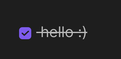
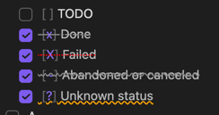
Sometimes it’s too hard to read the strikethrough text because of the fat line in the middle:
image

Proposed solution

Have an option to disable the middle line.

If the option for disabling the middle line is enabled:
Upon checking a checkbox, everything should be the same as it currently is, including dimming the text, but just hide the strikethrough line.

Current workaround (optional)

If anyone has CSS to share that would be awesome!

5 Likes

You can use this CSS Snippet:

/* <<------------- Hide Strikethrough in READING VIEW ----------------->> */
	.markdown-preview-view ul>li.task-list-item {
		text-decoration: none;
	}
/* <<------------- Hide Strikethrough in LIVE PREVIEW ----------------->> */
	.markdown-source-view.mod-cm6 .HyperMD-task-line[data-task="x"] {
		text-decoration: none;
	}
8 Likes

I think you can do this with a ? as the check status

4 Likes

Hmm, interesting. But that only works when I type the character. I’m looking for a way to have this functionality when checking the box with my cursor.

That’s what my snippet does.

2 Likes

By the way, if you are like me and like the strikethrough look for finished tasks, but sometimes want to be able to read it clearly, you could add the :hover function.
This way, unless you are hovering the task, it will still have that strikethrough.

/* <<------------- Hide Strikethrough in Reading View ----------------->> */
	.markdown-preview-view ul>li.task-list-item:hover {
		text-decoration: none;
	}
/* <<------------- Hide Strikethrough in LIVE PREVIEW ----------------->> */
	.markdown-source-view.mod-cm6 .HyperMD-task-line[data-task="x"]:hover {
		text-decoration: none;
	}
1 Like

Great ideas.

I went and added some of my ideas: I like to maintain more than just 2 states for my tasks:

- [ ] [ ] TODO
- [x] [x] Done
- [X] [X] Failed
- [~] [~] Abandoned or canceled
- [?] [?] Unknown status

are rendered like this for me:

screenshot.2022-10-21T150953Z
screenshot.2022-10-21T151010Z

Here’s the CSS snippet:


body {
    --checklist-done-decoration: dashed line-through #888;
}

/*
 * Live Preview
 */

.markdown-source-view.mod-cm6 .HyperMD-task-line[data-task="X"] {
    text-decoration: dotted line-through red;
    color: var(--checklist-done-color);
}

.markdown-source-view.mod-cm6 .HyperMD-task-line[data-task="~"] {
    text-decoration: wavy line-through #888;
    color: var(--checklist-done-color);
}

.markdown-source-view.mod-cm6 .HyperMD-task-line[data-task="?"] {
    text-decoration: wavy underline orange;
    color: var(--checklist-done-color);
}

.markdown-source-view.mod-cm6 .HyperMD-task-line[data-task]:hover {
    text-decoration: none;
}

/*
 * Reading View
 */


.markdown-preview-view ul>li.task-list-item:hover {
    text-decoration: none;
}

1 Like

Interesting. There is the “Checkboxes” snippet by @death.au that does this in a more stylish way.

awesome, thanks

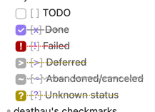
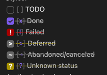
Since these haven’t been updated in over a year (and don’t support Live Preview), here are my updates (for Obsidian v1.0.2) on the default theme.
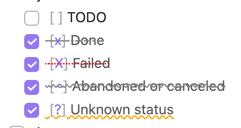
Also, it doesn’t make that much sense to me to have ? and ! interpreted as “question” or “important”. New types of checkboxes should be sub-classes of “done” since other markdown processors will treat them as done.

screenshot.2022-10-23T042707Z
screenshot.2022-10-23T042724Z

body {
  --checklist-done-decoration: dashed line-through #888;
}

/* notation checkboxes */
.markdown-preview-view .task-list-item-checkbox {
  -webkit-appearance: none;
  box-sizing: border-box;
  border: 1px solid var(--text-normal);
  position: relative;
  width: 16px;
  height: 16px;
  margin: 0;
  margin-right: 4px;
  margin-bottom: 2px;
  transition: background-color 200ms ease-out 0s;
  cursor: pointer;
  filter: none;
  border-radius: 4px;
}
.markdown-preview-view .task-list-item-checkbox:checked {
  border: none;
  background-color: var(--interactive-accent);
}
.markdown-preview-view .task-list-item-checkbox:hover {
  background-color: var(--background-primary-alt);
}
.markdown-preview-view .task-list-item-checkbox:checked::before,
.markdown-source-view.mod-cm6 .task-list-item-checkbox::before {
  position: absolute;
  color: white;
  text-align: center;
  font-weight: 900;
  line-height: 13px;
  left:0px;
  right:0px;
}

.markdown-preview-view ul>li.task-list-item {
  font-weight: normal;
  color: var(--text-normal);
}

/* hide strikethroughs on hover */
.markdown-preview-view ul>li.task-list-item:hover,
.markdown-source-view.mod-cm6 .hypermd-task-line[data-task]:hover {
    text-decoration: none;
}


/* all checked task */
.markdown-preview-view li:not([data-task="x"]):not([data-task="x"]) > .task-list-item-checkbox:checked::after,
.markdown-source-view.mod-cm6 .task-list-item-checkbox:not([data-task="x"]):not([data-task="x"]):checked::after {
  background-color: transparent;
}

/* failed */
.markdown-preview-view li[data-task="!"] > .task-list-item-checkbox:checked,
.markdown-source-view.mod-cm6 .task-list-item-checkbox[data-task="!"] {
  border: 1px solid #a90000;
  background-color: #a90000;
}
.markdown-preview-view li[data-task="!"] > .task-list-item-checkbox:checked::before,
.markdown-source-view.mod-cm6 .task-list-item-checkbox[data-task="!"]::before {
  content: '!';
}
.markdown-preview-view .task-list-item[data-task="!"],
.markdown-source-view.mod-cm6 .hypermd-task-line[data-task="!"] {
  color: var(--checklist-done-color);
  text-decoration: dotted line-through red;
}

/* abandoned/canceled */
.markdown-preview-view li[data-task="~"] > .task-list-item-checkbox:checked,
.markdown-source-view.mod-cm6 .task-list-item-checkbox[data-task="~"] {
  border: 1px solid var(--text-faint);
  background-color: var(--text-faint);
}
.markdown-preview-view li[data-task="~"]>.task-list-item-checkbox:checked::before,
.markdown-source-view.mod-cm6 .task-list-item-checkbox[data-task="~"]::before {
  content: '~';
}
.markdown-preview-view .task-list-item[data-task="~"],
.markdown-source-view.mod-cm6 .hypermd-task-line[data-task="~"] {
  color: var(--checklist-done-color);
  text-decoration: wavy line-through var(--text-faint);
}

/* deferred */
.markdown-preview-view li[data-task=">"] > .task-list-item-checkbox:checked,
.markdown-source-view.mod-cm6 .task-list-item-checkbox[data-task=">"] {
  border: 1px solid var(--text-faint);
  background-color: var(--text-faint);
}
.markdown-preview-view li[data-task=">"]>.task-list-item-checkbox:checked::before,
.markdown-source-view.mod-cm6 .task-list-item-checkbox[data-task=">"]::before {
  content: '>';
}
.markdown-preview-view .task-list-item[data-task=">"],
.markdown-source-view.mod-cm6 .hypermd-task-line[data-task=">"] {
  color: var(--checklist-done-color);
  text-decoration: dotted line-through #a99400;
}

/* unknown status */
.markdown-preview-view li[data-task="?"] > .task-list-item-checkbox:checked,
.markdown-source-view.mod-cm6 .task-list-item-checkbox[data-task="?"] {
  border: 1px solid #a99400;
  background-color: #a99400;
}
.markdown-preview-view li[data-task="?"]>.task-list-item-checkbox:checked::before,
.markdown-source-view.mod-cm6 .task-list-item-checkbox[data-task="?"]::before {
  content: '?';
}
.markdown-preview-view .task-list-item[data-task="?"],
.markdown-source-view.mod-cm6 .hypermd-task-line[data-task="?"] {
  color: var(--checklist-done-color);
  text-decoration: dotted line-through #a99400;
}
2 Likes

Wow, this blew up.

Thanks for the help @Olondre, and this might come as a noob question, but how do I apply that snippet of yours?

1 Like

Sorry, just saw your question. Maybe you’ve found it out by now, but here I go anyways:

You create a textfile with the CSS code and give the file a title + .css (e.g.: Checkboxes.css).
You put that file into the snippets folder (Vault/.obsidian/snippets). If the snippets folder does not exist yet, simply create it.
Now you can activate your snippet in Obsidian under Settings -> Appearance -> CSS snippets.

2 Likes

Awesome, works like a charm, thank you!