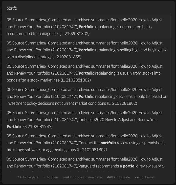
When using the quick switcher to find files in folders the output is extremely “noisy” because it includes the entire path in the name. This introduces significant friction when trying to move quickly between notes.
Another reason this is important is because plugins are also forced to develop their own search functions, which further fractures the search experience across the platform.
When the user open the quick switcher prompt (with ctrl+o by default), they are presented with the paths of each note :
It’s confusing, we probably care more about title than path
It’s weird that aliases are presented with alias name and not the path, it’s not very consistent
Proposed solution
I propose to do something similar than the completion system of internals links (when we type [[ and obsidian show files that correspond)
Each entries with :